"Do we need design thinking, or do we need UX?"
I get asked some version of this in almost every first meeting about an app or a platform. It's a fair question. Most of what's written online makes the two sound either identical or completely unrelated, and they're neither.
The simplest way I can put it: design thinking helps you decide what to build, and UX design shapes how it feels to use. You need both, and the order matters.
Below is how we use them together at Generator, from the first user interview to a clickable app prototype, with five real UI/UX projects from Saudi Arabia, Bahrain and the region.
The short answer
| Design thinking | UX design | |
|---|---|---|
| What it is | A problem-solving method | A design discipline |
| The question it answers | Are we solving the right problem? | Is the solution clear, easy and trusted? |
| Who uses it | Designers, founders, product teams, marketers | UX researchers, UI/UX designers, product designers |
| What it produces | Insights, a defined problem, tested concepts | User flows, wireframes, interfaces, prototypes |
| When it matters most | Before anything is designed | From the first wireframe to launch, and after |
When clients want the one-line version, I tell them design thinking is the thinking and UX is the craft. You can have great craft and still build the wrong thing beautifully. We've been brought in to fix exactly that more than once, and it's never cheap.
What design thinking is, and where it came from
This is how we define it in our own process:
Design thinking is a systematic yet creative process. Its aim is to understand users and their behaviour, challenge assumptions and find the real problem, so we can uncover strategies and smart solutions that aren't obvious at first.
In practice, that means you don't start with a feature list. You start with people: what they're trying to get done, where they get stuck, and what would make them trust you. We run design thinking on every digital project before anyone opens a design file.
The approach was popularised by IDEO, the firm behind Apple's first mouse, and by Stanford's d.school, which IDEO founder David Kelley helped set up. Tim Brown, IDEO's CEO at the time, took it to a business audience with a 2008 Harvard Business Review article, and it's been turning up in boardrooms ever since.
The six stages of design thinking
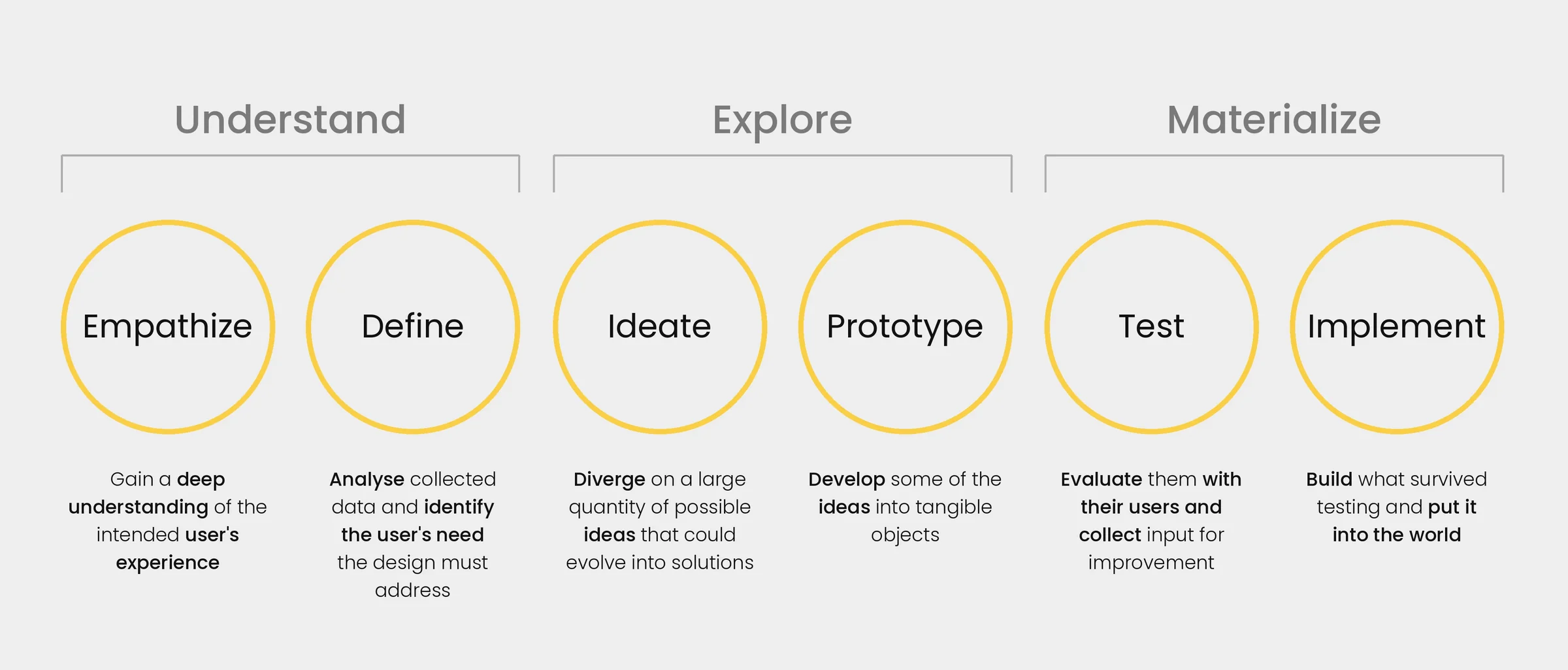
The model most teams use is the d.school's five stages. Nielsen Norman Group later grouped them into three phases and added a sixth step, implement, which is closer to how real projects run.
Understand
Empathize. Talk to real users and watch how they work. People are generous with opinions about what they'd do. What they actually do is usually more useful.
Define. Pull everything you've heard into one clear problem statement. This is where a project either sharpens or quietly drifts.
Explore
Ideate. Go wide. Get lots of possible solutions on the table before anyone gets attached to one.
Prototype. Turn the strongest ideas into something people can click and react to. Fast and rough is fine at this stage.
Materialize
Test. Put the prototype in front of real users and watch where they hesitate.
Implement. Build what survived.
It's rarely a straight line. Testing sends you back to define more often than anyone plans for, and that's fine. Every loop you do on a prototype is one you don't pay for in code.
What UX design is
User experience covers everything someone goes through with your product: finding it, understanding it, trusting it, getting a task done, and wanting to come back. Don Norman coined the term at Apple in the 1990s because "interface" felt too narrow for what he was working on.
People use UI and UX interchangeably, but UI is really one part of UX. UI is what you see: screens, typography, colour, buttons. UX is that plus everything underneath it. How information is organised, how users move through a flow, how interactions behave, the words on the buttons, accessibility, and for most of our clients, Arabic and English interfaces that work properly in both reading directions.
UX doesn't come with one official process, which is exactly why design thinking suits it so well. One helps you decide. The other helps you ship.
Where they meet: the user persona
If I had to pick one tool that sits right between design thinking and UX, it would be the user persona.
A persona is a portrait of one type of user, built from research: who they are, what they want, what gets in their way, and what they need from you. A good one settles arguments in design reviews. A bad one is a stock photo with a made-up name that nobody looks at after the kickoff.
A real example: M3 (Mawhiba MetaMinds)
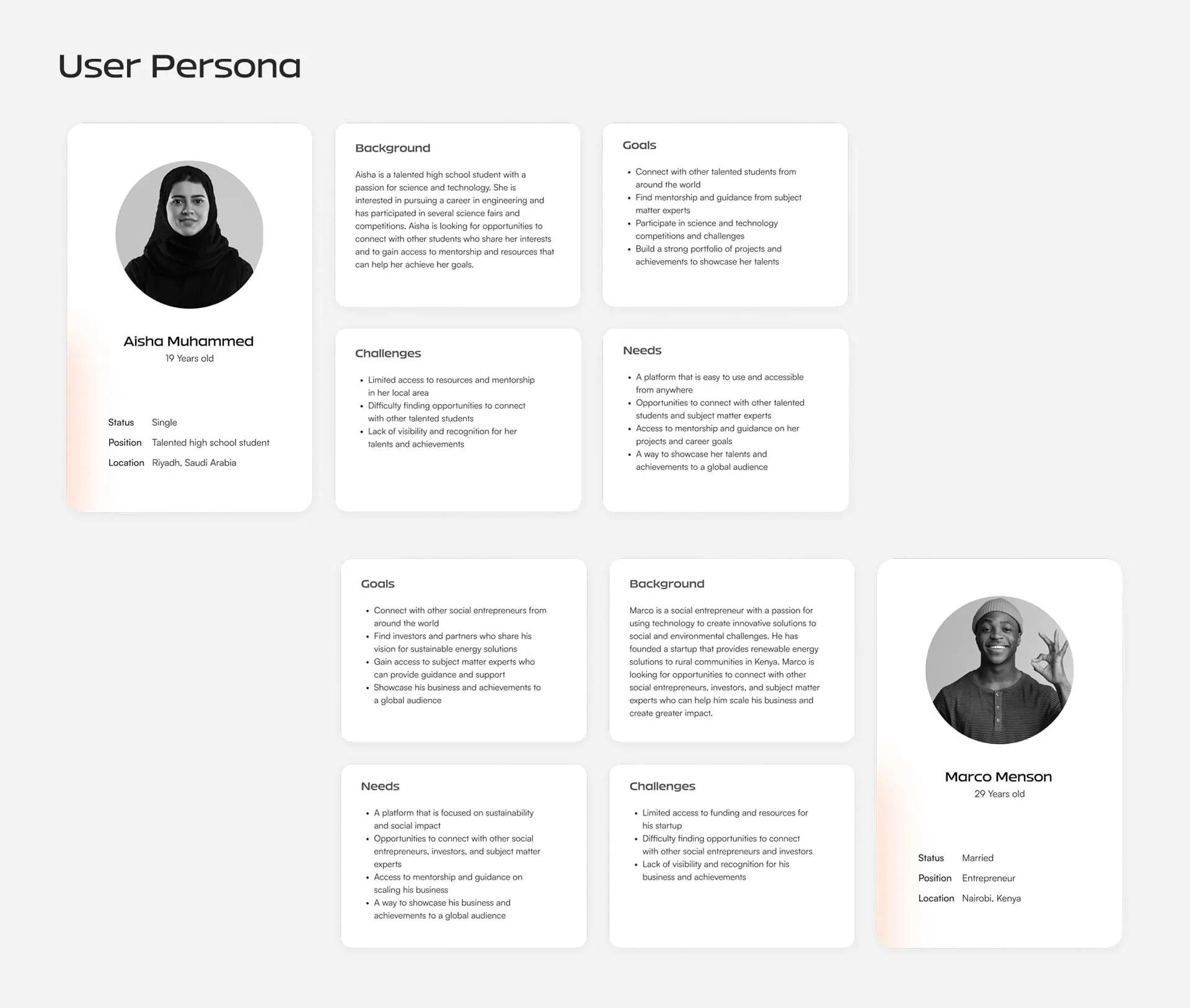
When we started research for M3, a digital platform for gifted youth that we built with Mawhiba in Saudi Arabia, we mapped out three personas:
- A 19-year-old student in Riyadh who loves science, wants to study engineering, and is looking for mentors and a way to show her work.
- A 29-year-old social entrepreneur running a renewable-energy startup, looking for investors, partners and expert advice.
- A 45-year-old environmental scientist with twenty years in the field who wants to mentor the next generation.
On paper they had almost nothing in common. But when we laid their challenges side by side, one line kept repeating: nobody could see what they were capable of. The student, the founder and the scientist all wanted visibility and recognition.
When users that different share the same frustration, you've usually found the heart of the product. That insight shaped the creative orientation behind M3's identity, tone of voice and UX, and it's why the project went through personas, wireframes and a full UI/UX prototype before anything reached development.
What makes a persona actually useful
In our experience it comes down to four things. Leave any of them out and the persona won't change a single design decision.
The goal. What they're really trying to get done, in their own words.
The obstacle. What stops them today.
The context. Where they are when they use your product. Someone on their phone during a commute is a different design problem from someone at a desk in an operations room.
The trust trigger. What would make them believe you.
Build personas from real interviews rather than assumptions, and keep it to three to five. In the Gulf especially, don't assume one language. Plenty of users browse in English and check out in Arabic.
From persona to prototype: how we run UI/UX
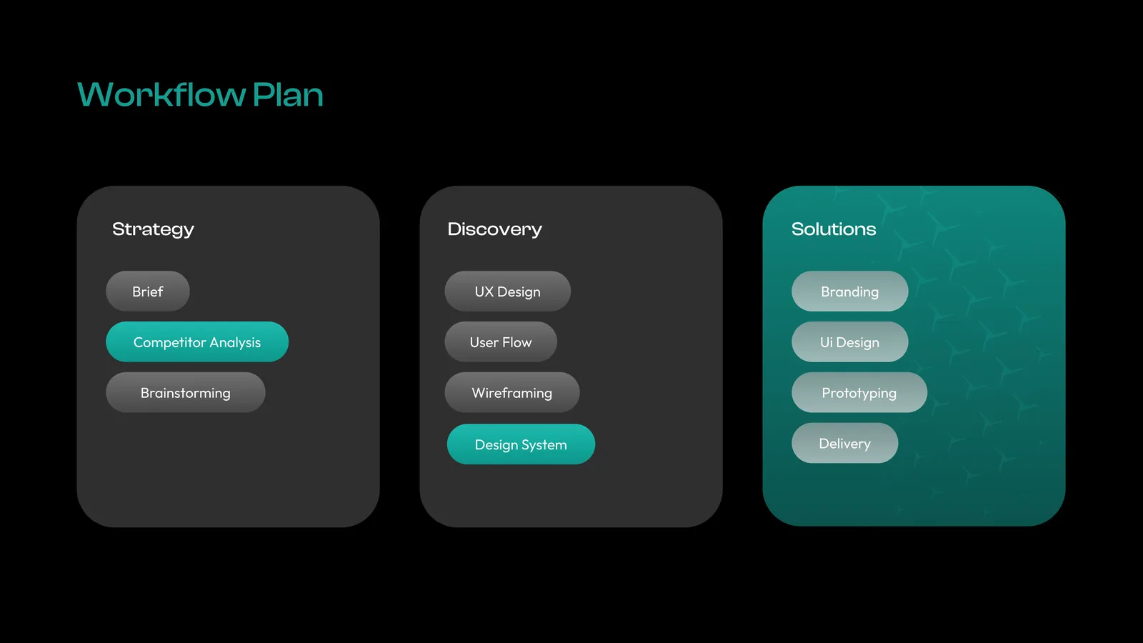
Our UI/UX process follows the 4D structure we use on every project: Discover, Define, Design, Deliver. If you know the UK Design Council's Double Diamond, it'll look familiar. You open up to explore, narrow down to decide, then do it again. For apps and websites, it looks like this.
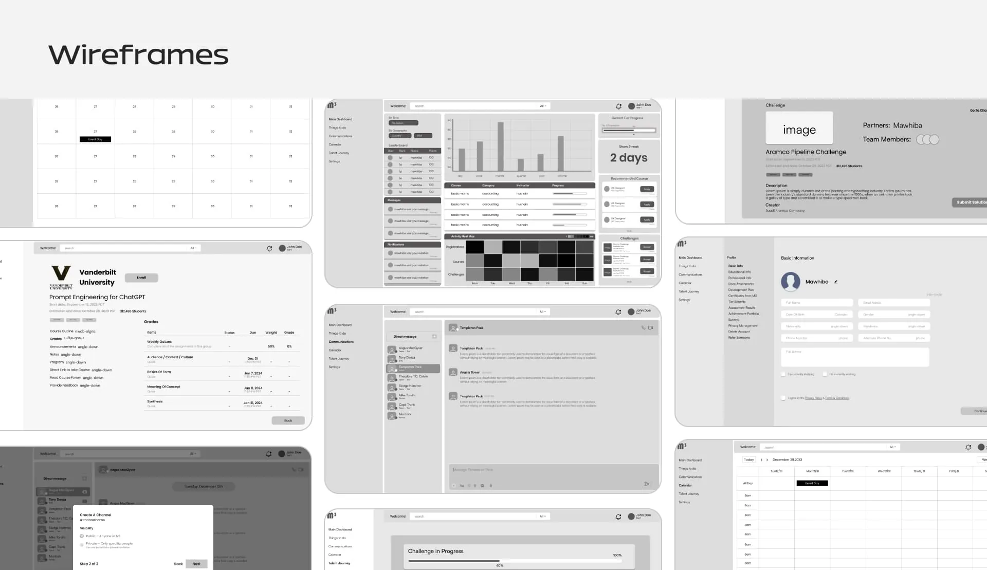
Discover. Desk research, stakeholder interviews, user research and benchmarking. For M3, that meant studying how platforms like GitHub, Toptal and LinkedIn handle profiles, talent and community before we designed anything of our own.
Define. Personas, user journeys, and the one problem statement that everything else has to answer to.
Design. Low-fidelity wireframes first, so we can settle structure and flow without anyone getting distracted by colour. Then mockups with real layout, typography, navigation and content. Then a high-fidelity prototype that's interactive and clickable, close enough to the real thing that test users forget it isn't.
Deliver. Testing with users, refining, and handing developers a proper design system rather than a folder of screens.
If I had to protect one step from budget cuts, it would be the prototype. Changing a flow in a prototype takes an afternoon. Changing it after development can cost a sprint, and sometimes a launch date. We wrote more about that in Prototyping: The Smartest Step in App and Website Development.
Four projects, four different UX problems
We use the same method every time. We've never had the same problem twice.
Souq Althahab: when trust is the interface
Souq Althahab is a Sharia-compliant digital marketplace for gold and jewellery, based in Bahrain, and the first platform of its kind. Gold isn't an impulse buy. The experience had to make a high-value purchase feel safe, and make the Sharia-compliant promise clear instead of hiding it in a footer. A lot of the answer was UX writing rather than visuals: clear hierarchy, calm spacing, a secure checkout, and dashboards built for vendors and customers alike.
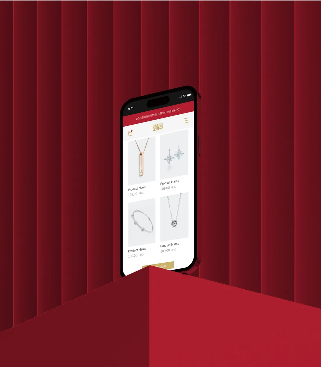
In a marketplace like this, trust isn't something you add at the end. It's the product.
C3i Protect: when the user is under pressure
C3i Protect is security management software for real-time surveillance and threat response. Its users aren't casually browsing, they're responding to incidents as they happen. Our job was to take complex security operations and simplify them into one centralised interface, then prototype it to fit the infrastructure clients already run. A short motion piece showed how the system works in real scenarios, which made onboarding a lot easier.
In enterprise software, good UX mostly means less thinking under pressure.
Arfof: when two languages share one screen
Arfof is a multi-vendor marketplace for Arabic and English audiences. Its identity merges the Arabic letter ف with the Latin F into a single mark, and we carried the same idea into the product: mobile-first wireframes, a working app prototype, and flows for product discovery and vendor interaction that feel natural in both languages.
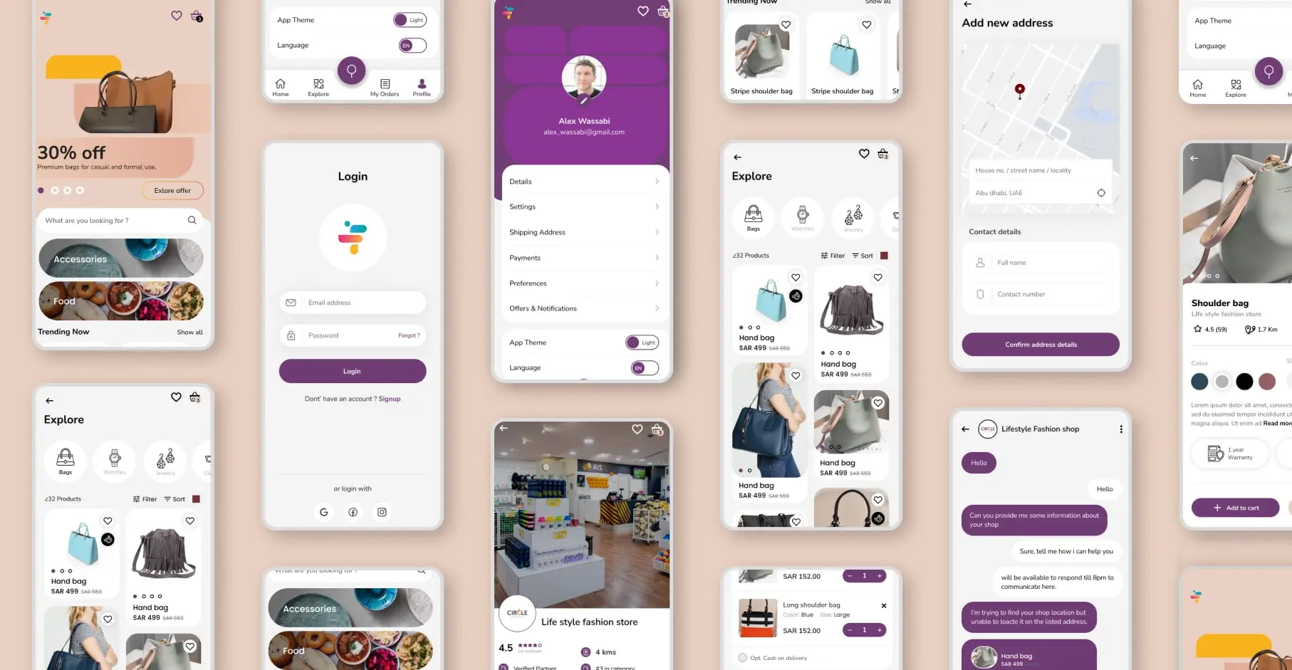
Bilingual UX isn't translation. It's two reading directions designed as one system from day one.
FORMA: when the interface has to feel like the product
FORMA is a premium aesthetic-shaping brand built on Italian technology, used by professionals and their clients. We designed the UI/UX and prototype alongside the brand identity, so the app feels as refined as the treatment itself. Every screen had to balance elegance with usability, and when the two disagreed, usability won.
FORMA's mobile experience, from the homepage through the treatment steps to the gallery.
When a product is premium, a clumsy interface undoes the brand in seconds.
How to choose a UI/UX agency for your app or website
If you're comparing agencies for an app prototype or a website, the polished final screens in a portfolio are the least useful thing to look at. Ask about what happened before them.
- Can I see the personas and research from a real project? If nothing exists before the mockups, the design was guessed.
- Do you prototype and test before development? Ask how many rounds, and who the testers were.
- Who does the research? A named UX researcher is a good sign. "The designers handle it" usually means nobody does.
- Can you design Arabic-first? Ask to see right-to-left screens that were designed, not mirrored.
- What will our developers receive? A design system with components and states, or a folder of pictures?
If you're still building a shortlist, our guide on how to choose a branding agency in Saudi Arabia, Egypt and the UAE covers the wider picture.
Common questions
Is design thinking the same as UX?
No. Design thinking is a problem-solving method that any team can use. UX design is the discipline of shaping how a product works and feels. UX teams use design thinking, but so do founders, product owners and marketers.
What are the stages of design thinking?
The widely used model has five: empathize, define, ideate, prototype and test. Many teams add a sixth, implement, and group them into three phases: understand, explore and materialize.
What is a user persona in UX?
A research-based profile of one type of user, covering their goals, obstacles, context and what earns their trust. It keeps design decisions tied to real people instead of opinions in a meeting room.
Why prototype an app before development?
A prototype lets real users try the flow while changes are still cheap. It's the fastest way to find what confuses people before you pay to build it.
What's the difference between UI and UX?
UI is the visible layer: screens, type, colour and buttons. UX is the whole experience, including structure, flows, content, and whether people actually finish what they came to do.
Ready to turn your idea into a prototype people can actually use?
We'd be glad to walk through your idea, the people it's for, and what a first prototype could look like. Generator designs apps, platforms and websites for companies across Saudi Arabia and Egypt, and we always start with the users.
Start a conversationGenerator Design Agency · Cairo, Egypt · Working across Saudi Arabia & Egypt · See more work · Our services