_1637577530.jpg)
Saker Partners
Saker Partners is a future-driven firm focused on security innovation and institutional resilience. With a strong presence in both private and governmental sectors, the brand needed an identity that captured its dynamic nature and its mission to deliver agile and intelligent solutions for safe societies.

Challenge
The core challenge was to craft a visual and verbal identity that expressed continuous movement, strength, and precision. The concept had to reflect the idea of a dynamic flow of force within an elastic system. It also needed to be bold enough for the security sector while remaining flexible for various applications and diverse audiences.
Our Strategy
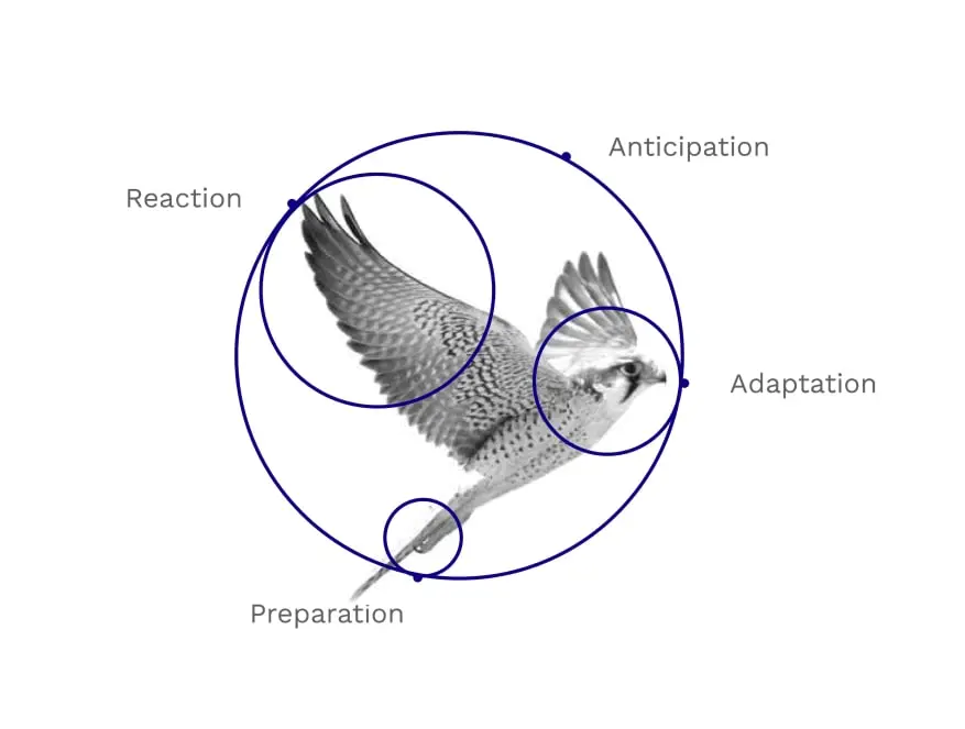
We built the strategic foundation on the symbolism of the hawk’s aerial vision, representing clarity, dominance, and reactive strength. The brand positioning aimed to portray Saker Partners as a source of momentum, intelligence, and future-readiness. To ensure alignment with audience expectations, we began with quantitative research using online surveys and structured questionnaires to gain insights into market perception and stakeholder priorities.
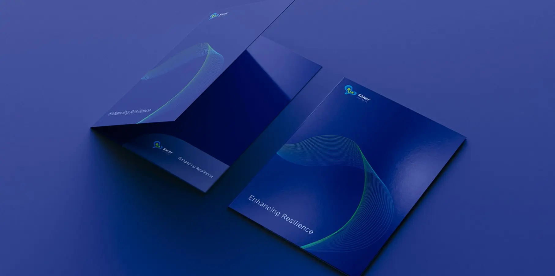
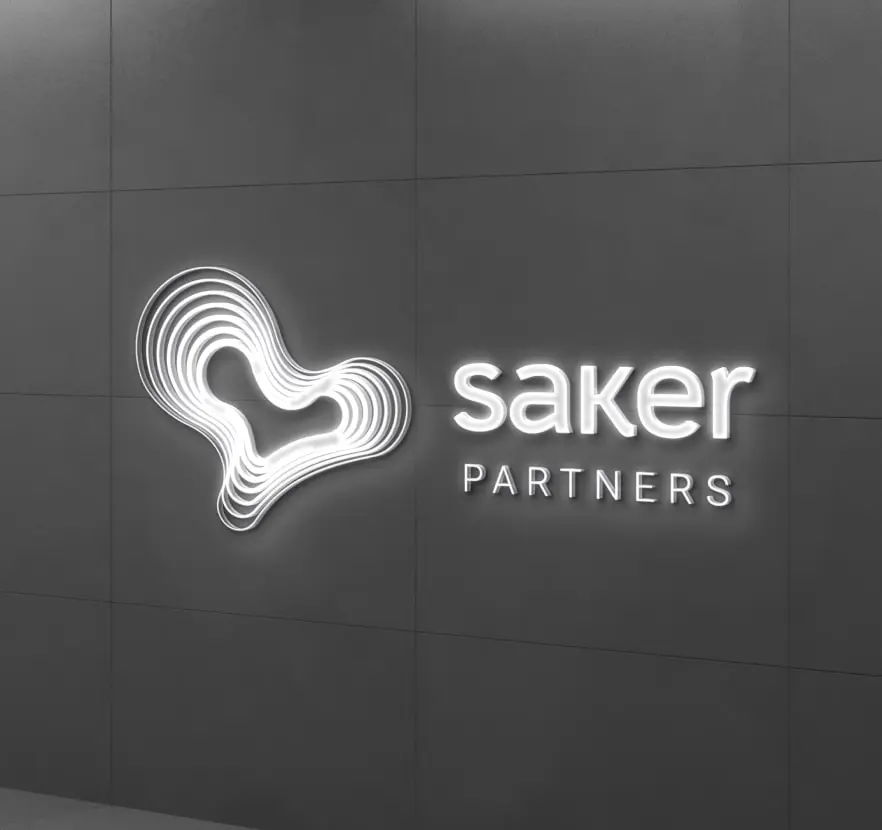
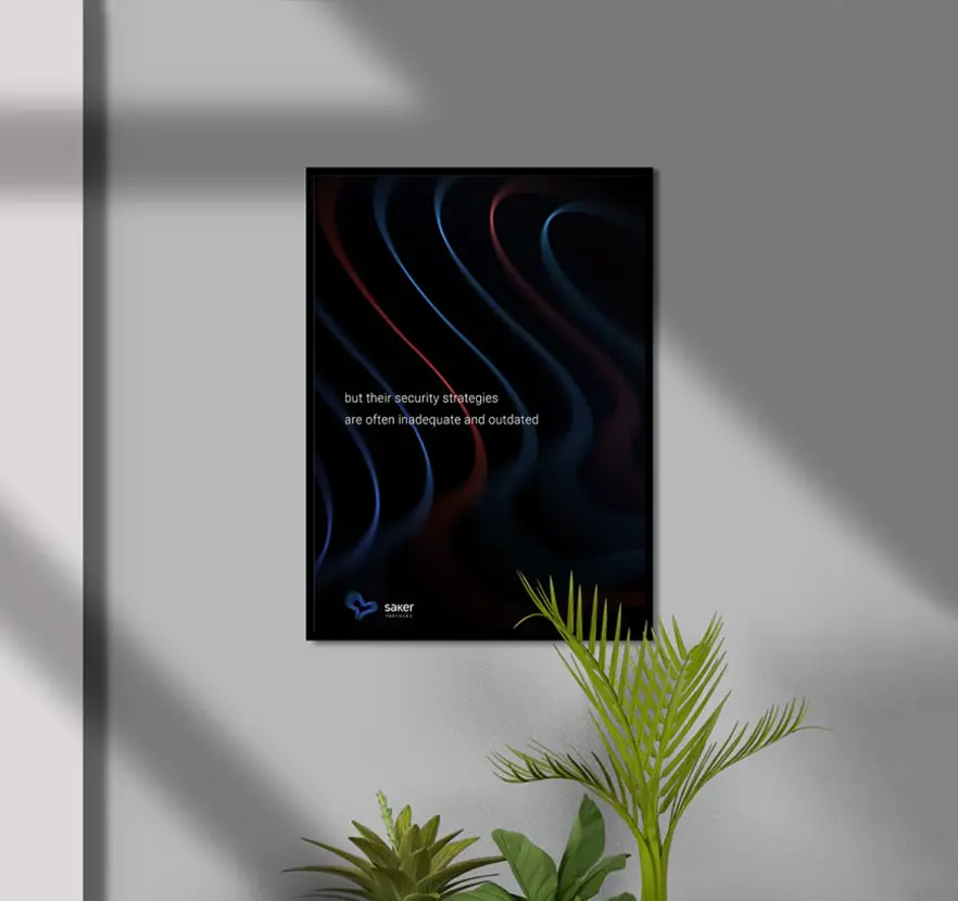
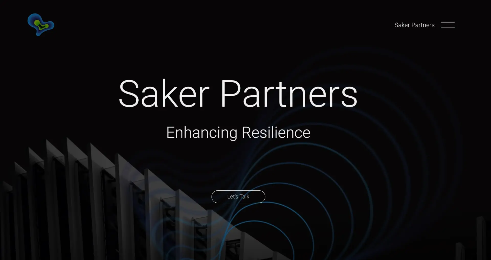
Creative Execution
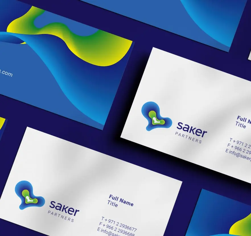
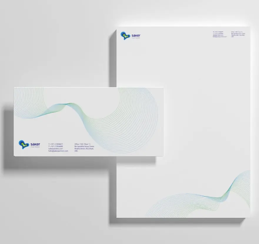
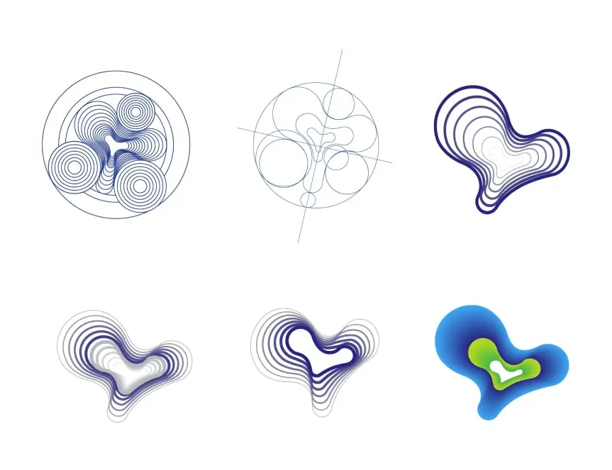
- Developed a custom logo inspired by motion, control, and visual clarity.
- Created a color palette that balances authority with adaptability.
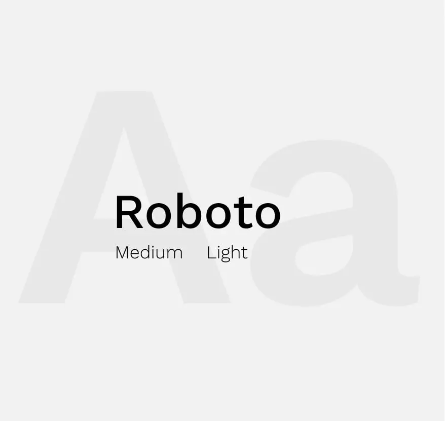
- Designed typography reflecting modern structure and high-frequency signal forms.
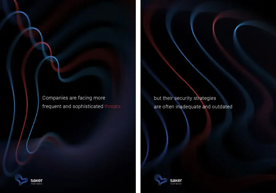
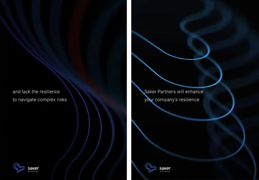
- Built a graphic system based on layered patterns symbolizing security and flow.
- Crafted brand guidelines that ensured consistency across digital and physical touchpoints.
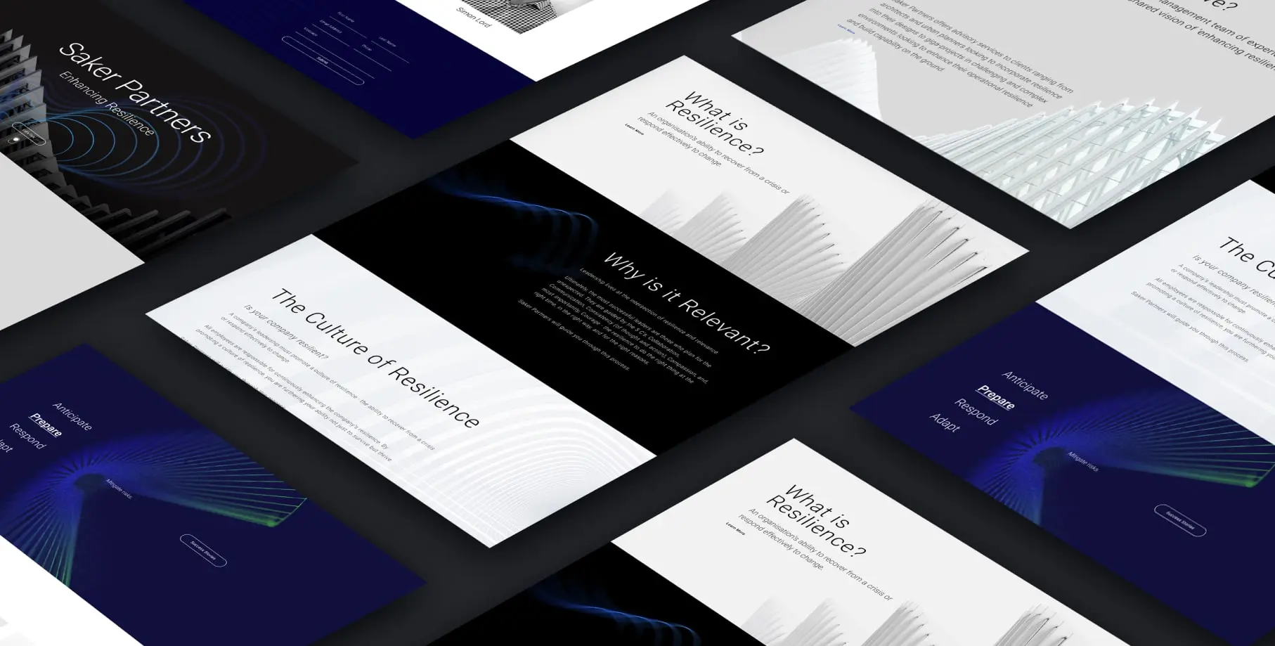
- Applied the identity across key deliverables including presentations, reports, and digital assets.
Result
The final identity successfully positioned Saker Partners as a leading force in future security. It enabled clear communication across both government and private sector channels while setting the foundation for long-term recognition. The brand now conveys its values with confidence, flexibility, and strategic clarity, reinforcing its role as a trusted guide for safe and resilient progress.