Falcon
Falcon is a forward-looking financial brand specializing in global asset management and financial consultancy. With a focus on precision, trust, and scalability, the client needed a brand identity that would speak to both international stakeholders and local clients with clarity and strength.

The Challenge
The finance industry is saturated with conventional visuals and generic branding. Falcon needed to set itself apart with a visual identity that reflects stability, trust, and a systematic approach to financial growth , all while positioning itself as a modern, international player.
The Strategy
We built the identity on three pillars: strength, clarity, and systemization. Inspired by the falcon, a symbol of vision, speed, and dominance, we crafted a brand that reflects calculated leadership. The design process was guided by market research, behavioral finance insights, and a structured design thinking methodology to ensure alignment with audience expectations and business goals.


The Execution
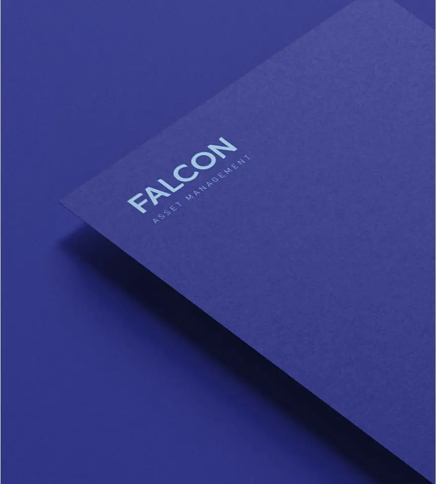
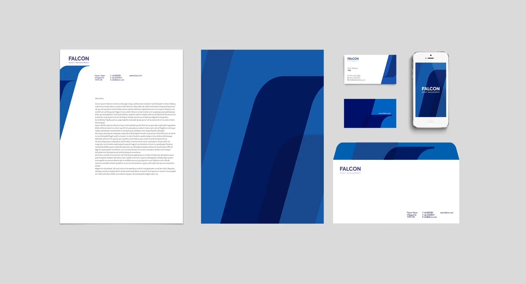
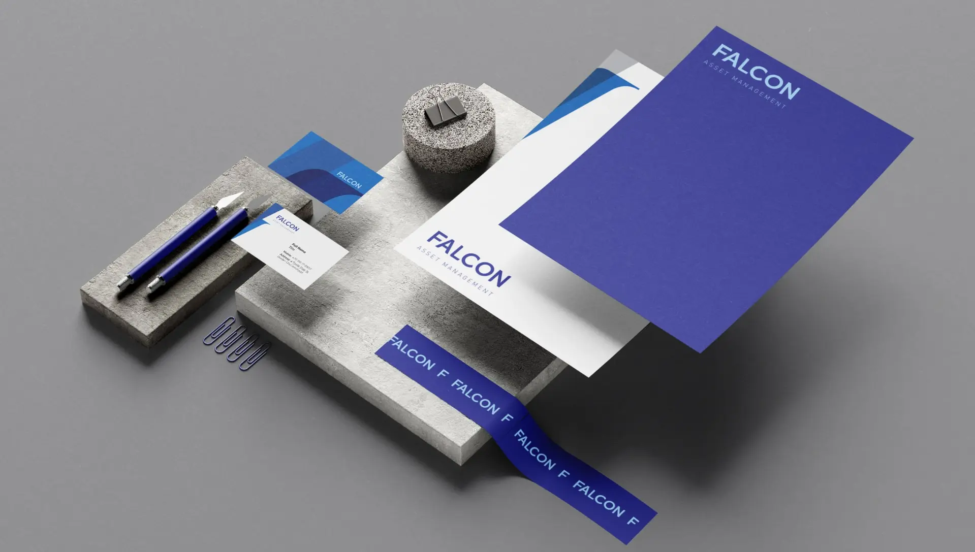
– Logo & Symbol: A refined falcon symbol abstracted into a geometric shape, balancing elegance with strength.
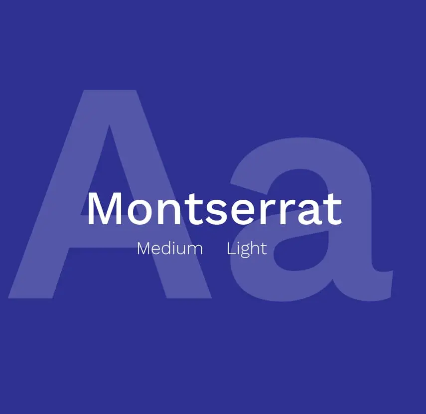
– Typeface Design: A custom, grid-based typeface developed to enhance brand recognition and emphasize consistency across global applications.
– Color Palette: Muted metallics and navy tones representing security, professionalism, and long-term value.
– Graphic System: Modular components designed for both digital and print, offering scalable solutions for reports, dashboards, and presentations.
– Typography System: A hierarchy-driven typographic system with generous white space to signal transparency and focus.
The Results
Falcon’s identity now communicates a sense of trust, global reach, and modernity. The new visual language allowed the brand to confidently enter international markets and establish credibility with high-net-worth clients and institutional partners.