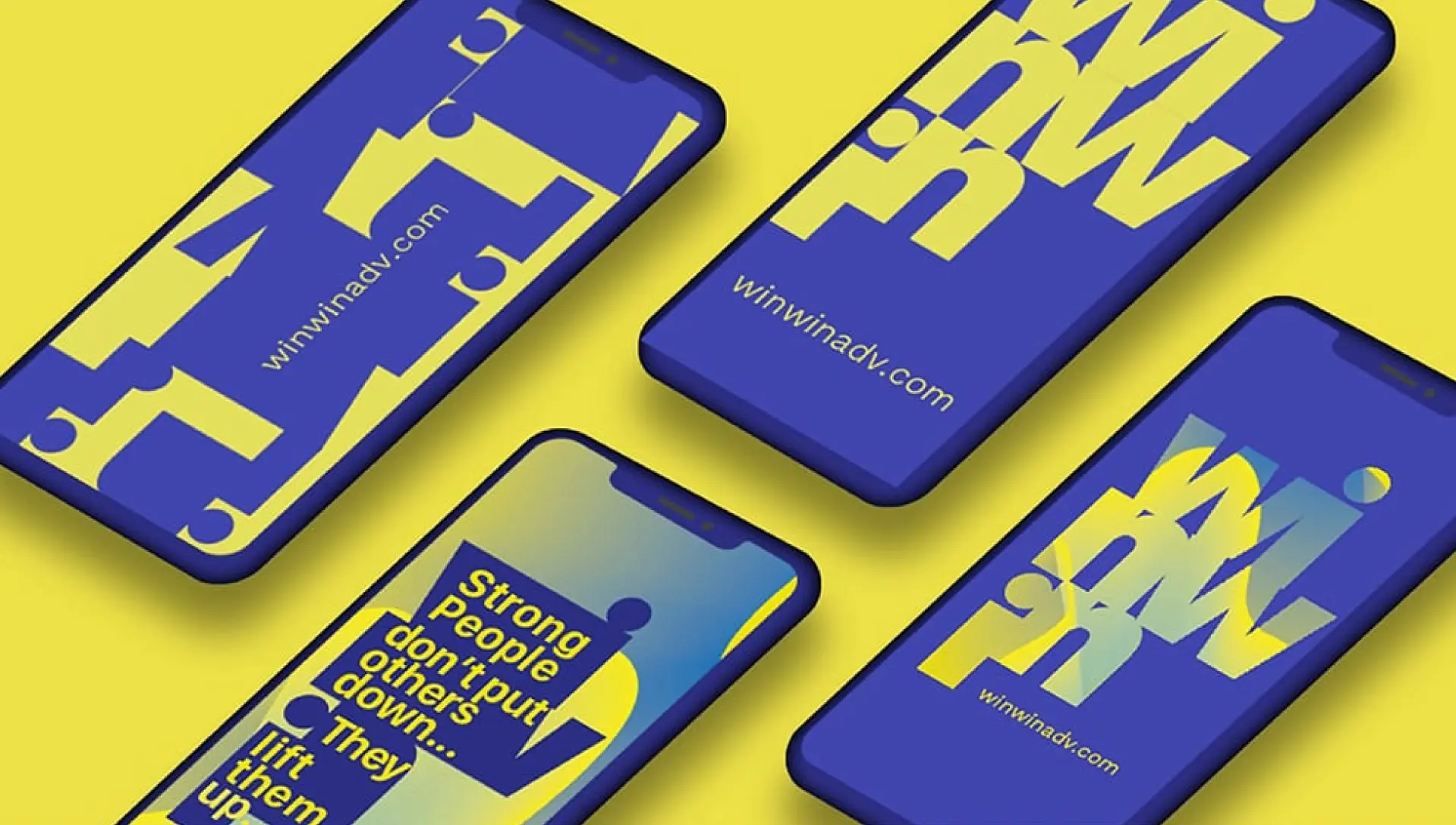
The Execution
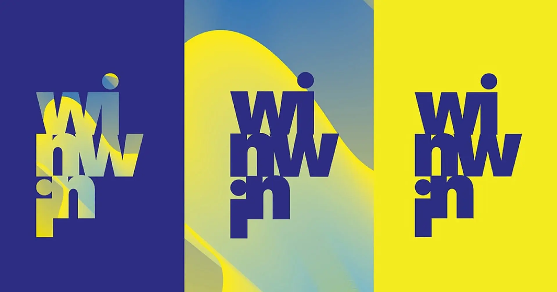
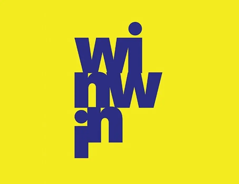
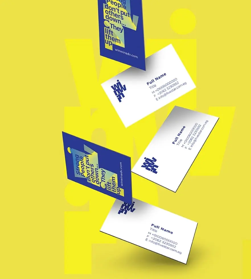
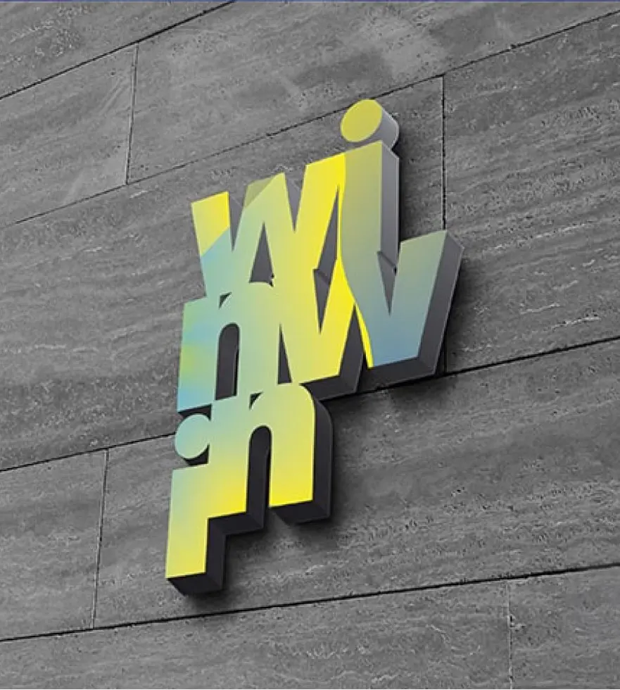
- Logo Design: A geometric and symmetrical logo mark symbolizes balance and dual success while maintaining a modern and playful edge.
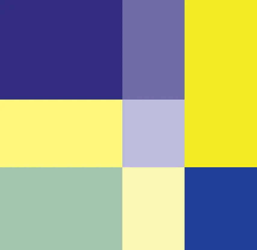
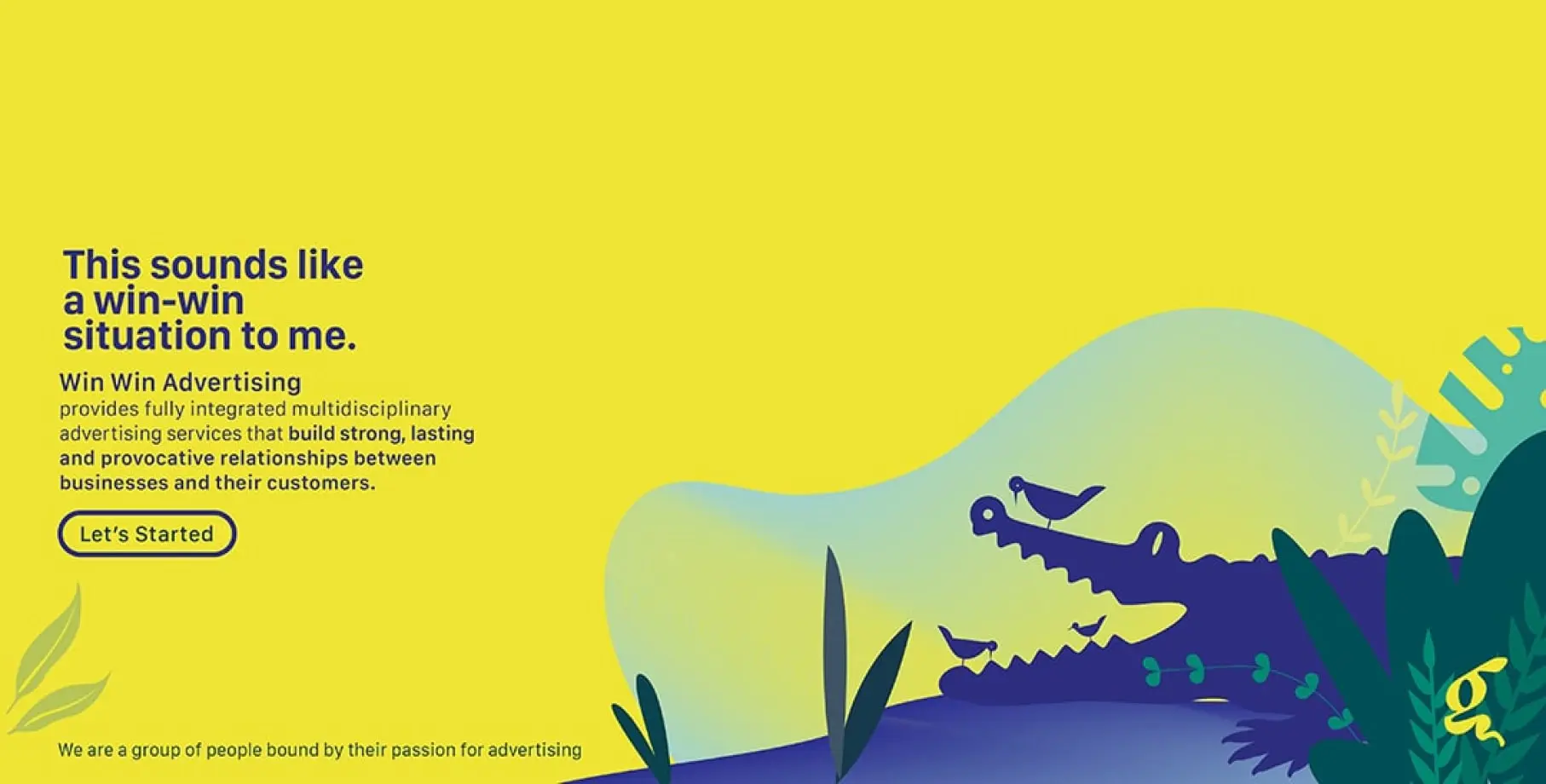
- Color System: A bold palette representing energy enthusiasm and creative potential with contrast tones to distinguish each partner’s contribution.
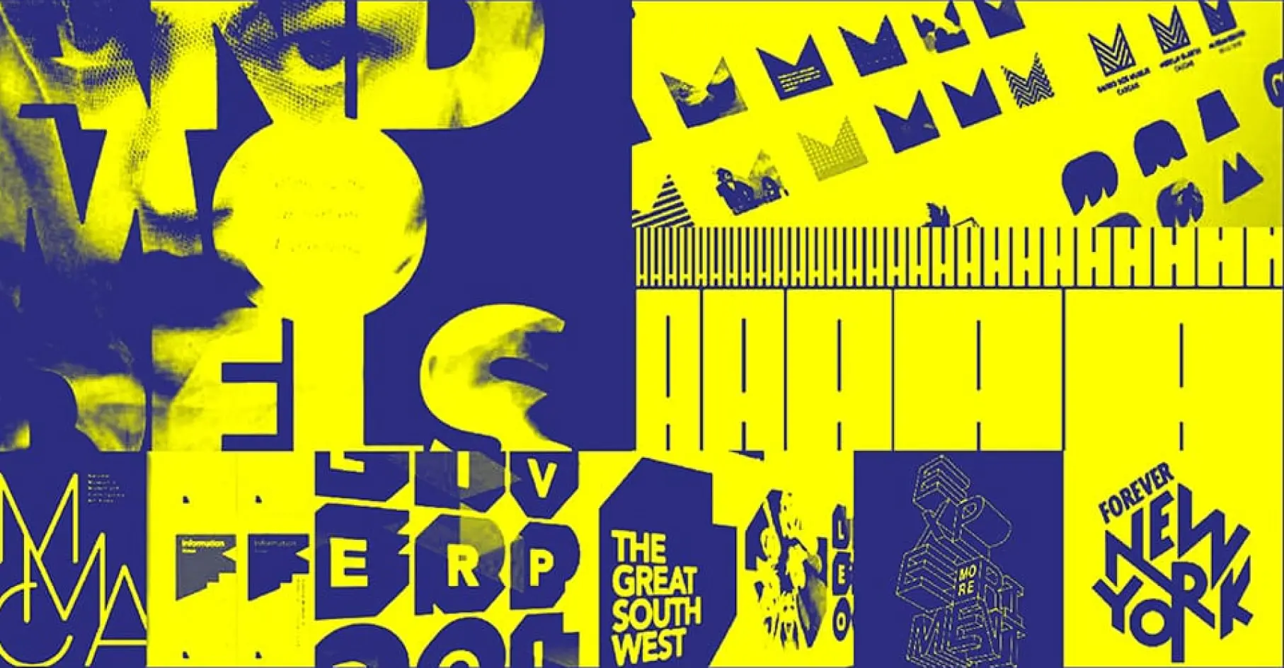
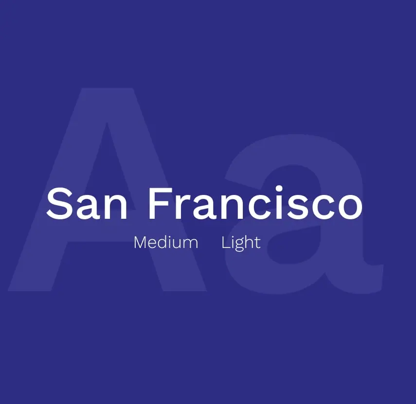
- Typography: Clean confident and legible fonts convey clarity and trust while supporting flexible applications across UI and print.
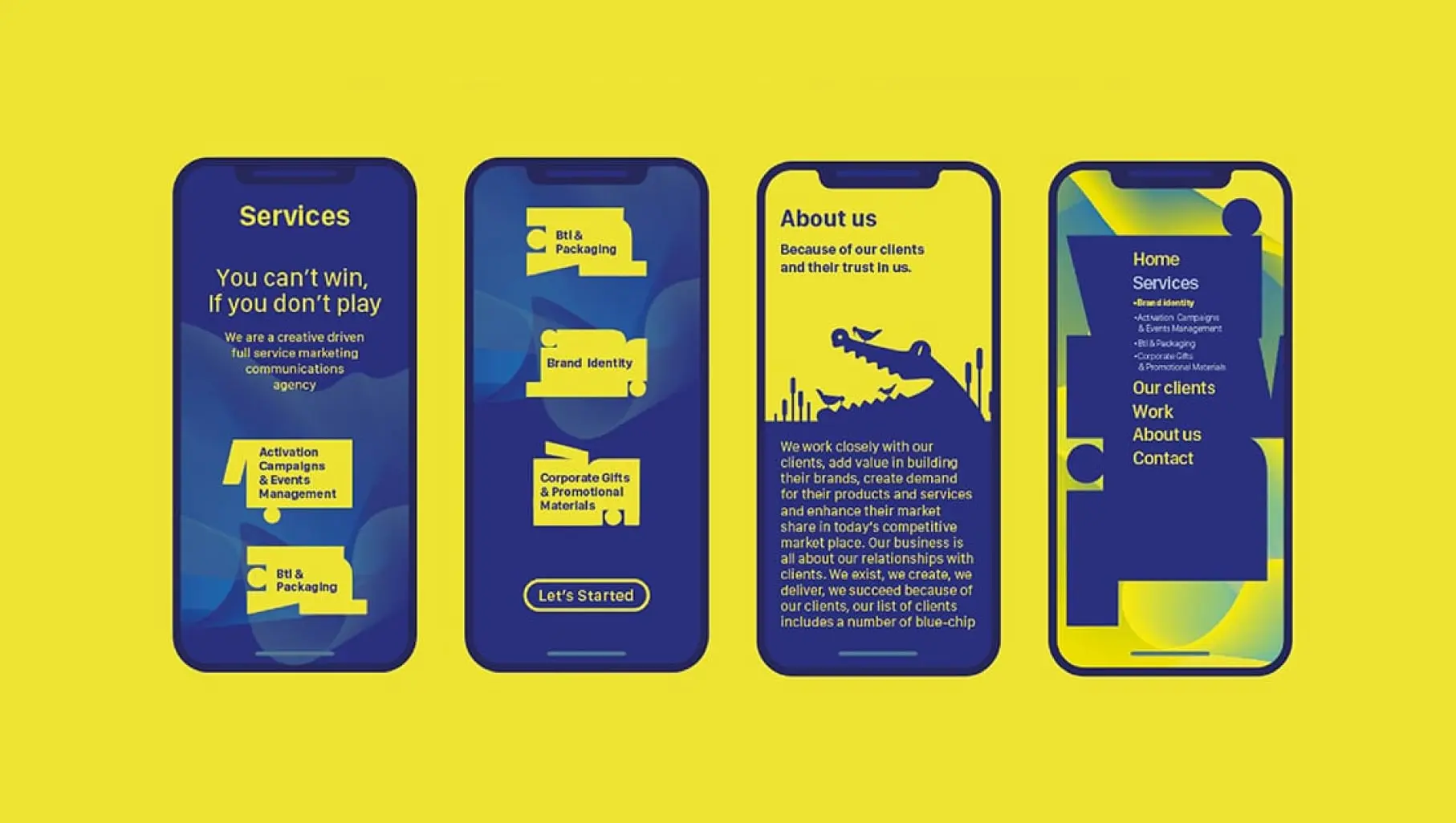
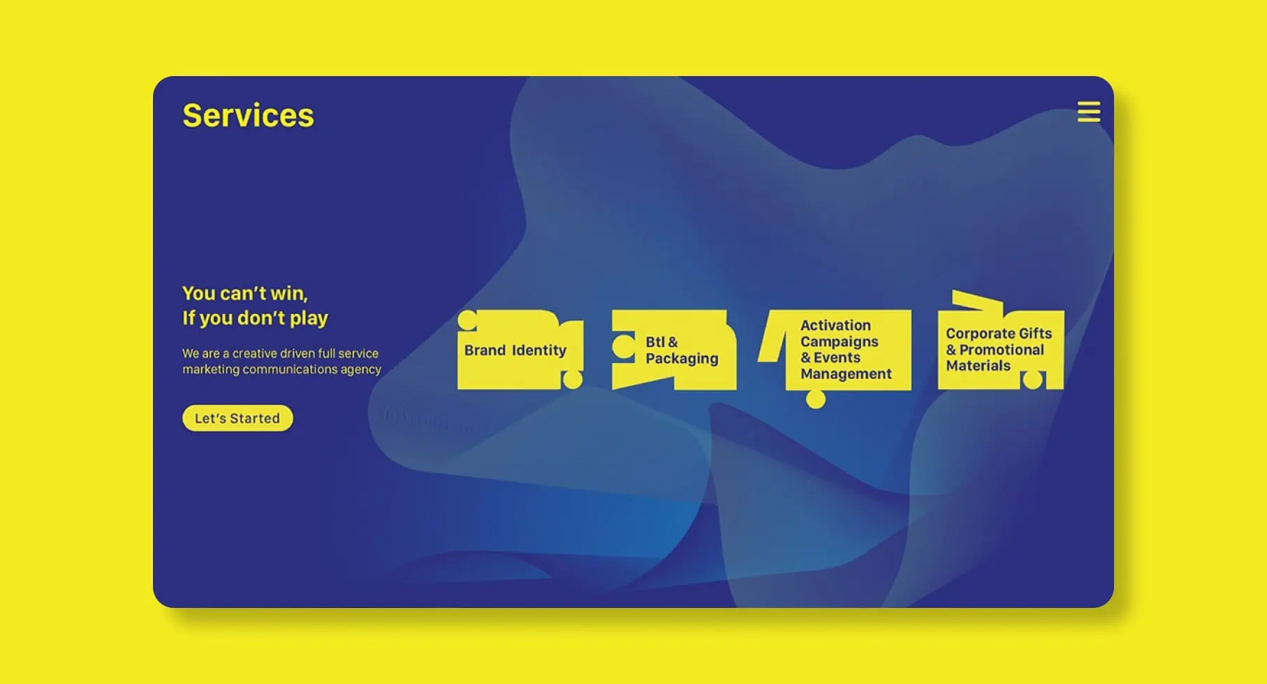
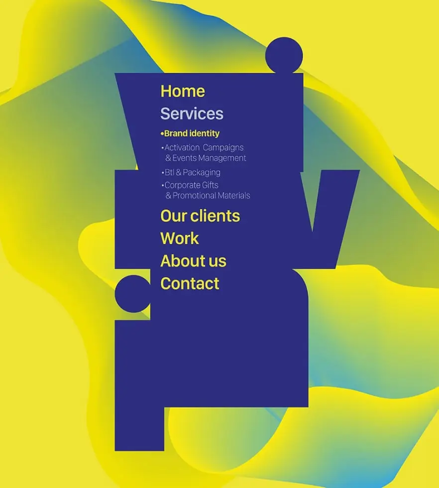
- UI UX: We developed interface concepts that highlight shared journeys decision making and user-driven actions to echo the brand philosophy.
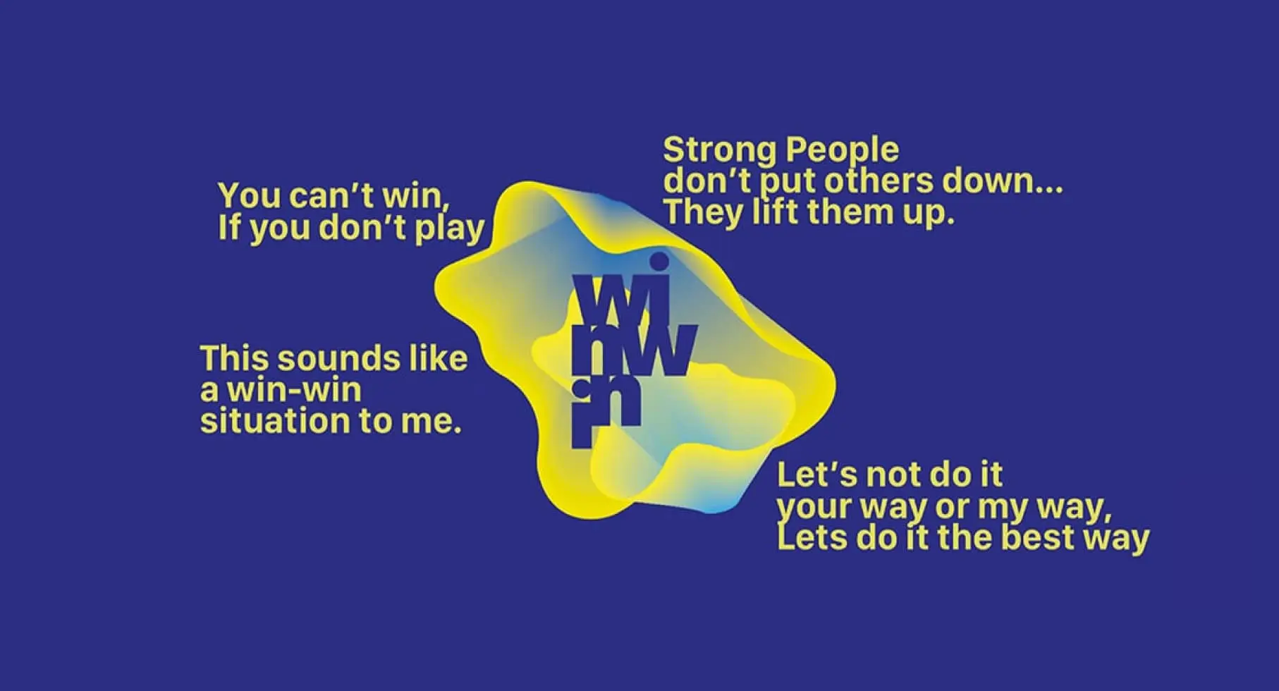
- Tone of Voice: Messaging centered on empowerment motivation and active collaboration using phrases like You were born to win and Create value together.
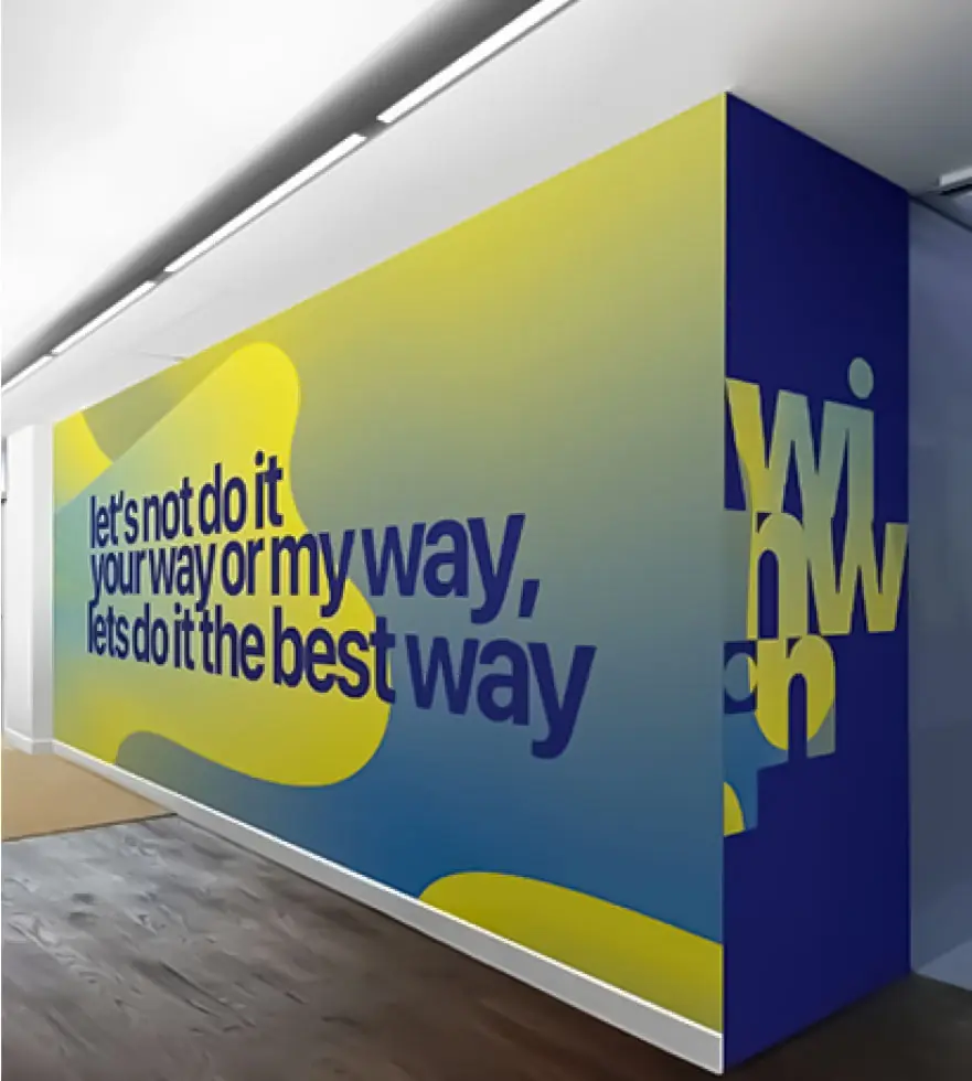
-Design System: Modular layouts and scalable assets enable brand consistency across events presentations digital platforms and merchandise.