Creative Execution
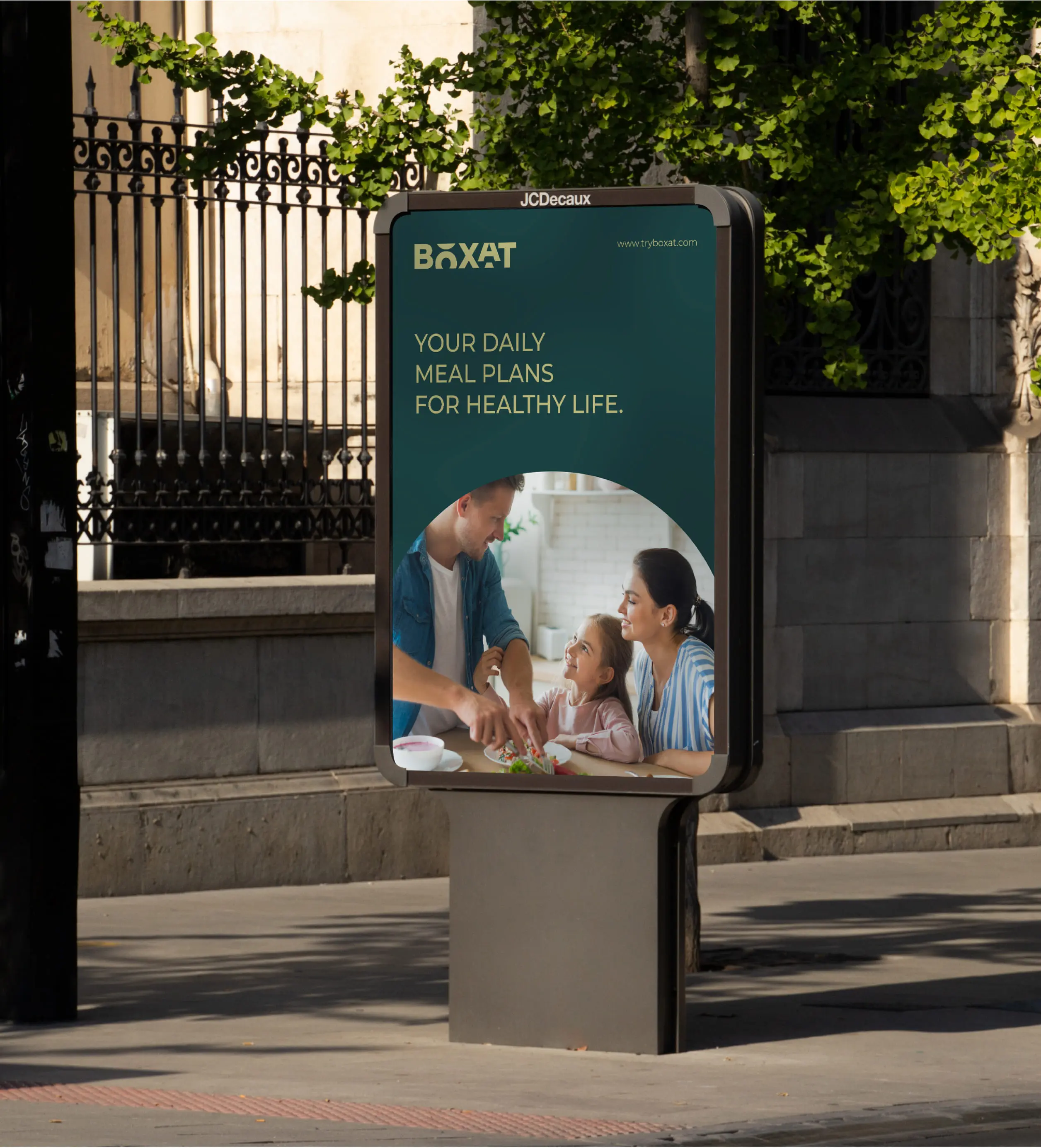
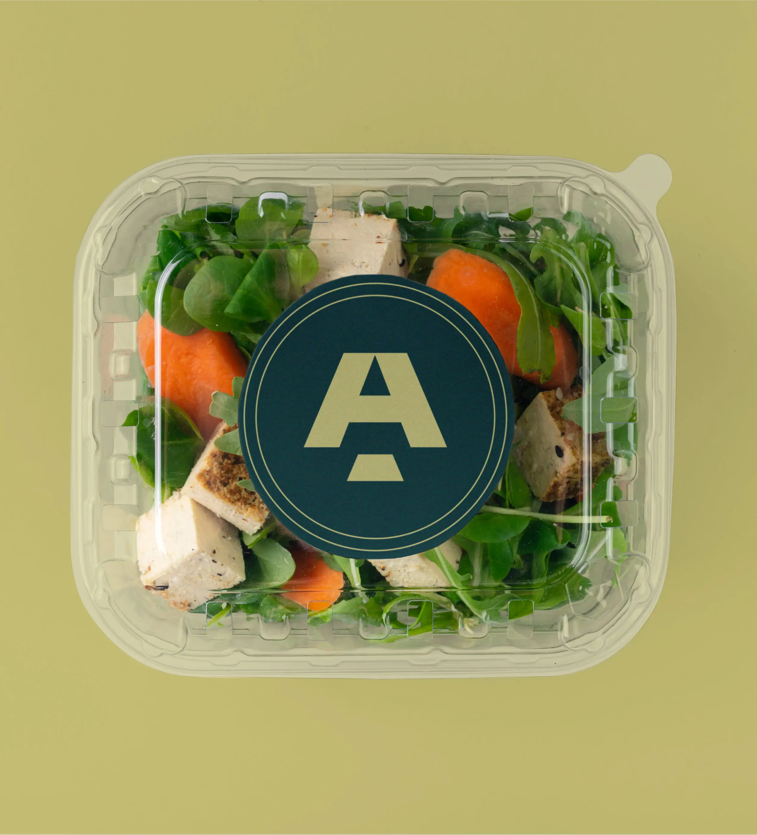
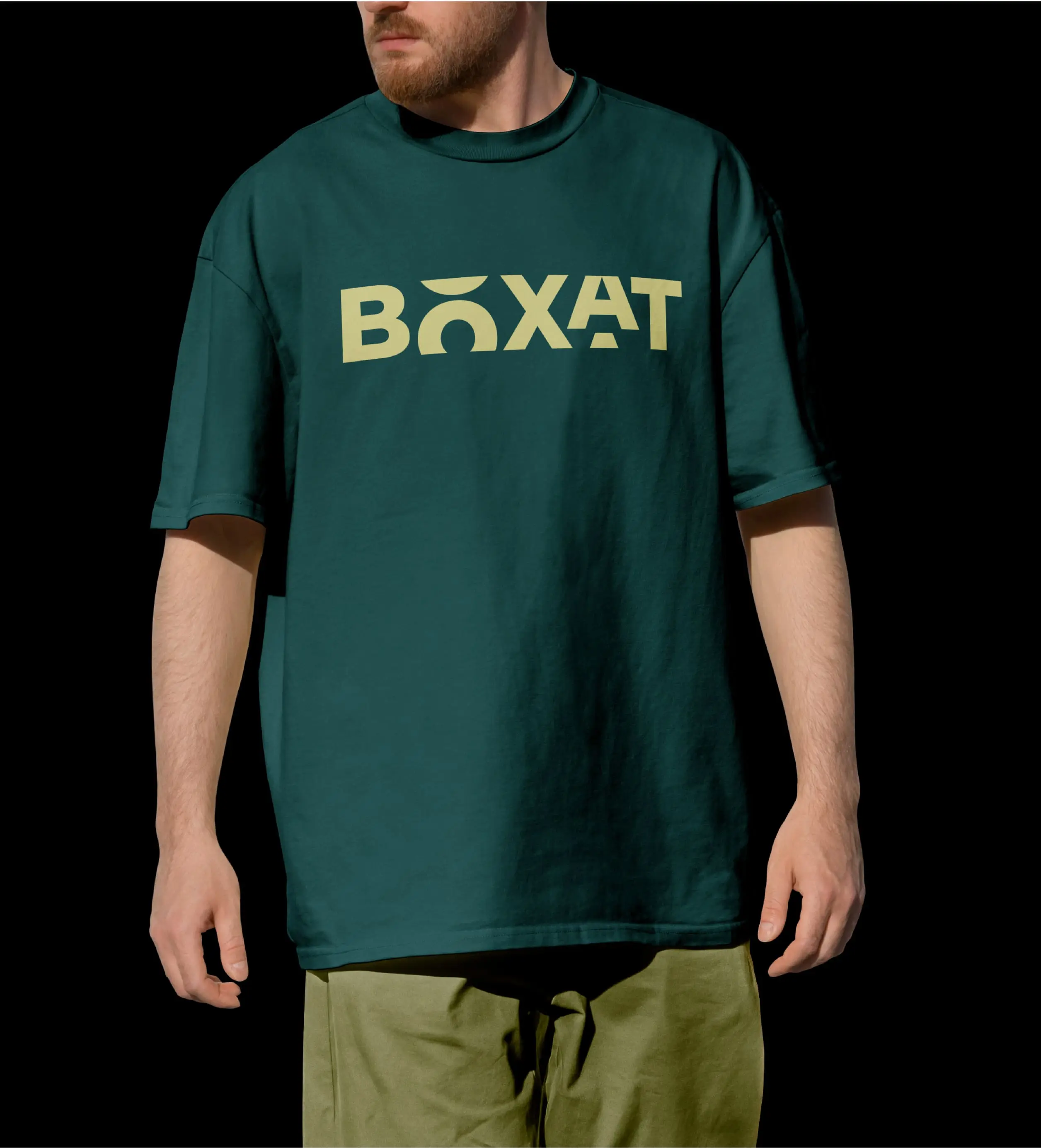
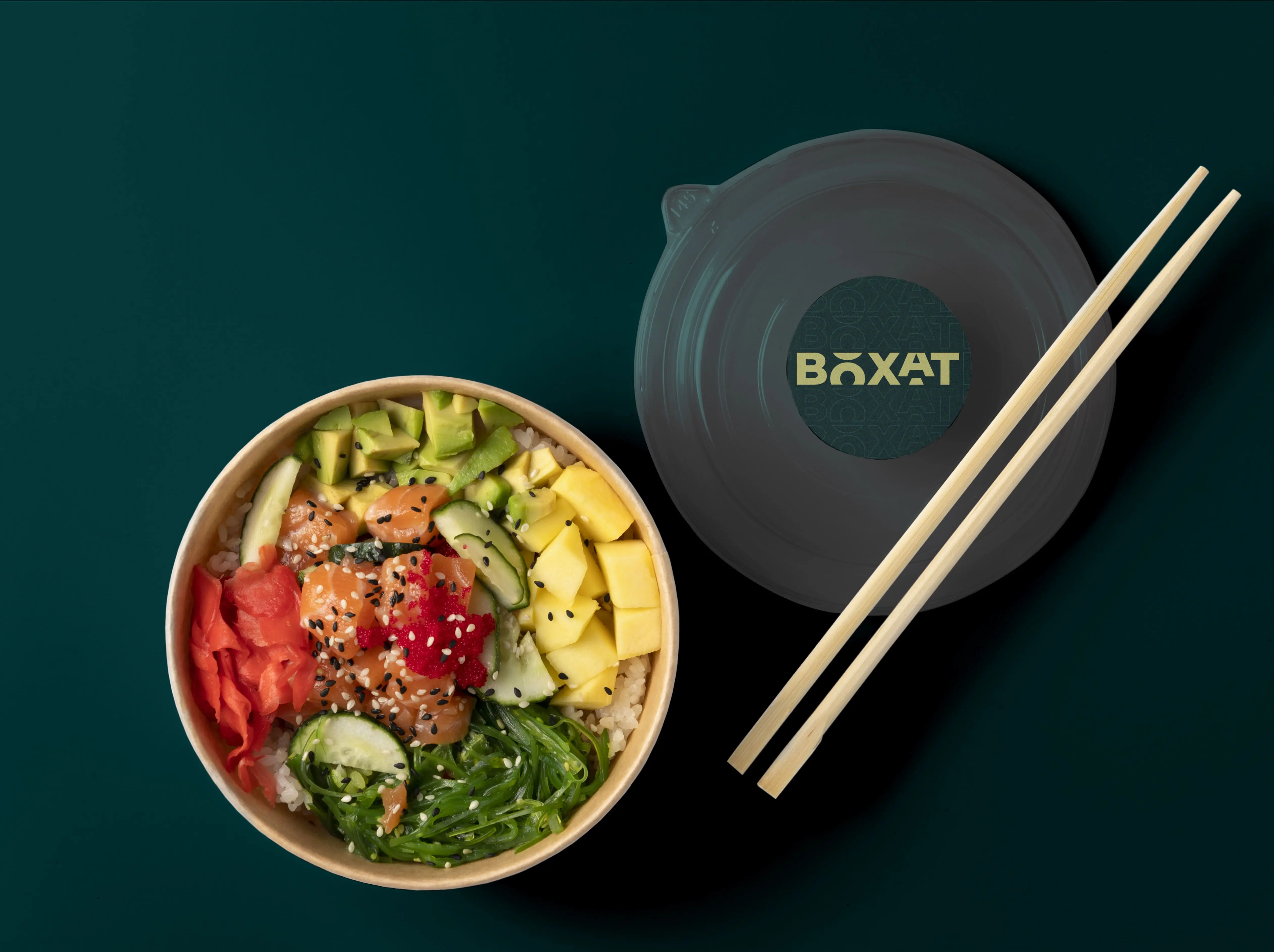
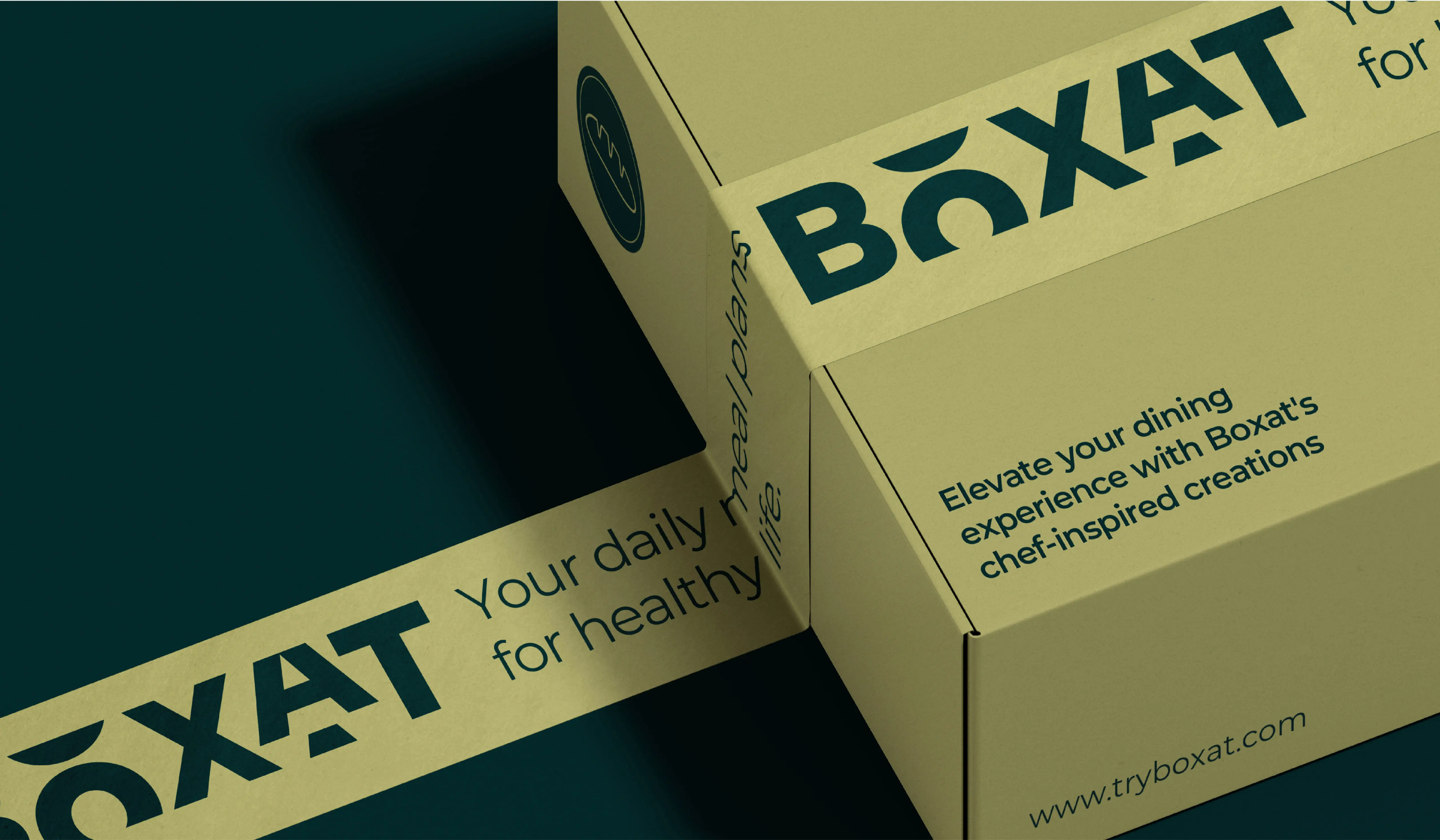
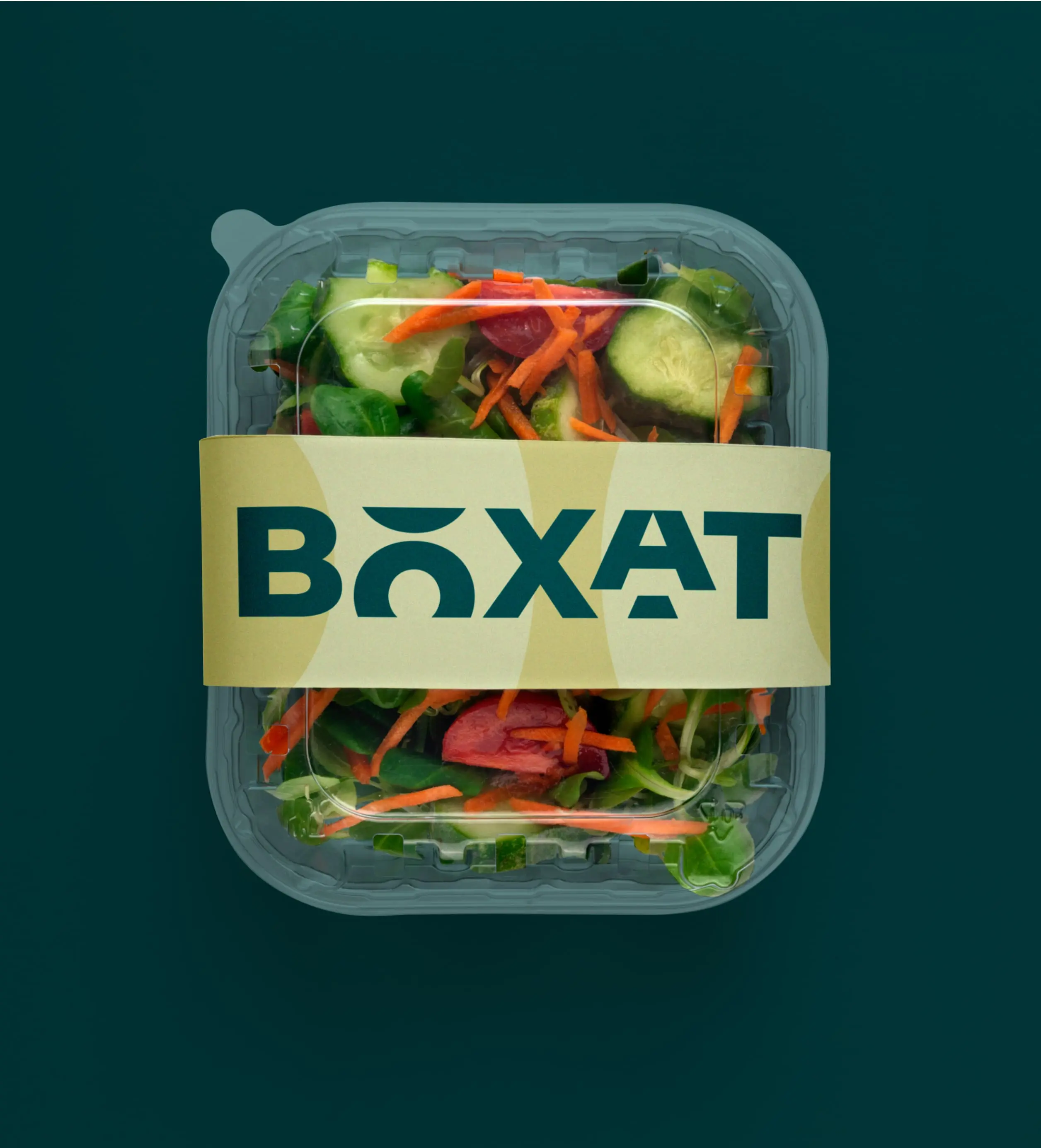
Our work spanned across multiple touchpoints to build a unified brand ecosystem:
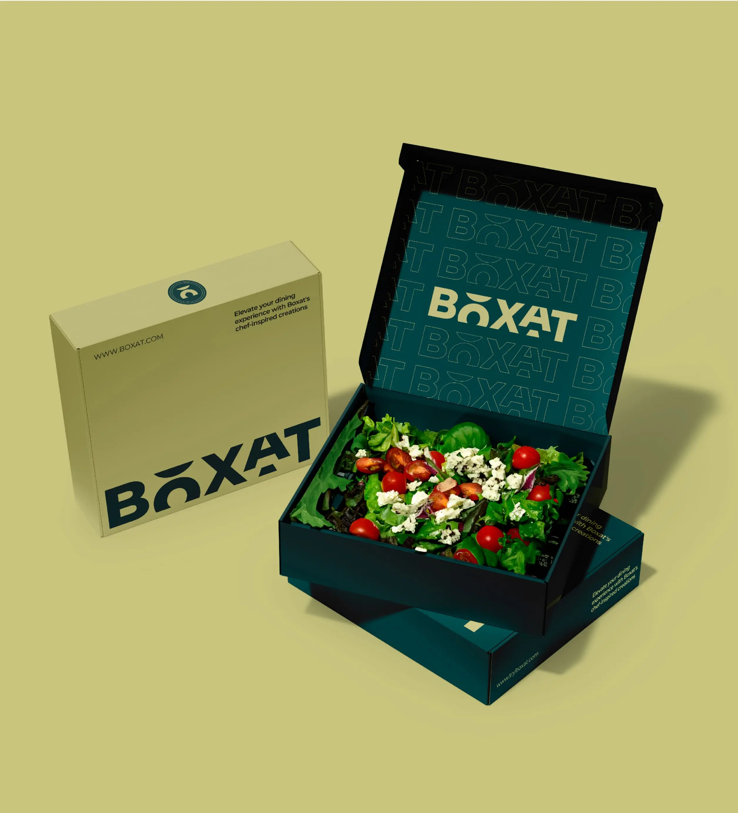
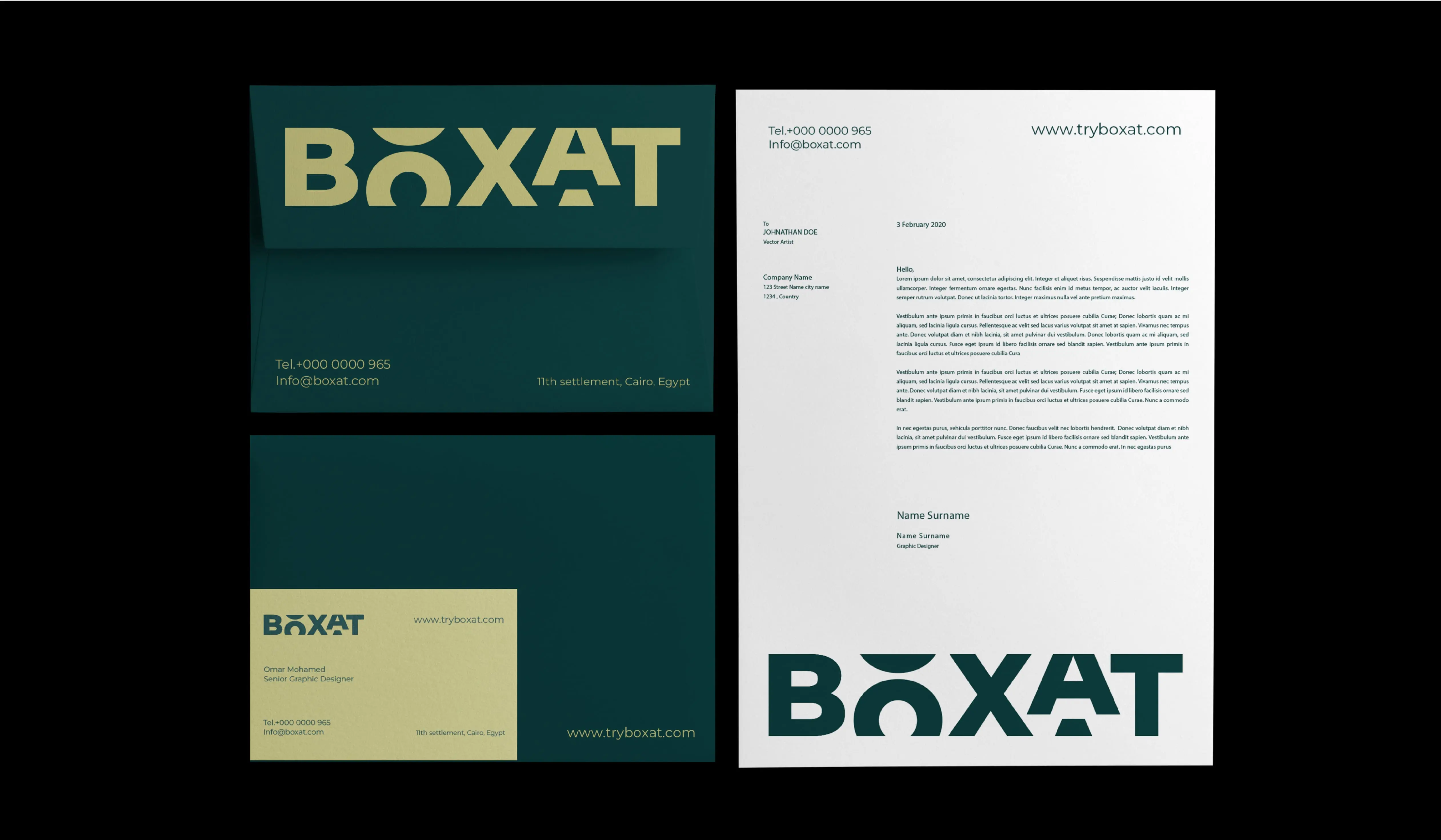
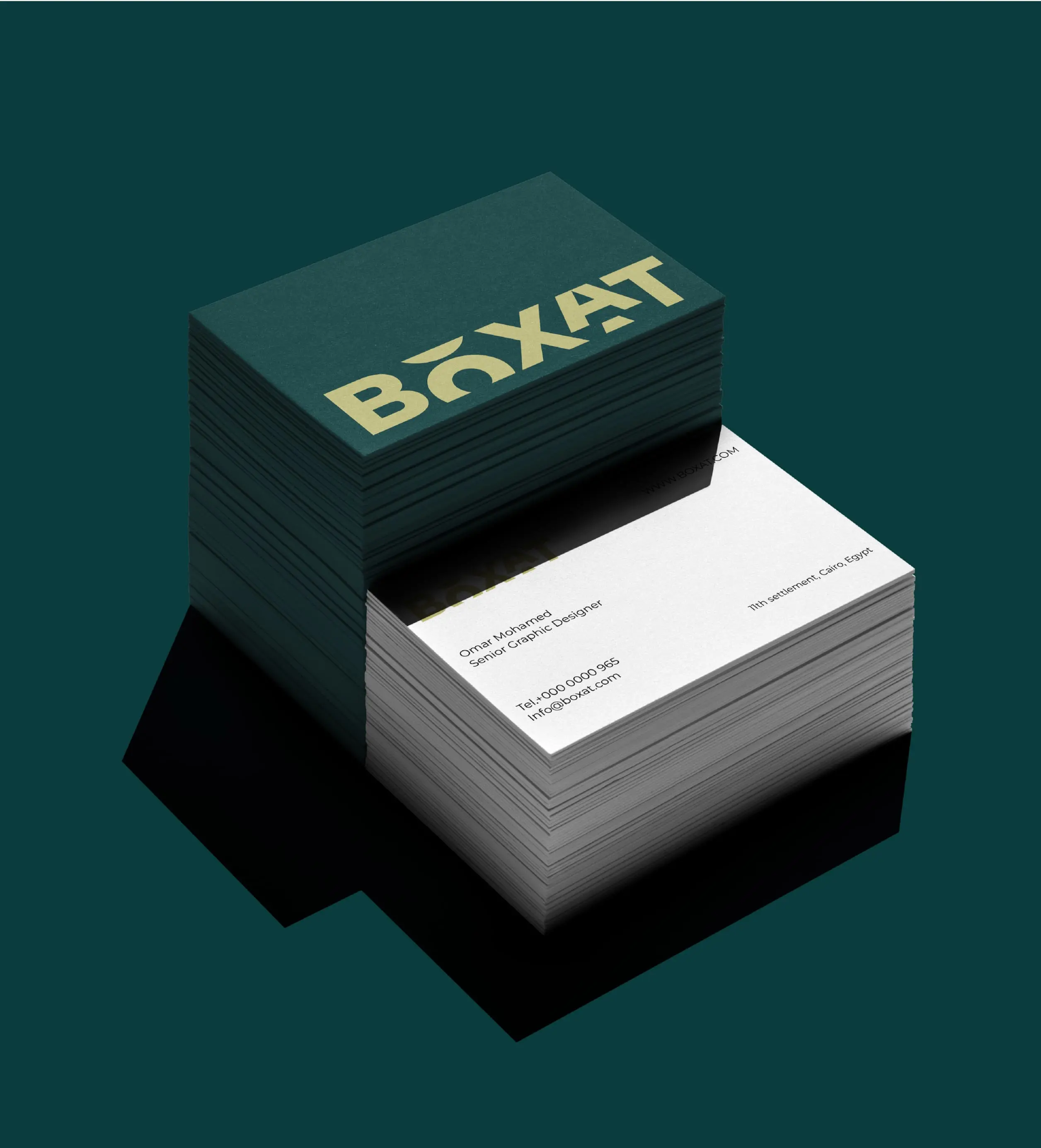
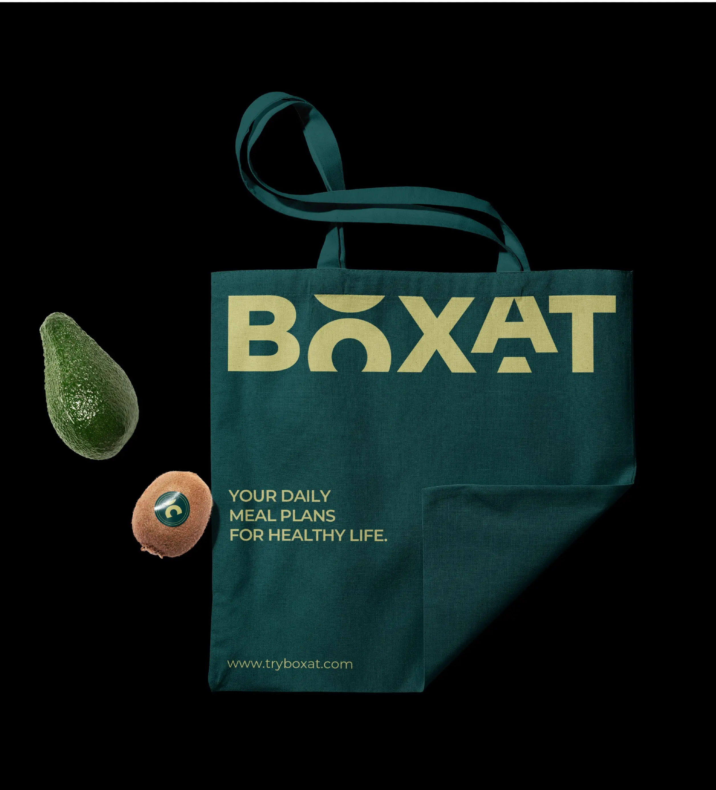
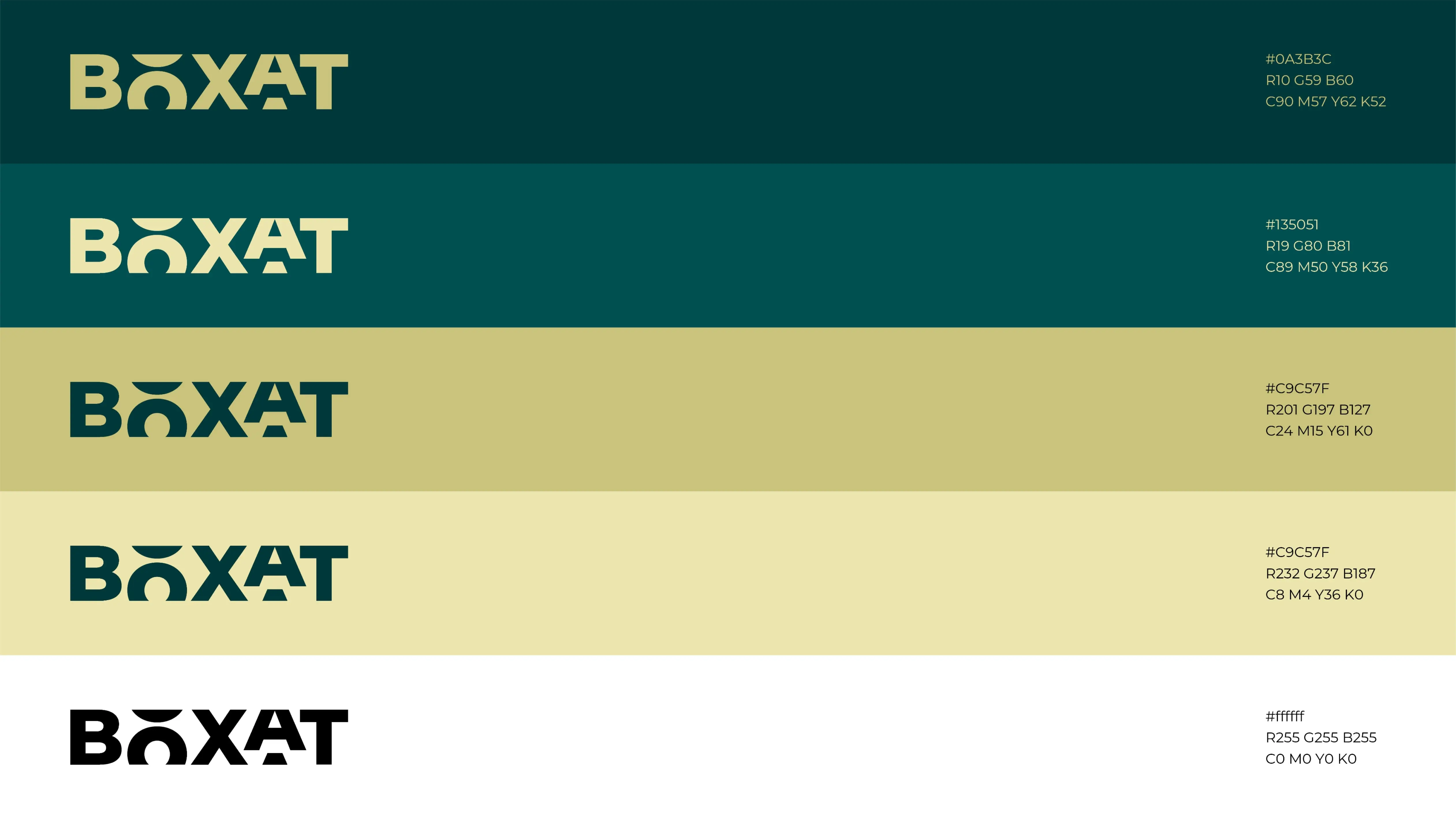
Logo Design: A clean, geometric logo that reflects order, modularity, and nutrition, with subtle references to meal divisions and smart tech.
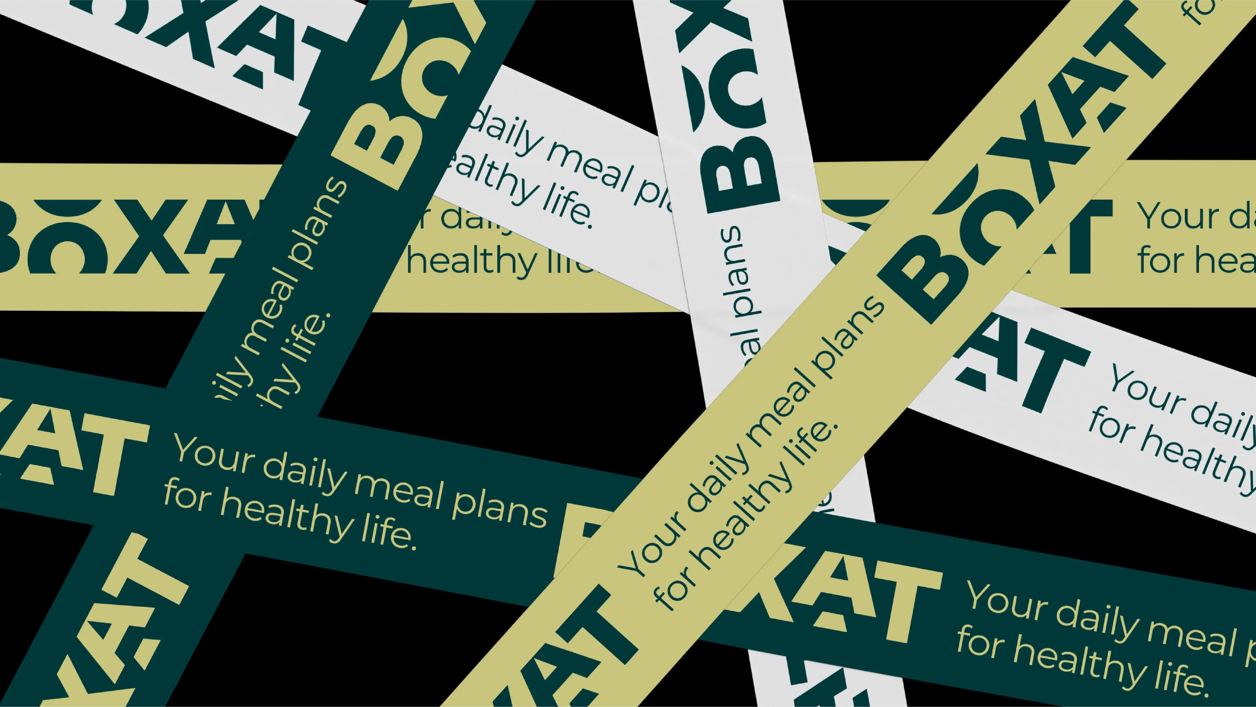
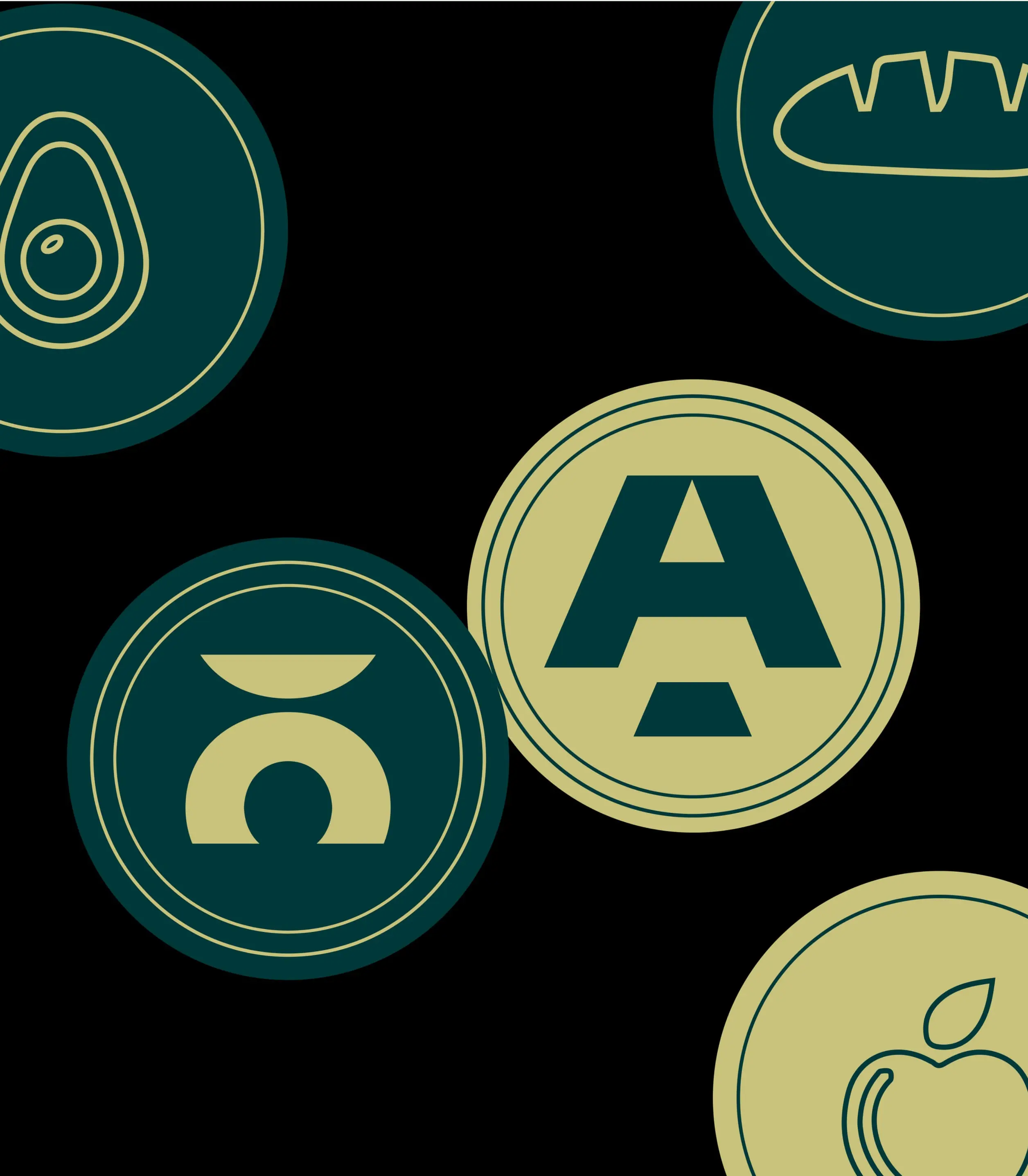
Visual Identity: A soft yet confident color palette, minimalist typography, and structured grid system to reinforce the “boxy” simplicity of the concept.
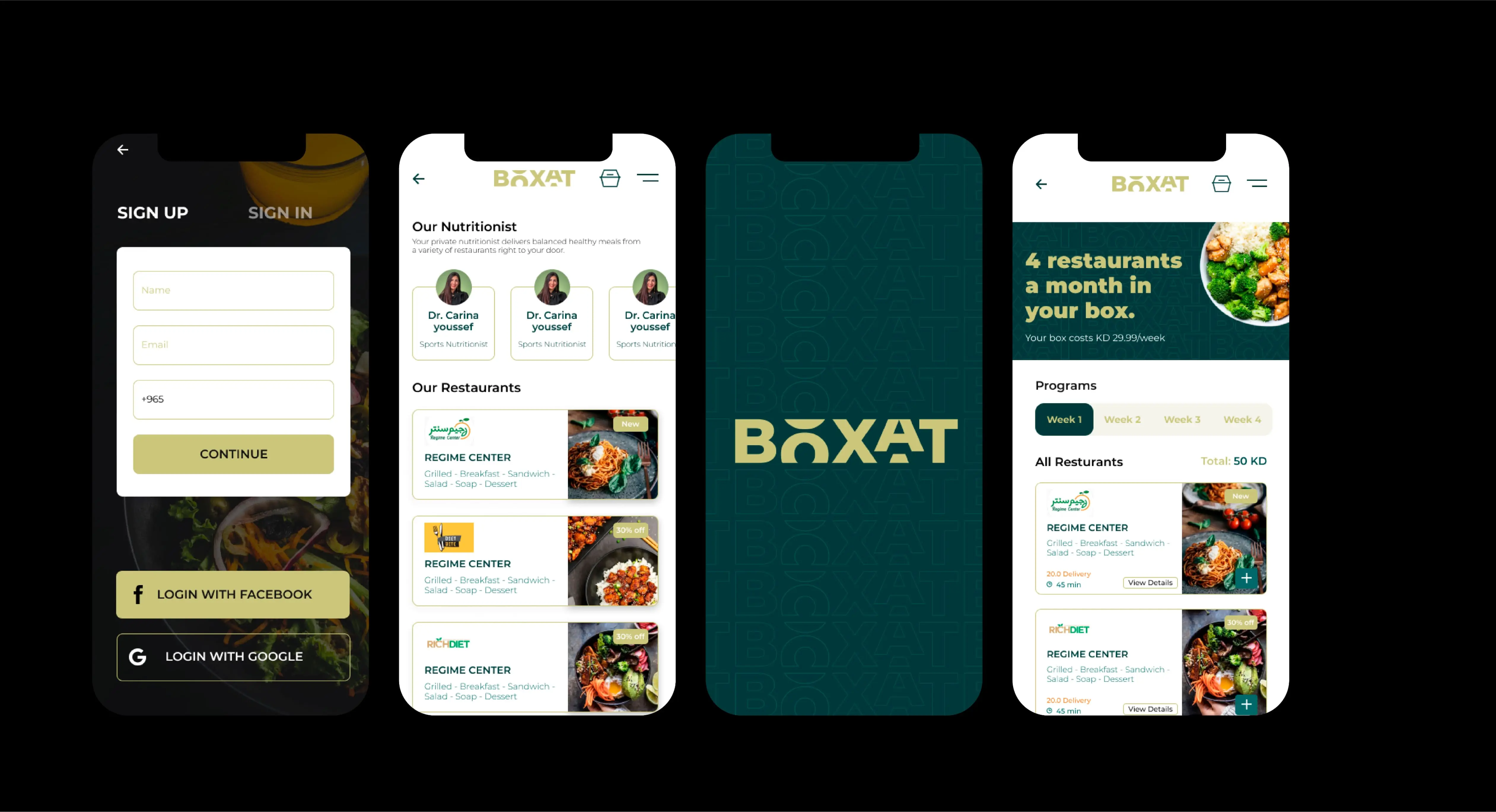
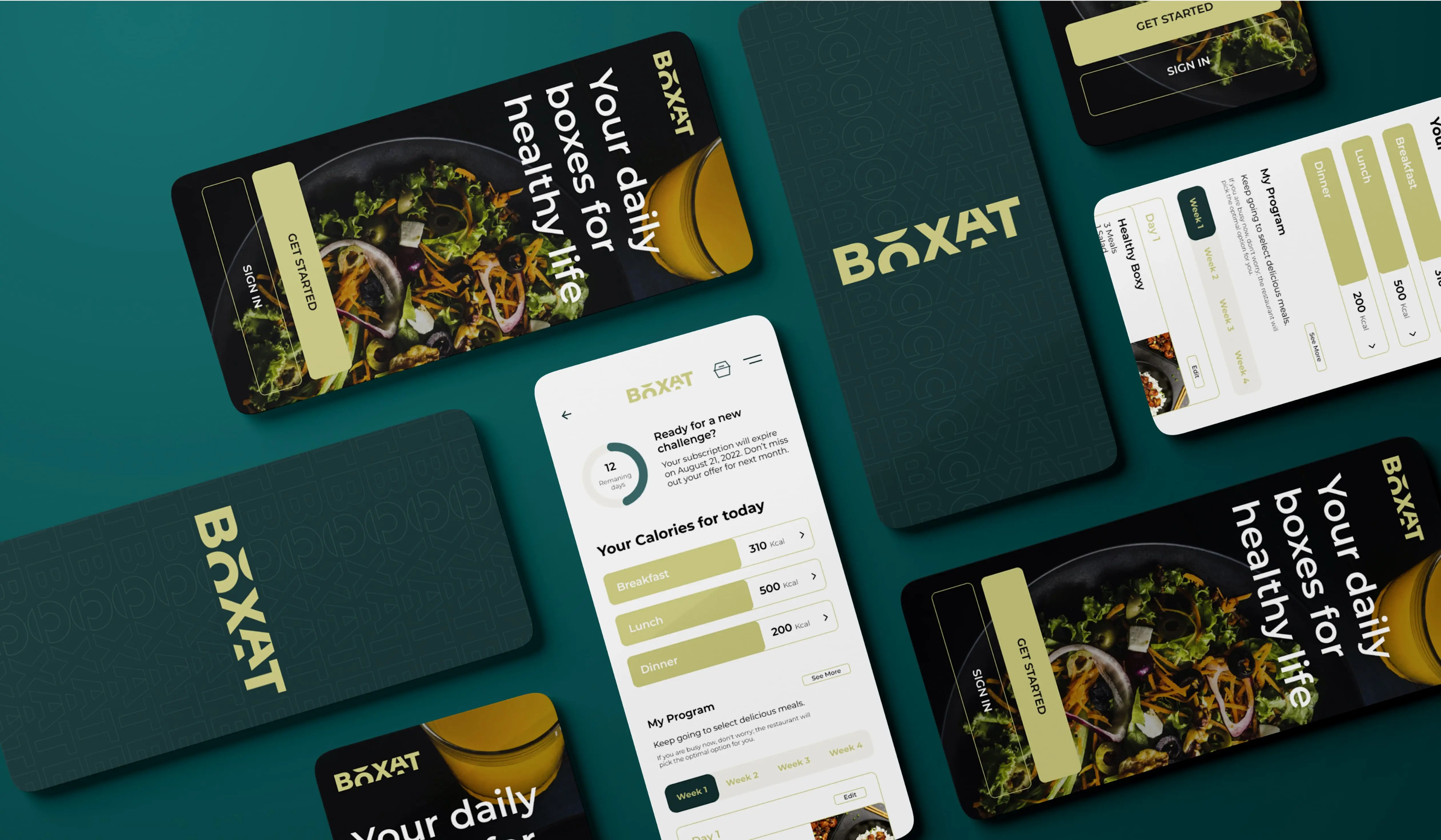
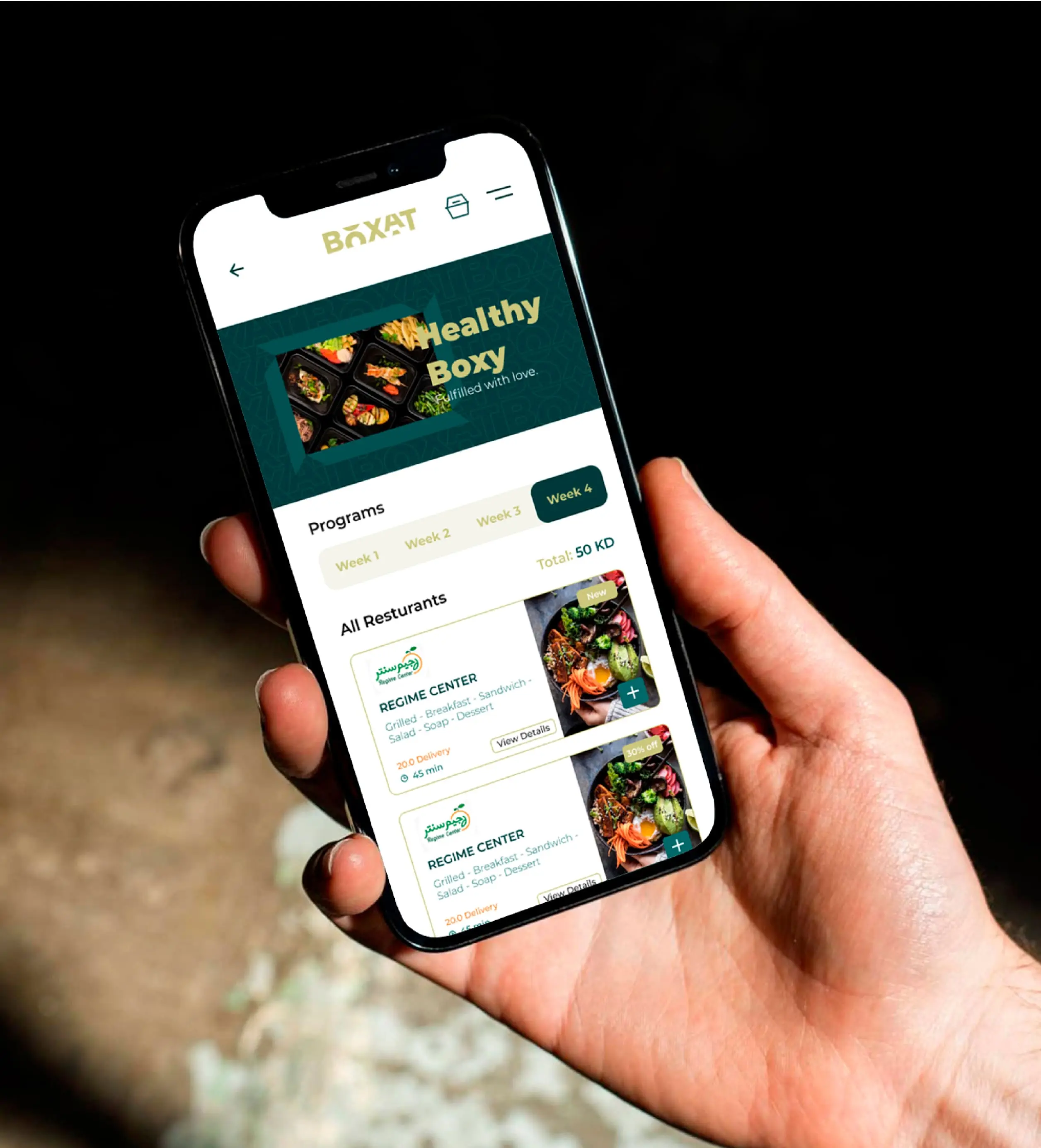
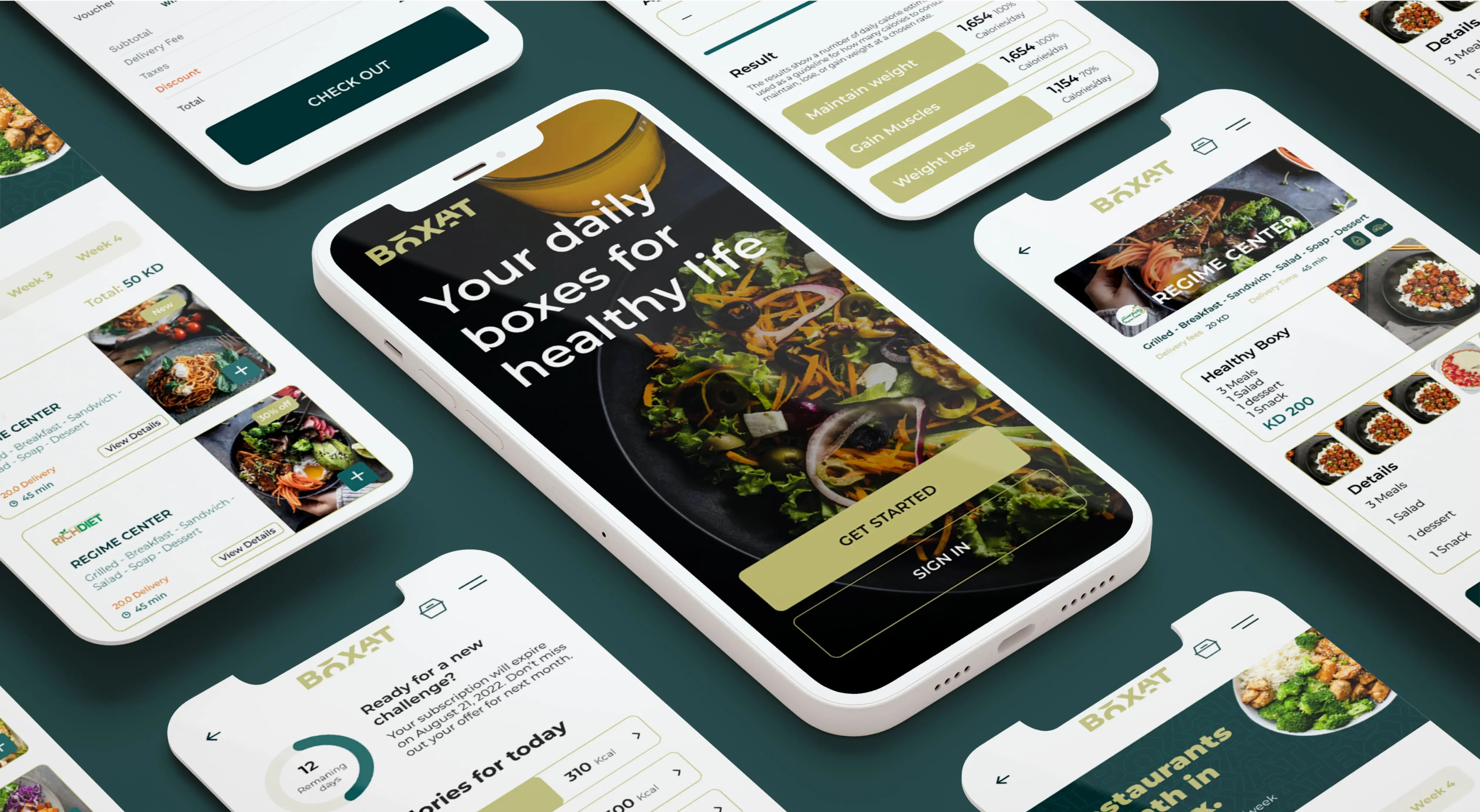
Mobile App UX Writing: Clear and friendly language designed to guide users with empathy and ease throughout the app experience.
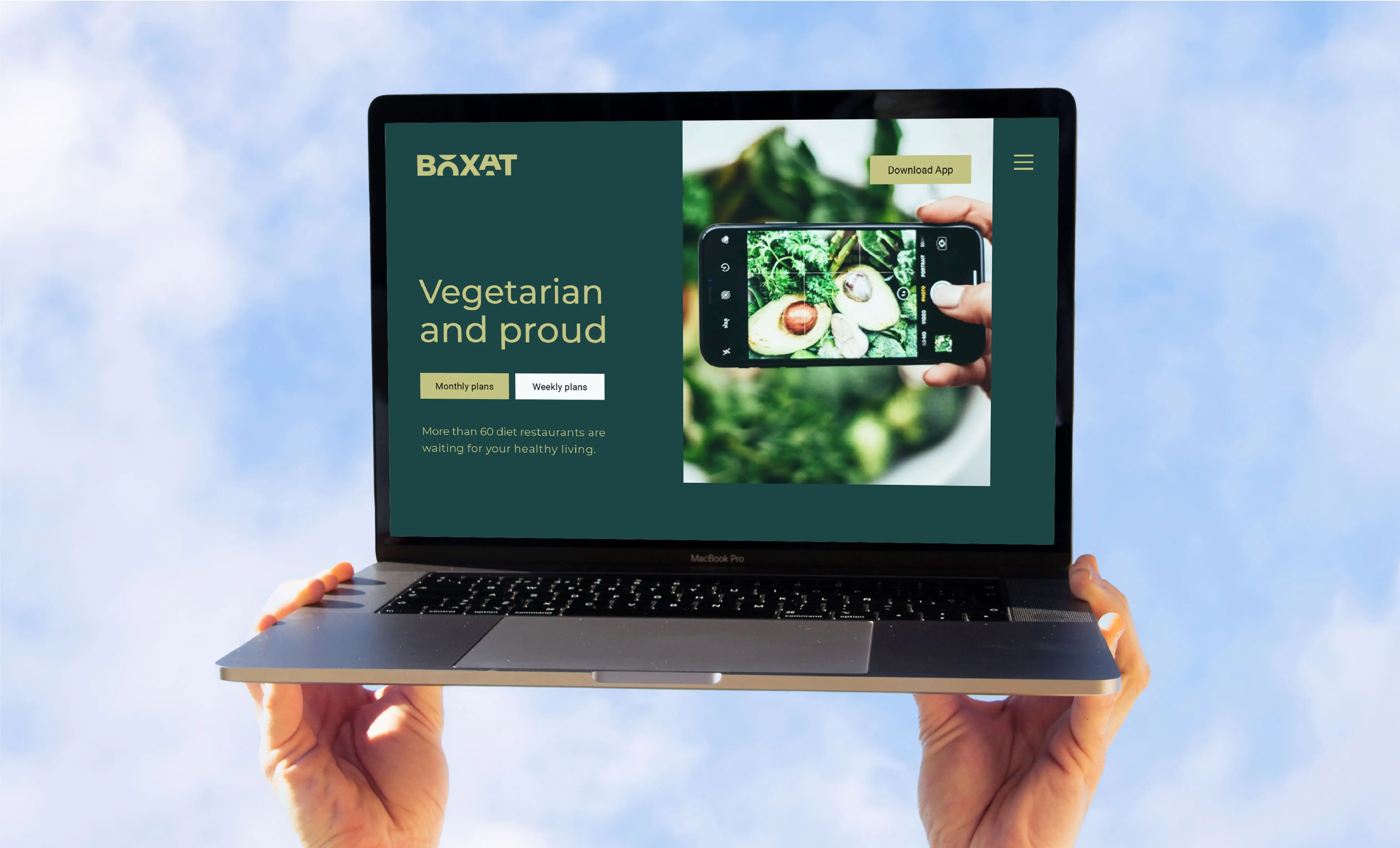
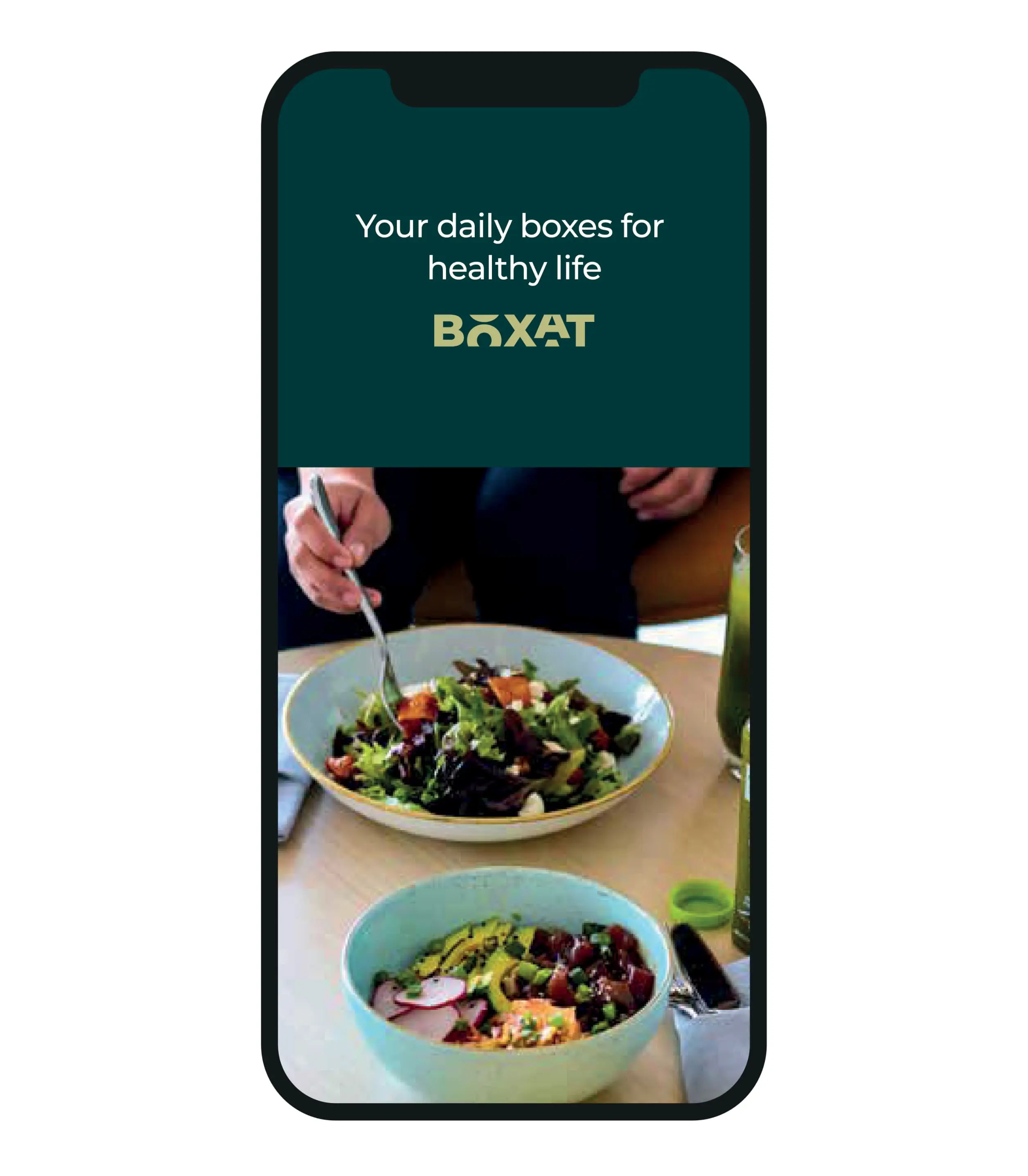
UI/UX Design: A user-friendly interface focused on quick meal selection, rotating menus, and easy personalization, optimized for everyday use.
Motion Design: We created dynamic motion elements to enhance storytelling and user engagement across digital platforms.
Brand Guidelines: A comprehensive visual and verbal system outlining logo usage, tone of voice, iconography, color palette, motion, and UI elements for consistent implementation.