CREATIVE DIRECTION.
OMORA BRANDING
@2026
The creative direction for OMORA is built around the emotional world of childhood warm, expressive, playful, and intentionally imperfect.
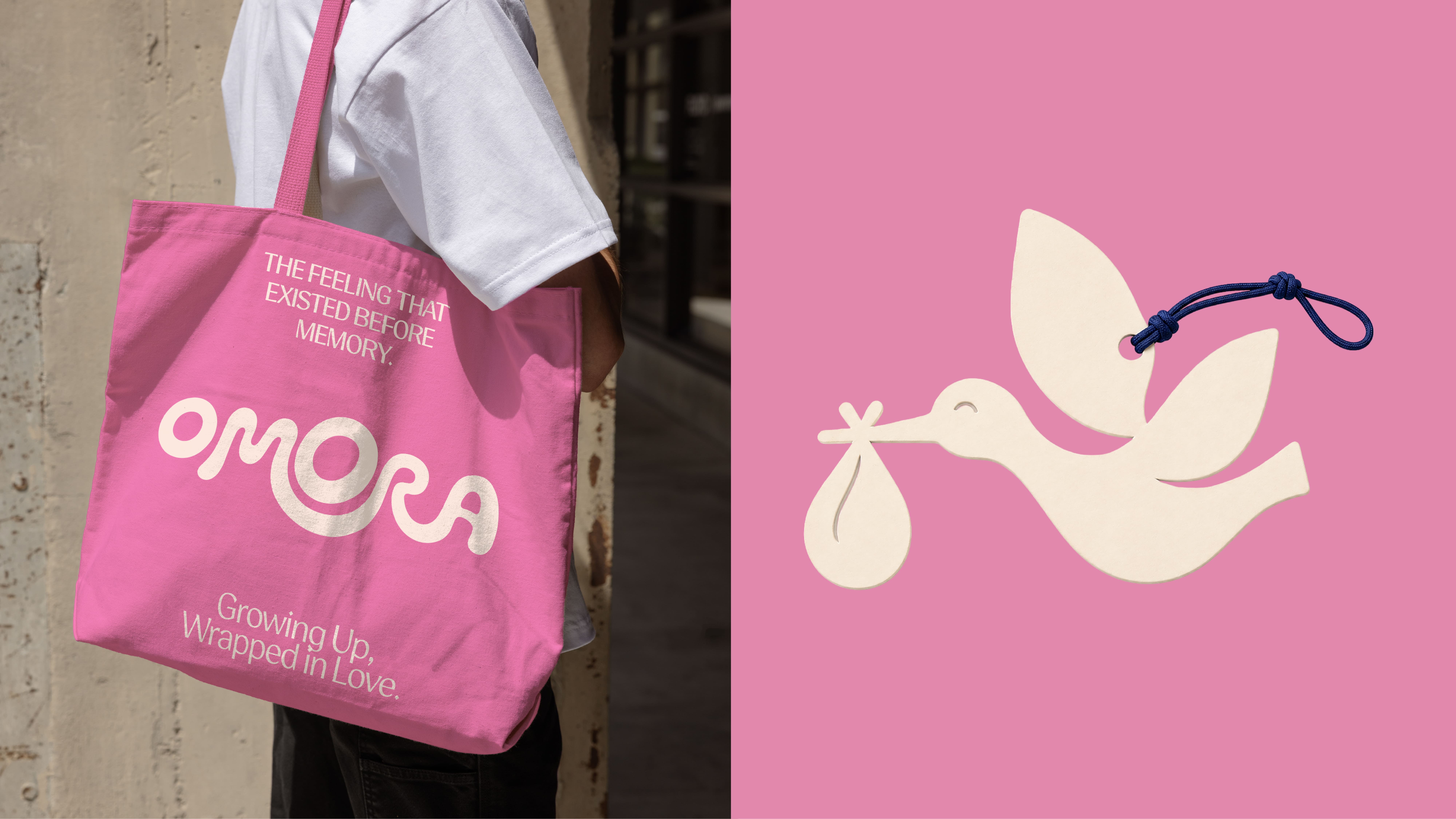
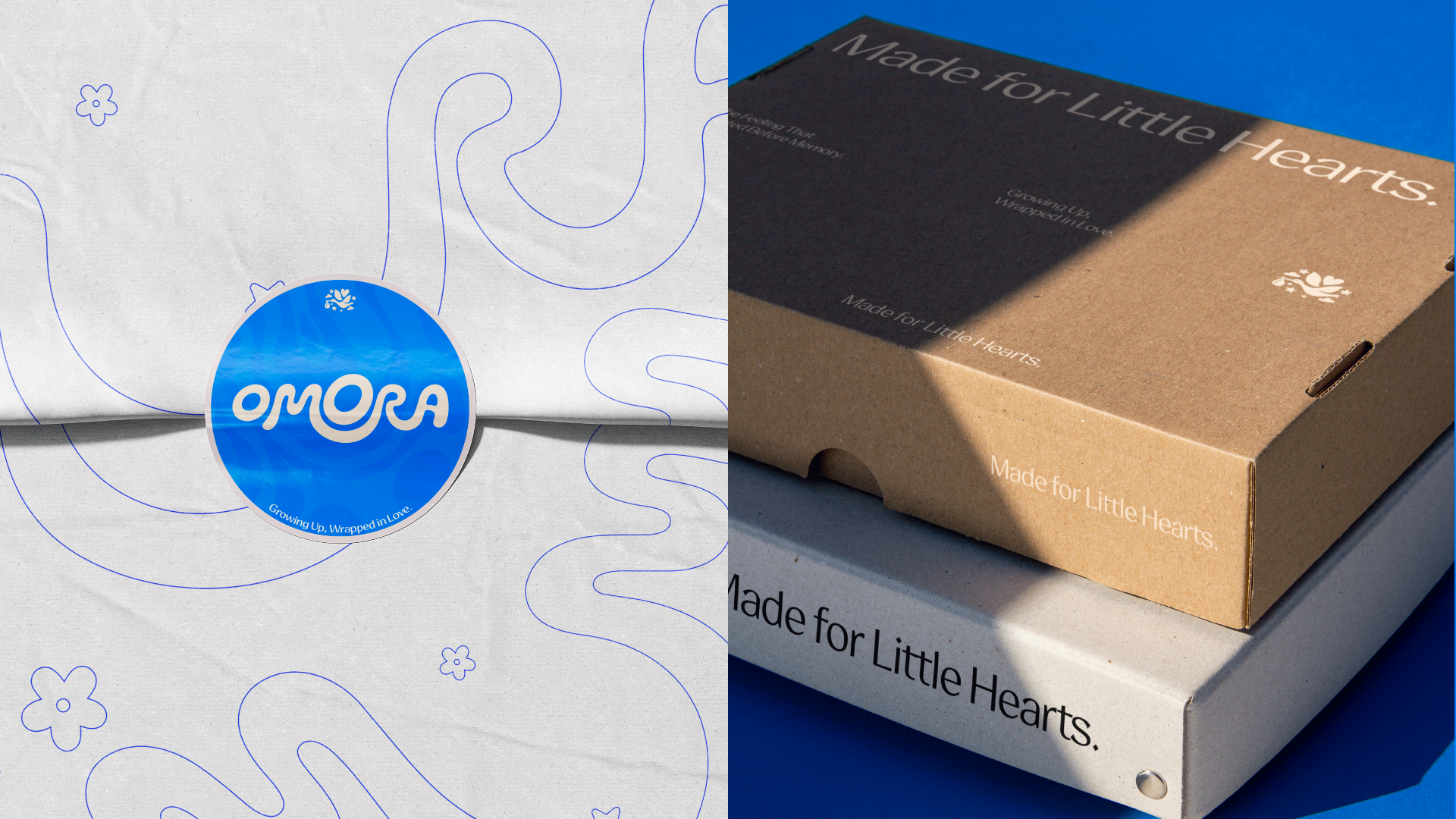
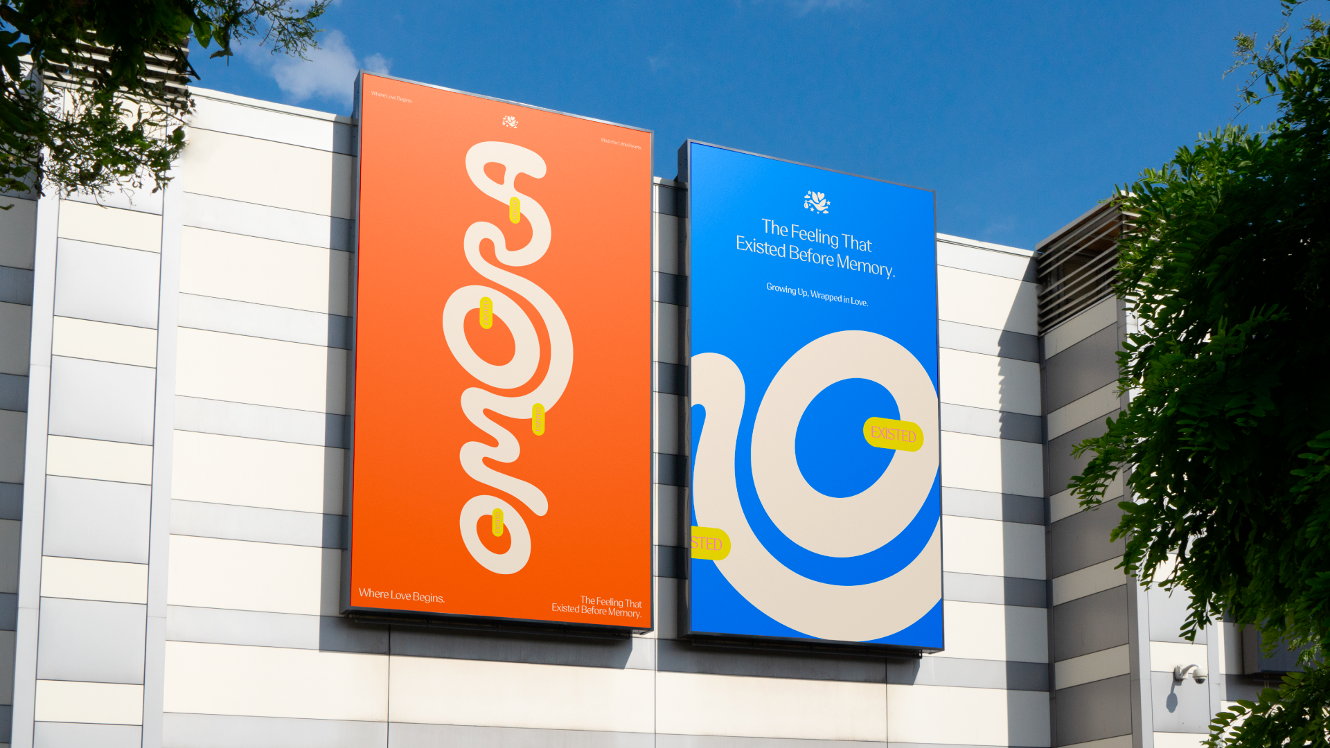
The visual system balances simplicity with character. Shapes are soft, bold, and easy to recognize, while hand-drawn marks, rough edges, and playful imperfections bring a sense of spontaneity and honesty to the identity.
Rather than creating a polished or overly decorative children’s brand, OMORA embraces a more human and tactile language. The identity feels as if it was drawn, touched, collected, and loved over time.
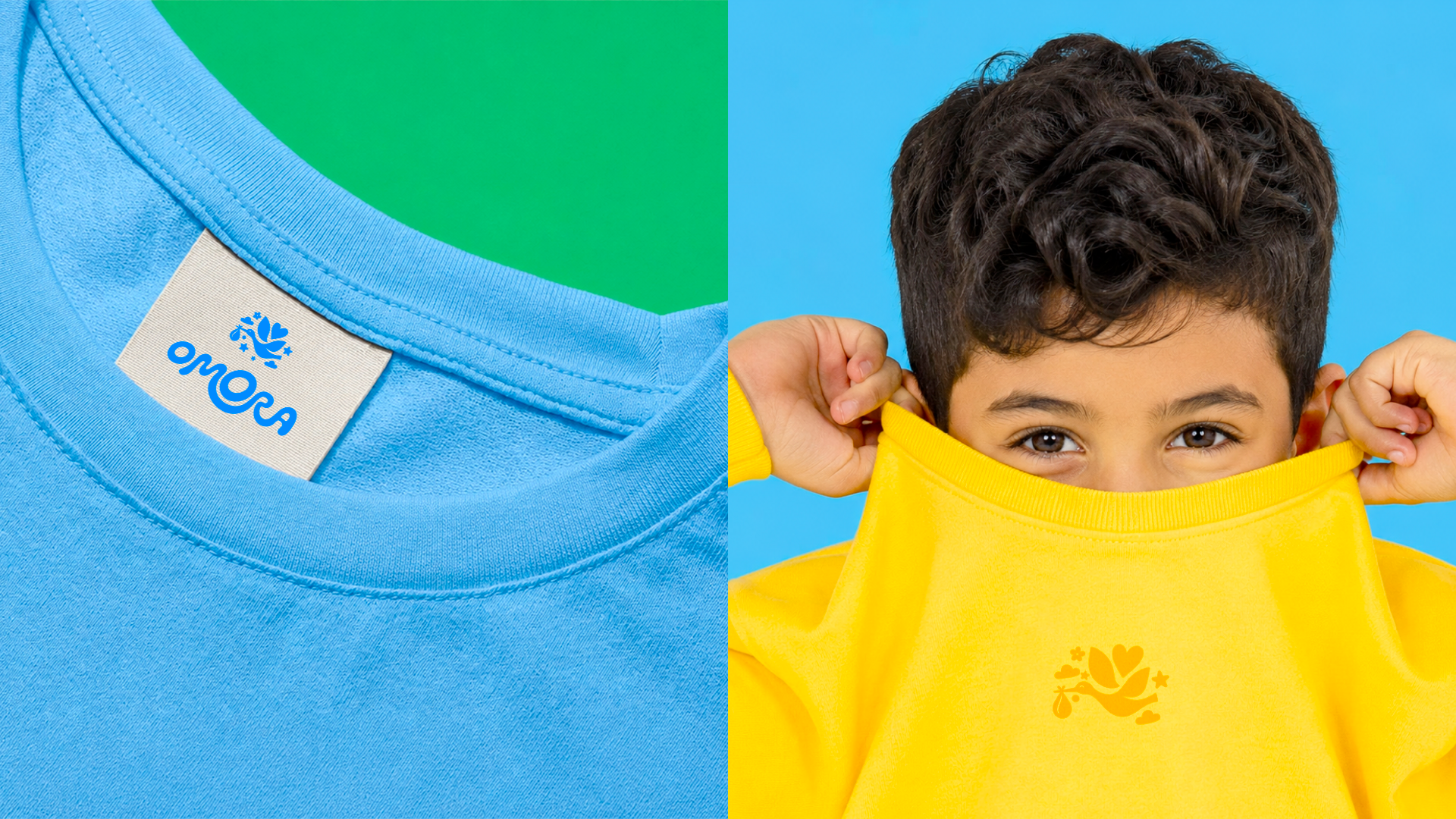
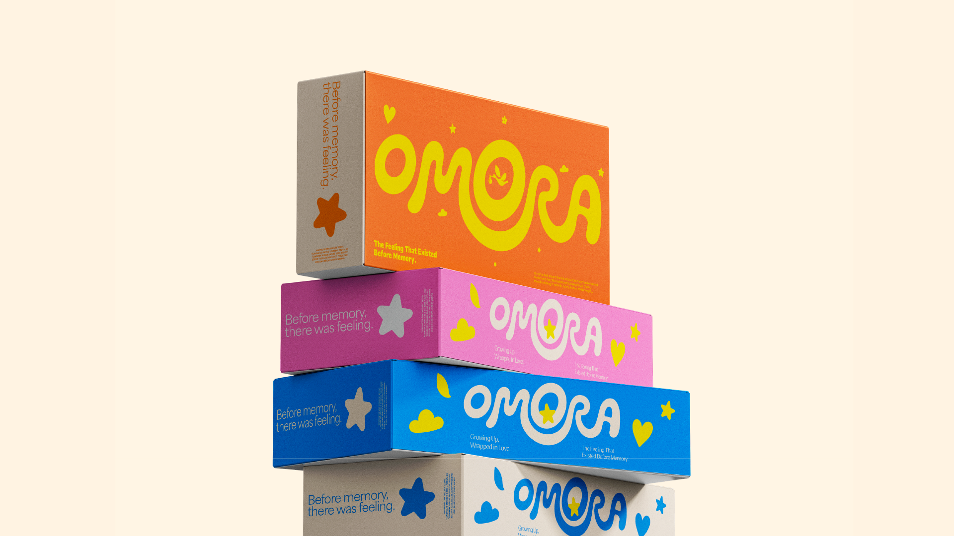
Color plays an essential role in the system. Bright blues, playful pinks, warm oranges, greens, and yellows create an optimistic world, while softer neutrals provide balance and keep the overall identity elevated.
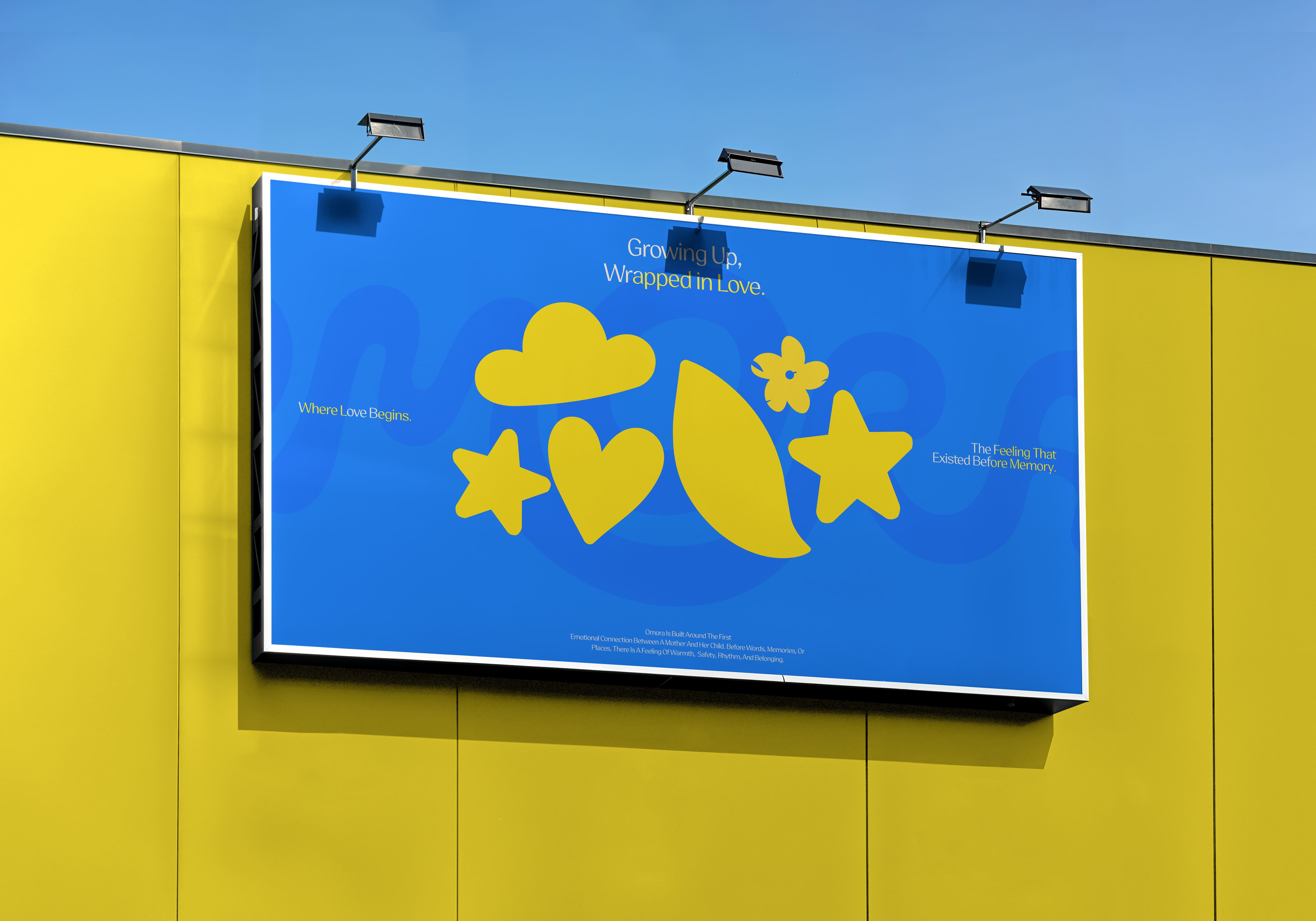
The bird symbol, hearts, clouds, stars, flowers, and other childlike forms become recurring elements across the brand. They can exist as illustrations, physical objects, patterns, packaging details, toys, or small moments within a composition.
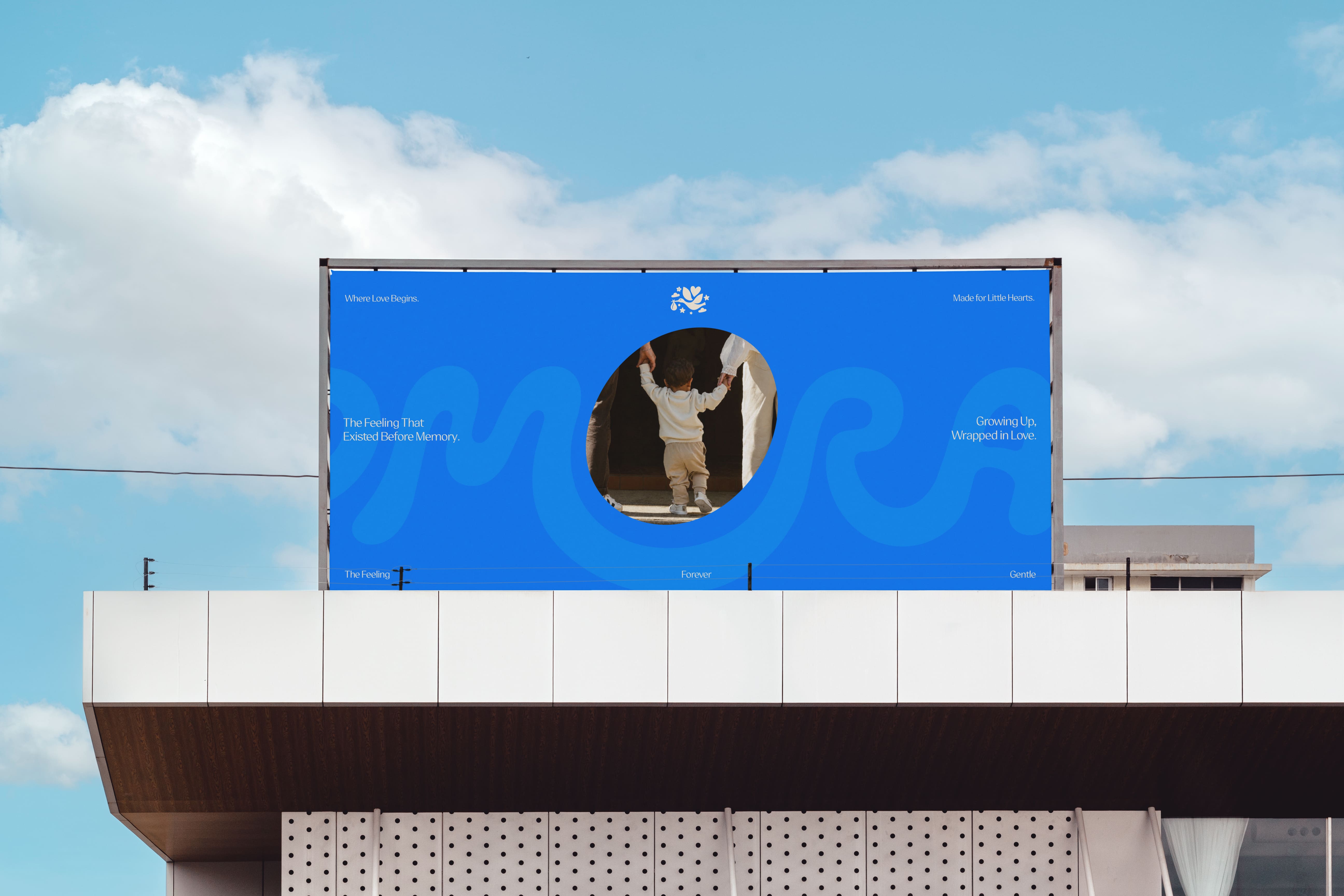
Photography follows the same philosophy: real emotion, natural movement, warmth, connection, and curiosity.
The aim is not to stage childhood, but to capture how it feels.
The result is a brand world that feels joyful without becoming childish, premium without becoming distant, and expressive without losing simplicity.