"We have the English logo. Can you just add the Arabic underneath?"
It's one of the most common requests we get, and it explains why so many bilingual logos in the region feel slightly off. The English name gets weeks of design attention. The Arabic gets typed out in whatever font is installed, placed underneath, and shrunk until it fits. Customers notice, even if they can't say exactly why.
The short version: in Saudi Arabia, Egypt and much of the UAE, Arabic isn't the second language of your brand. For many of your customers, it's the first. This article explains how to design an Arabic logo and a bilingual identity where both languages feel equally intentional, the mistakes we see most, and three brands we built that way.
Why Arabic can't be an afterthought
For a lot of brands in the region, the Arabic version is what people actually see most: on shop signs, packaging, government tenders, social media, and the WhatsApp message that gets forwarded to a family group. If that version looks borrowed or careless, it quietly tells people the brand wasn't really made for them.
There's also a practical reason. A logo designed only in English often breaks when the Arabic arrives. The shapes don't match, the heights don't line up, and the lockup that looked balanced suddenly feels crowded. Fixing that after launch means reprinting everything. Designing both from the start costs far less.
Designed, not translated
Arabic and Latin scripts work in completely different ways. Arabic is written right to left, letters connect and change shape depending on where they sit in a word, and the rhythm sits on a horizontal baseline with tall strokes and deep descenders. Latin letters stand apart, sit between a baseline and a cap height, and read left to right. You can't make one look like the other by choosing a font.
| Translated logo | Designed bilingual logo | |
|---|---|---|
| Arabic wordmark | Typed in an existing font | Drawn by hand to match the English |
| Weight and size | Adjusted until it roughly fits | Optically balanced with the Latin |
| Personality | Often different from the English | Same character in both scripts |
| The name | Translated word for word | Checked for meaning and sound in both |
| Result | Two logos standing next to each other | One brand, in two languages |
That's why the Arabic wordmark in our brand identity work is drawn, not typeset. Sometimes it grows into a full custom typeface, but even a simple logo gets letterforms made for that one name.
What a bilingual identity system includes
A great logo is only the start. The identity has to keep working when your team designs a menu, a tender document or an Instagram post in either language. A complete bilingual system covers:
- Two logo lockups, or one combined. Arabic-first, English-first, stacked and side by side, each with clear rules for when to use it.
- A paired type system. Arabic and Latin typefaces chosen to share the same visual weight and tone across headlines, body text and small print.
- Mirrored layouts. How grids flip for right-to-left, where the logo sits in each direction, and how to handle a page that mixes both languages.
- Numerals. When to use Arabic-Indic numerals and when to use Western ones, so prices, dates and phone numbers stay consistent.
- Voice in both languages. Taglines and key messages written for each audience, not translated line by line. That's where creative brand writing comes in.
- Everything documented. All of it captured in brand guidelines, with examples in both directions.
Six mistakes we see all the time
- The Arabic is set in a default font. It instantly looks generic next to a custom English wordmark.
- The Arabic is shrunk to match the English width. Arabic often needs different proportions. Squeezing it makes it hard to read, especially on signs and phone screens.
- Letters are disconnected or reversed. Software that doesn't support Arabic properly breaks the joins or flips the text. It happens more often than you'd think, and it's embarrassing on a billboard.
- The name means something odd in Arabic. A name that sounds premium in English can sound strange, or worse, when read aloud in Arabic. This is why naming needs checking in both languages before design begins.
- The layout just gets flipped. Mirroring a design isn't the same as designing for right-to-left. Images, arrows, icons and reading order all need thought.
- Only one language gets guidelines. Then every agency, printer and new designer invents their own Arabic, and the brand drifts.
Three bilingual brands from our studio
Three very different brands: a gifting app, a frozen food company and an acting studio. In each one, the name and the letters were designed with both languages in mind from the first sketch.
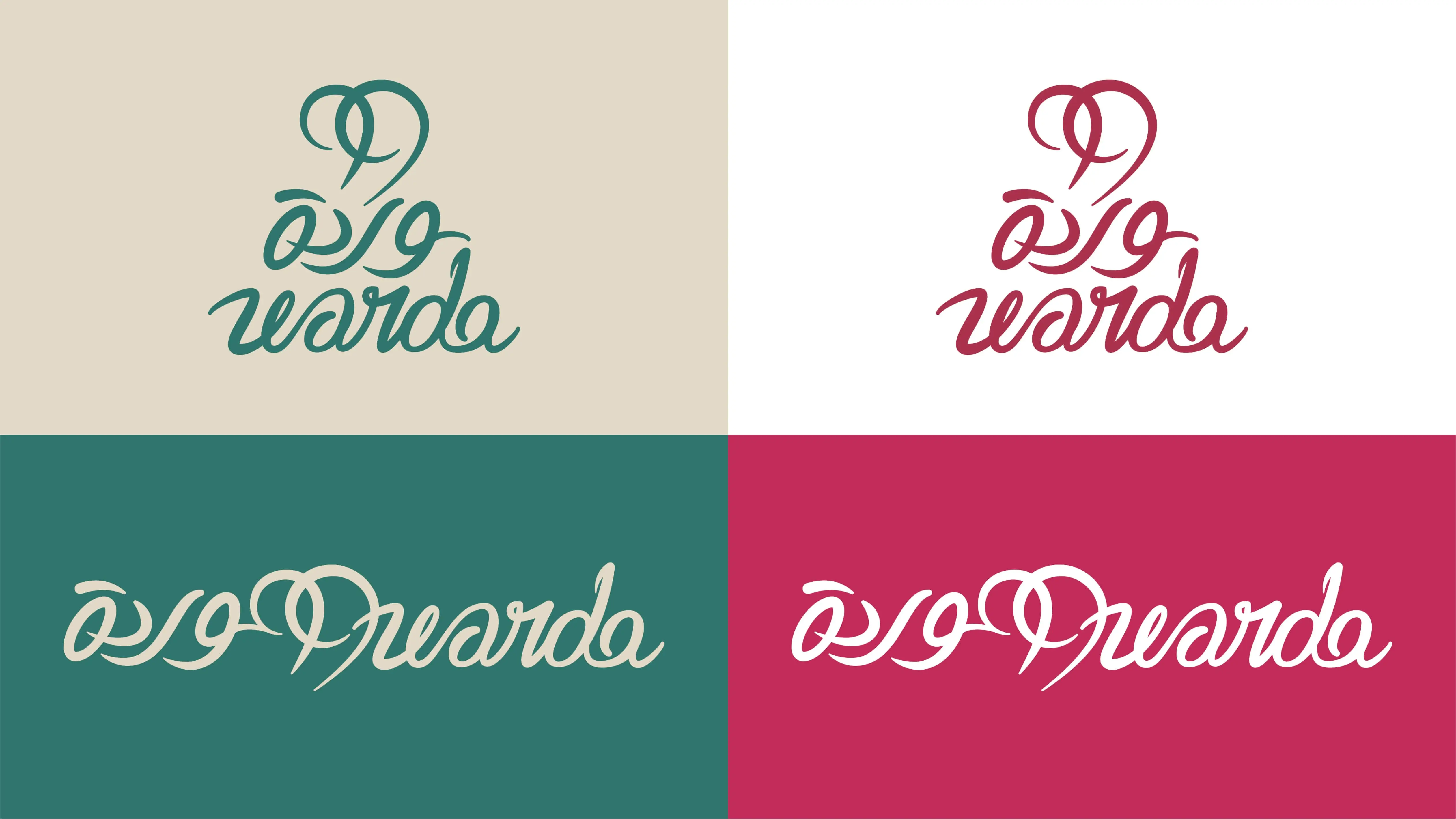
99 Warda: an Arabic name for a global gifting app
99 Warda is the first online florist and gift app in Iraq, delivering flowers, cakes, chocolates and balloons to customers across the Middle East, the UK and the US. Warda is Arabic for rose, so the brand starts from an Arabic word and has to feel just as natural to a sender in London as to a recipient in Baghdad.
We positioned 99 Warda as a full gifting experience rather than just a florist, built around freshness, warmth and quality. The logo captures celebration and care, supported by custom typeface design and a typography system that keeps the brand consistent across the app, packaging, gift cards and signage. Detailed guidelines cover how it all works online and offline, so the brand can scale across borders without losing its local warmth.
The 99 Warda logo in motion: celebration, care and a rose at its core.
Meeda: Arabic first, on every shelf
Meeda is a Saudi frozen food brand for busy families, restaurants and supermarkets. The name had to sit naturally in Arabic and still read cleanly in English, so the logo leads with ميدا and the voice is written in Arabic first: بكل حب وسهولة, "with love and ease." That same Arabic-first logic carries into a packaging system that stretches across dozens of products without losing clarity in a crowded freezer.
Meeda: Arabic leads, English follows, and both stay clear at shelf distance.
Studio ZAT: a name about the self
Studio ZAT is a creative platform for contemporary art cinema, acting education and independent artistic expression. Its name is the Arabic ذات, the self, which fits a studio where people explore their identity, emotions and potential through performance.
The logo stacks the Arabic ذات directly above the Latin ZAT, with the letters cut and shaped so the two scripts lock together as one block. Neither language is a translation of the other. They're one mark that reads in both.
We treated the brand as a stage where every individual is a story waiting to be told. The posters prove the point: film titles like الحريفي and مش فاهمين بعض are set in bold, expressive Egyptian Arabic typography that echoes an actor's emotional range, with the line مشاهد سينمائية متصورة بحب, "cinematic scenes, filmed with love." A warm, open palette and a modular content system let the brand speak to rising talents and seasoned professionals alike, on posters, video and the studio's website.
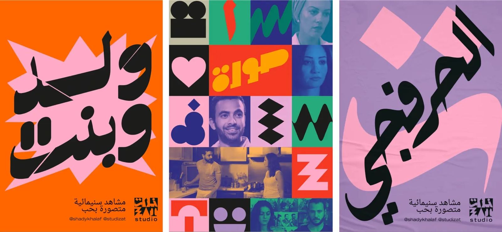
Studio ZAT posters: Egyptian Arabic set big and loud, each one signed with the stacked ذات / ZAT logo.
You'll find more bilingual identities on our work page.
Saudi Arabia, Egypt and the UAE: which language leads?
There's no single rule. It depends on who you're talking to.
Saudi Arabia
For consumer brands and anything touching government, Arabic usually leads. Buyers expect Arabic to be treated as a first language, and a weak Arabic logo undermines credibility quickly. Most of our clients are in the Kingdom, so this is where we spend most of our time. If you're comparing partners, see our honest guide to branding agencies in Riyadh.
Egypt
Egyptian brands often mix both languages freely, and many consumer names are written in Latin letters even when they're Arabic words. That makes the Arabic version easy to neglect and, for exactly that reason, a real chance to stand out. Our Cairo studio works with Egyptian brands of every size; see our shortlist of branding agencies in Egypt.
The UAE
The audience is more international, so English often leads, especially in B2B and hospitality. But Arabic remains the language of government and many official documents, and a careless Arabic logo stands out quickly in a market full of polished global brands.
Whichever leads, the other still has to be designed. That decision is usually made during creative orientation, before any drawing starts.
Why Arabic type is personal for us
Arabic typography isn't a service we added to a list. It's where Generator started. Our founder and creative director, Mohamed Nabil, trained at the Faculty of Fine Arts, moved from oil painting into design, and has spent his career working with Arabic letters. His typographic work has been shown at Visual Arabia in Dubai, D&AD XCHANGE and P21 Gallery in London, and Berlin's Right-to-Left project, and published in the Arabesque books. In his words, "My biggest passion is Arabic typography."
That shows in the studio's everyday work. Every Arabic wordmark we deliver is drawn and checked by people who read, write and care about the script. It's also why we're cautious about AI-generated Arabic lettering, which often looks fine at a glance and falls apart on closer reading. We wrote more about that in AI in branding.
You can see how Arabic logo design fits into the rest of our process on our Design page, and how it connects to branding and positioning and bilingual websites and apps on our services page.
Common questions
Should my logo be in Arabic, English or both?
If you sell to customers or government clients in Saudi Arabia, Egypt or the wider Arab world, you almost certainly need both. The real question is which one leads. That depends on your audience: a Saudi family brand might lead with Arabic, while an international B2B firm in Dubai might lead with English. Both should be designed as equals either way.
Can I just translate my English logo into Arabic?
You can, but it usually shows. Arabic has different letter shapes, proportions and rhythm, so typing the name in an Arabic font next to a custom English logo looks unbalanced. A proper Arabic wordmark is drawn to match the English one in weight, spacing and personality.
Should the brand name be translated or transliterated?
It depends on the name. Invented names are usually transliterated so they sound the same in both languages. Descriptive names may be translated, but the meaning, sound and associations need checking in both languages first. Sometimes the best answer is two different words that carry the same idea.
What should bilingual brand guidelines include?
Rules for both logo lockups, a paired Arabic and English type system, how layouts mirror for right-to-left and left-to-right, which numerals to use where, how to mix the two scripts in one line, and voice guidance written for each language rather than translated.
How long does a bilingual logo take to design?
Longer than a single-language logo, because the Arabic is drawn rather than typeset and both versions are tested together. Timing depends on whether it's a logo only or a full identity with guidelines, which we agree after the first conversation.
Does your brand speak Arabic as well as it speaks English?
We'd be pleased to look at your logo in both languages and talk through what it needs. Generator designs bilingual brand identities for companies across Saudi Arabia, Egypt and the UAE. It would be a pleasure to hear from you.
Explore our design services Start a conversationGenerator Design Agency · Cairo, Egypt · Working across Saudi Arabia, Egypt & the UAE · See more work · Our services