"Look at the corner of any stainless-steel prep table."
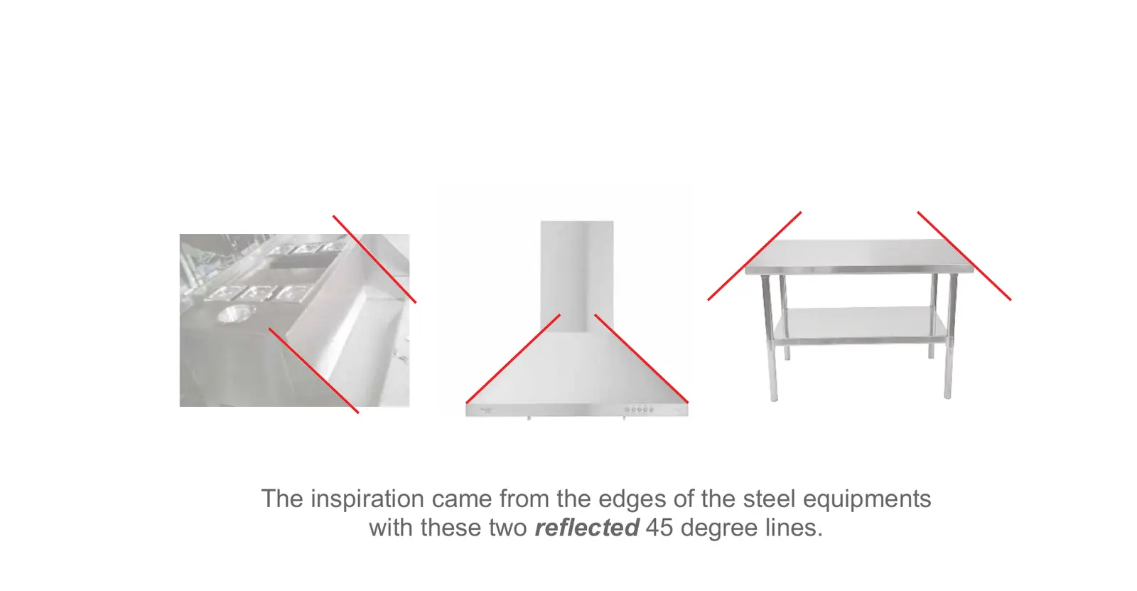
Where two surfaces meet, the steel is cut at 45 degrees. Mirror that line and you get a sharp, clean angle that tells you someone engineered this. We found that detail on NTS's own equipment, and it ended up shaping the entire brand.
NTS, short for New Technology Steel, makes commercial kitchen, bakery and ventilation equipment in Egypt for hotels, restaurants, hospitals and supermarkets. The products were good enough to sit next to imported brands. The brand was not. So we rebuilt it, starting with brand strategy and ending with a brand manual that keeps every touchpoint consistent. This is how we did it, and what other companies in Egypt, Saudi Arabia, the UAE and across MENA can learn from it.
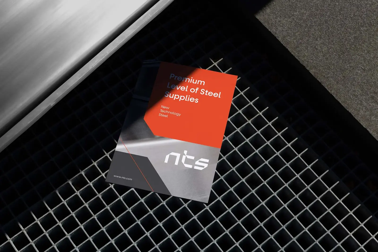
The brief: great steel, a dated brand
NTS was founded in 2013 with one goal: make Egyptian products that can compete with imports. Today it designs and fabricates cooking, refrigeration, bakery and ventilation equipment, self-service lines, storage and handling systems, and custom stainless-steel work. Every product is tested against a range of quality standards, and an in-house R&D team keeps it close to what customers need.
International buyers were ready for the product. The brand held it back. In a market crowded with local fabricators and European names, NTS looked like one more steel workshop, and nothing about it showed the engineering, customization or quality control that set it apart.
We see this a lot, especially with B2B companies. Cutting-edge products, wrapped in a brand that looks behind the times. When the identity can't stand shoulder to shoulder with the competition, it's time to rebrand.
Brand strategy: engineering, customization, quality
We don't open a design file until the strategy is written down. For NTS that meant two questions: who actually decides to buy, and what do they need to believe?
Who buys a commercial kitchen
A commercial kitchen is almost never bought by one person. During discovery we mapped everyone with a say: the chef who needs something that works, the kitchen consultant who writes the specification, the interior designer who has to fit it into the space, and the owner who watches the budget and every square metre.
The position and the promise
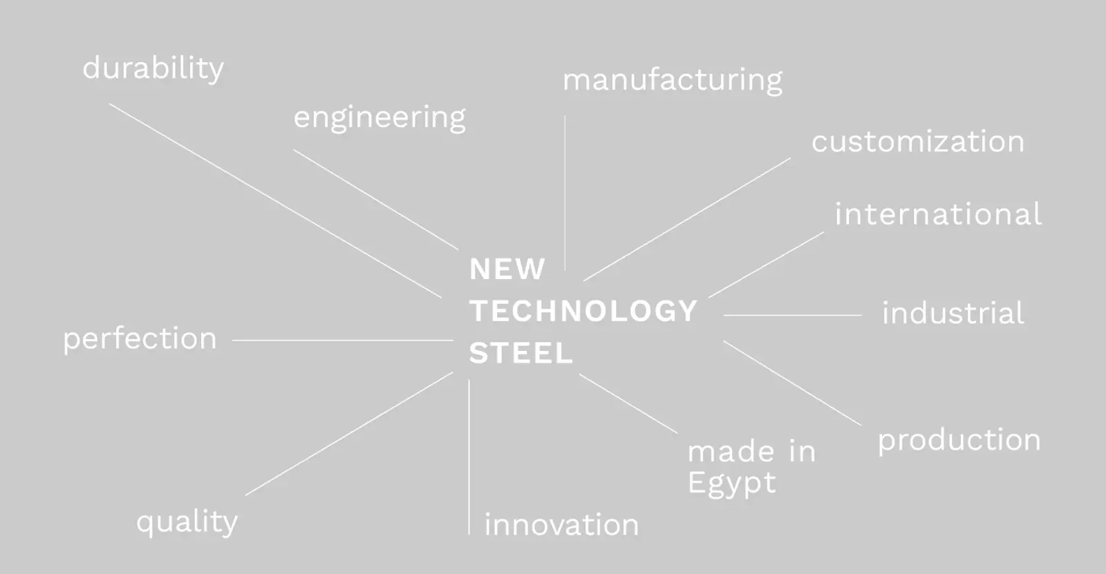
Those four people care about different things, but they agree on three: engineering, customization and international quality. That became the position, delivered by a company that's proud to be Egyptian.
"We rely on our good name for customizing, engineering, and meeting international quality standards."NTS brand purpose
We boiled it down to a three-word tagline that now sits under the logo: Optimal Steel Solution. Our guide to brand positioning goes deeper into this stage.
The visual identity
With the strategy agreed, we moved to what people see. Everything had to feel precise enough for an engineer and premium enough for a hotel owner signing off a new kitchen.
A wordmark cut like steel
We took two directions to the client. The first, Dynamic Customization, used angled strokes to tell a story about crossing barriers, diving into details and reaching the top. The second came straight from the product. Look at the edges of an NTS table, sink or extraction hood and you'll see the same thing every time: two mirrored 45-degree lines.
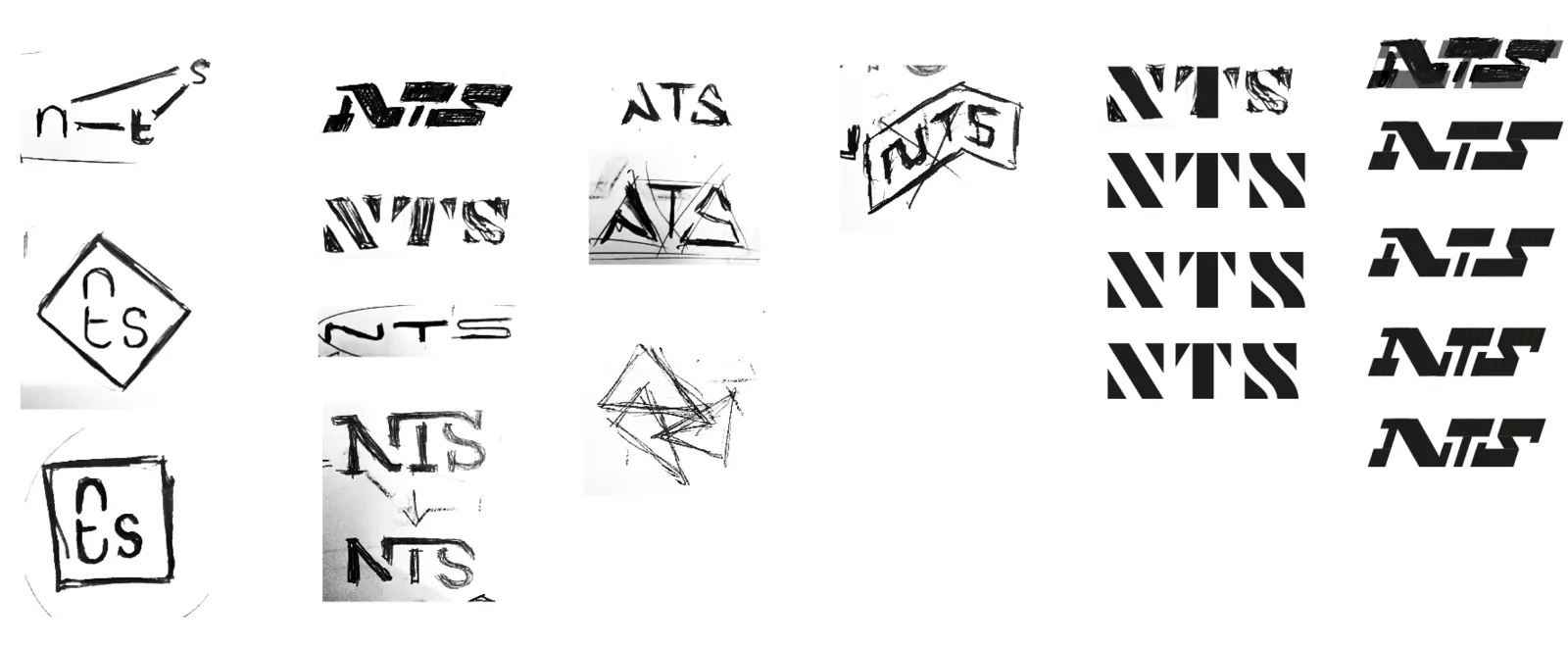
The first sketches tried capitals, diamonds, stencils and slanted blocks. The letters eventually settled into a custom lowercase wordmark, built on a strict grid of straight strokes and 45° cuts.
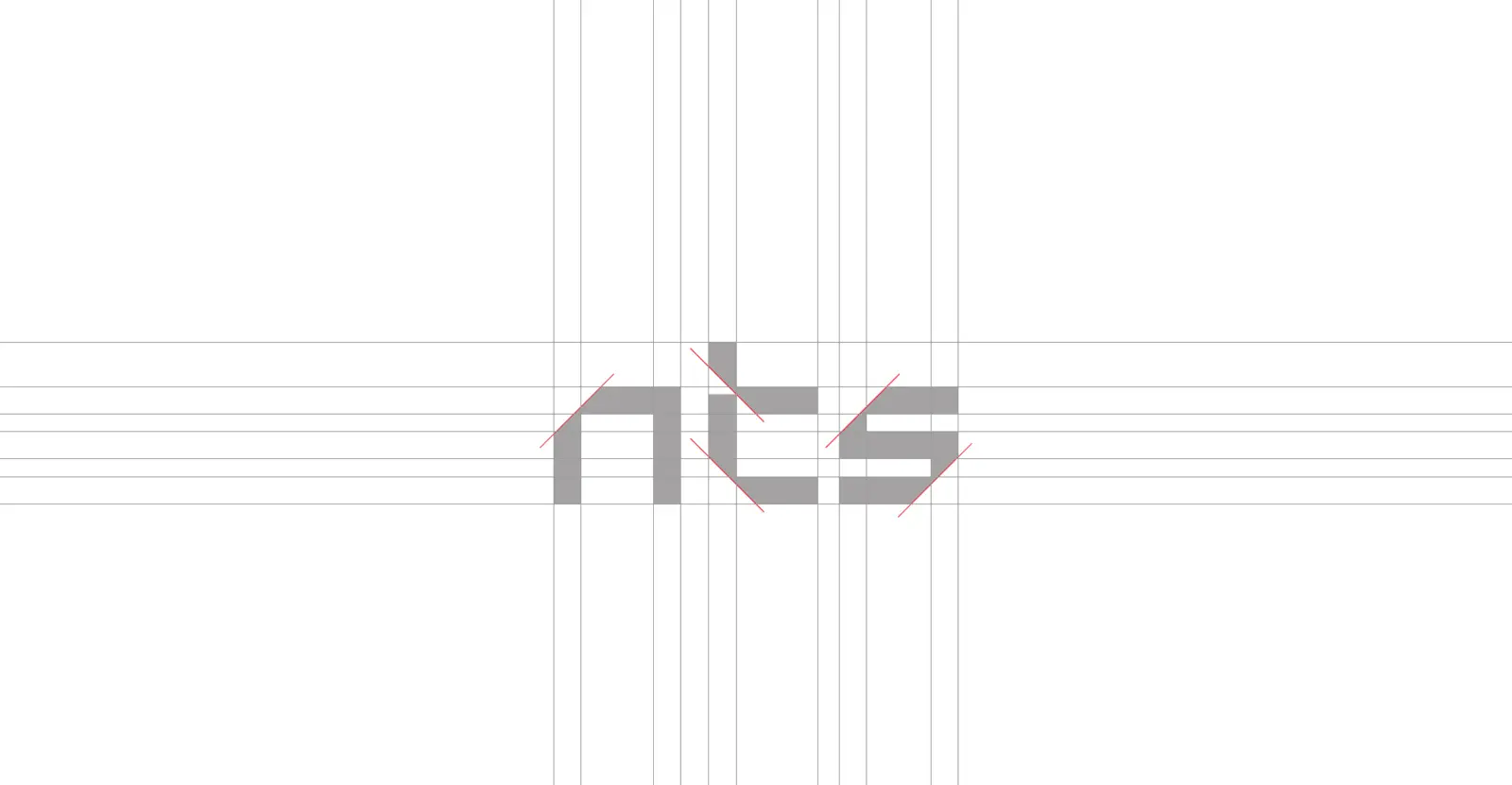
We wanted a wordmark anyone could read at a glance but no one else could own. The mirrored cuts make it bold and modern, and it still feels refined enough to carry a premium promise. It looks cut, not drawn.
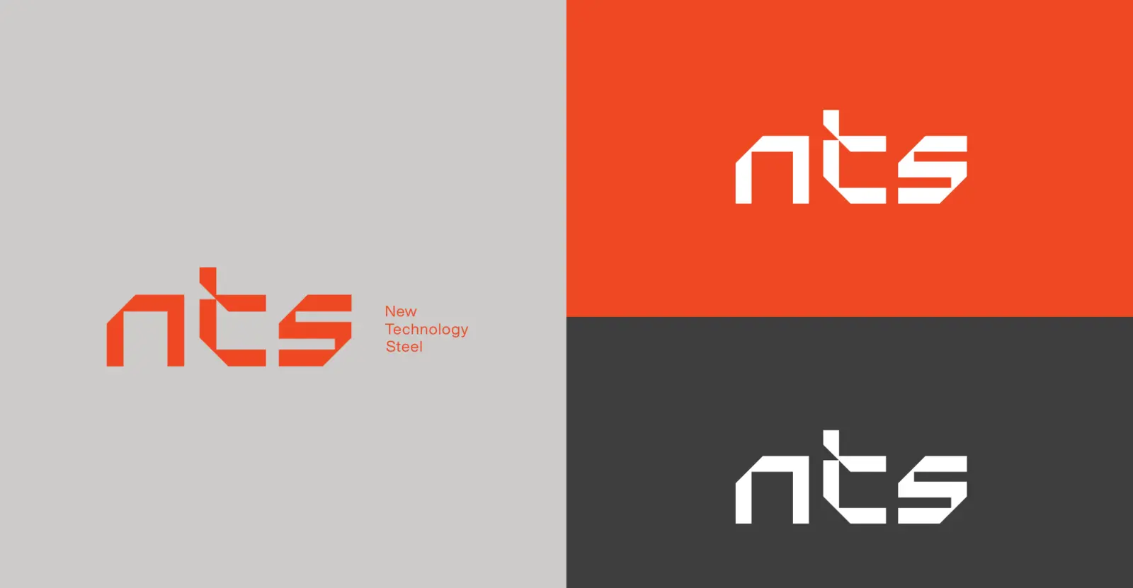
We also brought the wordmark to life. In the logo animation, a single 45° line slices in, the letters build cut by cut, and the full name locks into place, the same way a sheet of steel becomes a finished piece.

Color and typography
The palette comes from the factory floor. Melting Orange is the glow of steel being cut and welded. Ash Grey and Carbon Black are the metal itself. Medium Turquoise adds a cool, technical note.
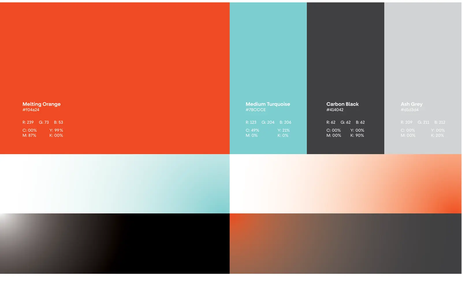
| Color | Role | What it says | HEX |
|---|---|---|---|
| Melting Orange | Primary: logo and accents | Energy and determination | #F04A24 |
| Medium Turquoise | Secondary: accents and gradients | Technology and calm | #7BCCCE |
| Carbon Black | Primary: backgrounds and text | Power and sophistication | #414042 |
| Ash Grey | Secondary: surfaces | Integrity and accuracy | #D1D3D4 |
On a building site or a hotel loading bay, that orange works like a signal. You spot the uniform, the tape or the helmet before you read a word. For type, we paired Fractul for English, a geometric family with the same engineered feel as the logo, with Mada for Arabic, so bilingual quotes, catalogues and signs stay balanced.
An icon for every product line
NTS sells a lot of different things, and customers often need several at once. We drew an icon for each of its twelve categories: cooking, refrigeration, bakery, pastry, barista, ventilation, handling, self-service lines, stainless-steel equipment, storage, cleaning and planning design.
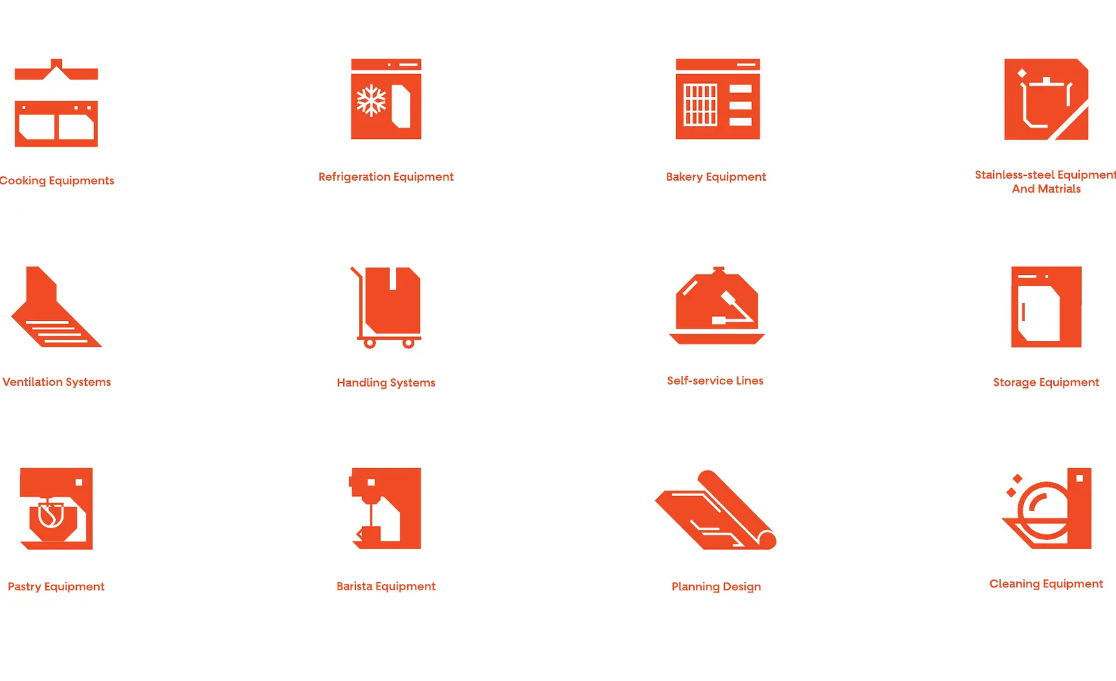
Every icon shares the logo's cut corners and solid shapes, so a catalogue page, a website menu and a trade-show wall all feel like one company. It also helps a busy consultant find the right category in seconds.
Brand consistency across every touchpoint
A brand only becomes recognisable when it shows up the same way every time. For an industrial company, that means far more places than a website: the building, the delivery, the crew, the paperwork and the screen. We designed for all of them.
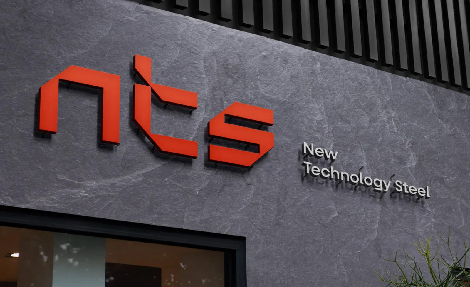
Signage
The signs speak the brand's language before anyone walks in: stainless-steel letters with the logo in orange, engraved concrete, and a bright acrylic light box for the street.
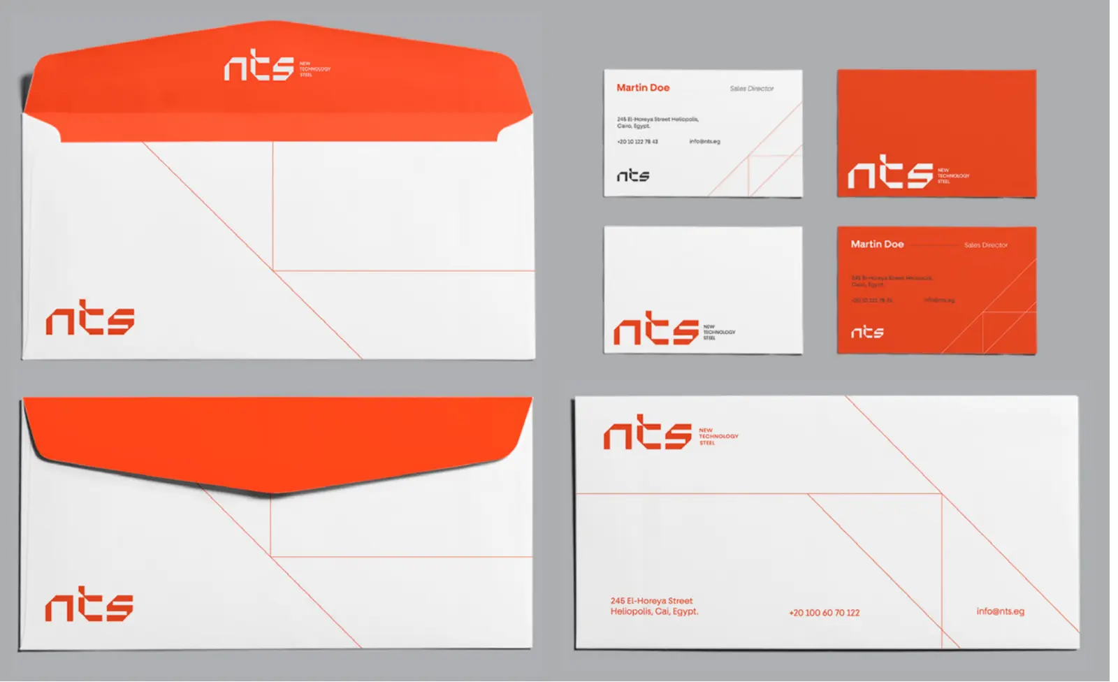
Stationery and print
In B2B, the quotation, the envelope and the company profile are often the first things a client actually holds. We made sure every one of them looks as precise as the equipment it describes.
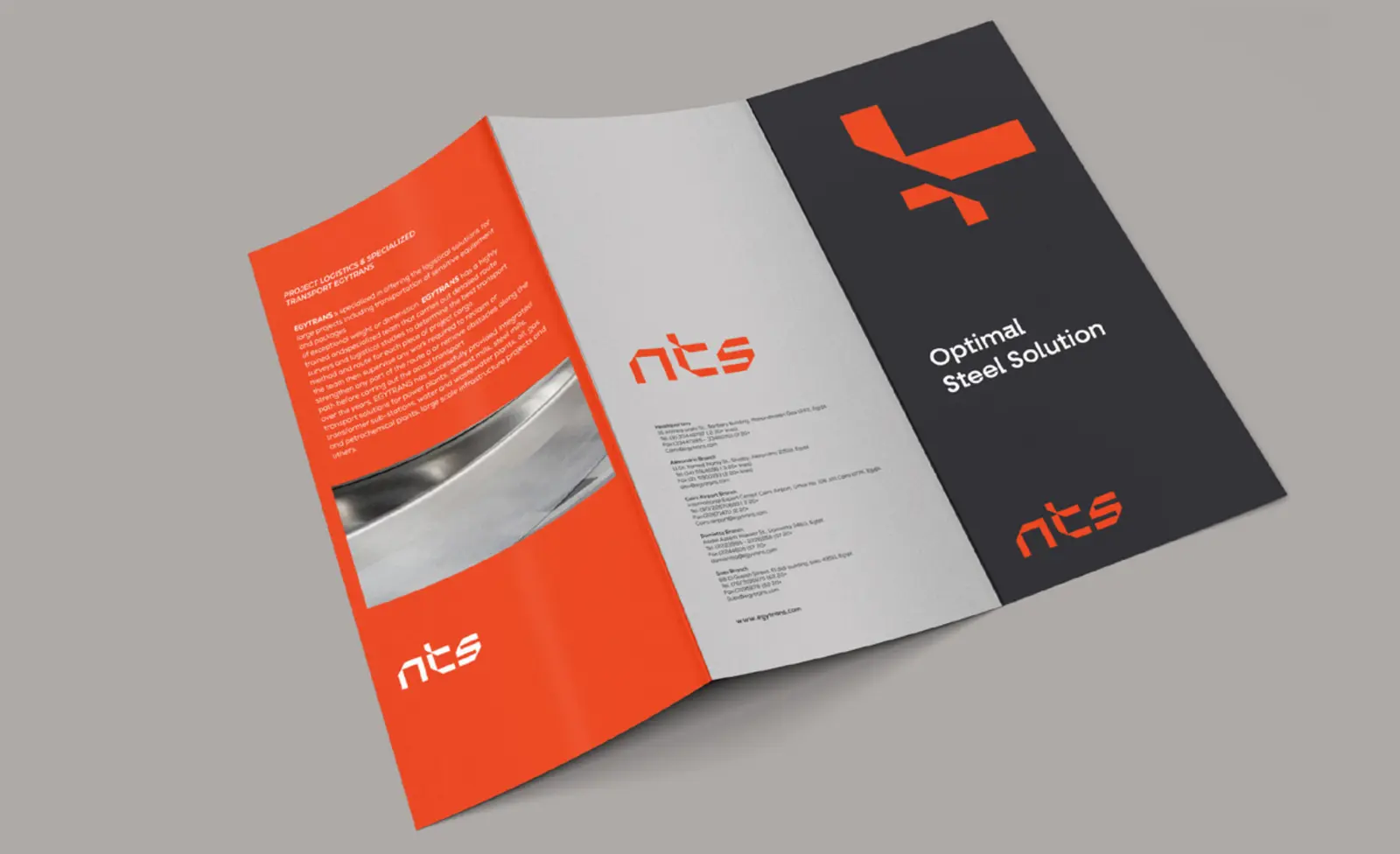
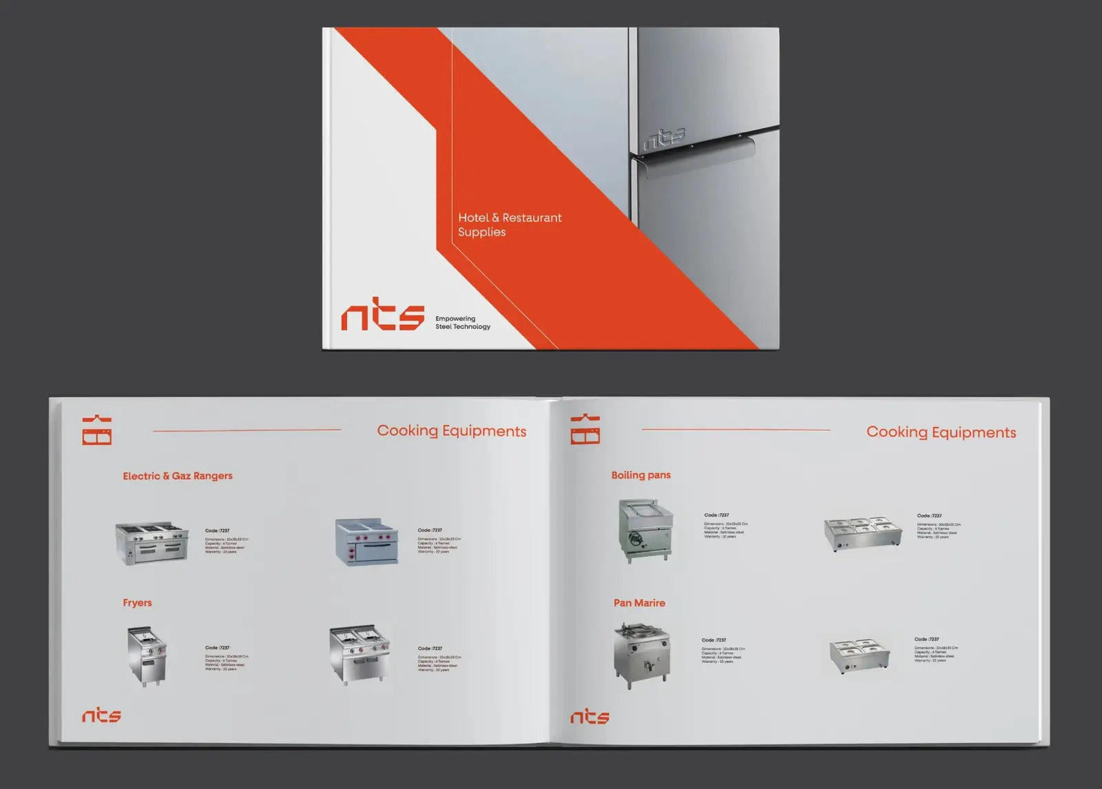
The product catalogue does the heavy lifting in sales meetings. Every range sits under its own category icon, with a clean product shot and the specs beside it, so a consultant can find a fryer or a boiling pan in seconds.
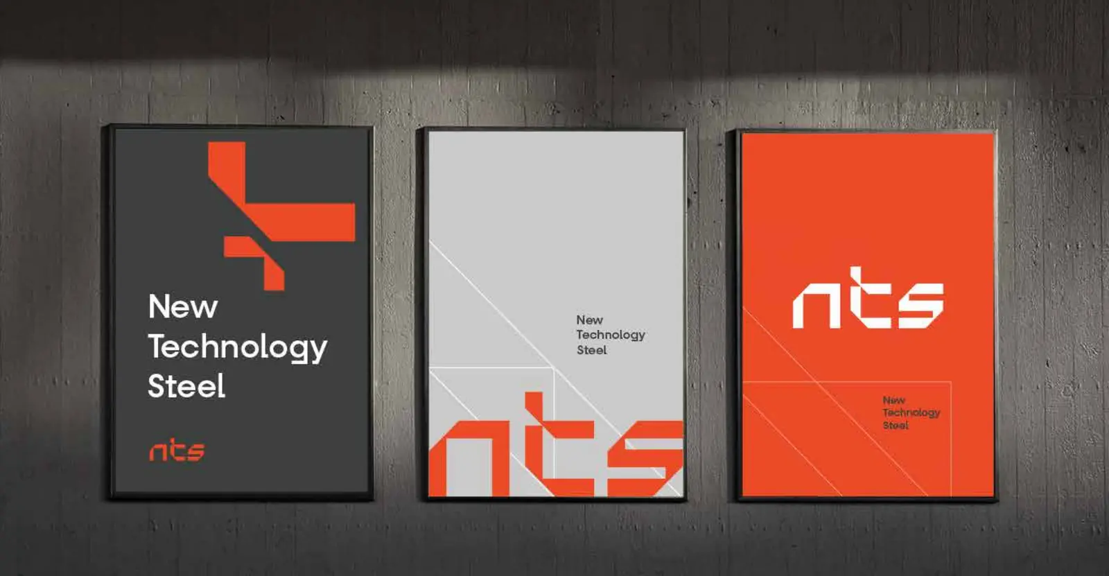
The posters take the angled graphic and scale it up to wall size. They print on A4, A3 and A2.
Workwear, safety gear and site tape
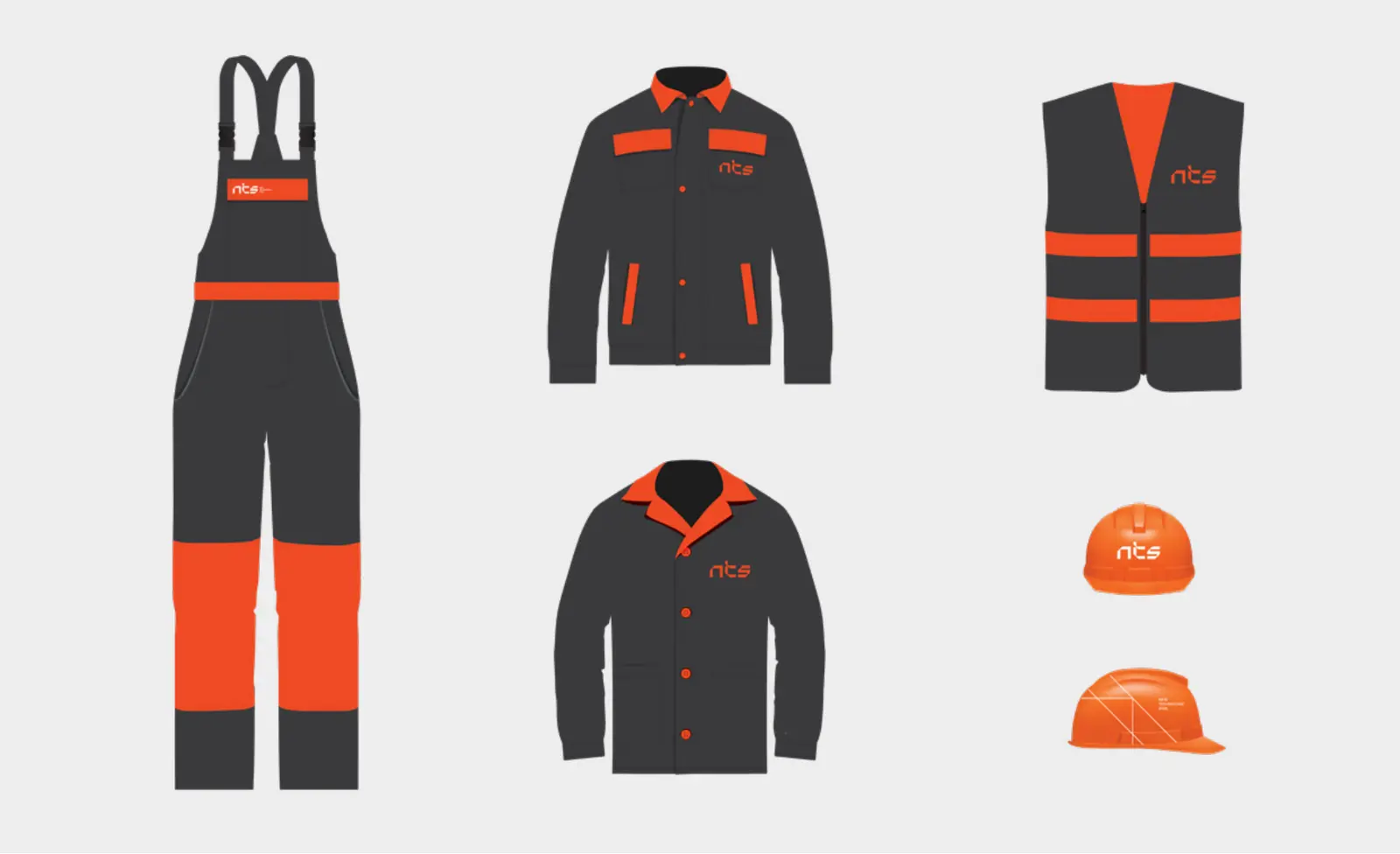
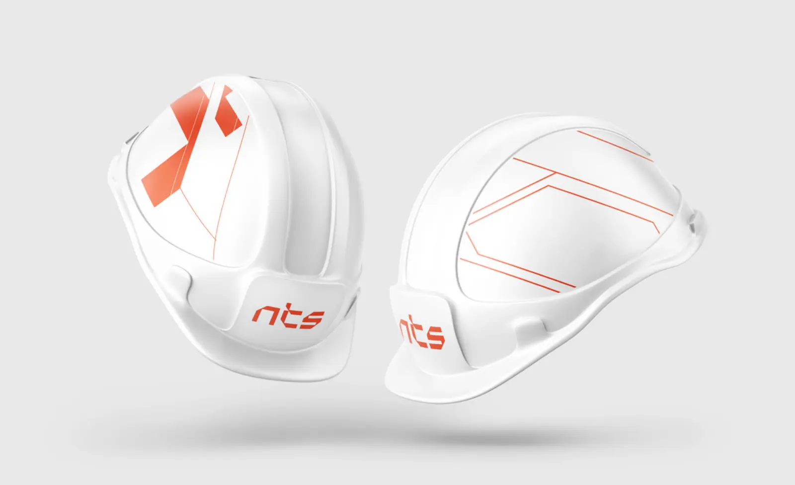
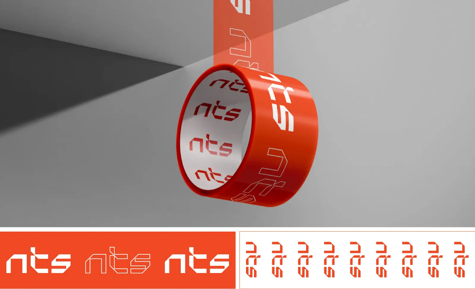
The people who deliver and install the kitchens are the brand inside the client's building. We dressed them in carbon black with orange panels and gave them white helmets carrying the identity on both sides. Even the packing tape has the logo on it, so every crate that leaves the factory is branded.
Website and social media
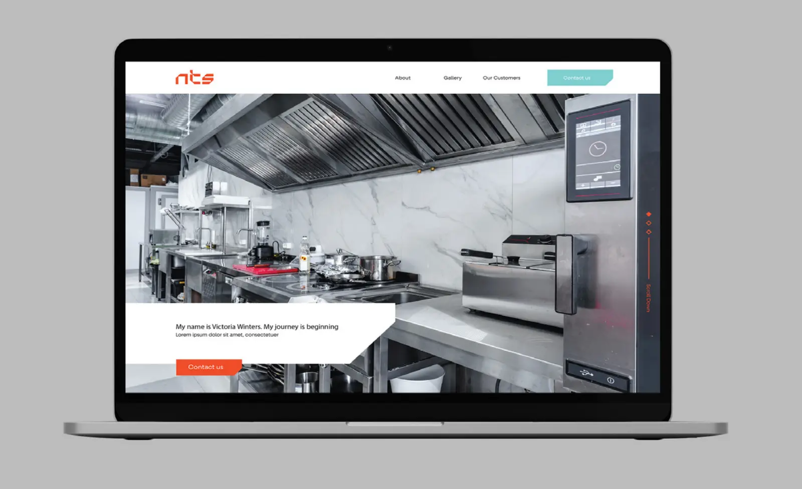
Online, the same system does the selling. The website puts real kitchens front and centre, and the orange guides the eye to the next step. Social templates pair product photos on clean white backgrounds with orange shapes, so a post about a new fridge or oven is recognisable before anyone reads the caption.
The brand manual that keeps it consistent
A new identity only stays new if everyone uses it the same way, from the sales team to the sign maker to the uniform supplier. So we gave NTS a brand manual in nine sections: brand mark, typography, colors, iconography, signage, posters, stationery, other applications and digital.
It sets a clear exclusion zone around the logo, a minimum width of 50 pixels when the tagline is included, and six mistakes to avoid: changing the proportions, the typeface, the colors or the descriptor, attaching extra headings to the logo, and ever mirroring the symbol. It even lists paper sizes and color settings, so every printer gets it right the first time.
Rebranding in Egypt, Saudi Arabia, the UAE and MENA
NTS is an Egyptian manufacturer, rebranded by our team in Cairo. Generator is a branding agency based in Egypt, and we work with industrial, B2B, food, retail and lifestyle brands in Saudi Arabia, the UAE and across the Middle East and North Africa.
The markets differ, but the question is the same. A steel fabricator in Cairo, an equipment supplier in Riyadh and a contractor in Dubai all have to ask whether their brand looks as good as the work they deliver. When the answer is no, the order doesn't change: listen first, write the brand strategy, find one idea, then build a system consistent enough to grow with you.
Working in food and beverage rather than the equipment behind it? Read how we rebranded Donut Time, a Saudi donut and coffee brand.
If you're comparing agencies, start with our guide on how to choose a branding agency in Saudi Arabia, Egypt and the UAE, or see what a brand identity design company actually delivers.
Frequently asked questions
What does a branding agency do?
A branding agency helps a company decide what it stands for and then expresses that everywhere people meet it. At Generator that means brand strategy, naming, visual identity, packaging, websites and the brand guidelines that keep it all consistent.
What is the difference between brand strategy and brand identity?
Brand strategy is the thinking: who you serve, what you promise and why you're different. Brand identity is how that shows up: the logo, colors, type, icons and voice. For NTS, the strategy was engineering, customization and international quality. The identity turned that into a steel-cut wordmark and a disciplined orange-and-steel palette.
Why does brand consistency matter?
People trust what they recognise, and they only recognise what they see the same way many times. When your sign, quotation, uniform and website all look like one company, every touchpoint builds on the last instead of starting from zero. That's why the NTS rebrand ends with a nine-section brand manual.
How do you know it is time to rebrand?
When your products or services have outgrown the way you look. If competitors look more credible than you, if every touchpoint looks like a different company, or if you're entering new markets, it's time. NTS rebranded because its equipment could compete with imports but its brand couldn't.
How long does a rebranding project take?
It depends on scope. For NTS, the brief was written in July 2022, design concepts were presented in October 2022, and the full brand manual was delivered in February 2023.
Do you work with brands in Egypt, Saudi Arabia, the UAE and MENA?
Yes. Generator is a branding agency based in Cairo, working with brands in Egypt, Saudi Arabia, the UAE and across the Middle East and North Africa on brand strategy, naming, identity, rebranding and packaging design.
Does your brand look as good as the work you deliver?
If not, that's where we start. Generator helps brands in Egypt, Saudi Arabia, the UAE and across MENA find one clear idea and build an identity people remember. We'd love to hear what you're working on.
See the NTS project Start a conversationGenerator Design Agency · Cairo, Egypt · Working across Egypt, Saudi Arabia, the UAE & MENA · See more work · Our services