"How do you make a family-run contractor look ready for a national project?"
That was the question on the table when Vision Construction Company came to us. VCC is a Jeddah construction company with real projects behind it: the Digital Art Museum in Historical Jeddah, work at Jabal Omar Hotel, and the Masar ST05 bus station and offices. It had the track record. What it didn't have was a brand that showed it.
We built that brand from strategy to brand guidelines: a mark drawn from an arc and an Arabian falcon, a logo that always speaks Arabic and English together, a dark red and golden yellow palette, seven service icons, and a system that runs from hard-hat sites to investor presentations. Here's how it came together, and what other companies in Saudi Arabia, Egypt, the UAE and across MENA can take from it.
The brief: proven work, a brand that hadn't caught up
VCC started as a family company and grew into a full construction and engineering firm. Today it covers building construction, infrastructure, mechanical, electrical and low-current systems, healthcare facilities and renewable energy, with a team that mixes seasoned engineers and young professionals.
Saudi Arabia is building at a pace few markets have ever seen, and the clients behind that work are demanding. Government entities, developers and investors don't just compare prices. They compare credibility. VCC needed a brand that looked as solid as the buildings it delivers, without losing the hands-on, family character that got it this far.
Brand strategy for a Vision 2030 contractor
Before any sketching, we agreed on what VCC stands for and who it has to convince.
Three audiences, one promise
VCC talks to three groups at once: investors who want to know their money is safe, partners who want a reliable team on site, and government clients who need a contractor aligned with the Kingdom's goals. Each reads a brand differently, but all three are looking for the same thing: trust.
So the strategy positions VCC as a contractor that can turn a complex vision into a finished building, with technical control and human leadership in equal measure. Its mission ties that directly to sustainability, local content and Saudi Vision 2030.
"To be the leading, most trusted, and innovative construction and engineering company, delivering exceptional projects that exceed client expectations and contribute to sustainable development."VCC brand vision
A voice that sounds like a site manager you trust
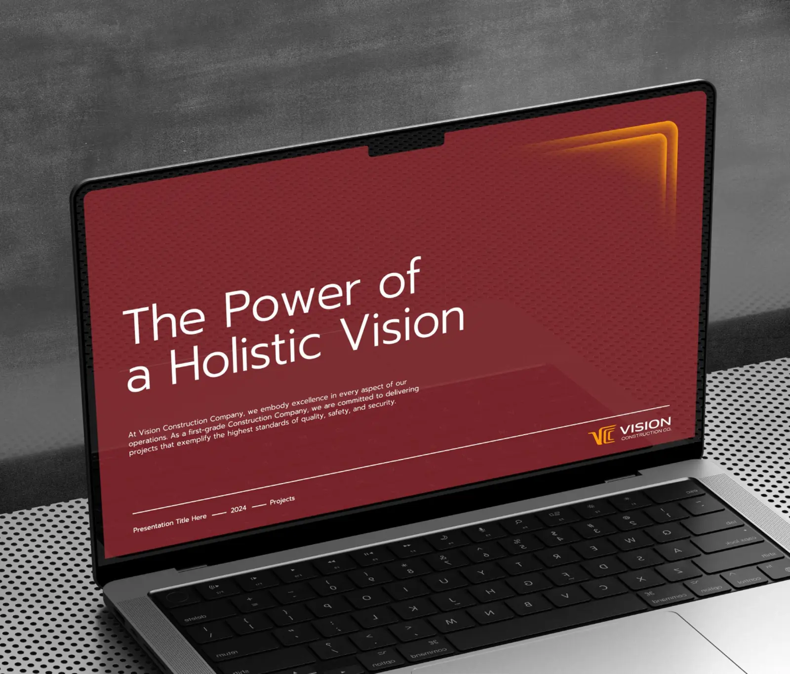
We defined the voice as clear, confident and collaborative. Clear, because clients need to understand scope, timelines and expectations. Confident, because the company has the expertise to back it up. Collaborative, because no large project is built by one firm. The brand's line pulls it together: The Power of a Holistic Vision.
If you're weighing up this stage for your own company, our guides to brand strategy and brand positioning go into more detail.
The visual identity
The identity had to feel solid enough for a ministry and modern enough for a new generation of Saudi projects. Every element connects back to the name: vision.
An arc and an Arabian falcon
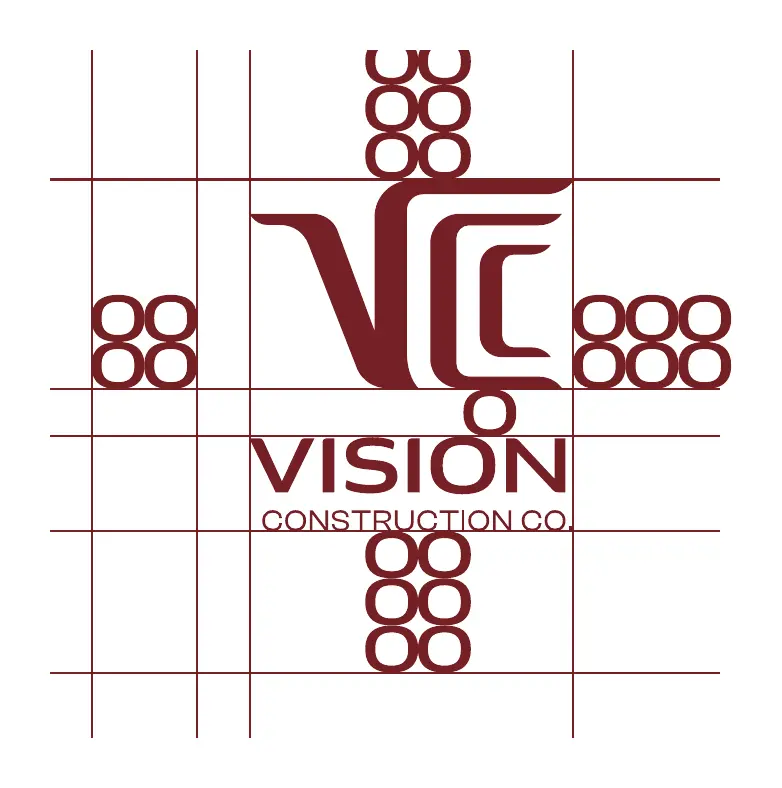
The mark starts with an arc, a smooth curve connecting two points on a circle, the kind of line you'd find on any architect's drawing. Inside it sits a stylised Arabian falcon, a bird known for seeing further than anything around it. Together they form the letters V and C, and they say what VCC promises: the full picture, from the first drawing to the final handover.

One logo, two languages
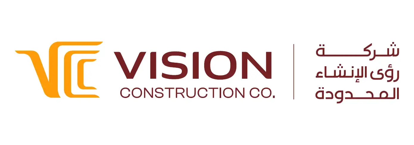
In Saudi Arabia, a brand that only speaks English feels imported, and one that only speaks Arabic can struggle with international partners. So VCC's primary logo is bilingual by default: VISION CONSTRUCTION CO. on one side, شركة رؤى الإنشاء المحدودة on the other, sharing one mark. The guidelines make it a rule: never use the logo in one language alone.
Getting two scripts to sit together well is a craft of its own. We cover it in more depth in our guide to Arabic logo design and bilingual brand identity.
Dark red and golden yellow
Most construction brands reach for blue or grey. We went the other way. VCC Dark Red is deep and grounded, with far more warmth and character than the usual corporate blue. Golden Yellow brings energy and light, like a site at sunrise. White gives both room to breathe.
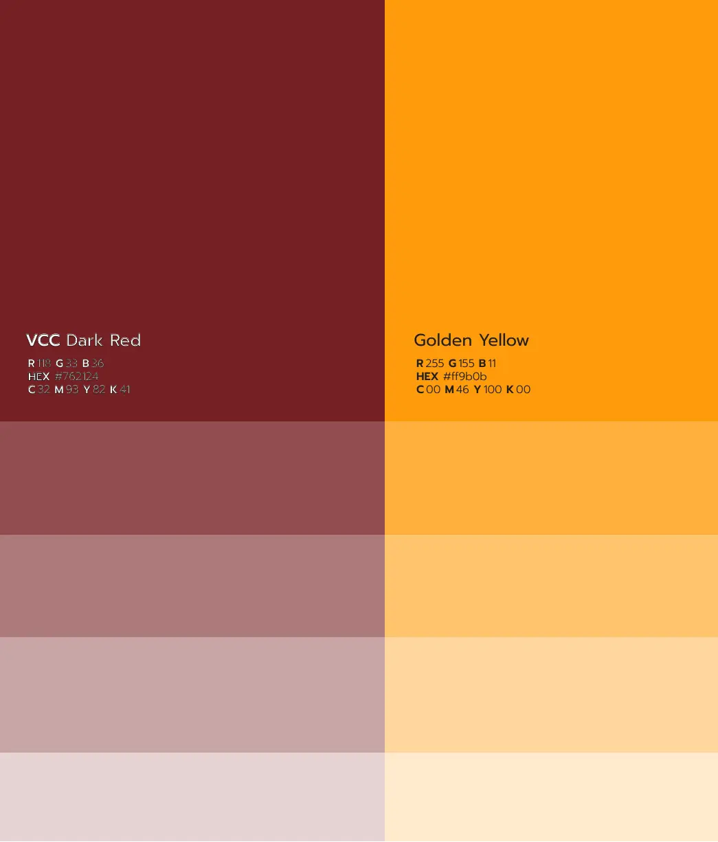
| Color | Role | HEX |
|---|---|---|
| VCC Dark Red | Primary: backgrounds, wordmark and print | #762124 |
| Golden Yellow | Primary: the mark, highlights and gradients | #FF9B0B |
| White | Supporting: space and contrast | #FFFFFF |
For type, Prompt handles English with wide, confident letters that work for short headlines and longer reading. Lama Sans does the same job in Arabic, and was designed to hold up in print and on screen.
A ripple you can rotate
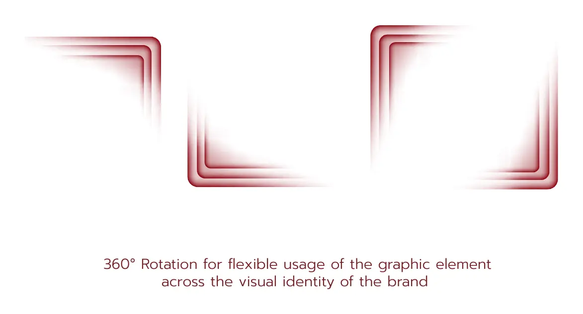
The graphic element grows out of the mark itself: a ripple of glowing lines that spreads from the arc. It rotates a full 360°, so it can frame a photo, mark a corner or lead the eye across a page without ever looking repeated.
Seven service icons
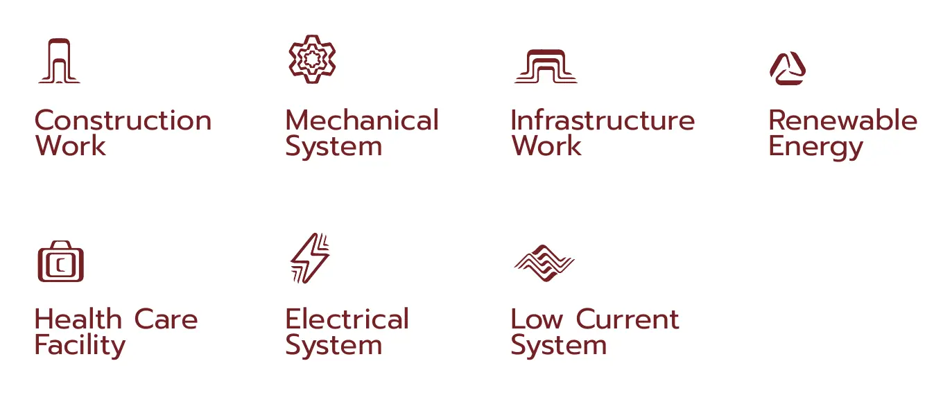
VCC's services are broad, so we gave each one its own icon: construction work, mechanical systems, infrastructure, renewable energy, healthcare facilities, electrical systems and low-current systems. Simple line drawings, built to read quickly in a profile, on the website or on a tender document.
Brand consistency from site to boardroom
A construction company meets its audience in very different places: a hoarding on a busy street, a tender submission, a gift box at a signing. People start to trust a company when every one of those moments looks like it came from the same place. That's the job of the system, and it's what we mean by one identity across a growing business.
Campaigns and posters
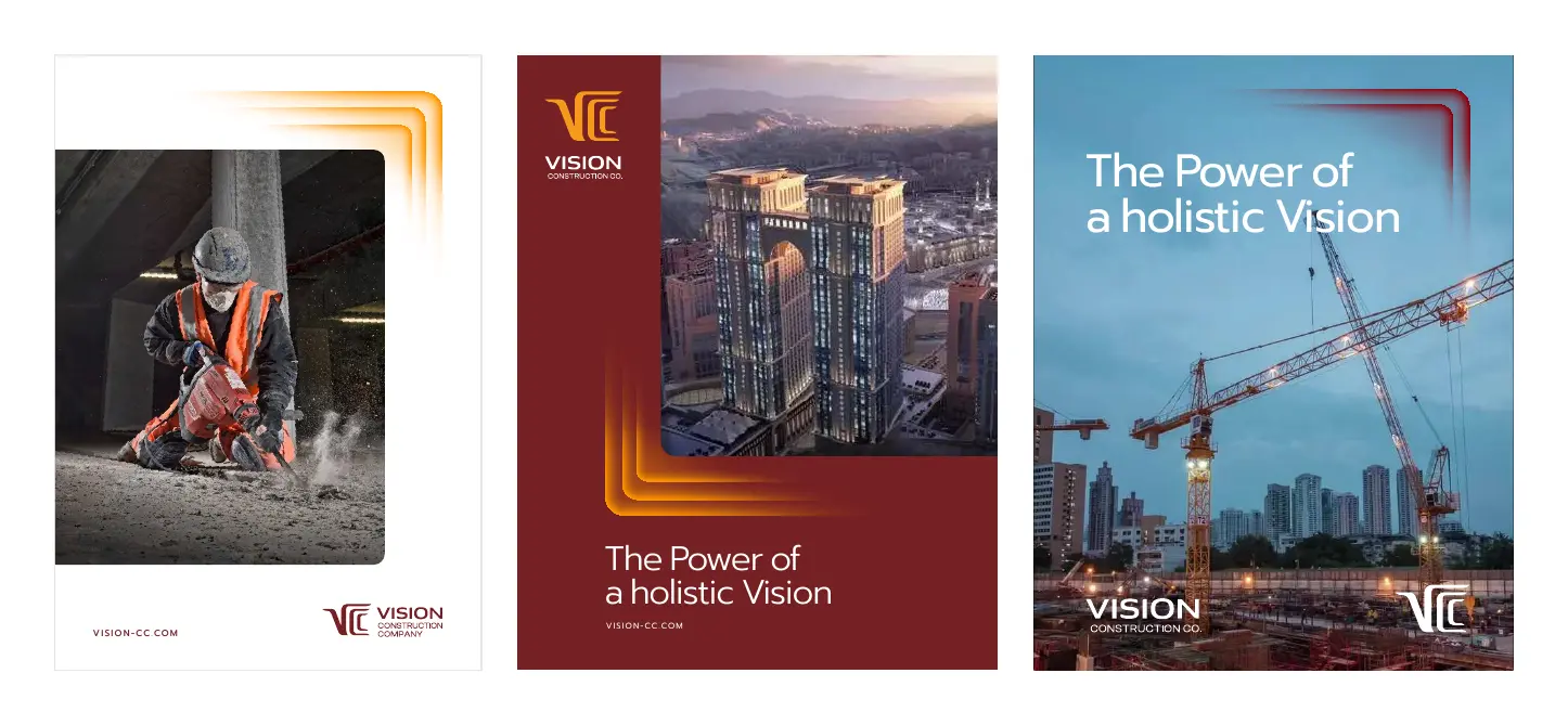
The posters mix real construction photography with the dark red and the golden ripple. The headline speaks for the whole brand: the power of having a holistic vision.
A bilingual company profile
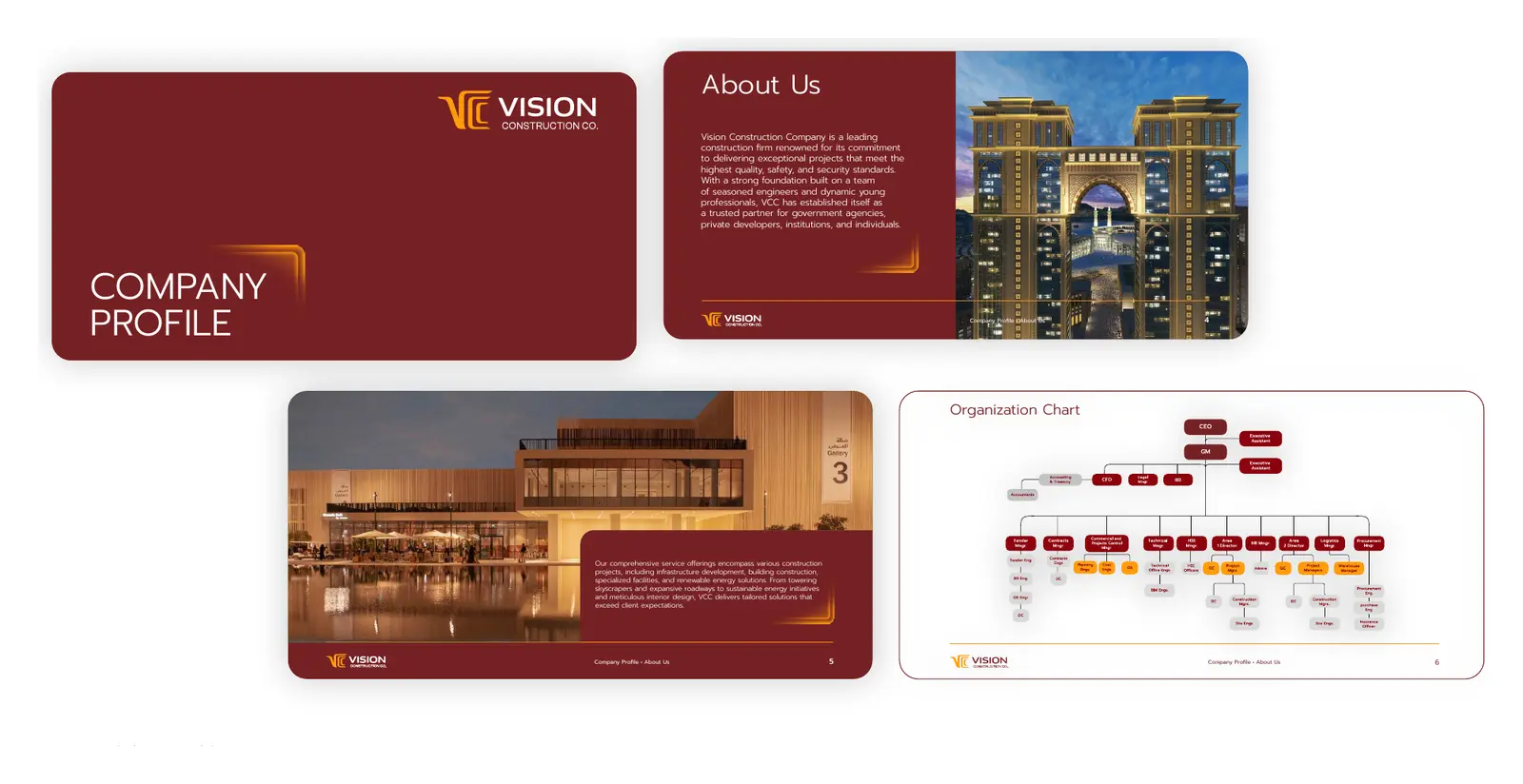
For investors and government clients, the company profile is often the brand. We designed it in both languages, with a clear story, the full service range, featured projects and an organisation chart that shows exactly who does what.
Stationery
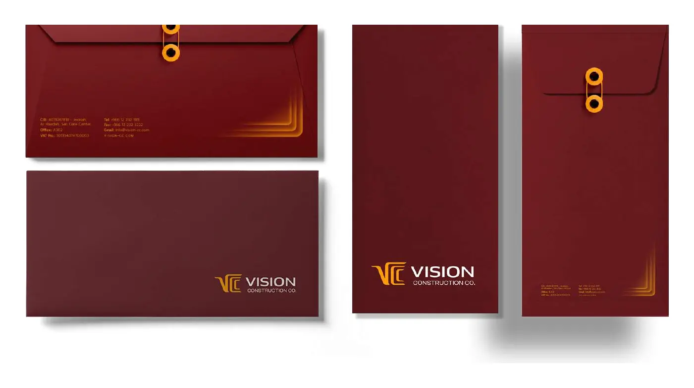
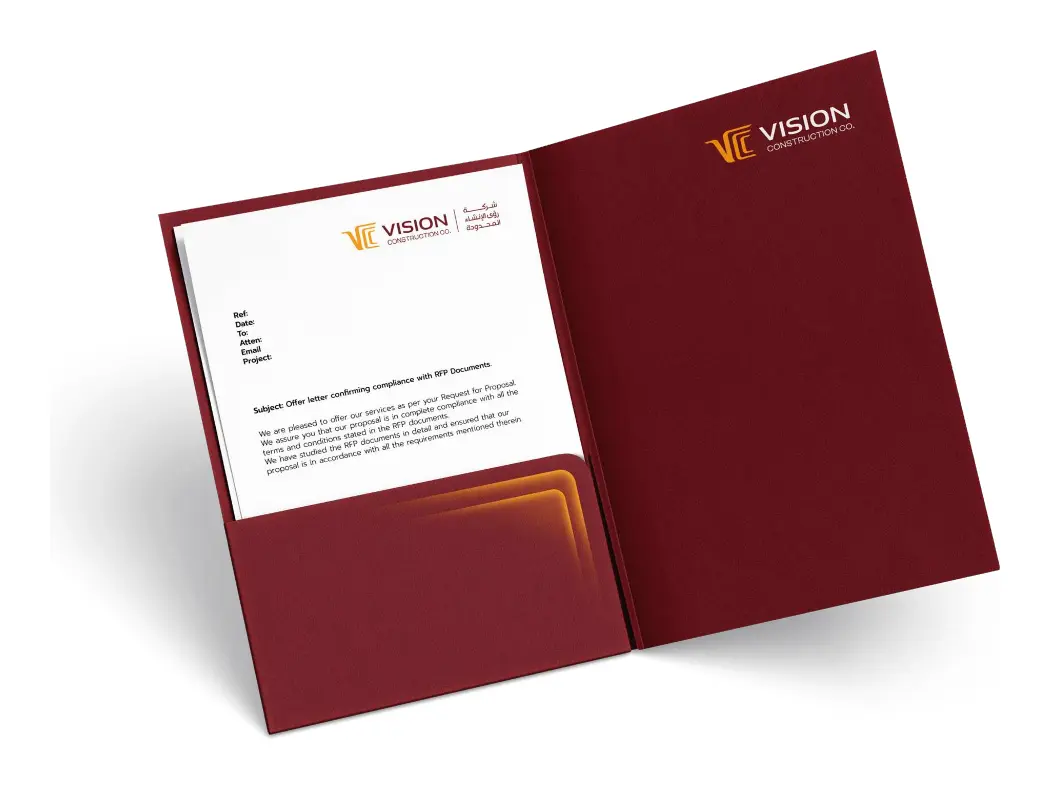
Envelopes, folders and letterheads carry the dark red outside and clean white inside, with the ripple appearing on the corners. Even a hand-delivered contract looks like it came from a serious company.
Gifts, kits and merchandise
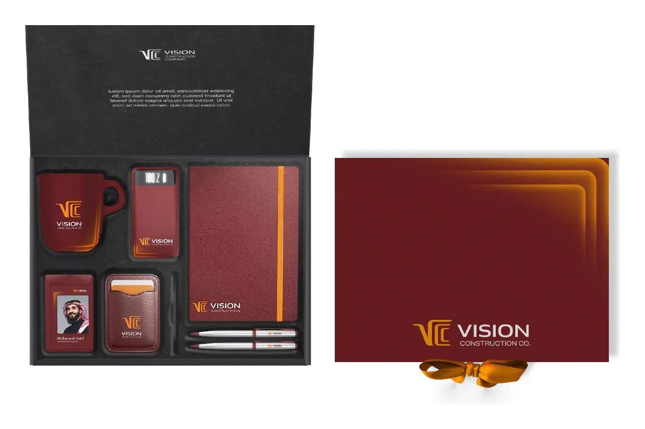
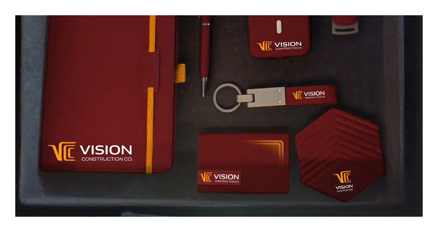
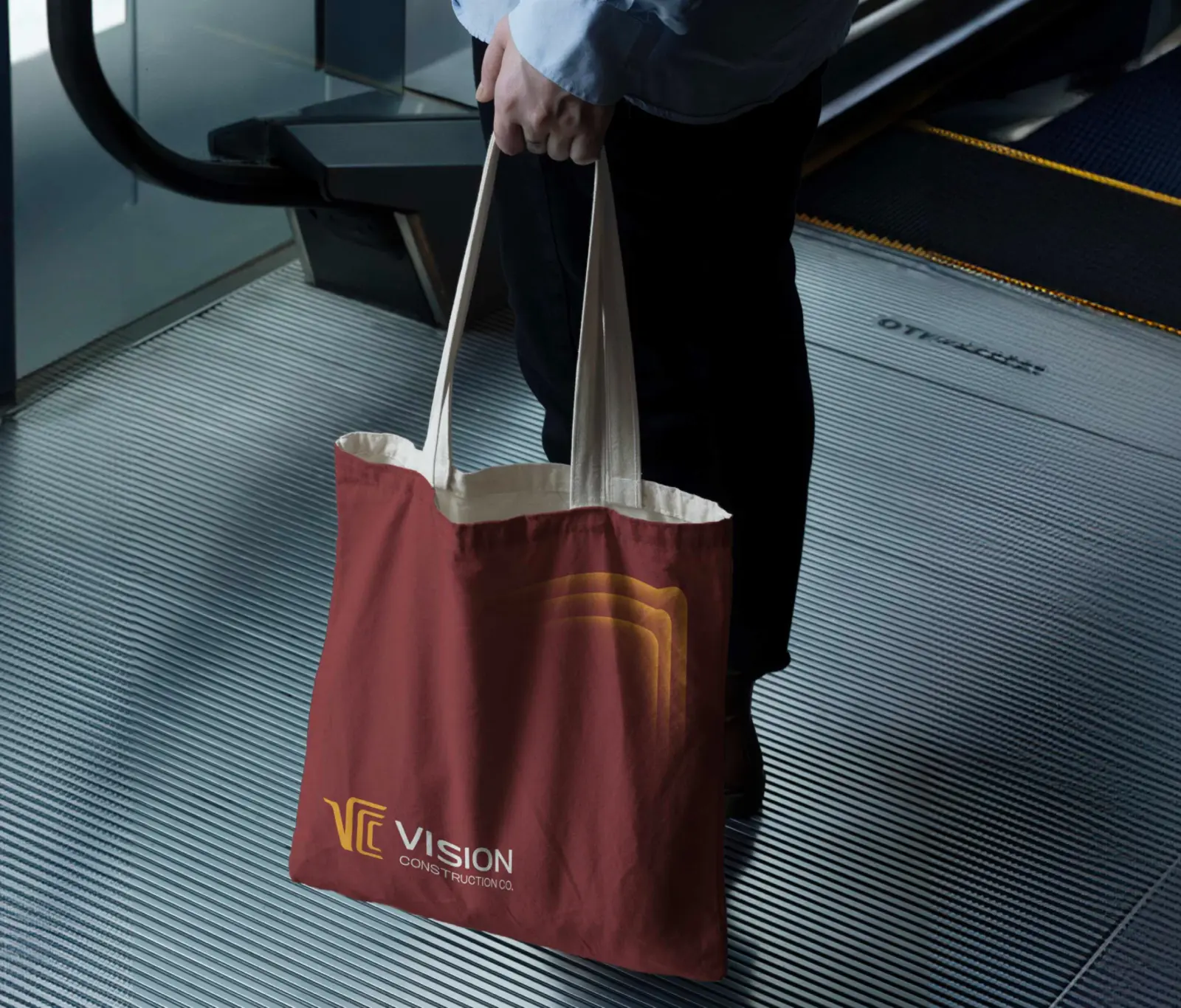
In the Gulf, a well-made gift at the right moment says a lot about a company. We designed a welcome box for new employees and a VIP kit for partners, plus everyday items like tote bags and mugs, all in the same palette.
Flags and events
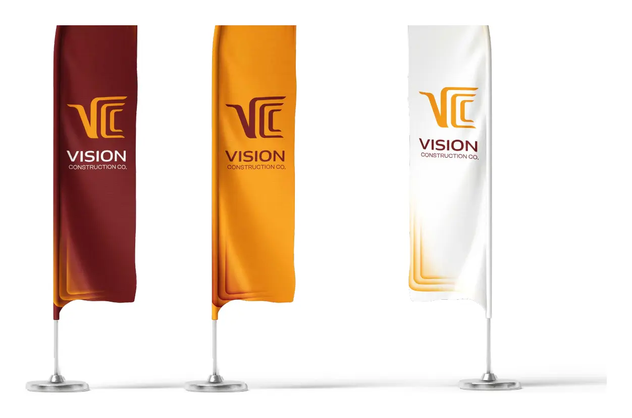
On sites, at exhibitions and at project launches, the feather flags come in all three brand colors, so VCC is easy to find in a crowded space.
Social media and presentations
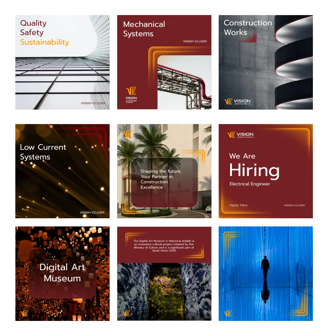
Online, the templates switch between project stories, service highlights and hiring posts, while keeping the same frame, type and ripple. The presentation template carries the same look into every meeting room.
Brand guidelines in six chapters
A contractor works with dozens of suppliers, printers and subcontractors. Without clear rules, a brand starts to drift within months. We wrote VCC's brand guidelines in six chapters: overview, logo, colors, typography, visual language and applications.
They set the clear space around the logo, minimum sizes for every use (1.5 cm in print, 16 px for a favicon, 1.2 inches for embroidery and at least 1 metre on the short side of large prints), and the common mistakes to avoid, from stretching the logo to dropping one of its two languages. Twenty-one applications, from notebooks to email signatures, are shown exactly as they should be made. We explain what good guidelines need in our article on brand guidelines services.
If you want to see how we handled the same challenge for a manufacturer, read how we rebranded NTS, an Egyptian steel brand.
Construction branding in Saudi Arabia, Egypt, the UAE and MENA
VCC is a Saudi company, branded by our team in Cairo. Generator is a branding agency working with construction, real estate, industrial and B2B companies in Saudi Arabia, Egypt, the UAE, Qatar, Oman, Bahrain, Iraq and across the Middle East and North Africa.
Construction is one of the region's most competitive industries, and one of the most under-branded. Many contractors with excellent work still lose to competitors who simply look more established. A clear brand strategy, a bilingual identity and real brand consistency are how that changes. We've done the same for an accounting firm in the UAE with Integral, and for a Saudi food brand with Donut Time.
If you're comparing agencies, start with our guide on how to choose a branding agency in Saudi Arabia, Egypt and the UAE, check our shortlist of the best branding agencies in Riyadh, or see what a brand identity design company actually delivers.
Frequently asked questions
Why does branding matter for a construction company?
Because clients judge credibility before they judge price. Government entities, developers and investors shortlist contractors who look established and organised. A clear brand, a strong company profile and consistent materials help a construction company get into the room, and stay there.
Should a company in Saudi Arabia have a bilingual logo?
In most cases, yes. A bilingual Arabic and English logo works for local government clients and international partners at the same time. The two versions should be designed together, so neither feels like a translation. VCC's guidelines go further and never allow the logo to appear in one language alone.
How can a brand reflect Saudi Vision 2030?
Not by copying its visuals, but by sharing its goals. VCC's strategy is built around sustainability, local content and quality, the same priorities that matter to Vision 2030 projects, and the identity expresses them through a falcon, an arc and a forward-looking design.
What should brand guidelines include for a construction company?
At minimum: logo rules, colors, typography, graphic elements and examples of real applications. For a contractor that also means stationery, a company profile, signage, flags, workwear, gifts and digital templates. VCC's guidelines cover all of this across six chapters and twenty-one applications.
What is the difference between a brand identity and brand guidelines?
The brand identity is the visible system: the logo, colors, type, icons and graphic elements. Brand guidelines are the rulebook that tells everyone, from your team to your printer, how to use that system correctly so the brand stays consistent.
Do you work with companies in Saudi Arabia, Egypt, the UAE and MENA?
Yes. Generator is a branding agency based in Cairo, working with companies in Saudi Arabia, Egypt, the UAE, Qatar, Oman, Bahrain, Iraq and across the Middle East and North Africa on brand strategy, naming, brand identity, rebranding and brand guidelines.
Does your brand look ready for the projects you want to win?
If not, that's where we start. Generator helps companies in Saudi Arabia, Egypt, the UAE and across MENA find one clear idea and build an identity people trust. We'd love to hear what you're working on.
See the VCC project Start a conversationGenerator Design Agency · Cairo, Egypt · Working across Saudi Arabia, Egypt, the UAE & MENA · See more work · Our services