Creative Execution
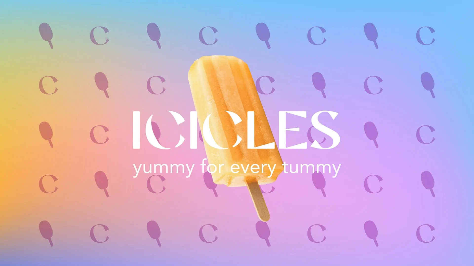
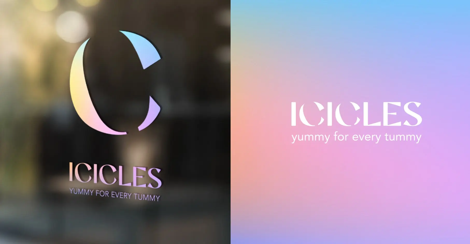
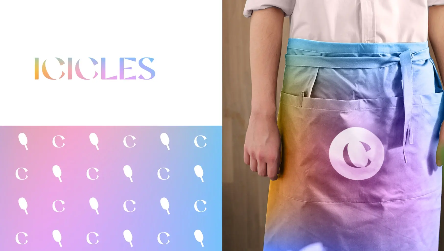
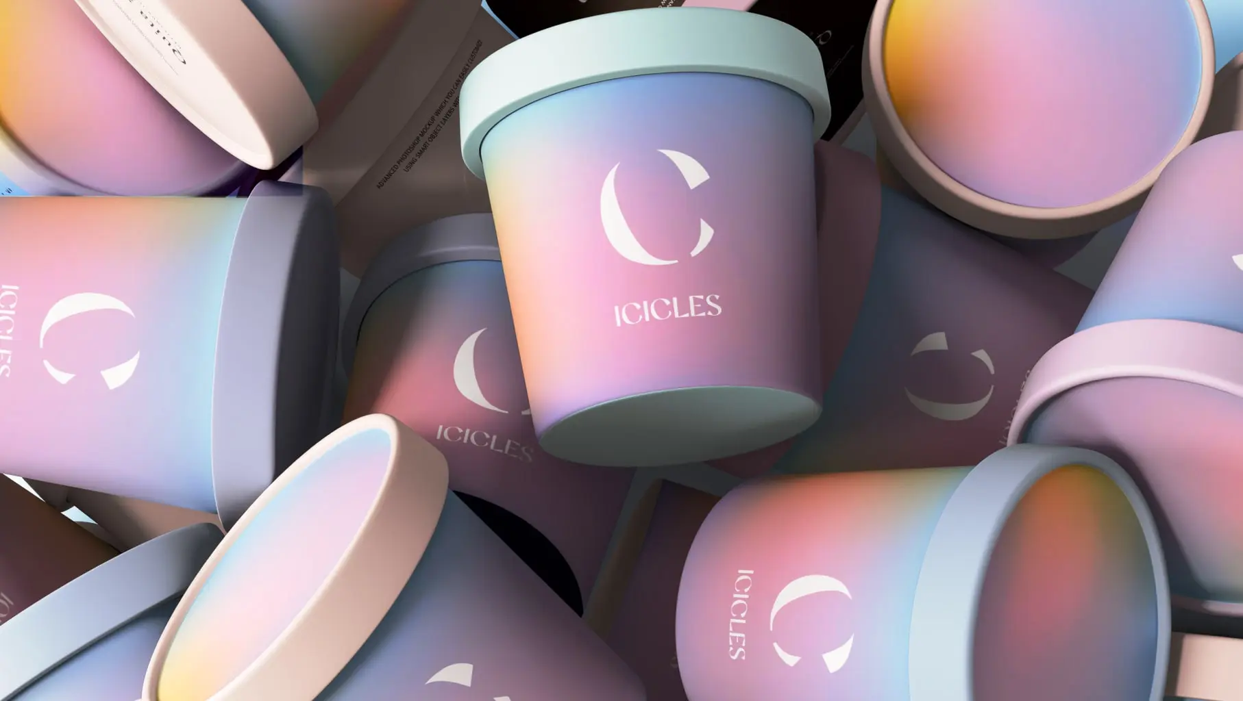
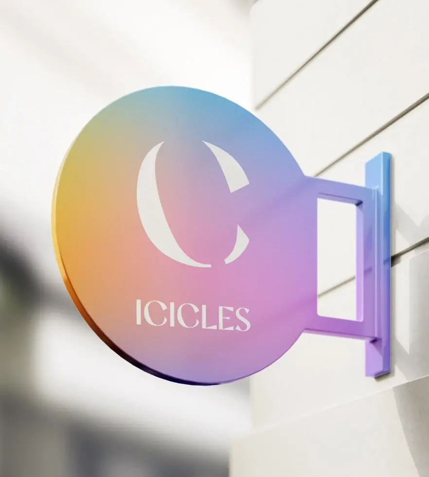
- Logo and Icon Design: The brand mark is elegant and layered with meaning. Within the minimalist typeface, the letter C subtly reveals a popsicle silhouette, symbolizing both the mystery and delight of the product. This hidden detail becomes a signature that is instantly recognizable and visually satisfying.
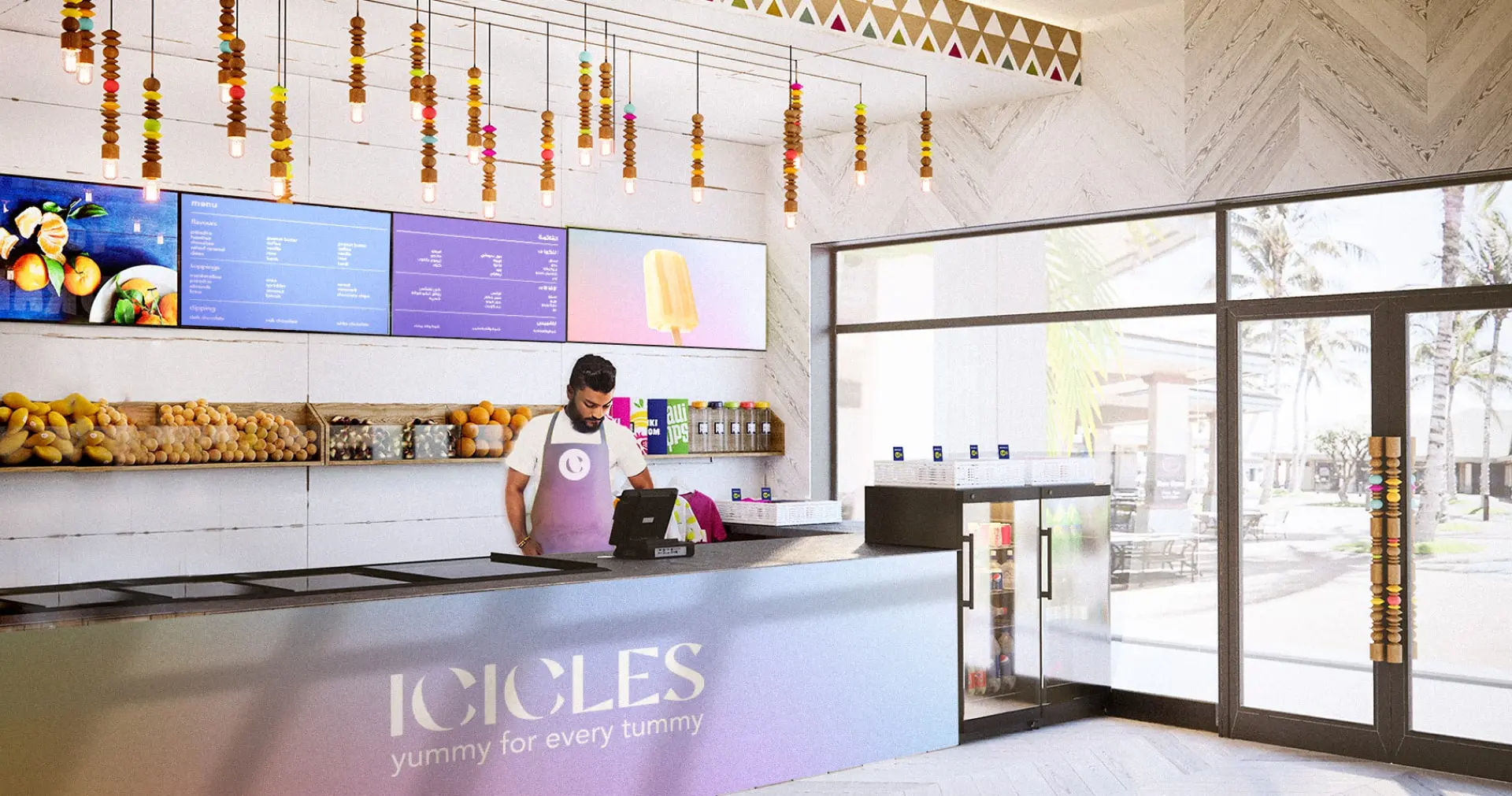
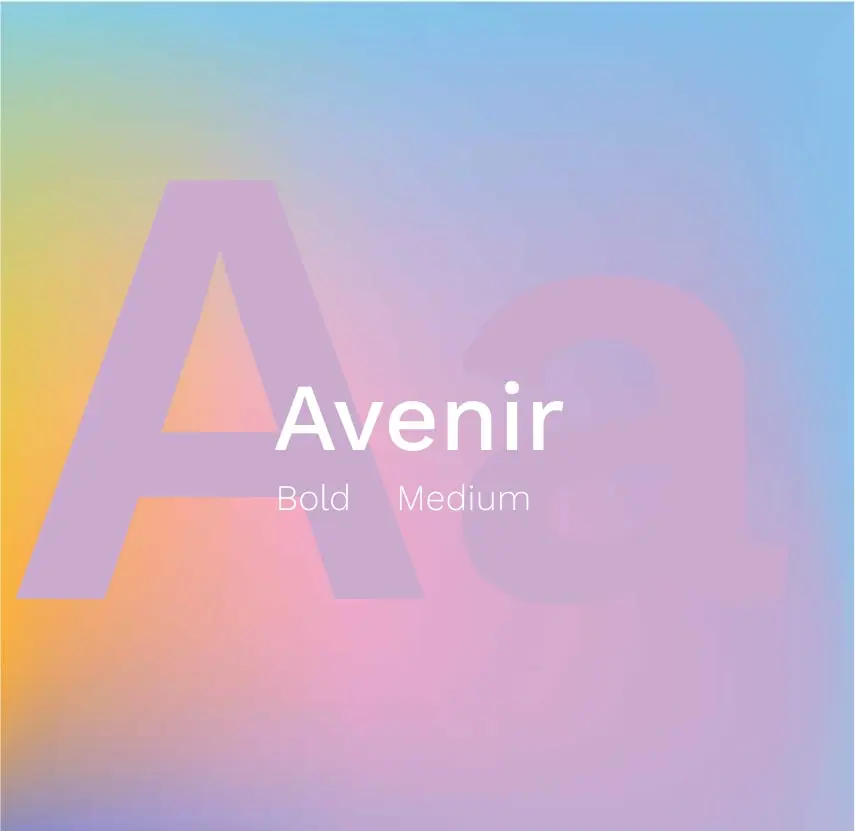
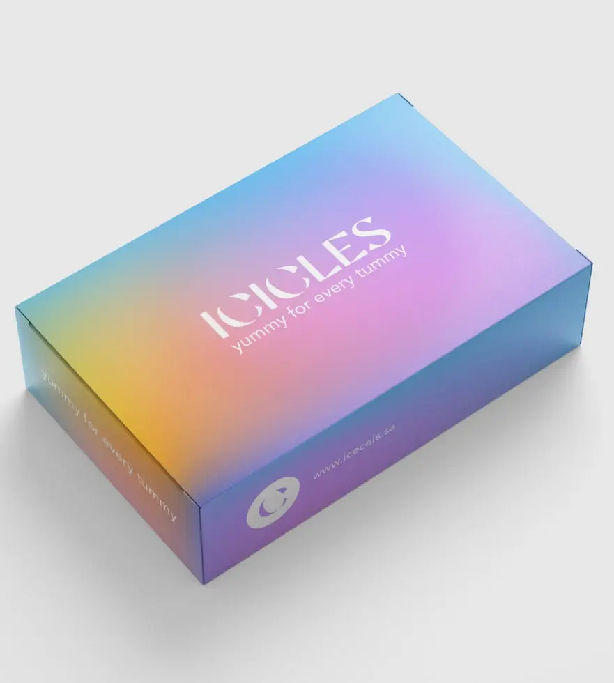
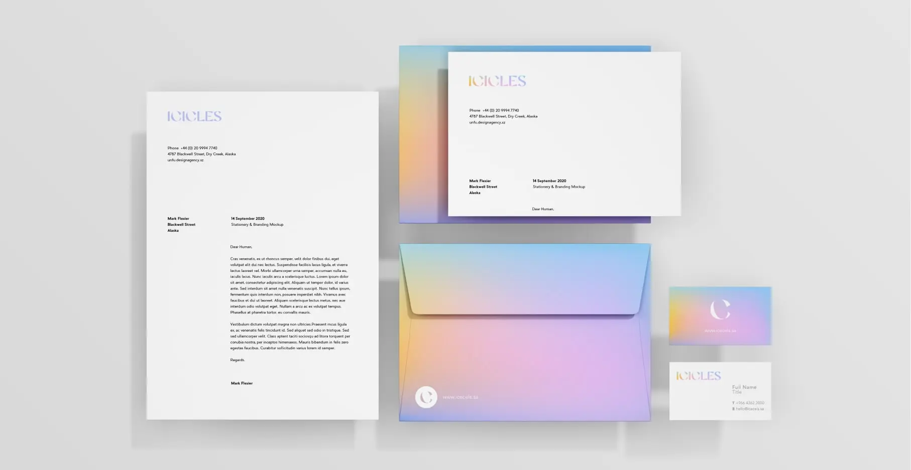
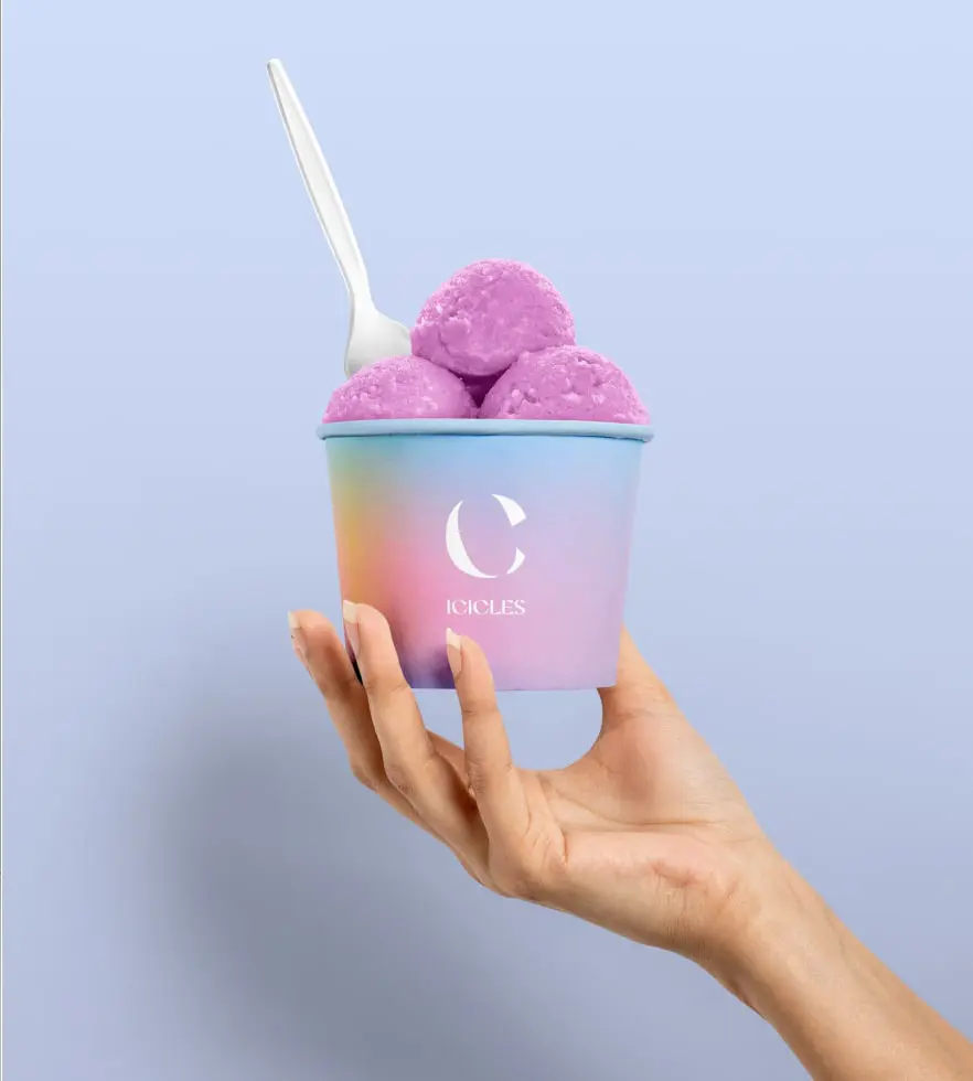
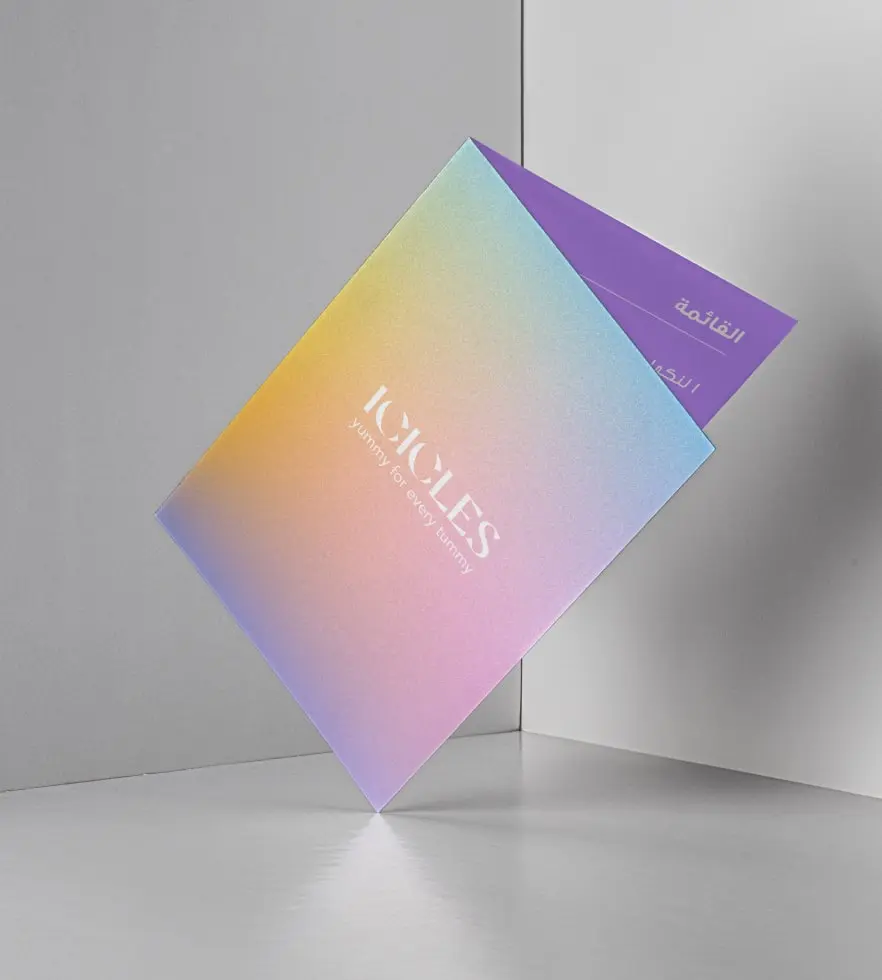
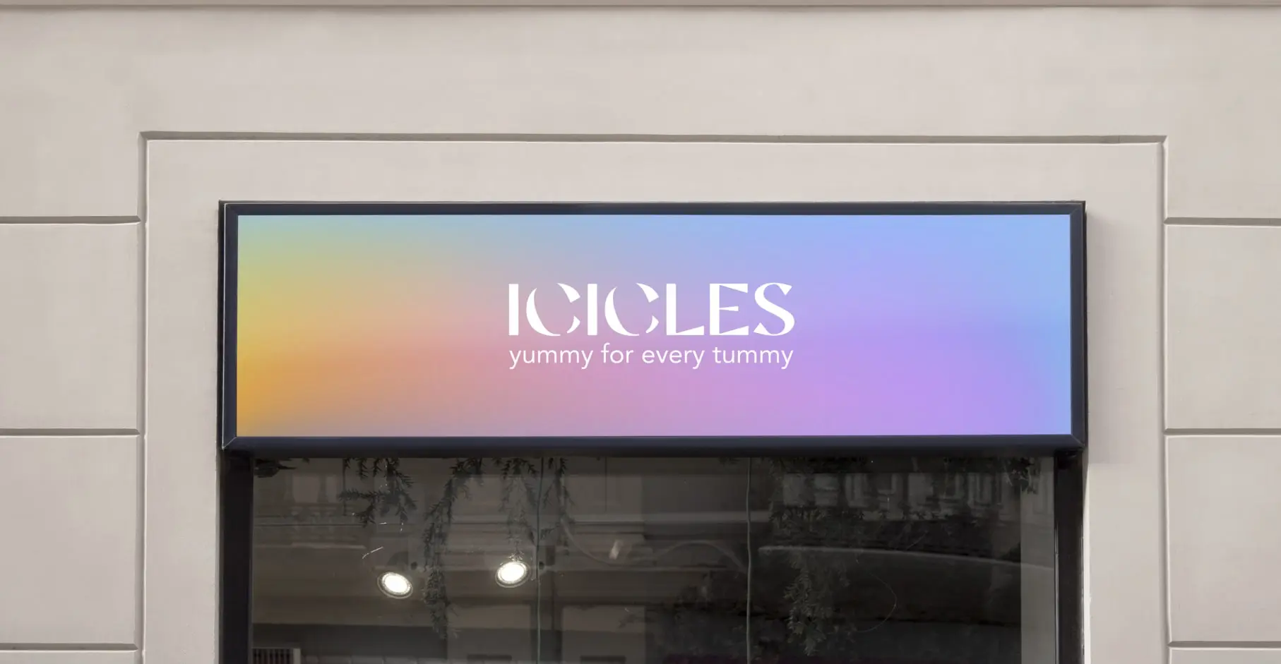
- Visual Language: The identity plays with cool tones, glacier-inspired textures, and sleek typography. Together, these elements evoke the freshness of ice and the warmth of indulgence, making the system adaptable for packaging, signage, and digital platforms.
- Narrative Positioning: Icicles are more than just ice cream. It is an elevated emotional treat and a story of four creators coming together to deliver a product born of passion, craft, and a shared love for popsicles.
- Tone of Voice: Playful yet polished. Every message is infused with delight, surprise, and gratitude for the ice cream community. The tone welcomes all lovers of frozen moments with expressions such as:
"We appreciate all ice cream lovers."
"Spectacular happiness, one popsicle at a time."

_1637498230.jpg)