"Can a bag of frozen peas feel like it was made with love?"
That was the question behind Meeda. Frozen food is bought fast. A shopper opens the freezer door, scans a wall of bags and boxes, and decides in seconds. Most brands in that aisle compete on price and look almost the same. Very few give you a reason to care.
Meeda is a new Saudi frozen food brand, and we built it from nothing: the name, the strategy, the identity and a packaging system that covers fruit, vegetables, poultry, seafood, oils and dairy. Here is how we did it, in the order it happened, and what other food brands in Saudi Arabia, Egypt and the wider MENA region can take from it.
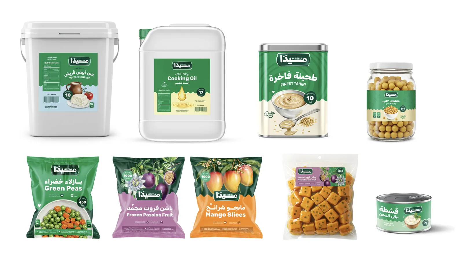
The Meeda range: from 170 g cans to 17-litre oil containers, one brand family.
The brief: a new name in a crowded freezer
Meeda sells premium frozen poultry, seafood, vegetables and fruit, alongside staples like butter, ghee, cooking oil, tahini and dairy. It serves two very different customers. Families buy it in the supermarket. Restaurants, caterers and grocery stores buy it in bulk.
The brand had to do four things at once. Stand out in a category led by established players. Speak to a home cook and a professional kitchen without sounding confused. Feel Saudi, but modern. And give a growing range room to expand without a redesign every time a new product arrives.
Strategy first: who Meeda cooks for
We started with a person rather than a product. At first we pictured a smart mother who cares about what her family eats and wants good food that saves her time and money. That picture was true, but too narrow. Plenty of people cook for someone they love: fathers, young professionals, and chefs in busy restaurant kitchens. So the idea grew into something anyone can share: food made with care, made easier.
"To be a globally recognized leader in frozen food solutions, delivering high-quality, convenient, and nutritious products to households and businesses worldwide."Meeda brand vision
Five values support it: quality, convenience, trust, innovation and sustainability. We then set three working principles for everything we designed. Authenticity, so the brand celebrates Saudi flavours. Clarity, so shoppers find what they need quickly. Scalability, so the system holds up across every category.
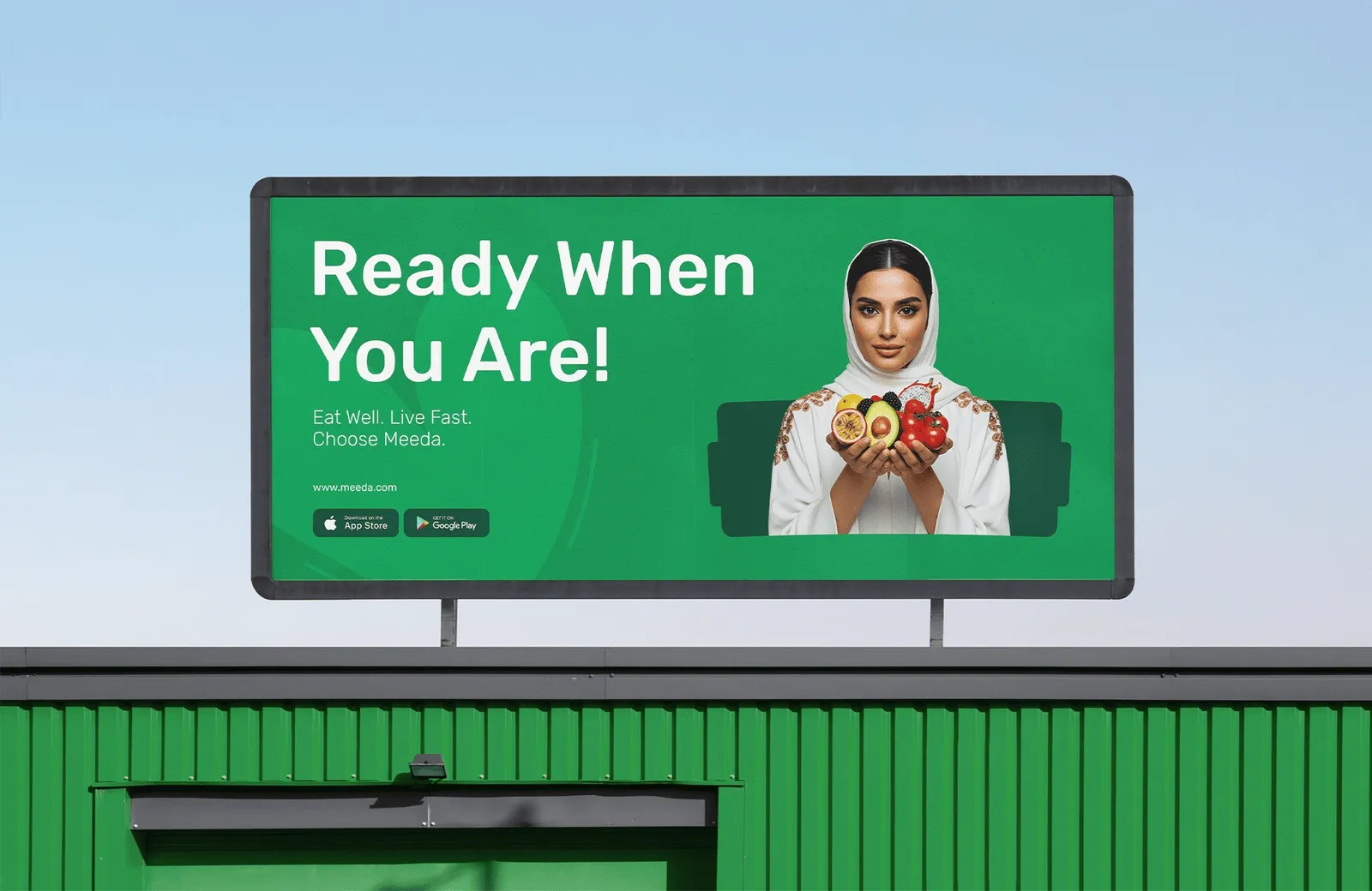
We also defined how Meeda behaves. It looks warm, playful and fresh. It speaks in a conversational, upbeat and welcoming way. And it thinks quality first, keeps innovating, and stays focused on its community. The campaign line sums it up for busy people: Ready when you are. Eat well. Live fast. Choose Meeda. (Our guide to brand positioning explains this stage in more detail.)
The identity: name, logo, color, illustration and photography
With the strategy clear, we built the pieces that people actually see. Each one had to feel warm and still work hard in a cold aisle.
A name that sounds like home
We named the brand Meeda, ميدا in Arabic. The name comes from Meda, a feminine name of Greek origin, and it carries the idea at the heart of the brand: the smart, sharp-minded mother who helps her family grow as strong as a crashing wave.
Meda is also a short form of Halimeda, a name tied to the calm and mystery of the ocean. That wave never left the brand. You can see it in the soft, wavy edge that runs across every Meeda pack. And for anyone who likes a hidden meaning, the letters also stand for Modern Eatery Delights.
Just as important, the name is short, warm and easy to say in Arabic and English. That matters for a brand that talks to Saudi families, expatriate shoppers and restaurant buyers at the same time.
A logo you can spot through frosted glass
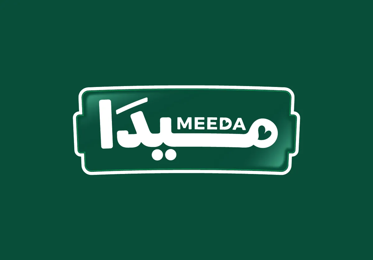
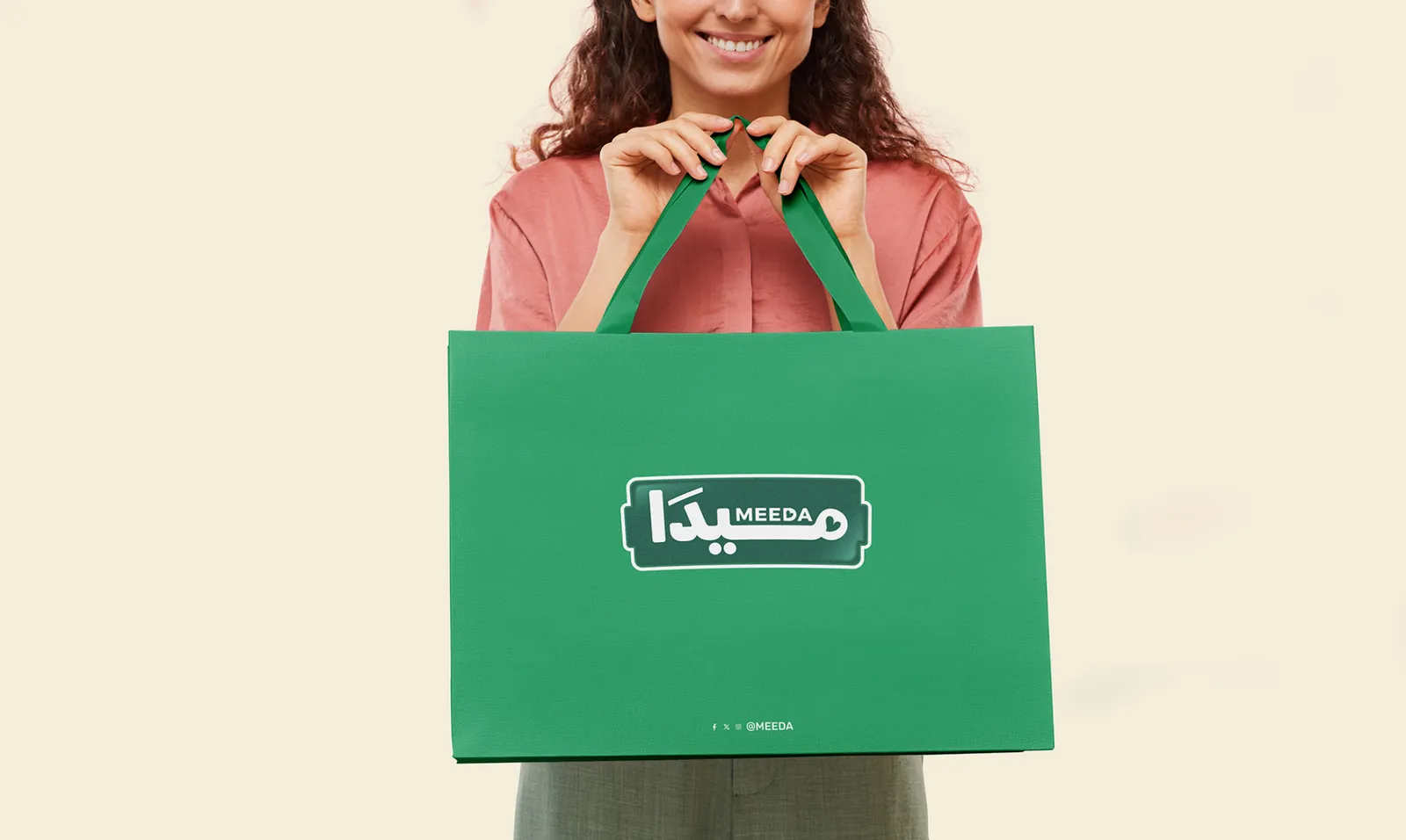
The logo sets the Arabic name in bold, rounded letters inside a green badge, with MEEDA in small English letters above. The opening letter, م, curls into a small heart, a quiet nod to food made with love. The badge works like a stamp: it sits in the same place on every pack, so the brand is easy to find even through a frosted freezer door.
Green for the brand, the food's own colors for the range
Deep green is Meeda's anchor. It stands for freshness and gives the whole range one strong color block in the freezer. Around it we built a food palette of 21 colors, each with its Pantone reference: mango orange, passion fruit pink, shrimp blue, olive green, soft gold and more. Every product borrows the color of the food inside it, which makes the range easy to shop without losing its family look.
The palette in motion: 21 colors drawn from the food itself.
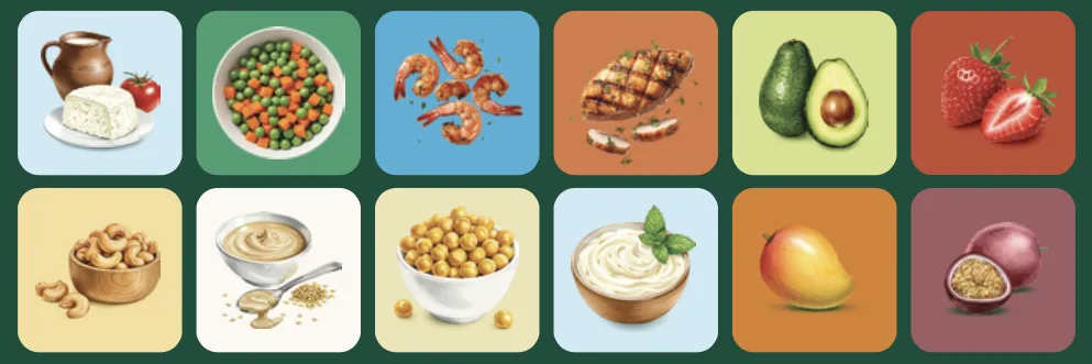
Each product also has its own illustration: cottage cheese, peas, shrimp, chicken, avocado, strawberries, cashews, tahini, chickpeas, cream, mango and passion fruit. The illustrations are detailed and warm, closer to a recipe book than a catalogue, and they work as icons on the app, on social media and on stationery.
One typeface, natural photography
We used one typeface, Rubik, for both Arabic and English. Its rounded shapes match the logo and keep bilingual packs balanced. We wrote more about pairing the two scripts in our guide to bilingual Arabic brand identity.
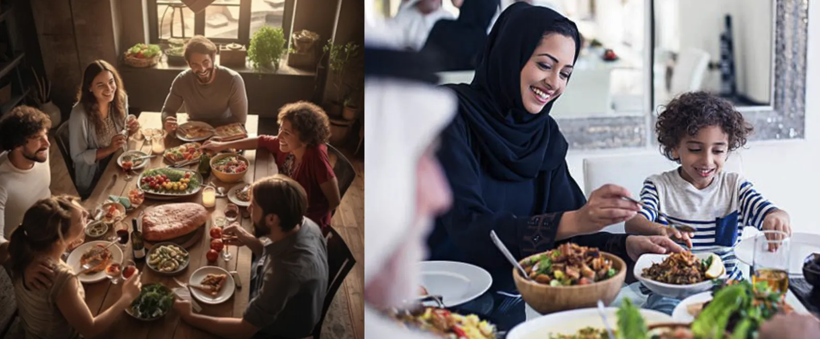
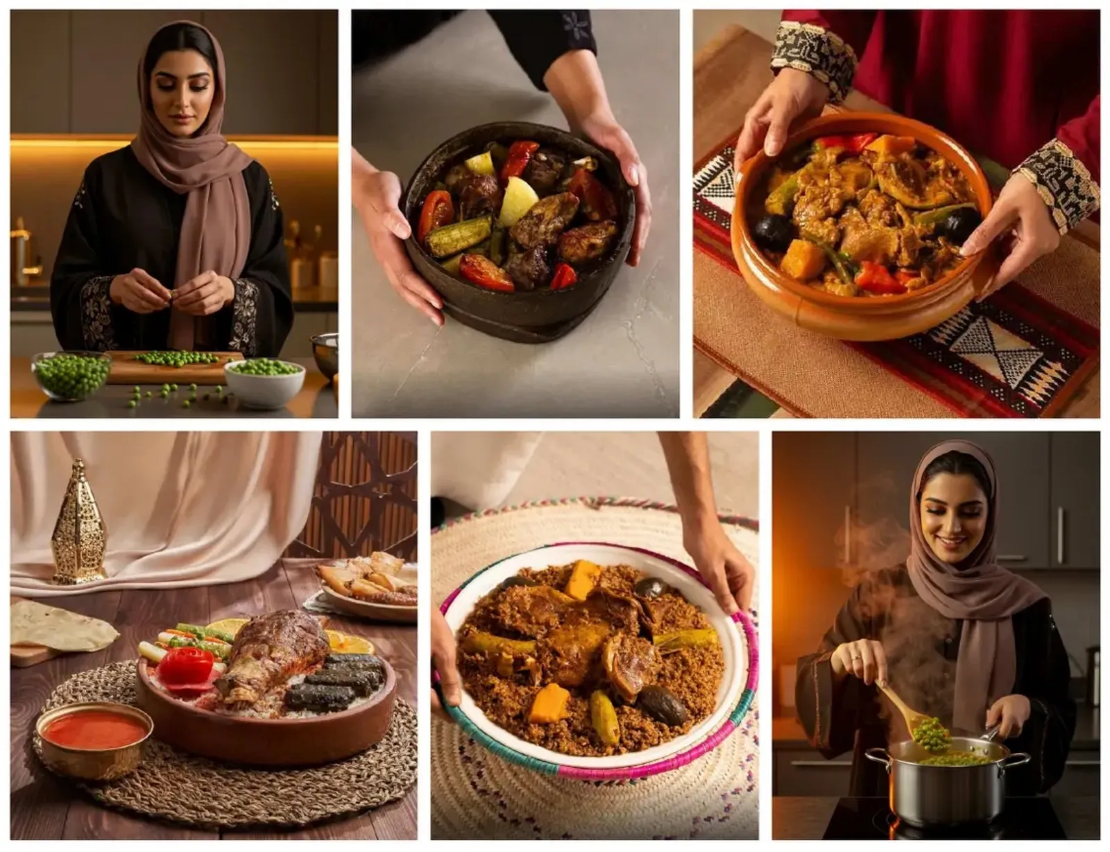
For photography, the rule is simple: natural light, real people and real home cooking. No over-styled, over-edited shots. Meeda should look like the food you would actually make for the people you love.
Frozen food packaging design: one system, every SKU
Packaging was the biggest job. Meeda starts with a wide range, and new products are always coming. Designing each bag separately would have made the brand harder to find with every launch. So we designed one system instead.
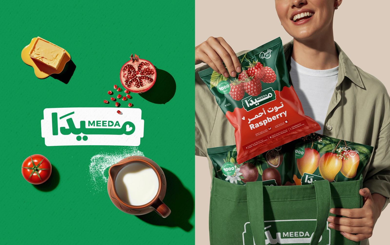
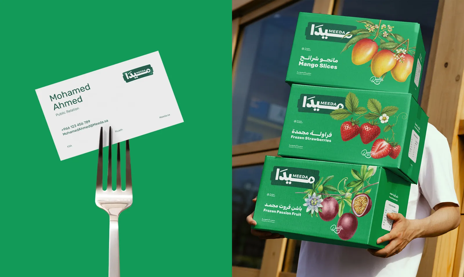
Every pack follows the same structure. A deep green top carries the food image and the logo badge. A wavy edge leads into a band of the product's own color, where the name sits in Arabic and English. Weight, "no preservatives" and origin details always sit in the same place, and so does the nutrition panel on the back.
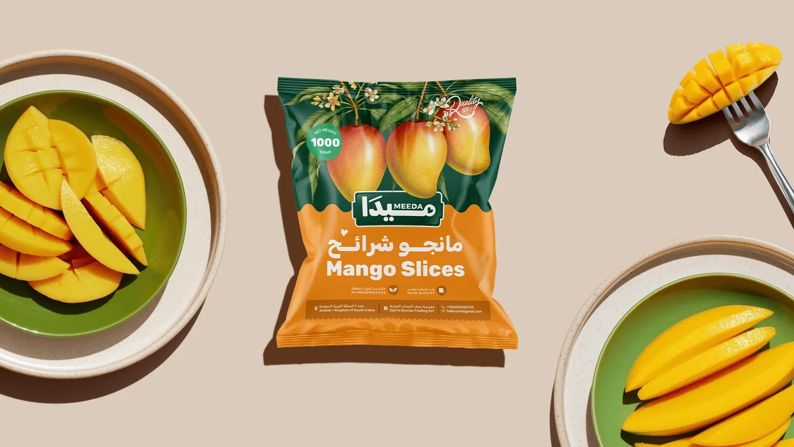
The result is a range that looks like one family from across the aisle, while each product is easy to spot up close. Shrimp gets a bright blue, raspberry a strong red, passion fruit a soft pink, mango a warm orange. A shopper learns the system once and uses it every time.
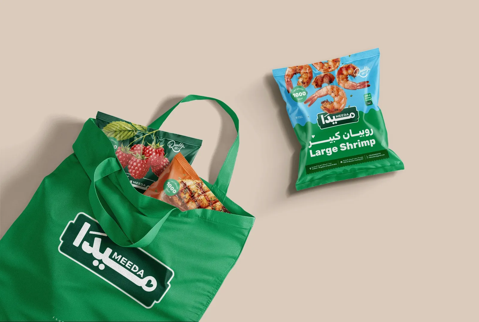
The same system scales to other formats and to the professional customer. A 170 g can of cream, a 450 g bag of peas, a 570 g jar of chickpeas, a 10 kg tin of tahini and a 17-litre container of cooking oil all share the badge, the wave and the naming style. Shipping cartons for restaurants and stores carry the same illustrations. A chef and a parent see the same brand.
Beyond the pack: from the app to the apron
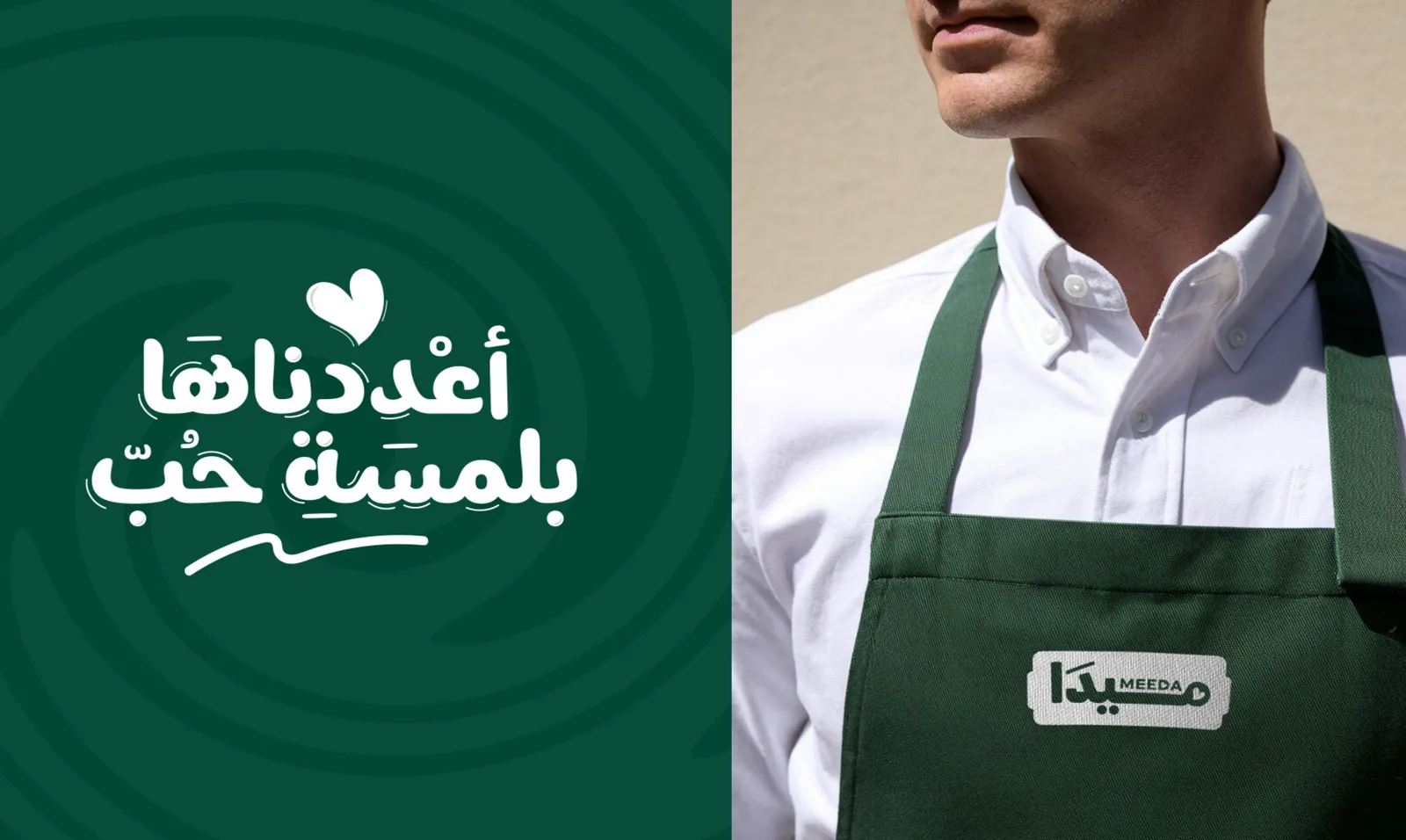
Customers meet Meeda long before they reach the freezer. So the brand carries one simple promise everywhere: أعددناها بلمسة حب, "we made it with a touch of love". You see it on staff aprons and t-shirts, in-store displays and the side of every delivery truck.
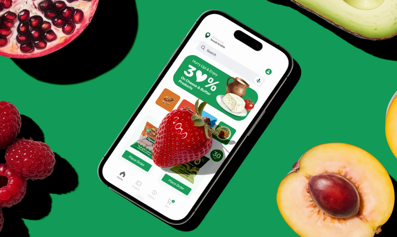
Meeda also sells through its own app, so the identity had to work on a phone screen as well as a freezer door. The app uses the same green, illustrations and friendly tone, with offers and quick reordering for busy households. On social media, the voice stays light and helpful, with lines like مع ميدا كل شيء أسهل, "with Meeda, everything is easier".
Keeping it consistent: the brand guidelines
A system only works if everyone follows it, from the in-house team to the printer to the next agency. We gave Meeda a full brand guidelines book in six chapters: overview, logo, colors, typography, photography and applications.
It sets the logo's clear space and minimum sizes (1 cm in print, 1.2 inches for embroidery, 16 px for a favicon) and lists six mistakes to avoid: adding colors, strokes or shadows, and flipping, stretching or rotating the logo. The applications chapter shows every pack, uniform and vehicle, so new products can be added with confidence.
What other food brands can take from this
Meeda now has a distinctive name, a range that looks like one family, and a system ready for many more SKUs. Four lessons apply to almost any food or FMCG brand:
- Design for the five-second decision. In the freezer, recognition beats decoration. Fix the layout and let the food do the talking.
- Start with a person, then widen the circle. A clear customer makes every choice easier. A generous one lets the brand grow.
- Let the product pick the color. A core brand color plus a food-led palette makes big ranges easy to shop.
- Build for the next SKU. If a new product needs a new design, the system isn't finished yet.
If you're working on packaging for a heritage product rather than a new brand, read how we approached premium date packaging for Rajhia Dates.
Food branding for Egypt, Saudi Arabia and MENA
Meeda is a Saudi brand, designed by our team in Cairo. That mix is how Generator works. We are a branding agency based in Egypt, working with food, retail and industrial brands in Saudi Arabia and across the Middle East and North Africa.
The lessons travel well. Egyptian food producers preparing for Gulf shelves face the same freezer-door moment as Saudi brands at home. Regional brands entering new markets need names and packaging that work in Arabic and English from day one. In every case, the order is the same: know who you're cooking for, name it well, then build a packaging system that grows with you.
If you're comparing agencies, start with our guide on how to choose a branding agency in Saudi Arabia, Egypt and the UAE, or see what a brand identity design company actually delivers.
Common questions
How do you design frozen food packaging that stands out in the freezer?
Shoppers look into a freezer for a few seconds, often through frosted glass. Use one strong brand color and a fixed layout across the range so the brand is easy to spot, then a large, appetising food image and a clear product name so each item is easy to find. Keep the back of pack just as organised.
How do you design packaging for both retail and foodservice?
Build one system that works at any size. For Meeda, the same badge, wave and naming style run from a 170 g can of cream to a 17-litre container of cooking oil and bulk shipping cartons, so restaurants and families recognise the same brand.
Should a Saudi food brand use Arabic or English on its packaging?
Usually both. Meeda leads with Arabic for the logo and product names, with English alongside for expatriate shoppers, foodservice buyers and future export.
Do you offer brand naming as well as packaging?
Yes. We named Meeda before designing its identity and packaging, building the name on the idea of a caring, clever mother. Naming, strategy, identity and packaging are all handled by the same team at Generator.
Do you work with food brands in Egypt, Saudi Arabia and the wider MENA region?
Yes. Generator is a branding agency based in Cairo, working with brands in Egypt, Saudi Arabia and across the Middle East and North Africa on brand strategy, naming, identity and packaging design.
Can shoppers find you in five seconds?
If not, that's where we start. Generator helps food brands in Egypt, Saudi Arabia and across MENA find their voice, name it well and design packaging that sells on the shelf. It would be a pleasure to hear what you're working on.
See the Meeda Project Start a conversationGenerator Design Agency · Cairo, Egypt · Working across Egypt, Saudi Arabia & MENA · See more work · Our services