"A brand can look perfect on launch day and fall apart six months later."
We've watched it happen more times than we can count, and it's almost never one big mistake. The logo gets stretched to fit a presentation. Someone picks a slightly different red because it "looks closer." The social team swaps the font because the original isn't installed on their laptop. A printer in Riyadh places the Arabic and English logos one way, and a printer in Cairo places them the other way. Then a new agency comes in and starts deciding based on what feels right to them.
None of these decisions feels serious on its own. Together, they quietly take the brand apart. That's what brand guidelines services are really for. Not a polished PDF that sits in a shared folder, but a working system that lets designers, marketers, developers, printers and other agencies make the right call without the original designer in the room. As a branding agency working across Egypt, Saudi Arabia, the UAE and the wider MENA region, this is the part of the job we care about most, because it decides whether a brand survives growth.
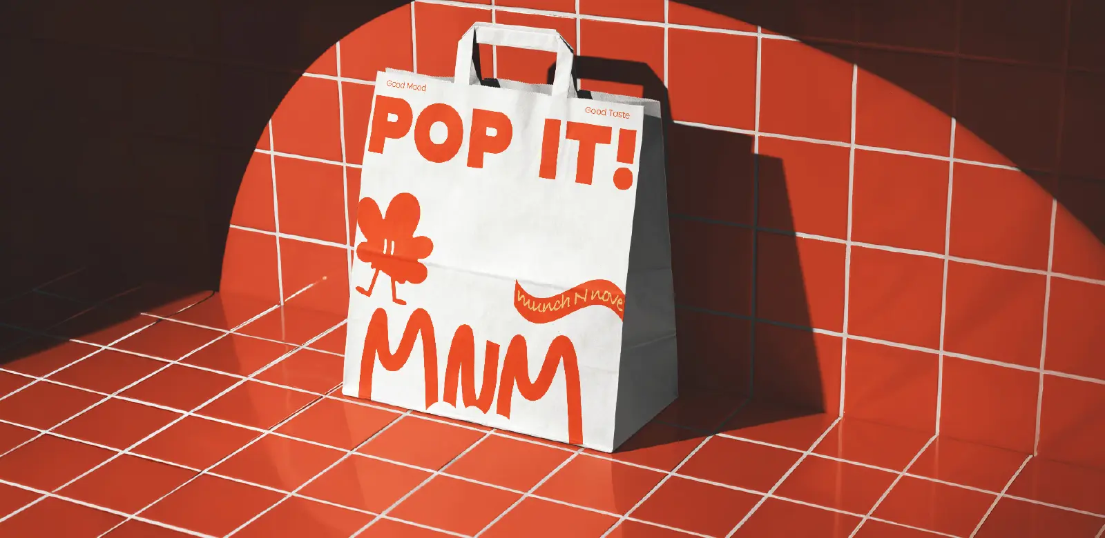
MnM: a playful popcorn brand whose guidelines keep the energy high on every bag, cup and poster.
A brand guideline is not a logo manual
This distinction matters more than most people expect. A logo manual tells you where the logo can go, how much clear space it needs and which versions are allowed. Useful, but limited.
A complete brand guideline answers a much bigger question: how should this brand behave when the people who designed it are no longer approving every file?
| Area | Logo manual | Complete brand guidelines |
|---|---|---|
| Logo | Versions and clear space | Lockups for real situations, sub-brands and partners |
| Colour | A list of codes | Hierarchy, proportions and combinations to avoid |
| Typography | Font names | Hierarchy in Arabic and English, for print and screen |
| Visual language | Not covered | Photography, illustration, icons, grids and motion |
| Voice | Not covered | Personality and examples in both languages |
| Applications | A few mockups | Signage, uniforms, packaging, web, social and templates |
| Who can use it | The original designer | Anyone your brand works with |
What belongs in your document depends on your business. A single-location restaurant doesn't need the governance of a Saudi holding company with several subsidiaries. An events company needs different rules from a manufacturer producing site signage, safety helmets and tender documents. If an agency sells the same 60-page template to all of them, most of those pages are decoration.
The test: can a stranger use your brand correctly?
Here's the simplest test we know. Hand your guidelines to a designer, marketing manager, developer or printer who had nothing to do with the original project. Can that person create something new that still clearly belongs to your brand?
If the answer is no, the guidelines failed. It doesn't matter how beautiful the pages are. That's why our brand identity and design work is built as a system, not a set of approved mockups. Logo, type, colour, imagery and composition need enough structure to stay consistent, without forcing every future piece to look identical.
"Good guidelines draw the boundaries. Inside them, the brand should still have room to move."How we build brand guidelines at Generator
What professional brand guidelines include
There's no universal table of contents. But there are six areas we expect to solve on almost every project.
1. The brand foundation
Before explaining how a brand looks, explain why it exists: positioning, purpose, values, personality, audience and the idea behind the identity. This doesn't need 30 pages. It needs enough context that anyone using the system understands the decisions that follow. If your positioning hasn't been defined yet, that's a strategy problem, not a guidelines problem. Our brand strategy work sorts out that foundation before a single rule is written.
2. Logo rules that cover real situations
Primary logo, secondary lockup, symbol, wordmark, monochrome versions, minimum sizes, clear space. Those are the basics. The useful part is what happens when conditions aren't perfect. What goes on a busy photograph? What still reads at favicon size? Which lockup fits a narrow sign? How do partner logos sit next to yours? What happens when a government entity shares the same page?
When we built the guidelines for SABIT, a Riyadh-based bitumen and waterproofing manufacturer, we didn't just show the logo. We explained how the "S" is built from roof, wall and ground, the exact surfaces their products protect. Once a team understands the logic, they stop guessing.
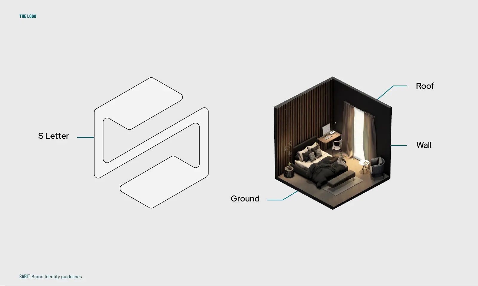
SABIT: the logo concept explained inside the guidelines, so every team understands why the mark looks the way it does.
3. A colour system, not just hex codes
Listing five colours is easy. Explaining how they relate is harder. Which colour leads? Which is only for accents? Which combinations should never appear together? How does the palette behave on screen versus in print? What does accessibility mean for contrast? Without hierarchy, a palette turns into five colours used at random.
For SustYnable, a sustainable lifestyle platform incubated in PepsiCo's Greenhouse Accelerator, we gave each of the platform's seven categories its own colour, so users could find their way through water, energy, mobility, waste and more by colour alone.
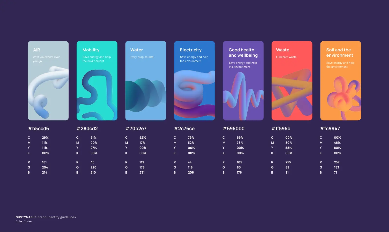
SustYnable: one colour per category, so the palette does navigation work, not just decoration.
4. Typography with hierarchy
Naming the approved fonts isn't enough. Guidelines should explain how type behaves in headlines, subheads, body copy, captions, numbers, presentations, interfaces and long documents. For brands in the Middle East, this matters even more, because Arabic and English can't be treated as visual copies of each other. We'll come back to this below.
5. A recognisable visual language
The strongest brands stay recognisable even with the logo removed. That recognition comes from the wider system: composition, photography, illustration, graphic devices, icons, grids and motion.
For WOTN, a 360° luxury event management company working from Riyadh and Cairo, we built a library of sculptural 3D forms that carry the brand across social media, company profiles, presentations, the website and even the office interior. You know it's WOTN before you see the name.
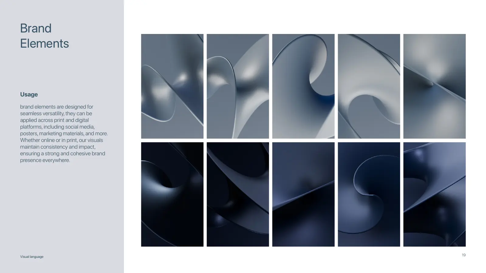
WOTN brand elements: the 3D forms behind every layout.
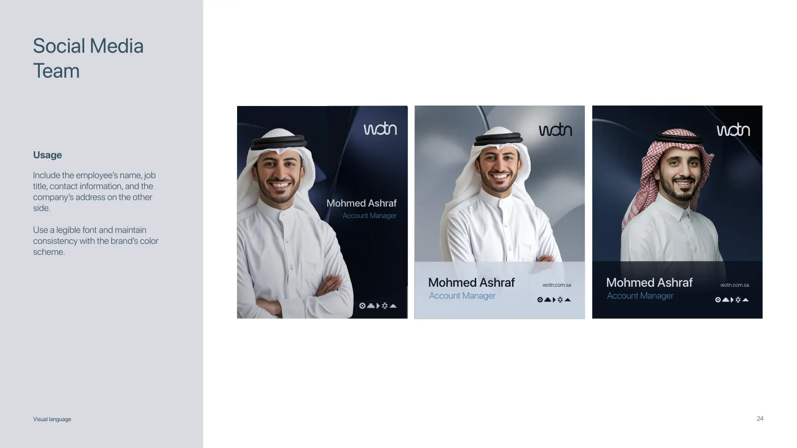
WOTN social: the same forms, applied to team posts.
6. Tone of voice
Visual consistency is only half the job. A luxury developer shouldn't sound like a youth gaming platform, and a cybersecurity company shouldn't talk like a café. Voice guidelines define personality, vocabulary, sentence style and real examples of what the brand would and wouldn't say, in both Arabic and English. The point isn't to script every sentence. It's to make the brand recognisable before anyone sees the logo.
How it looks
Logo, colour, type, imagery and layout, with clear rules.
How it speaks
Voice and vocabulary in Arabic and English.
How it thinks
Positioning and values every decision can be checked against.
Bilingual brand guidelines need more than translation
This is where a lot of regional brands break. The English identity gets designed first. Everything is approved. Then Arabic is added at the end, usually in a rush. The result technically has two languages, but it rarely feels like one brand.
For brands in Saudi Arabia, Egypt, the UAE, Qatar and the rest of the Gulf, Arabic and English should be designed as one system from day one. Good bilingual brand guidelines define:
- How the Arabic and English logos relate and lock up together
- Typeface pairing across both scripts
- Right-to-left and left-to-right layouts
- Bilingual hierarchy: which language leads, and when
- Mixed-script typography inside one line or headline
- Numeral conventions
- Arabic-specific spacing and line height
- Messaging principles in both languages
For NLC, a Saudi lighting manufacturer, the Arabic typeface Lama Sans sits beside Bizmo for English, with matching weights from light to bold. On Omora, a brand built around the bond between mother and child, Alexandria carries the Arabic side with the same warmth as the English.
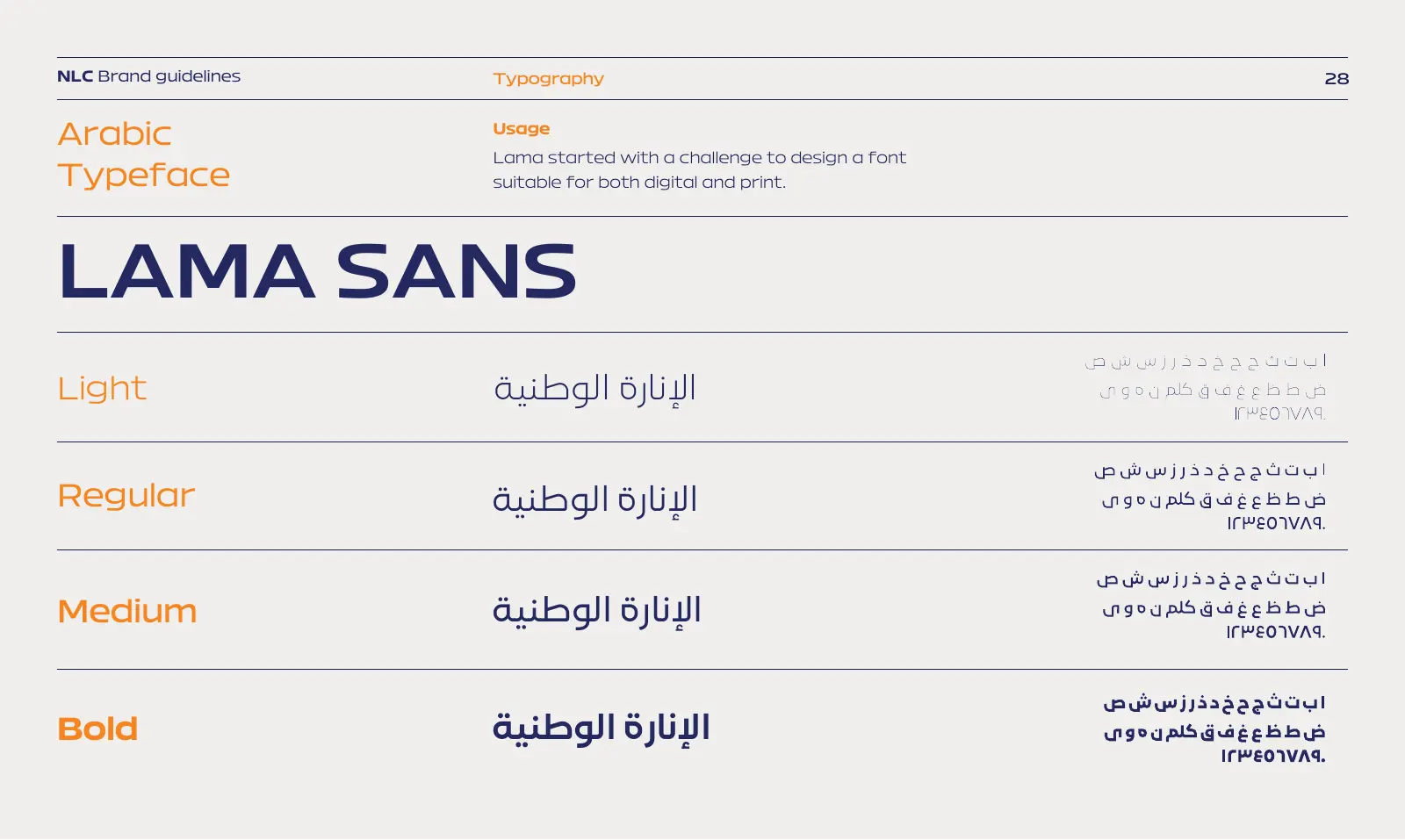
NLC: Lama Sans for Arabic, matched weight for weight.
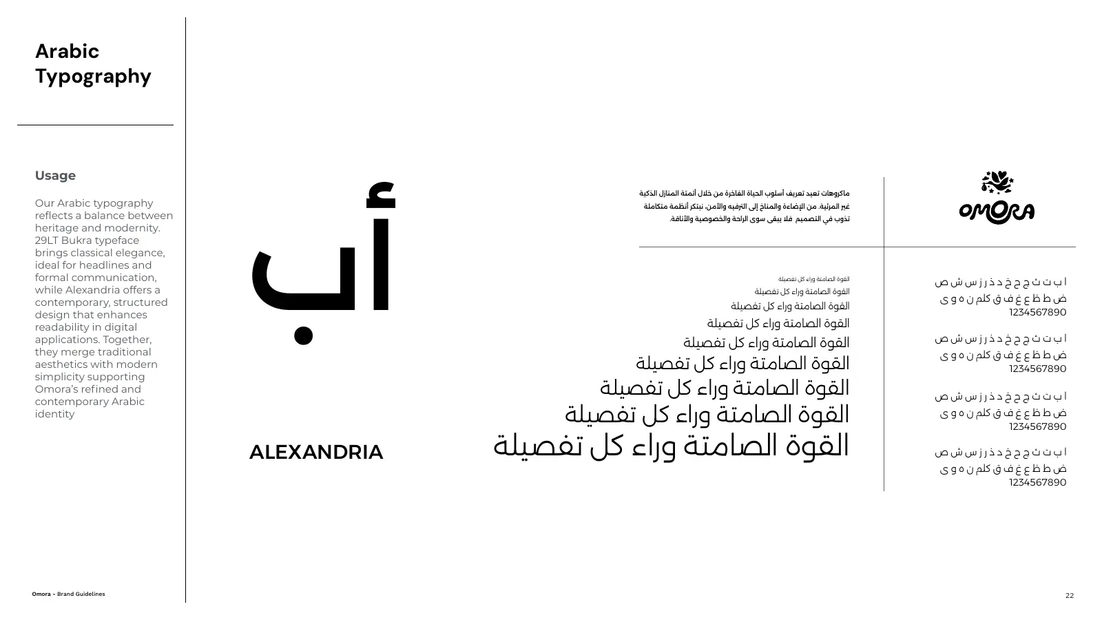
Omora: Arabic type rules with the same warmth as the English.
Translation keeps the meaning. A bilingual brand system also has to keep the character. We go deeper into this in our guide to Arabic logo design and bilingual brand identity.
Brand architecture: when one logo has to hold a family
A founder can personally approve every Instagram post when the company has four employees. That stops working at 400. Growth brings more people into brand decisions: marketing, HR, sales, agencies, developers, franchisees, distributors, printers, event suppliers and regional offices. Every new person is another chance for interpretation.
For groups with several businesses, there's another layer. You need brand architecture: clear rules for how the parent company, subsidiaries, products and future entities relate to each other. Without it, most groups do the same thing. They take one logo and recolour it for every subsidiary. It looks tidy for a year, then it stops scaling.
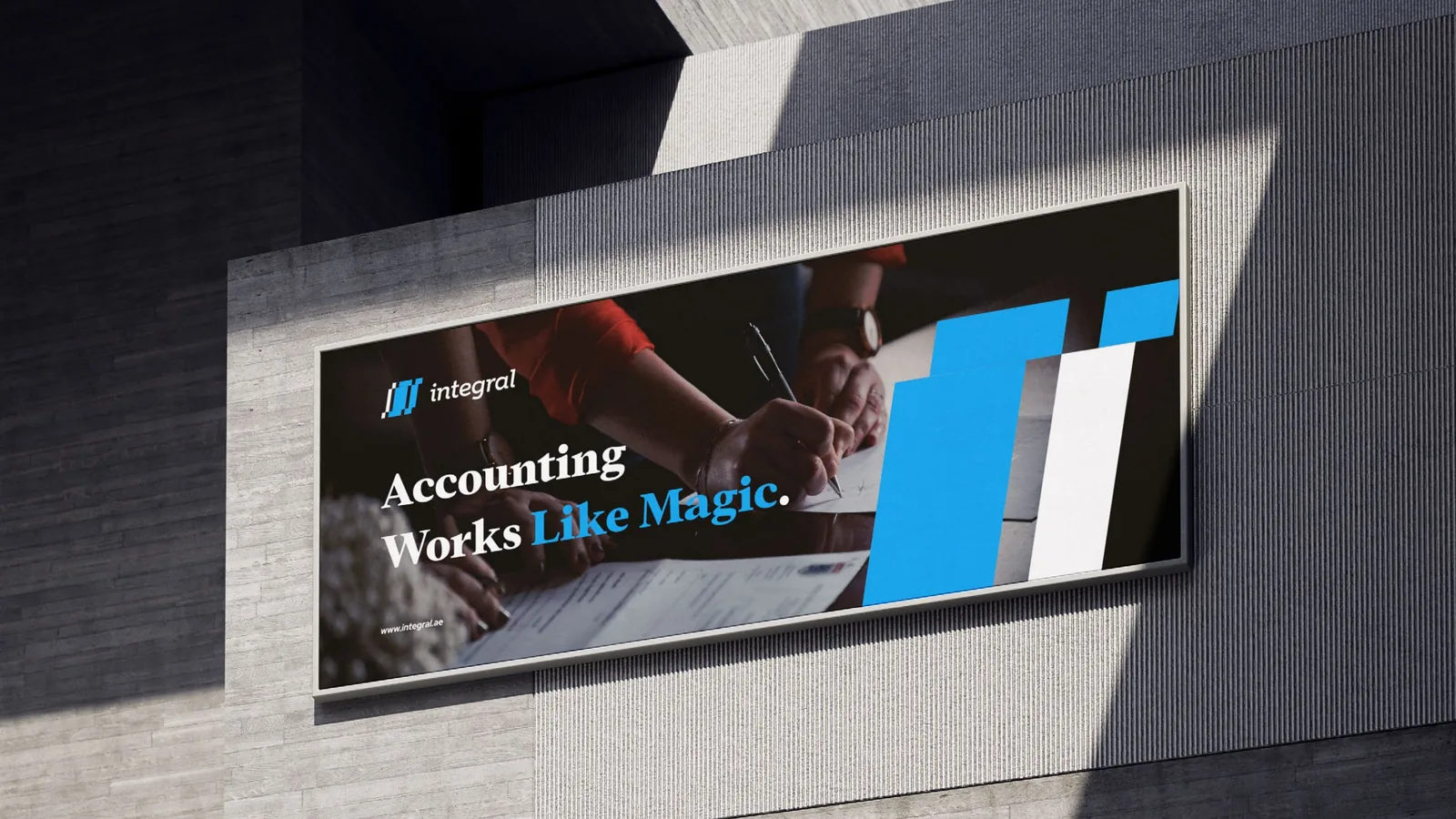
We built exactly this kind of system for Integral, a Dubai accounting firm with three colour-coded service brands, and we see the same need with holding companies in Saudi Arabia. You can see it in EGi too, where one master identity carries its sub-brands Slang, Squad and Gaming, each with its own role but clearly part of the same family. (More in our piece on building one identity across a growing business.)
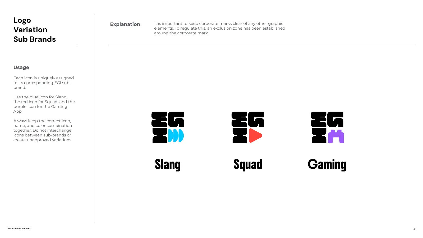
EGi sub-brands: one master identity, three sub-brands, one family.
Brand guidelines we've built across MENA
The most useful pages in a brand manual are rarely the prettiest ones. They're the rules that stop expensive mistakes. Here's what that looked like on real projects across Saudi Arabia, Egypt, Iraq and Kuwait.
Athman Holding: architecture for a Saudi investment group
Athman is a Saudi holding and investment company with more than four decades of cumulative investment experience. The identity had to carry that legacy and still work as a clean system across its subsidiaries. We led research, benchmarking, brand concept, development, brand architecture and web design, then documented logo, typography, colour, imagery and tone of voice so the group can keep adding entities without the brand drifting.
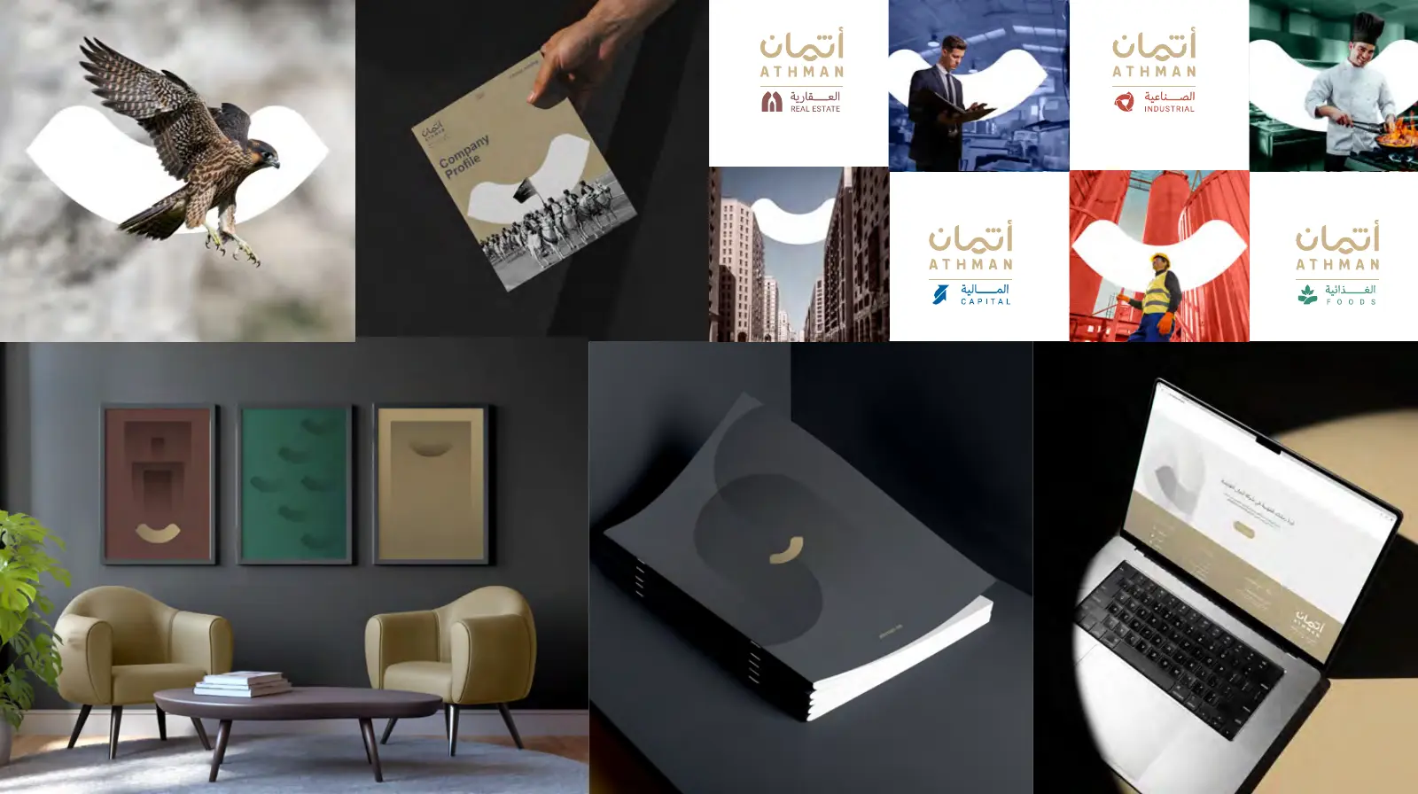
Athman Holding: one identity, built to carry a growing family of companies.
Insha'at and VCC: construction brands that live on site
Construction brands don't live on Instagram. They live on site boards, tender documents, uniforms, safety gear and RFP decks, often produced by suppliers who never met the designer. For Insha'at Contracting, a main contractor building residential, commercial and infrastructure projects, we created the brand concept, website, company profile and a full brand manual covering logo use, typography, layouts and voice. For VCC, a Saudi construction and manufacturing brand, the guidelines keep site boards, signage, digital tools, safety apparel and print in the same family.
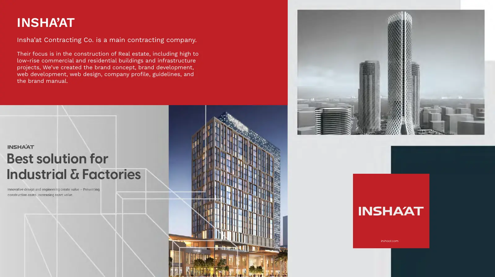
Insha'at Contracting: corporate materials and signage from the same brand manual.
NLC and SABIT: industrial brands, bilingual by default
Manufacturers need their brand to hold up on a helmet, a delivery truck, a product box and a website, in Arabic and English, all at once. NLC's guidelines go from the logo concept all the way to vests, helmets, packaging, LinkedIn and presentation templates. SABIT's manual covers bilingual billboards, trucks, product paint tins, flags and the website's product pages, so their team in Riyadh and their suppliers work from the same rules.
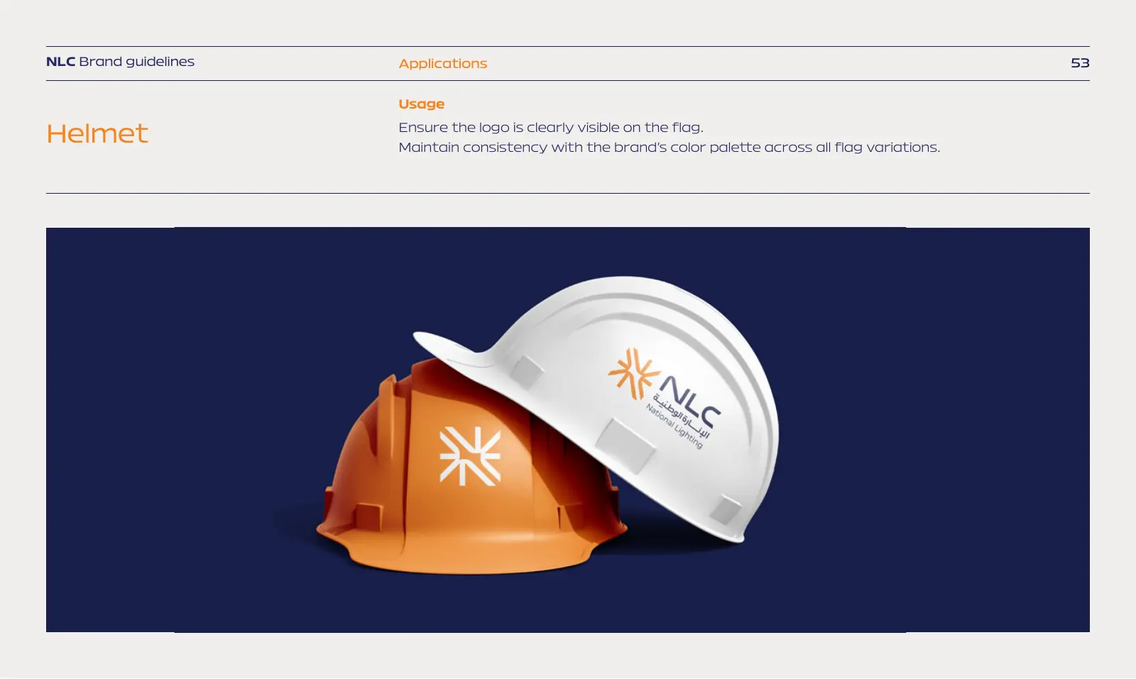
NLC: the identity on site equipment.
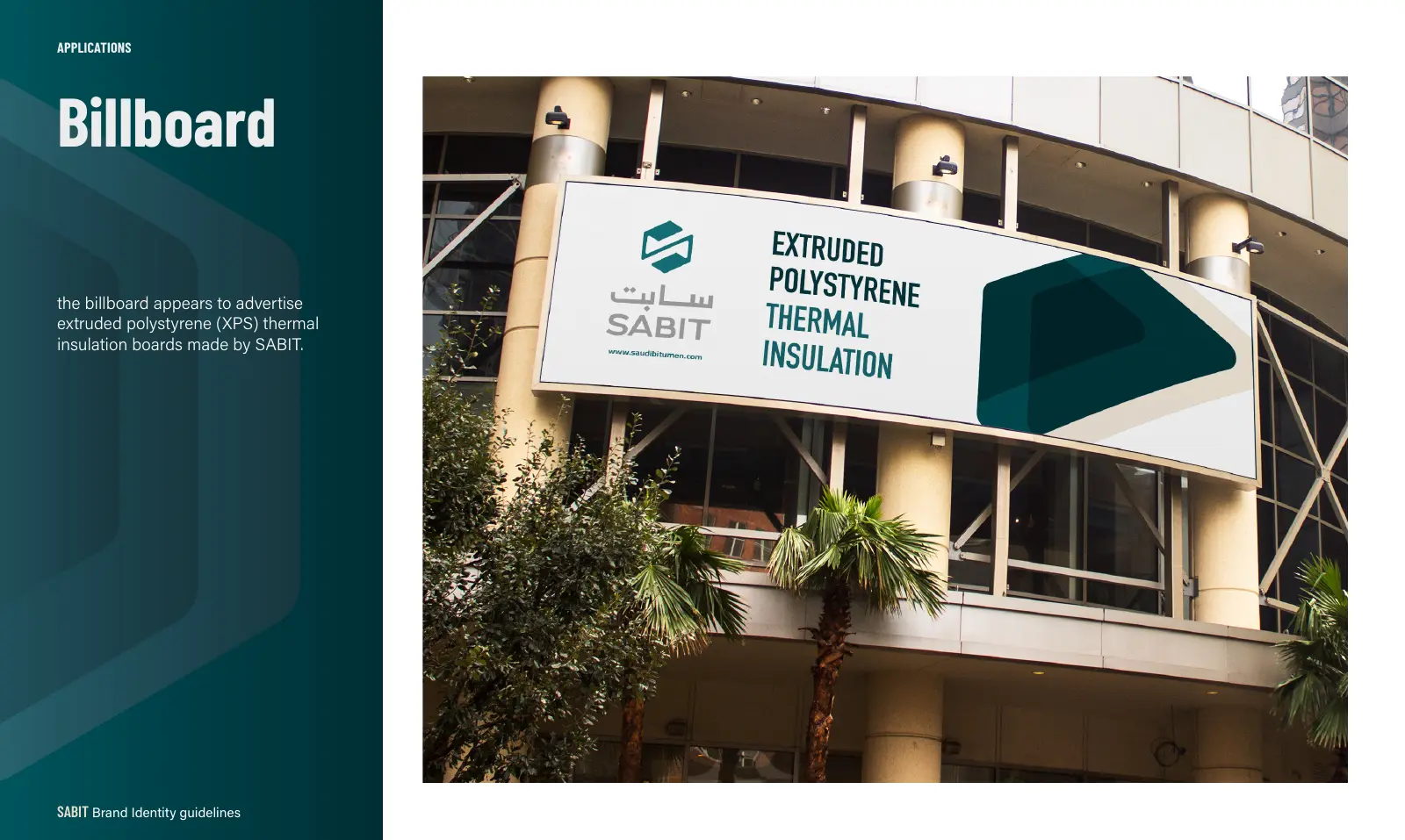
SABIT: a bilingual billboard, straight from the manual.
Al-Zomra: Egyptian culture, made for kids
Al-Zomra is the first Egyptian brand built to bring authentic Egyptian culture to children. It needed to feel playful without losing its cultural roots, across packaging, merchandise, digital content and learning tools. We created the identity, copywriting, brand guidelines and brand manual, including an illustration system drawn from Egyptian landscapes and symbols, so every new product feels like part of the same world.
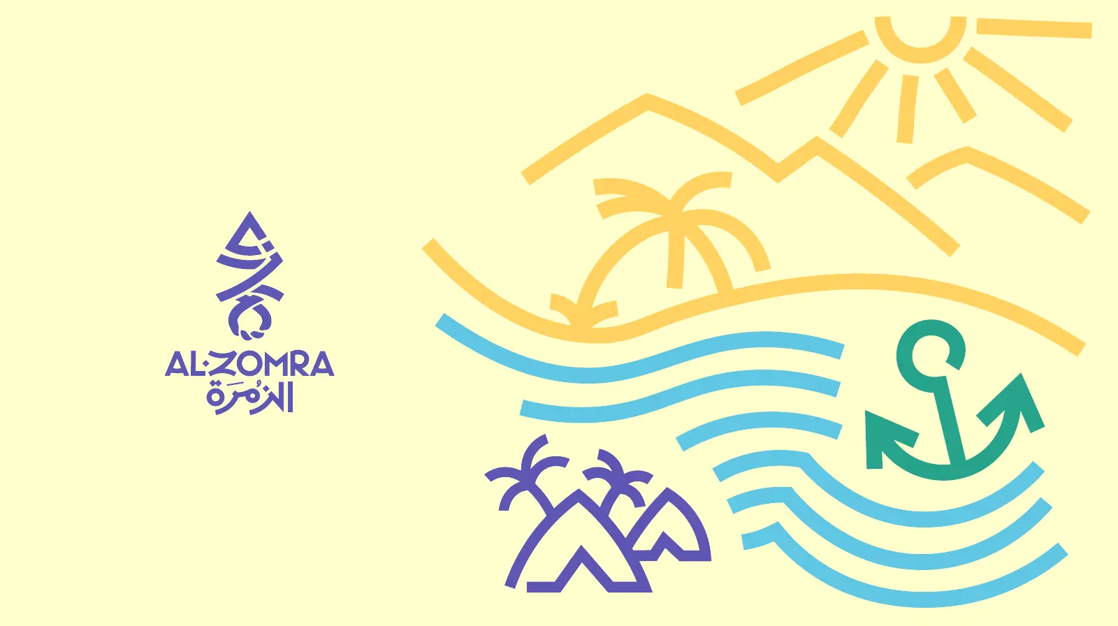
Al-Zomra: the logo and illustration system.
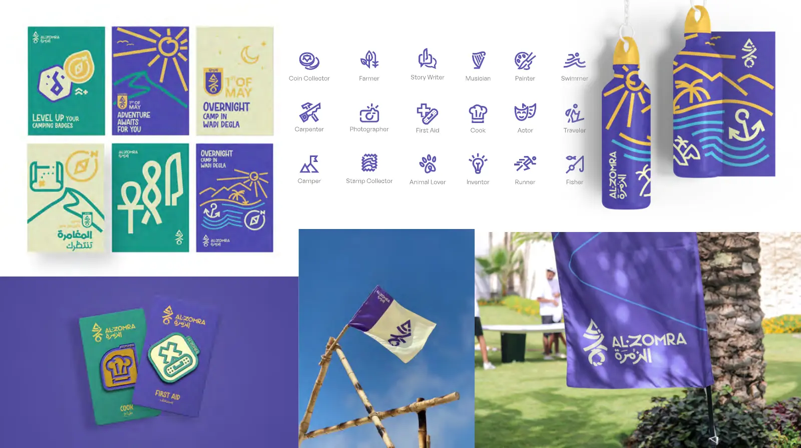
Applications: packaging, merchandise and learning tools.
EGi: a digital ecosystem for Iraq's next generation
EGi brings together creators, gamers and young communities across Iraq and the Middle East. It needed one master brand that could carry several sub-brands, including Slang, Squad and Gaming, without each one becoming its own island. The guidelines define a modular symbol system, a bold Arabic and English type pairing (Bukra with Boldonse and Anybody), a photography style and campaign templates that the team can extend without calling us every week.
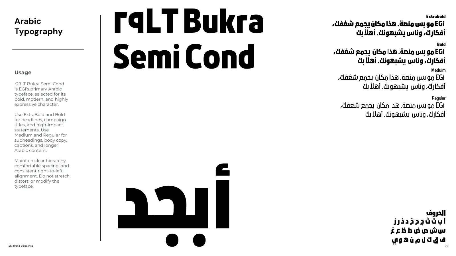
EGi type: Bukra for Arabic, built for loud headlines.
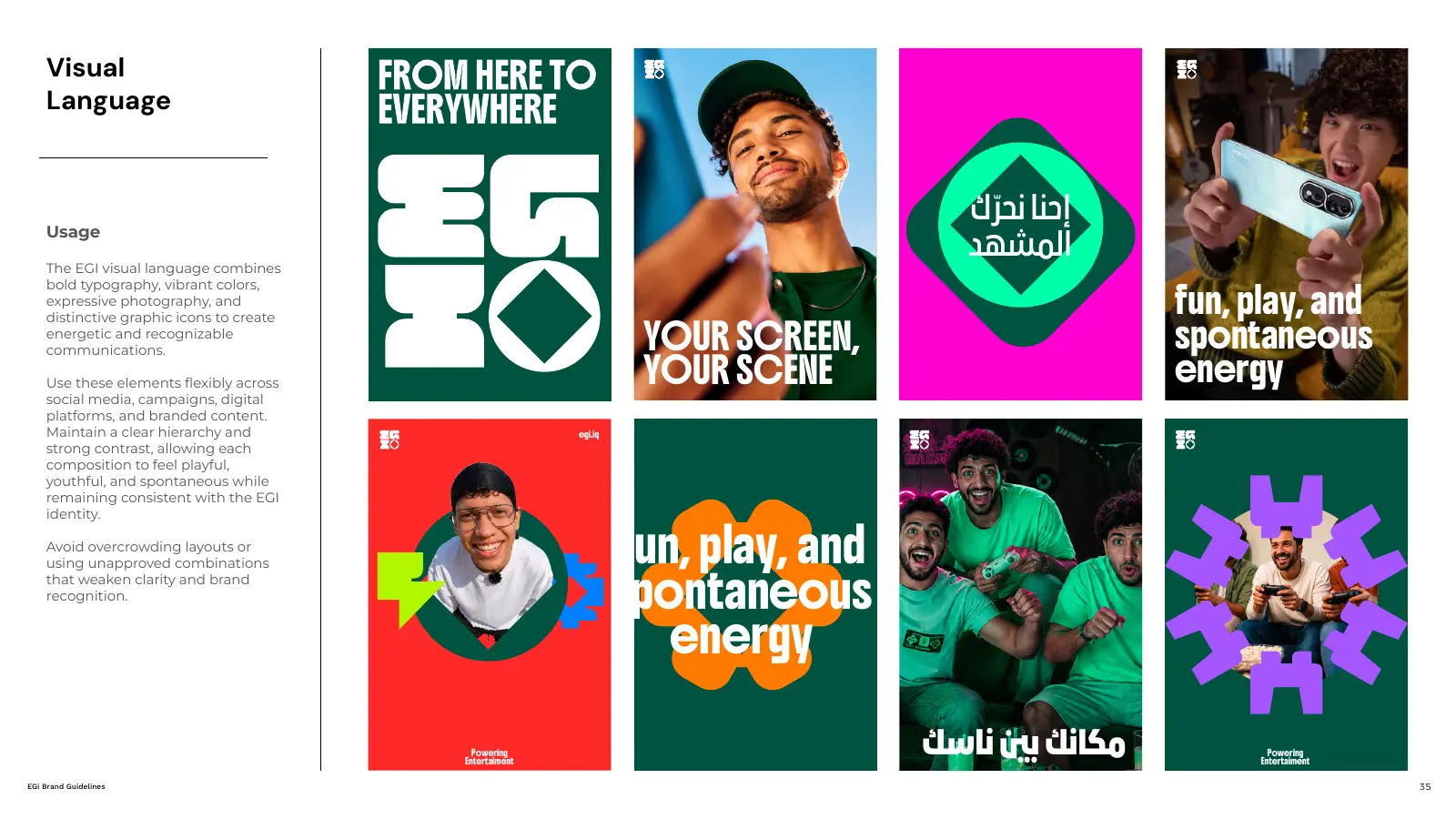
EGi campaigns: posters in both languages, one look.
Mawhiba MetaMinds (M³): guidelines for a digital product
M³ is a digital hub that connects gifted and creative young people. A product like this needs guidelines that work inside the interface, not just on a business card. Alongside naming, research and the identity, we documented a tier system (Initial, Ascend, Elite, Apex), badges, UI components, landing pages and app icons, so the product team and the brand team speak the same language.
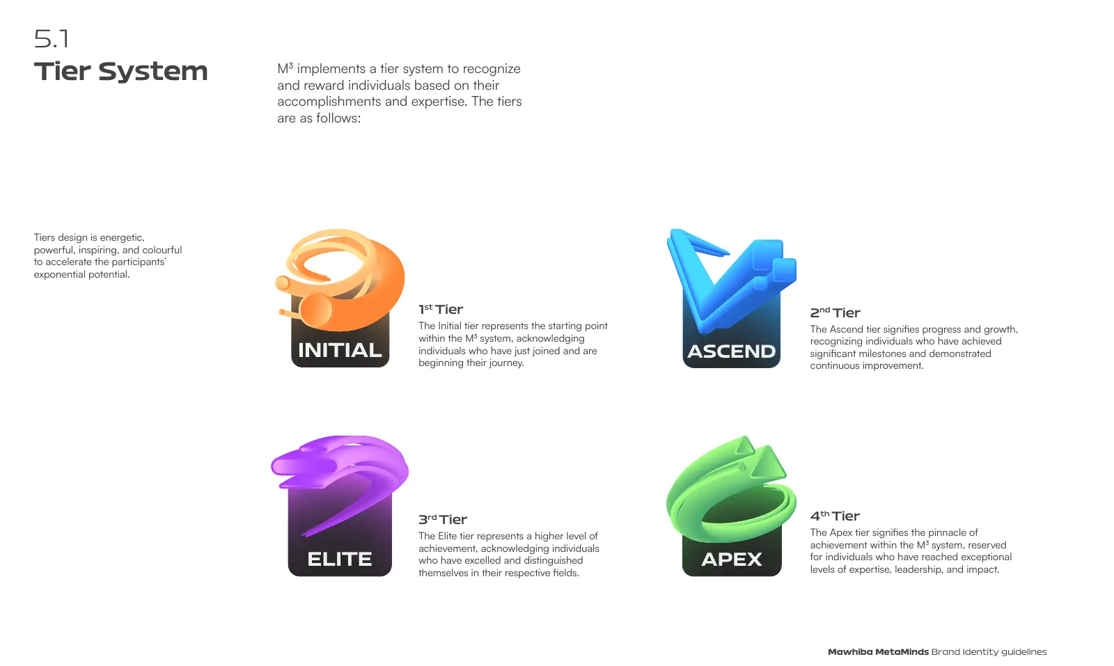
Tier system: four levels, one visual logic.
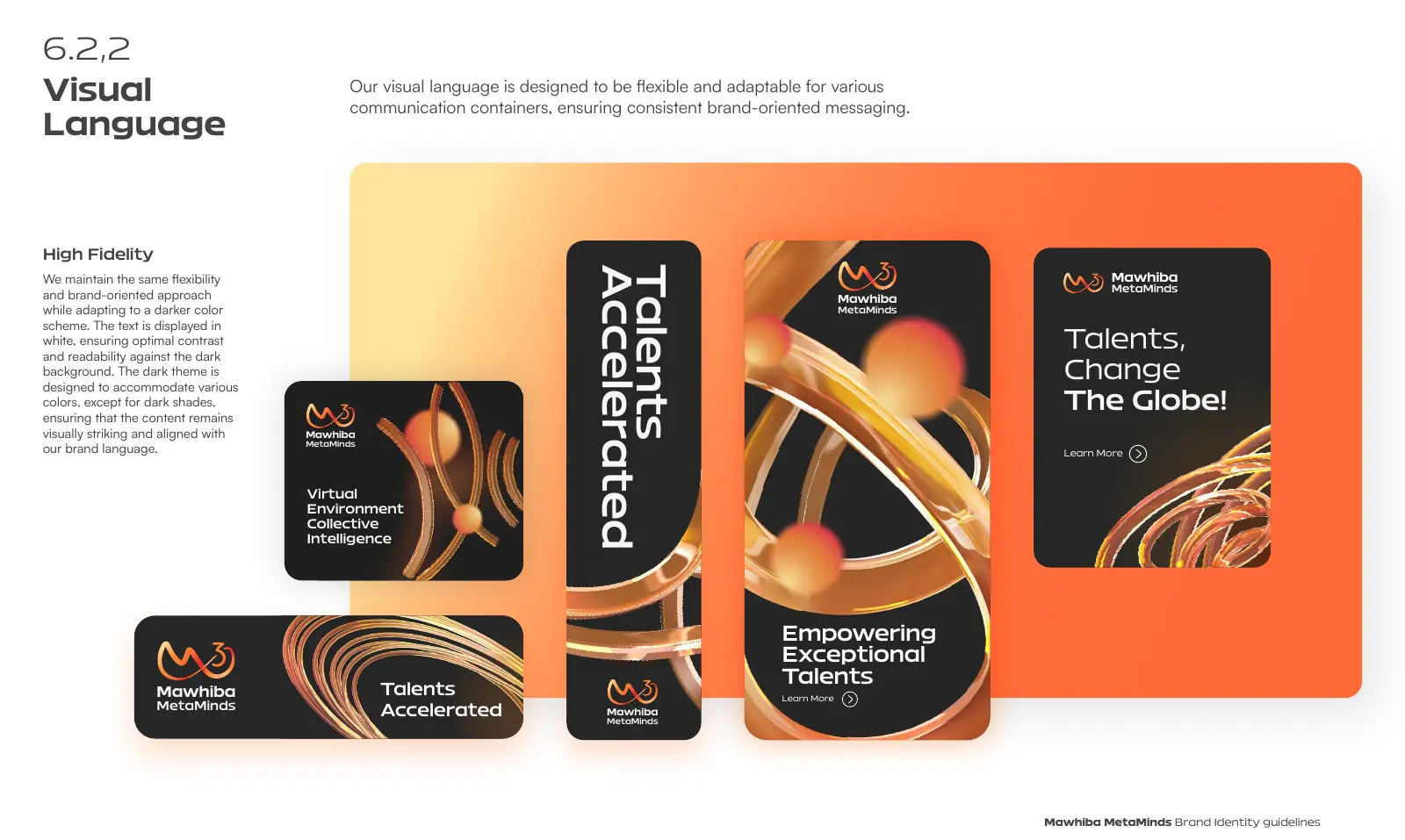
Visual language: the same forms across digital and print.
Omora, BOXAT and MnM: consumer brands that need to stay fun
Playful brands are the easiest to break. Every new designer wants to add their own character, pattern or colour. Omora's guidelines define its patterns, iconography and packaging down to the gift box. BOXAT, a meal-plan app in Kuwait, has rules that run from the logo into every app screen. MnM, a popcorn brand built on "good mood, good pop," has a character system and poster rules that keep the energy high without turning chaotic.
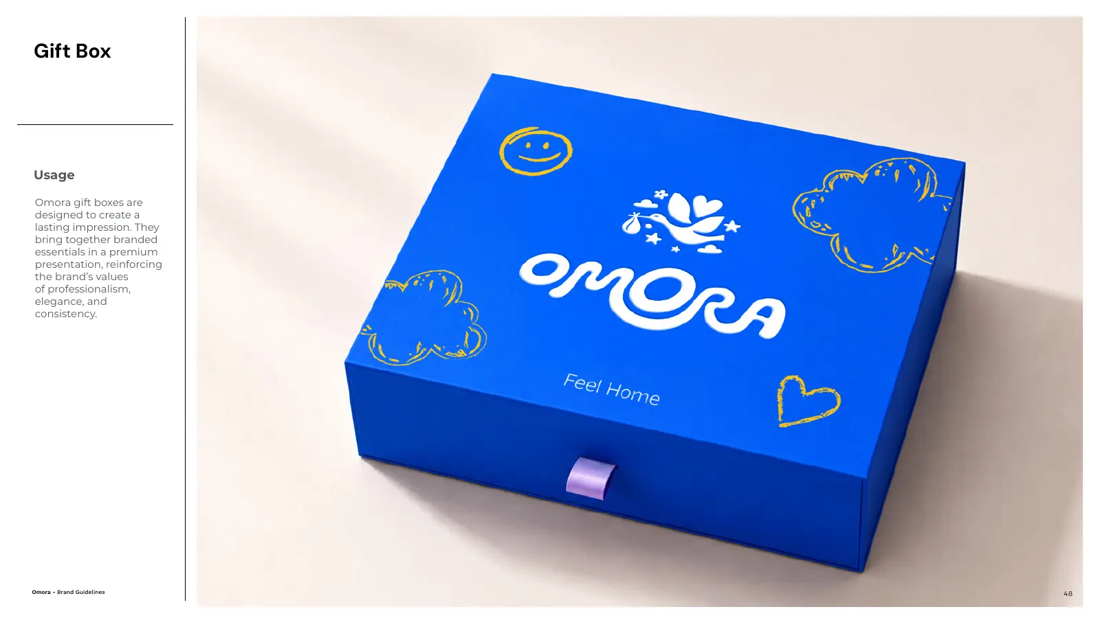
Omora: the gift box, down to the pattern.
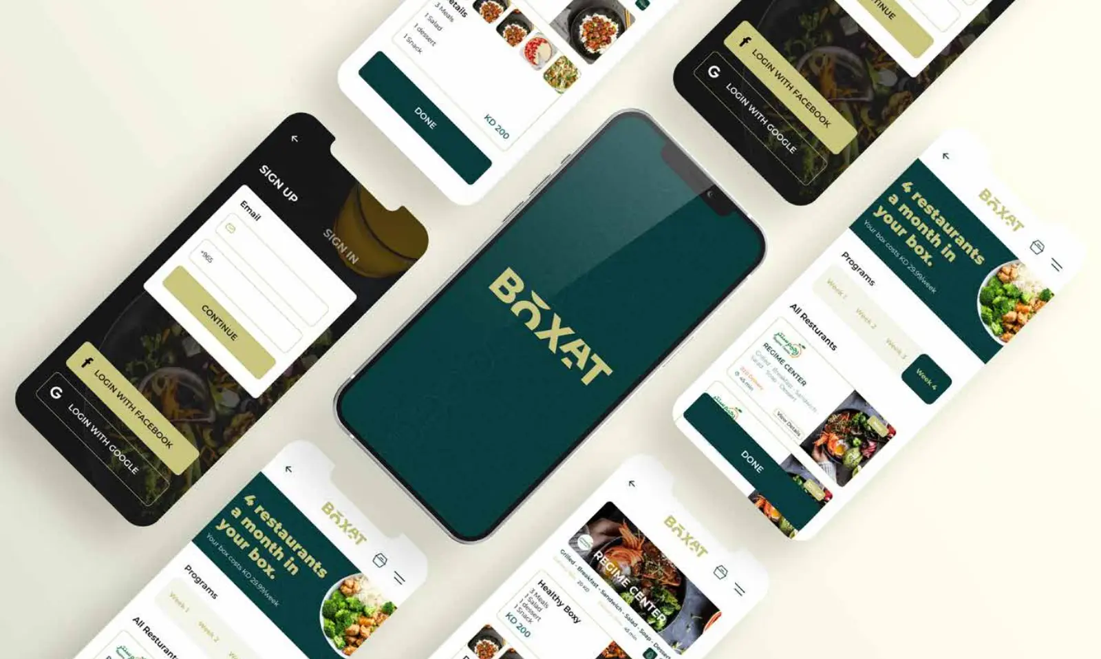
BOXAT: the brand carried into every app screen.
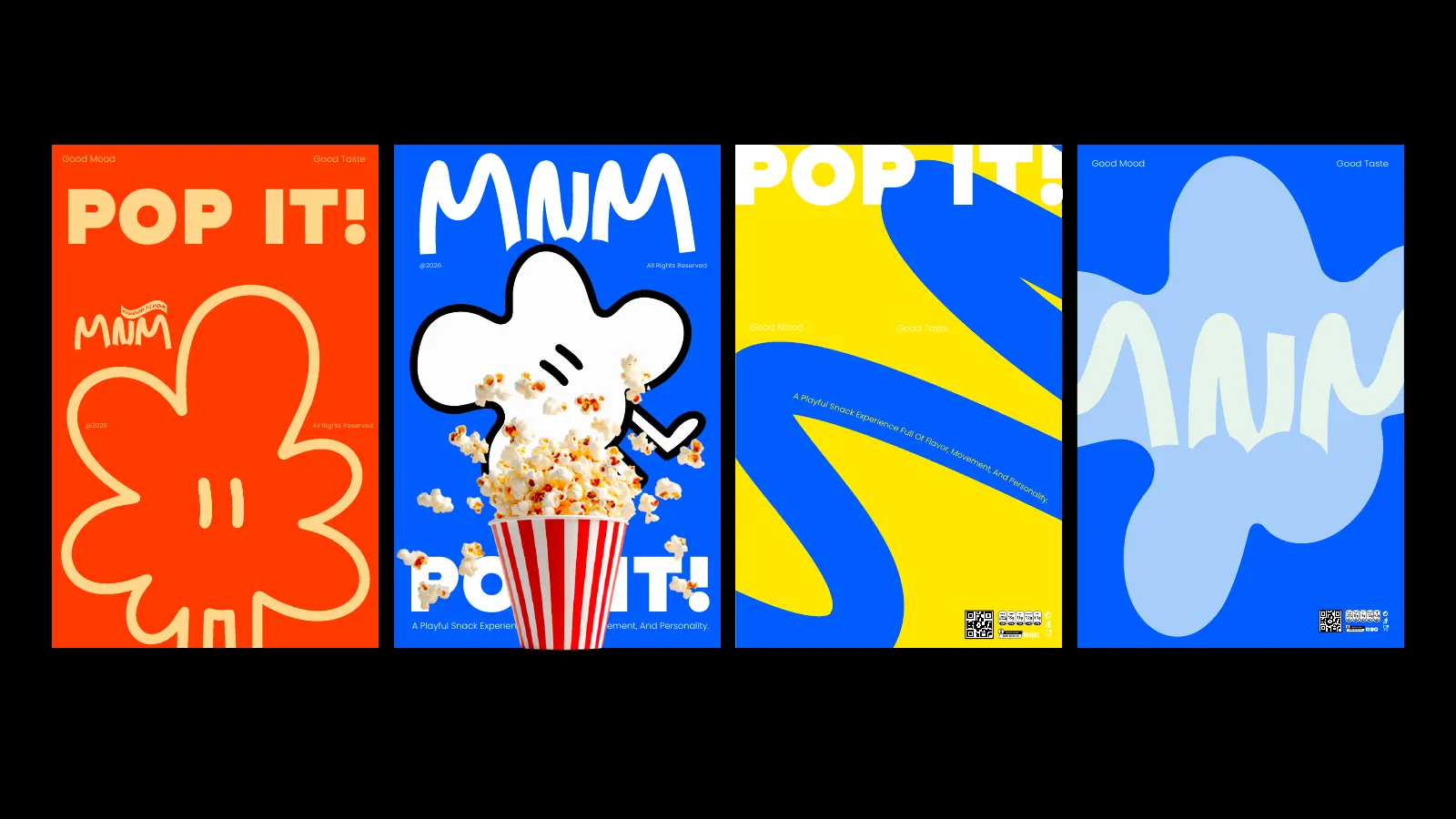
MnM posters: characters and bold type, kept in check by clear rules.
Same deliverable name. Very different operating systems. That's the point. You can see more of these systems in our full body of work.
When do you actually need brand guidelines services?
Not every company needs a 100-page manual. If you're an early-stage founder still testing the product and one designer makes everything, a compact identity guide is probably enough. It gets serious when:
- Several teams create branded material
- External agencies or suppliers are involved
- You operate in more than one market, say Egypt and Saudi Arabia, or the UAE and Qatar
- You use both Arabic and English
- You have multiple products or subsidiaries
- The brand lives on physical and digital touchpoints
- Franchises, distributors or partners use your brand
- Inconsistency is already visible
- You're preparing to scale
The complexity of your guidelines should follow the complexity of your organisation. Not the agency's favourite page count.
And to be honest about it: if you already have a mature identity and only need someone to typeset your rules into a nicer PDF, you probably don't need a strategic branding agency. If nobody really knows what the rules should be, or your identity keeps breaking as you grow, that's a different brief. That means designing the system first and documenting it second. Our guide to rebranding without losing what works is a good place to start.
Brand guidelines vs. brand book vs. brand manual
The industry uses these words loosely, so don't pick an agency based on what it calls the PDF. In practice:
| Term | Usually means |
|---|---|
| Brand guidelines | The practical rules for using the identity day to day. |
| Brand manual | A more detailed, operational version of those rules, often with applications and templates. |
| Brand book | Adds the brand's story, strategy and philosophy alongside the visual rules. |
There's no global standard behind these definitions. Ask what's actually inside. A 20-page document that answers your team's real questions is worth more than a 150-page "brand book" full of mockups nobody knows how to reproduce.
How much do brand guidelines cost?
There's no useful fixed price without understanding the identity and the organisation. A small visual guide for one brand is a completely different job from governance for a bilingual holding group across several markets. The main cost drivers are:
- Scope of the identity. How many components and applications need rules.
- Languages. Arabic and English requirements, and how they work together.
- Architecture. The number of sub-brands and how they relate.
- Digital. Design-system needs for websites and apps.
- Voice, packaging and motion. Each adds its own chapter.
- Rollout. Templates and ready-to-use assets for your team.
So the better question isn't "how many pages do I get?" It's this: what decisions will my team be able to make on their own after this is delivered? That's what you're paying for.
Brand guidelines for Egypt, Saudi Arabia, the GCC and Iraq
Generator is a branding agency based in Cairo, working with businesses in Egypt and Saudi Arabia every week, and with brands across the UAE, Qatar, Oman, Bahrain, Kuwait, Iraq and the wider Middle East and North Africa. Our guideline work spans Saudi Arabia, Egypt, Iraq and Kuwait, and in the UAE we built the brand, architecture and guidelines for Integral. Most of our clients operate in more than one of these markets, which is exactly why we build guidelines to travel: one system, two scripts, many suppliers.
If you're comparing agencies, start with our guide on how to choose a branding agency in Saudi Arabia, Egypt and the UAE, see what a brand identity design company actually delivers, or read how we approach brand strategy.
Common questions
What are brand guidelines services?
Brand guidelines services define and document the rules a team needs to use a brand consistently. Depending on the business, that covers logo use, colour, typography, imagery, layouts, tone of voice, digital and print applications, Arabic and English rules, packaging, motion and brand architecture.
What should a brand guidelines document include?
Most brands need logo, colour, typography and basic visual rules. Larger or more complex brands also need imagery, illustration, tone of voice, digital design, Arabic-English usage, co-branding, brand architecture, motion, packaging and ready-to-use templates.
How long should brand guidelines be?
There's no correct page count. The document should be long enough to answer the decisions your team faces every week, and short enough that people actually open it.
Do we need a new brand identity before creating guidelines?
Not always. If your identity is strong but undocumented, guidelines can formalise it. If it's inconsistent or incomplete, it usually needs refining first, otherwise you end up documenting the problem.
Do brand guidelines include Arabic and English rules?
They should whenever the brand operates bilingually. Good bilingual guidelines define how both scripts work together, including lockups, type pairing, right-to-left and left-to-right layouts, numerals and voice, instead of treating Arabic as a translation of an English-first system.
Do you work with brands outside Egypt and Saudi Arabia?
Yes. Generator is a branding agency based in Cairo, working with brands in Saudi Arabia, the UAE, Qatar, Oman, Bahrain, Kuwait, Iraq and across the Middle East and North Africa. Our guideline work includes projects in Saudi Arabia, Egypt, the UAE, Iraq and Kuwait.
Is your brand growing faster than the rules holding it together?
If so, that's where we start. Generator builds brand strategy, identity and guidelines for brands in Egypt, Saudi Arabia, the UAE and across MENA, so your team can run the brand with confidence. It would be a pleasure to hear what you're working on.
See our work Start a conversationGenerator Design Agency · Cairo, Egypt · Working across Egypt, Saudi Arabia, the UAE, Qatar, Oman, Bahrain, Kuwait, Iraq & MENA · See more work · Our services