"What does a donut look like from underneath?"
Look at the bottom half of the ring and you'll see a curve. Turn it the right way up and it's a smile. That one shape became the whole idea behind the new Donut Time.
Donut Time is a Saudi donut and coffee brand. People loved the product and the shops were full of families, but the brand had fallen behind its own customers. We rebuilt it from the strategy up: the positioning, a new logo family in Arabic and English, color, type, an illustration world, photography, packaging and a full set of brand guidelines. Here is how we did it, step by step, and what other brands in Saudi Arabia, Egypt and the wider MENA region can take from it.
The brief: a brand that fell behind its customers
Donut Time sells handcrafted donuts, coffee and small bites. Its real regulars are parents, kids aged four and up, and groups of friends. The old identity didn't show that. It looked girly and a little dated, and it spoke to a much narrower audience than the one actually walking in.
There were two more problems. The market was crowded, with dessert and coffee shops on almost every street, so looking pleasant was not enough to be picked. And there was no system. Boxes, cups and social posts each did their own thing, so the brand never built up recognition.
Alina Wheeler, in her book Designing Brand Identity, lists the classic signs that a company is ready to rebrand. Two of them described Donut Time almost word for word: "We look behind the times" and "Our packaging is not distinctive." The owners wanted a brand that was more robust, more consistent and younger in spirit, without losing the warmth their customers already felt.
Strategy first: a place for the whole family
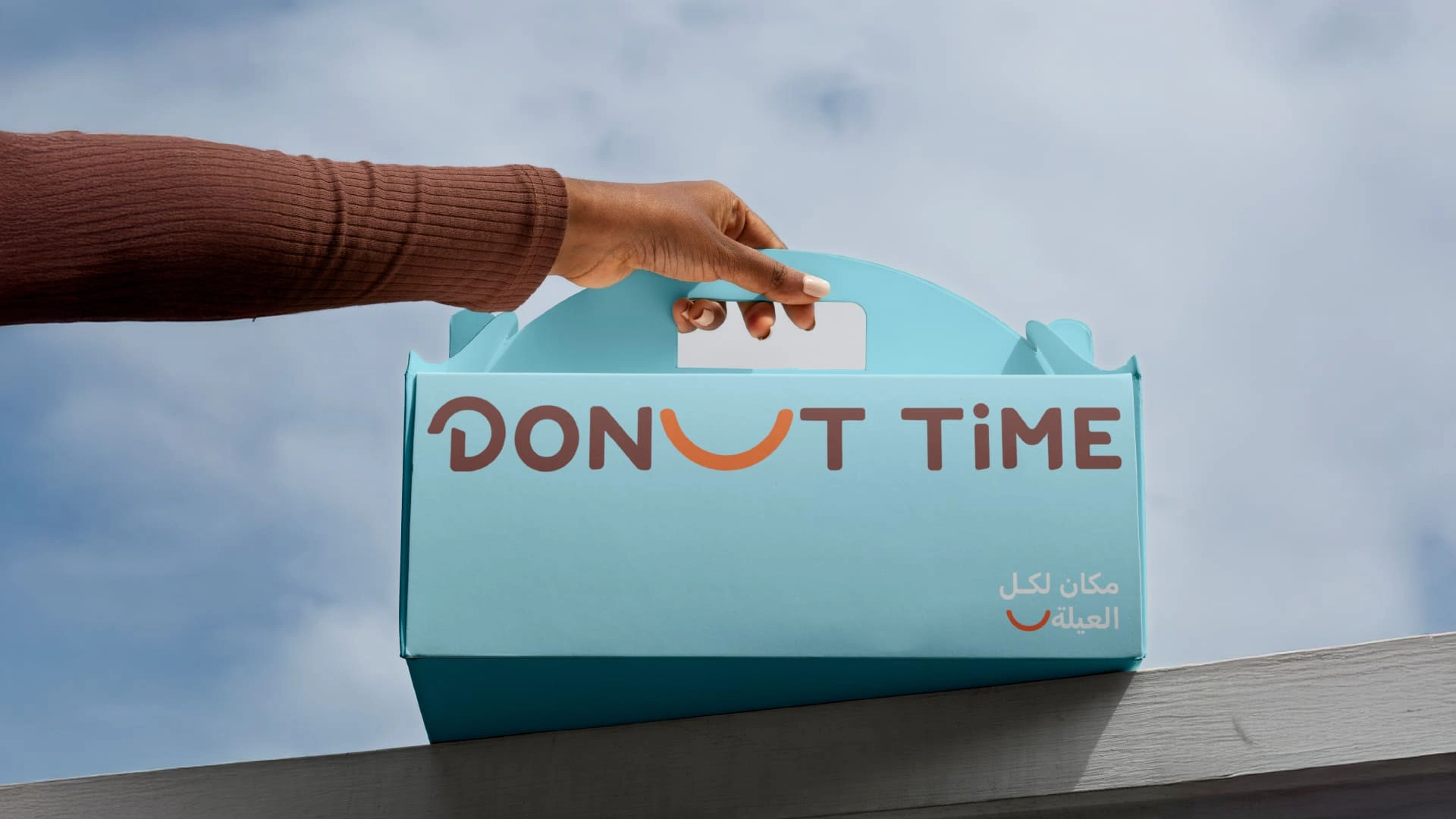
We wrote the strategy down before anyone opened a design file. Wheeler calls this stage clarifying strategy: turning what you learned into a clear position the whole team can agree on. For Donut Time, the position fits into one Arabic line that now sits on every box: مكان لكل العيلة, "a place for the whole family".
"To be the leading destination for families to create unforgettable donut-filled memories."Donut Time brand vision
The mission backs it up: to craft exceptional donuts and experiences that bring joy, inclusivity and a touch of sweetness to every day. We then defined how the brand behaves, so every future decision has something to check against.
How it looks
Warm and inviting. Playful and colorful. Fresh and appealing.
How it speaks
Conversational. Enthusiastic and upbeat. Inclusive and welcoming.
How it thinks
Quality first. Innovation always. Community focused.
Read those back and one word keeps coming up: joy. That became the design brief. Whatever we made had to smile. (Our guide to brand positioning explains this stage in more detail.)
The identity: the smile, color and type
With the strategy clear, we built the pieces people actually see. Each one had to feel friendly to a child and still look confident to the parent paying the bill.
One smile, two languages
The logo is built around a single orange arc that does three jobs at once. It's half a donut. It's a smile. And it's a letter. In English, it takes the place of the U in DONUT. In Arabic, it forms the bowl of the ت in دونت, and the two dots above it turn into a pair of eyes.
The Arabic wordmark: the smile becomes the letter ت, and its two dots read as eyes.
Wheeler describes a big idea as "an organizational totem pole around which strategy, behavior, actions, and communications are aligned." The smile does exactly that. It carries the joy from the strategy, and it gives the logo, the illustrations and the packaging one shape to share.
We designed a full logo family so the idea works at any size: the smile on its own for app icons and favicons, English and Arabic wordmarks in vertical and horizontal versions, and bilingual lockups for general use across the Kingdom. The letters are rounded and chunky, with a playful lowercase i dropped into TiME. We wrote more about designing both scripts together in our guide to bilingual Arabic brand identity.
There's a reason this works so fast. Wheeler explains that the brain recognises shape first, then color, and only then reads words. Nobody needs to read "Donut Time" to know where their box came from. The orange smile gets there first.
Sky blue, glaze orange, chocolate brown
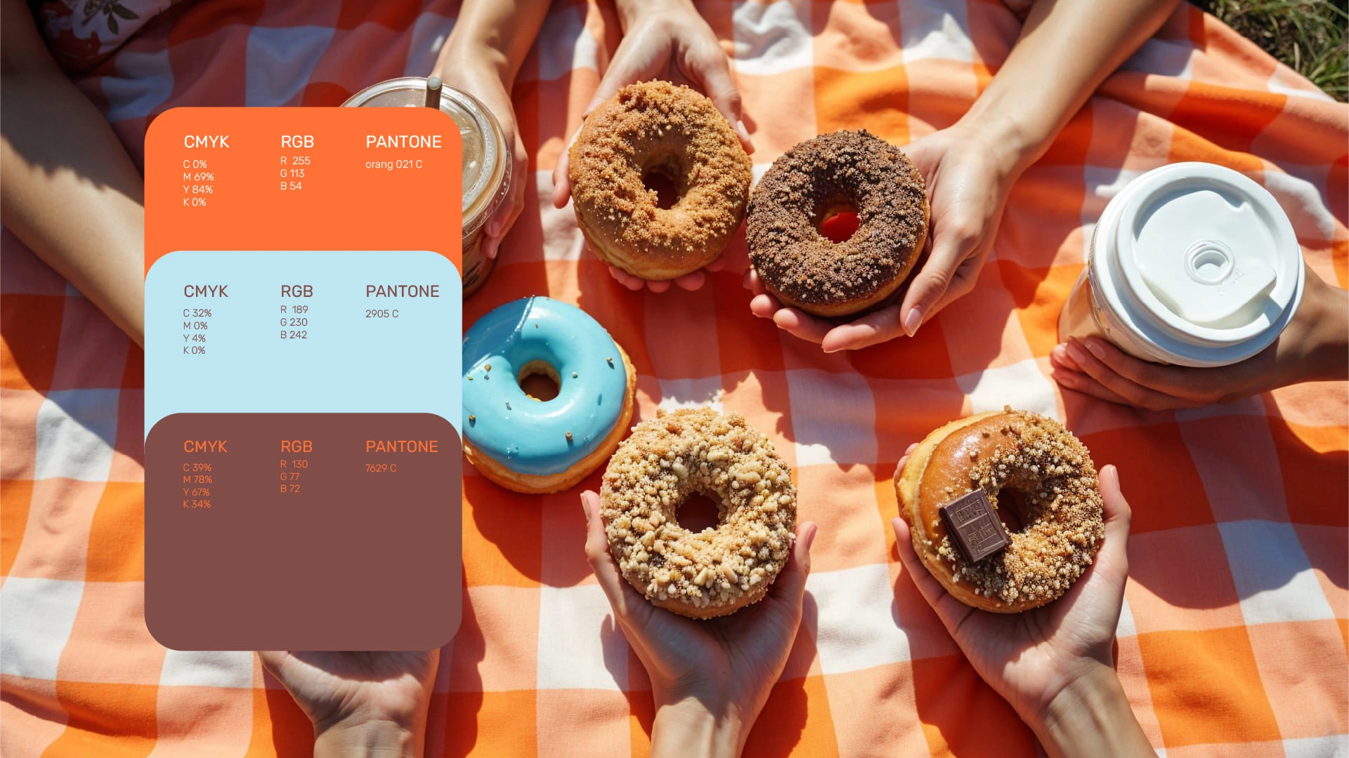
We took the palette straight off the counter. Sky blue, the orange of a fresh glaze and chocolate brown make up the core. Four brighter accents handle stickers, campaigns and seasonal launches.
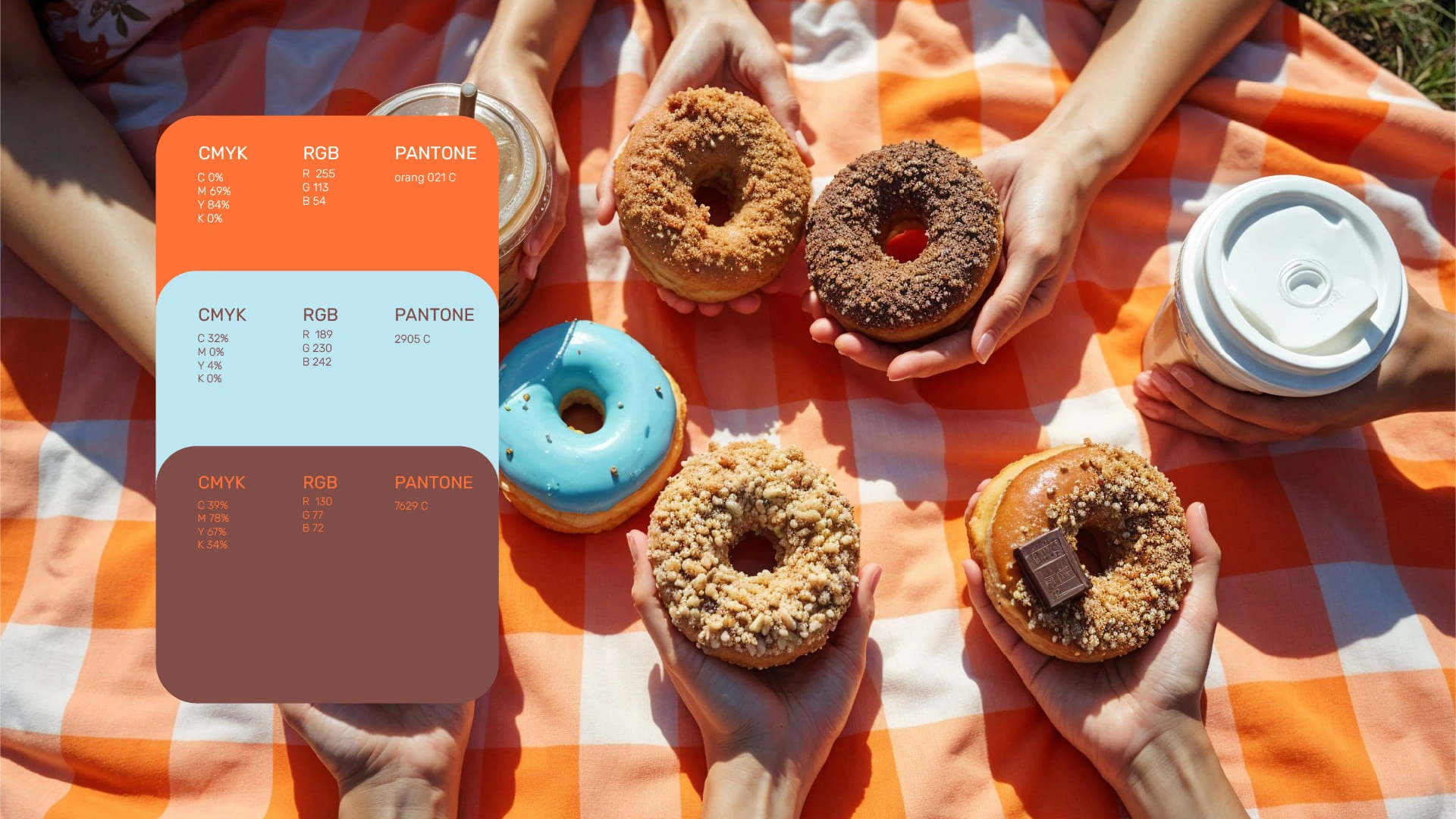
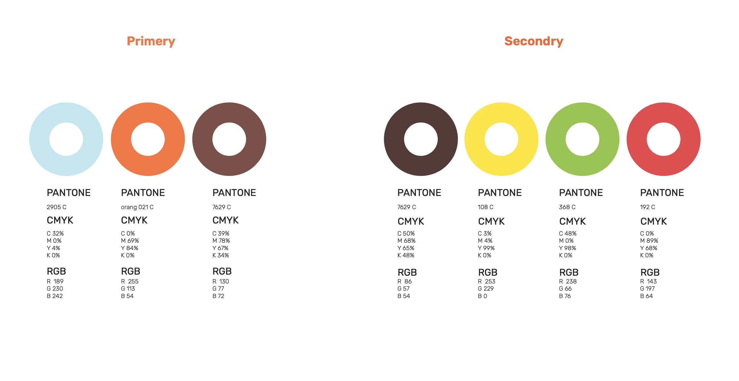
| Color | Role | Pantone | RGB |
|---|---|---|---|
| Sky blue | Primary: backgrounds and packaging | 2905 C | 189 · 230 · 242 |
| Smile orange | Primary: the mark and accents | Orange 021 C | 255 · 113 · 54 |
| Chocolate brown | Primary: wordmark and text | 7629 C | 130 · 77 · 72 |
| Dark cocoa | Secondary | — | 86 · 57 · 54 |
| Sprinkle yellow | Secondary | 108 C | 253 · 229 · 0 |
| Pistachio green | Secondary | 368 C | 143 · 197 · 64 |
| Strawberry red | Secondary | 192 C | 238 · 66 · 76 |
The blue does most of the work. It's calm and gender-neutral, a clean break from the old girly look, and it makes the orange smile jump out from across a busy mall. For type we chose one family for both scripts, Rubik, whose rounded corners echo the logo and keep bilingual layouts balanced.
An illustration world rooted in Saudi life
Wheeler quotes Michael Bierut of Pentagram on what makes a brand system strong: "You should be able to cover up the logo and still identify the company because the look and feel is so distinctive." That was our test for the illustrations.
We drew a set of full scenes in a clean line style. Families in thobes and abayas, skaters and cyclists, palm trees, city towers, coffee pouring from a moka pot. Look closely and the smile turns up in every one of them, as a slide, a sofa or a giant swing. The skies stay blue to keep things calm, and the props stick to orange and brown so everything ties back to the palette.
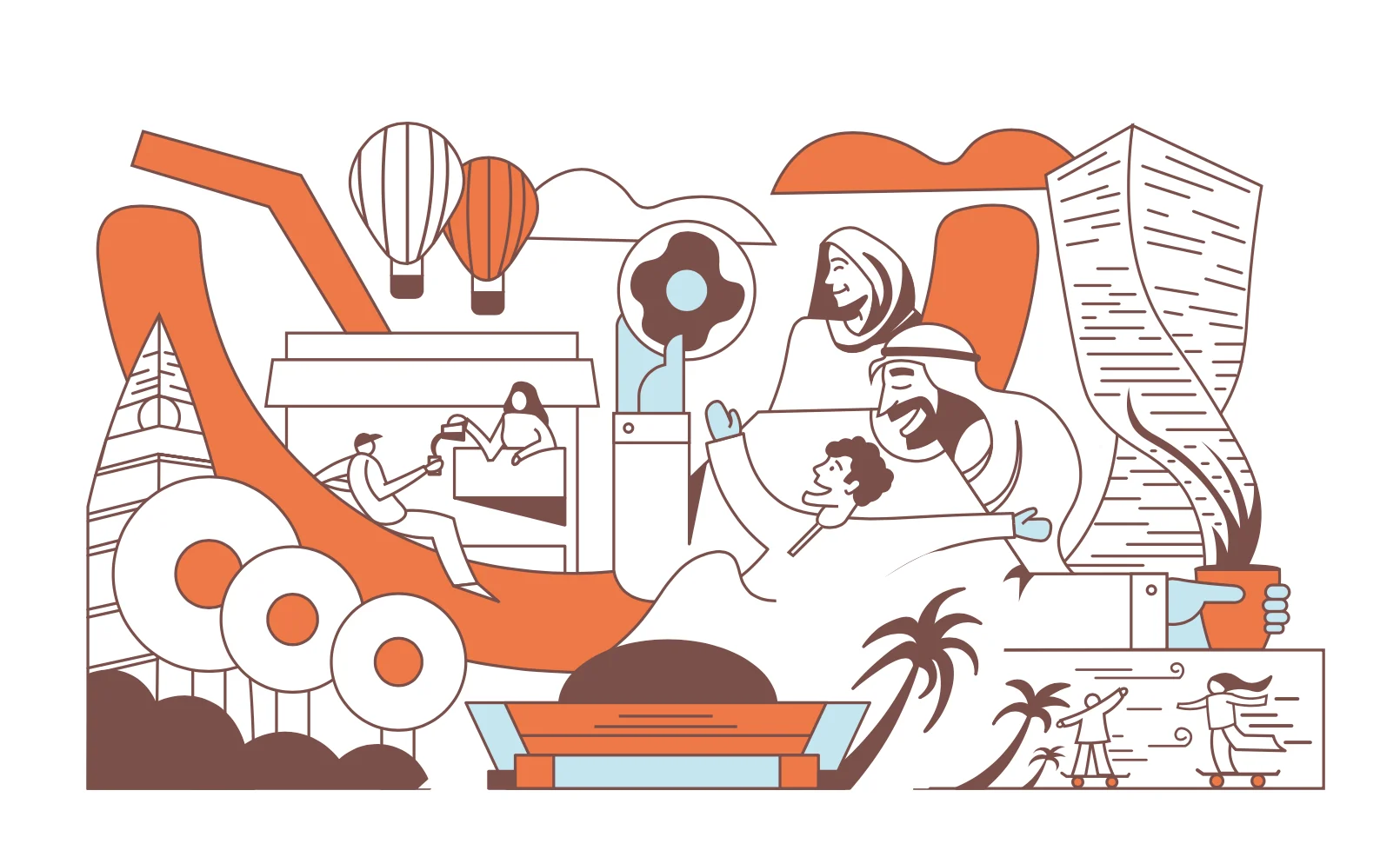
Full scenes are too big for a cup or an Instagram story, so we cut them into a library of small tiles: a hand holding a coffee, a donut floating in the sky, a friend in orange sunglasses. We added stickers too, with lines like دونت حلو لحلو, to bring the brand's chatty voice onto windows and boxes.
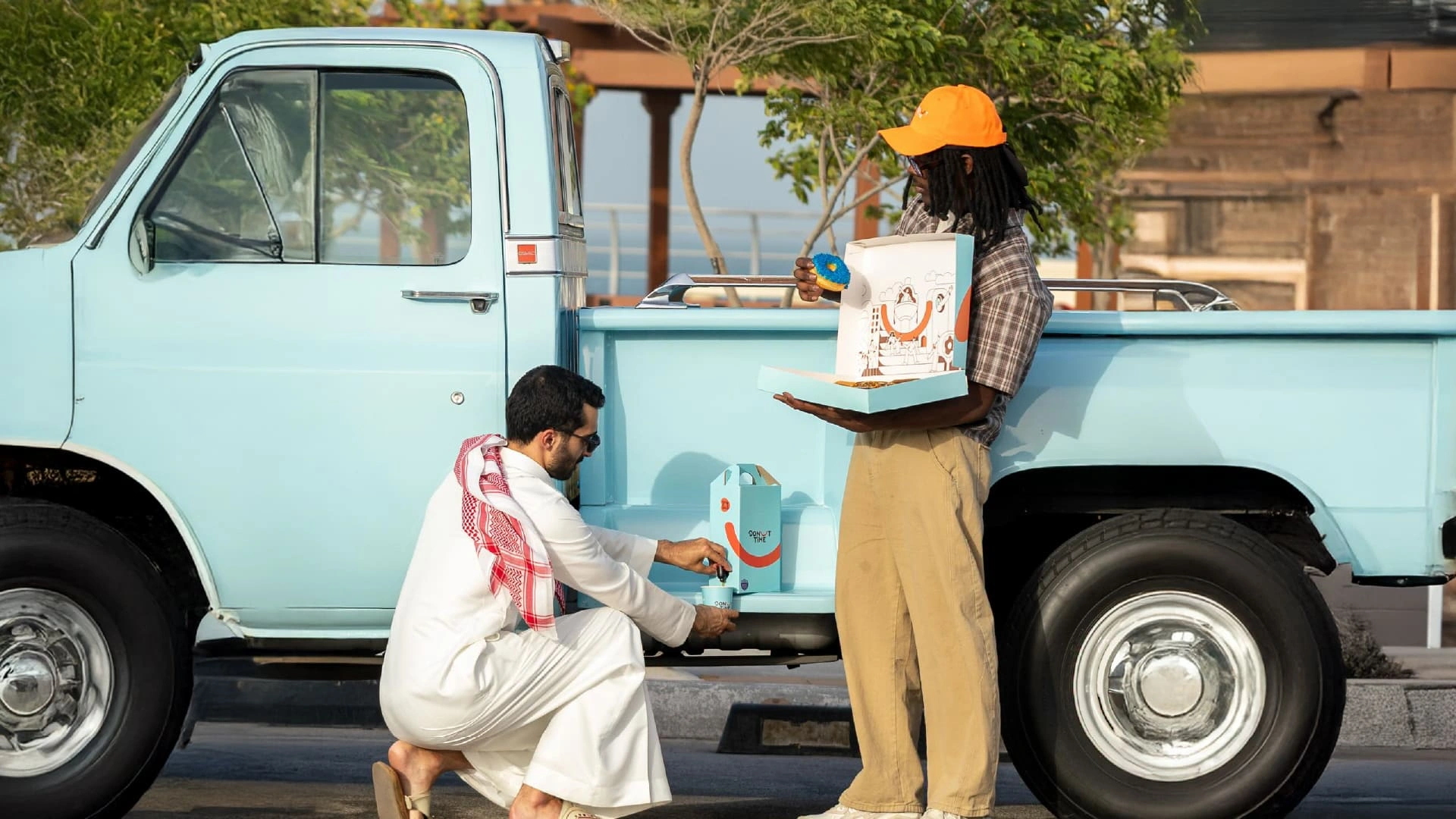
The photography follows the same mood. Donuts placed into everyday life, shot outdoors in bright sunlight, with props in brand colors. A vintage sky-blue pickup truck became one of the campaign's quiet stars.
Packaging design people carry home
In food and beverage, the box is the most-seen advert a brand has. It travels to homes, offices and family gatherings. So we put most of our energy into the things customers hold in their hands.
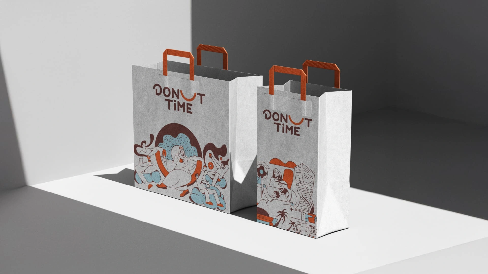
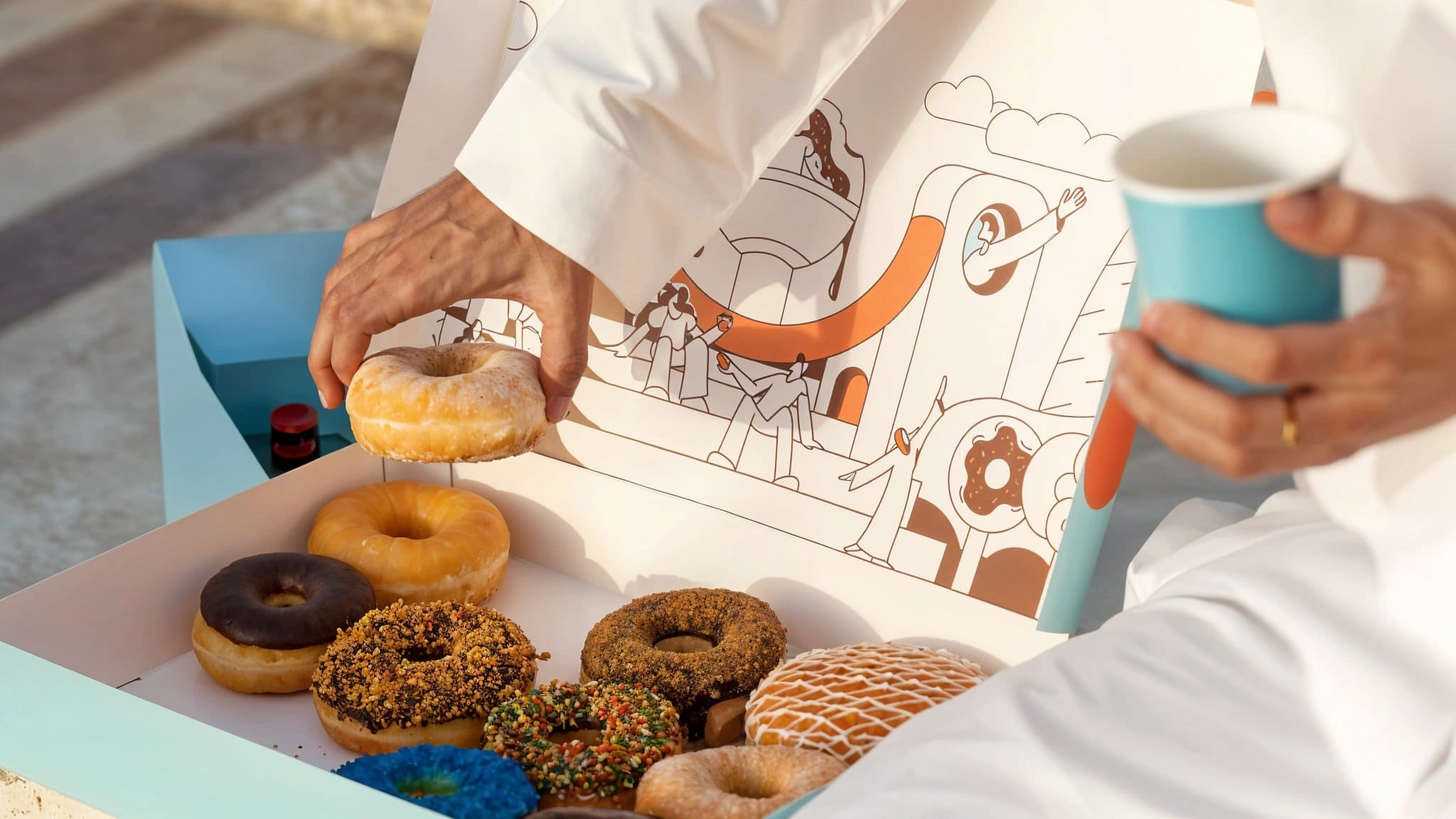
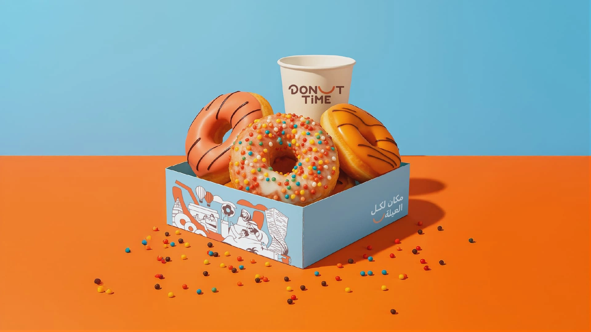
The dozen box is the hero. A full illustrated scene is printed inside the lid, so opening it feels like a small reveal. The carrier box and the single-serve tray keep the sky blue and carry مكان لكل العيلة on the side.
Drive-thru bag: sized to pass cleanly through a car window.
The same look carries on to the street. Window graphics, stickers and the in-store interior all use the smile, the palette and the illustrations, so the shop feels like the box it sends you home with.
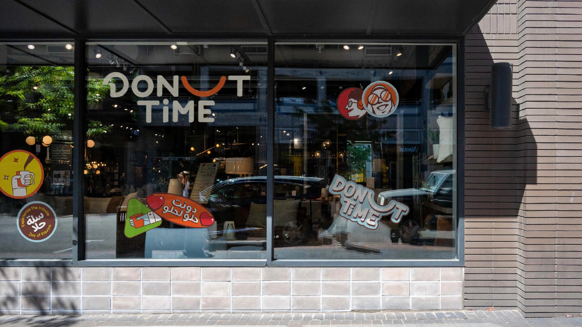
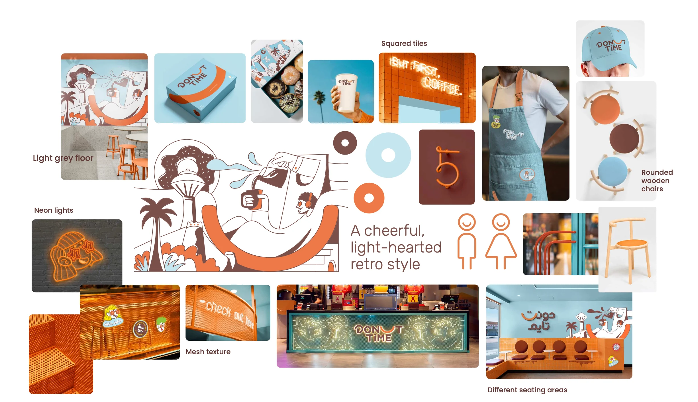
Inside, the store design follows one line from the brief: a cheerful, light-hearted retro style. Orange squared tiles, a light grey floor, perforated metal mesh, neon signs and rounded wooden chairs in the brand colors. The illustrations grow into wall murals and a glowing counter, and different seating areas give families, friends and solo coffee drinkers each a place to sit.
Keeping it consistent: the brand guidelines
A new identity only stays new if everyone uses it the same way, from the in-house team to the printer to the next agency. Wheeler calls this final stage managing assets. We gave Donut Time a brand book in eight chapters: overview, logo, colors, typography, photography, illustration, applications and store design.
It measures the logo's clear space in smiles, so the rule is easy to remember. It sets minimum sizes (1 cm in print, 1.2 inches for embroidery, 1 m on the short side for large prints, 16 px for a favicon) and lists six mistakes to avoid: extra colors, outlines, reversed word order, stretching, shadows and rotation.
Why the rebrand works
Wheeler closes her framework with nine ideals every strong identity should meet. We use them as a final check on every project.
| Ideal | The test | How Donut Time meets it |
|---|---|---|
| Vision | A clear picture of the future | A family destination for donut-filled memories |
| Meaning | Stands for a big idea | The smile: half a donut, all joy |
| Authenticity | Clear on market and position | Built for Saudi families, fully bilingual |
| Differentiation | Stands apart in its category | A smile-shaped mark and calm sky blue |
| Durability | Lasts beyond trends | A simple arc and a rounded wordmark |
| Coherence | Feels familiar everywhere | One palette, one typeface, one mark |
| Flexibility | Supports growth | Mark, wordmarks and bilingual lockups |
| Commitment | Assets are actively managed | An eight-chapter brand book |
| Value | Creates measurable results | 50,000+ followers soon after launch |
That last row is the one owners care about most. A cheerful, consistent look gave people something worth photographing and sharing, and the smile did the rest.
What other brands can take from this
Donut Time now has one clear idea, a look that holds together everywhere, and a system its team can run on its own. Four lessons apply to almost any rebrand:
- Start with who actually walks through your door. Not who you pictured when you opened.
- Find one idea and let it run through everything. One strong shape beats a dozen decorations.
- Design Arabic and English together. A bilingual logo should never feel like a translation.
- Write the rules down. Guidelines are what keep a rebrand looking new in year three.
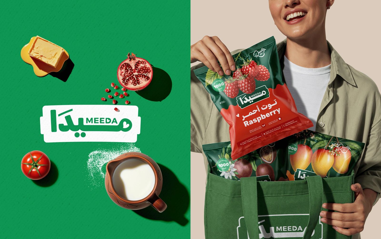
If you're launching a food brand from scratch rather than rebranding, read how we named and built Meeda, a Saudi frozen food brand.
Rebranding for Egypt, Saudi Arabia and MENA
Donut Time is a Saudi brand, rebranded by our team in Cairo. That mix is how Generator works. We are a branding agency based in Egypt, working with food, retail and lifestyle brands in Saudi Arabia and across the Middle East and North Africa.
The lessons travel well. A café in Riyadh, a bakery chain in Cairo and a dessert brand in Dubai all face the same question: does our brand still look like the people who love us? When the answer is no, the order is the same. Listen first, write the strategy, find one idea, then build a system that grows with you.
If you're comparing agencies, start with our guide on how to choose a branding agency in Saudi Arabia, Egypt and the UAE, or see what a brand identity design company actually delivers.
Common questions
How do you know it is time to rebrand?
Look at who actually buys from you, then look at your brand. If the two no longer match, if your packaging blends in with competitors, or if every touchpoint looks like it came from a different company, it is time. Donut Time rebranded because its old look felt dated and spoke to a narrower audience than the families who filled its shops.
Will a rebrand make us lose our existing customers?
Not if you keep what they already love. Donut Time kept its name, its product and its warmth. What changed was how clearly the brand showed that warmth, across every box, cup and window.
Should a Saudi brand have an Arabic and an English logo?
Usually yes, and the two should be designed together from day one. For Donut Time, the same smile works as the U in the English DONUT and as the letter ت in the Arabic دونت, so neither version feels like a translation.
What does a rebranding project include?
For Donut Time it covered brand strategy, the logo family, color and typography, an illustration system, photography direction, packaging, store design, social media direction and an eight-chapter brand guidelines book. Scope depends on how many touchpoints need to change.
Do you work with brands in Egypt, Saudi Arabia and the wider MENA region?
Yes. Generator is a branding agency based in Cairo, working with brands in Egypt, Saudi Arabia and across the Middle East and North Africa on brand strategy, naming, identity, rebranding and packaging design.
Does your brand still look like your customers?
If not, that's where we start. Generator helps brands in Egypt, Saudi Arabia and across MENA find one clear idea and build an identity people remember. It would be a pleasure to hear what you're working on.
See the Donut Time project Start a conversationGenerator Design Agency · Cairo, Egypt · Working across Egypt, Saudi Arabia & MENA · See more work · Our services