"Ask an accountant what the job really is, and they'll describe a lot of small pieces."
Invoices. Receipts. Payroll. VAT returns. On their own, none of them tell you much. Put them together properly and you get the one thing a business owner actually wants: a clear picture of where the money is. Mathematicians have a symbol for exactly that idea. It's called the integral, and it happened to be our client's name.
Integral is an accounting and bookkeeping firm in Dubai. It works with businesses of every size, across accounting, VAT, UAE corporate tax, audit and business setup. The expertise was there. The brand didn't show it. We built the whole thing from the strategy up: positioning, a new symbol and wordmark, a brand architecture for its service lines, color, type, icons, stationery, outdoor, social, a website and full brand guidelines. Here is how we did it, and what other finance firms in the UAE, Saudi Arabia and Egypt can take from it.
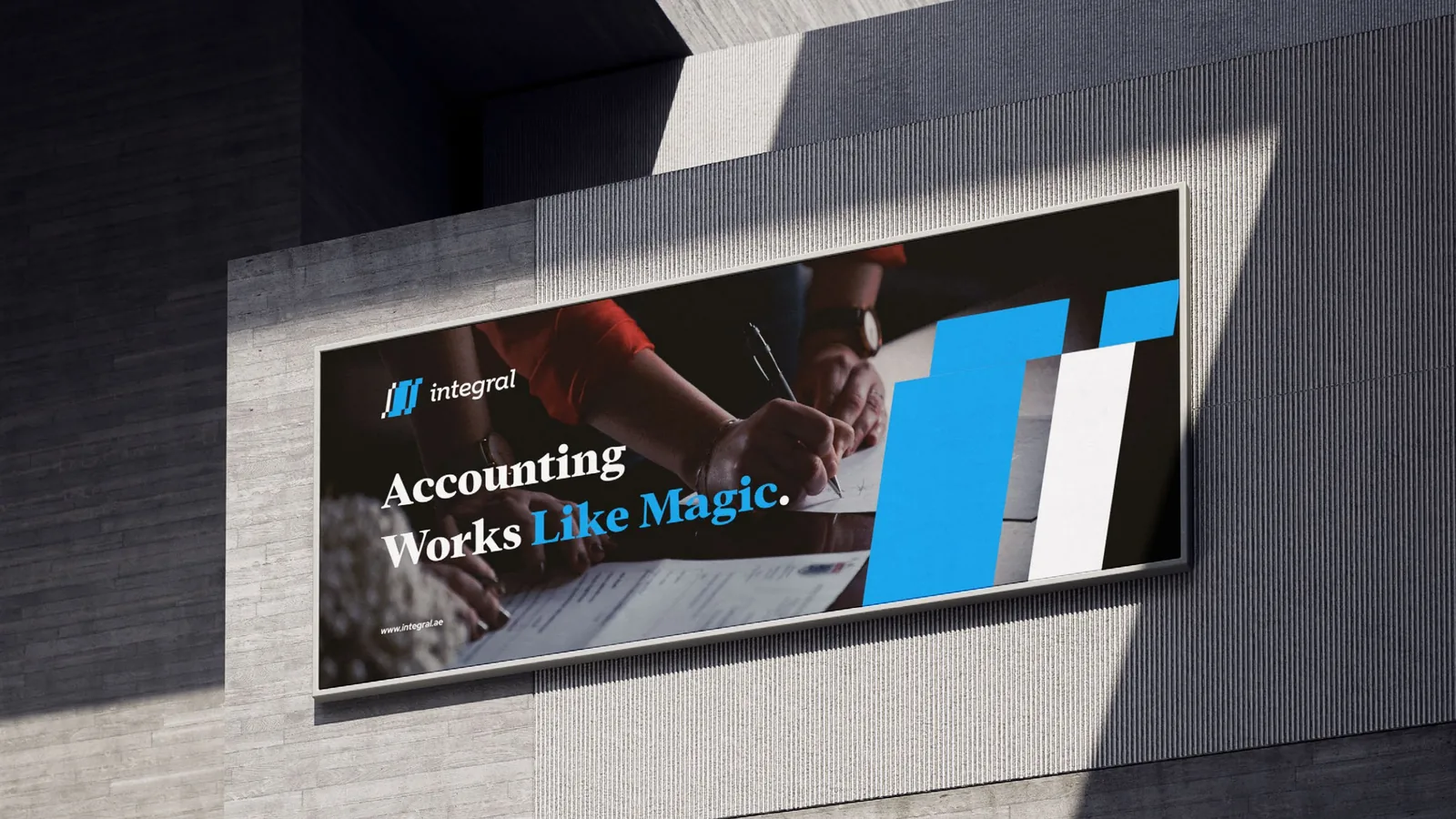
Integral's outdoor campaign: the new symbol, scaled up to the size of a building.
The Integral brand at a glance: a walkthrough of the brand guidelines.
The brief: real expertise, a forgettable look
Integral's team has years of experience with businesses in the UAE and abroad. They care about accurate, timely numbers, they use modern tools, and they want accounting to feel easy for their clients. In their own words, it should be "hassle-free."
The trouble is that clients can't see any of that before they sign. They judge an accounting firm the way they judge a doctor's clinic: by how organised it looks. Integral needed a brand that looked as precise as its work, felt approachable instead of stiff, and could hold several services under one name as the firm grew.
Discovery: a category that all looks the same
We started by looking hard at the market. We audited the logos, websites and social channels of the main accounting and audit firms in the UAE, side by side.
The pattern was hard to miss. Calculator stock photos. Dubai skylines. "Tax deadline" posts that could belong to anyone. Navy and teal everywhere. Cover the names and most of these brands were interchangeable. Very few had an idea behind them, and almost none felt warm.
That was the opening. If everyone else looked like a generic finance firm, Integral could win simply by standing for something specific. So we went looking for that something, and we didn't have to go far.
The big idea: every part completes the whole
We run every project through four steps: Define, Discover, Design and Deliver. In Discover, we held a mind-mapping session around one word, the client's own name, and followed every branch: the history of the symbol, the maths behind it, the language of accounting, and the values the team wanted to live by.
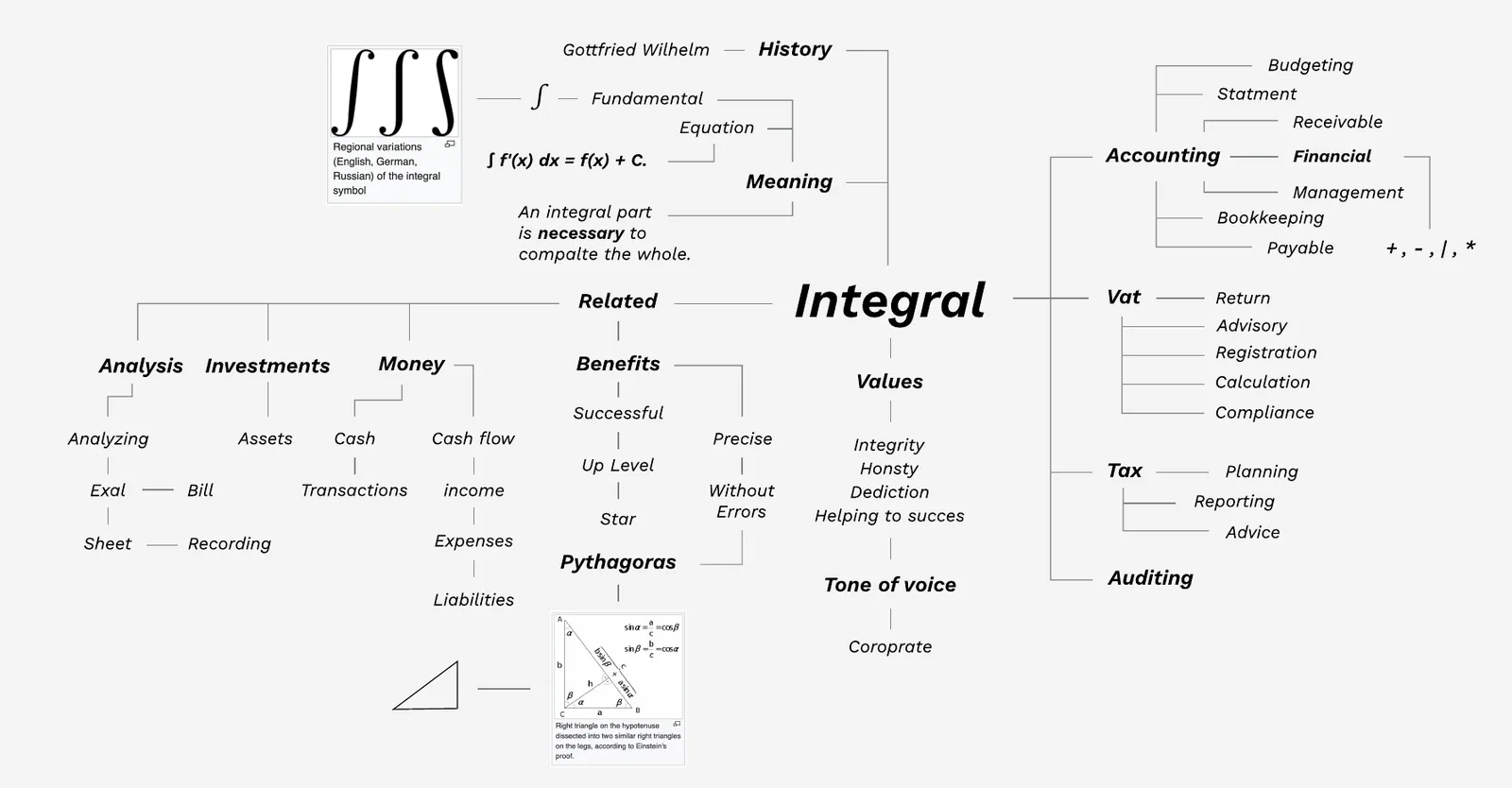
From our discovery session: one word, followed in every direction.
One branch stood out. In calculus, integration is a way of uniting small parts to find a whole. That is a fair description of what an accountant does every day. Every entry is a small piece. Integral's job is to add them up into one clear picture of a business.
"An integral part is necessary to complete the whole."Integral brand idea
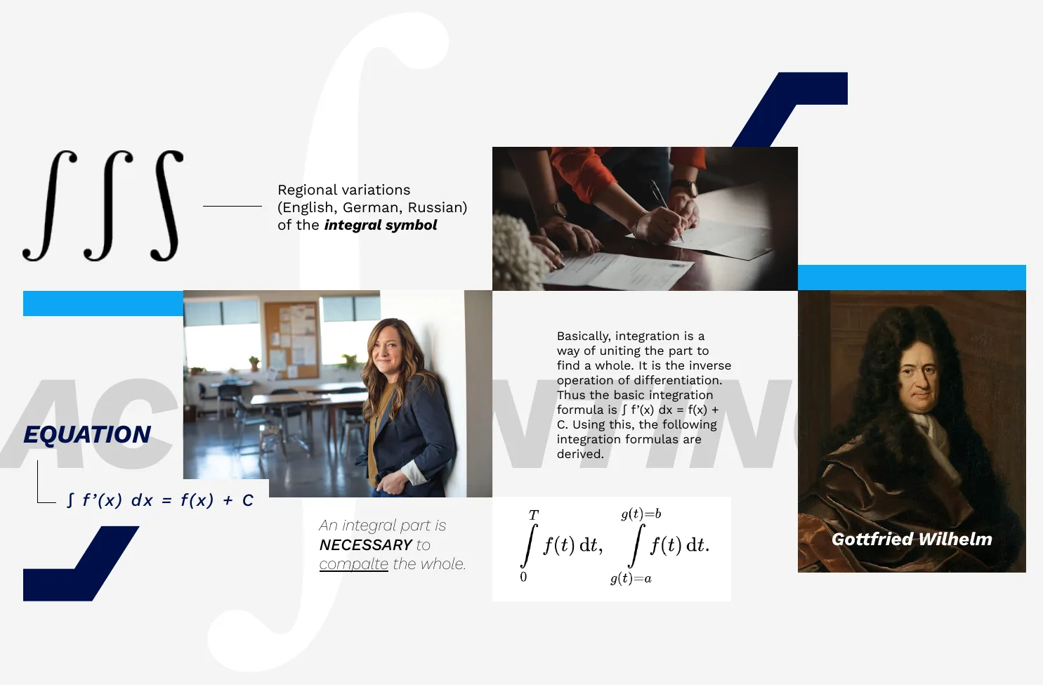
The moodboard: the integral sign, the formula behind it, and the people the brand serves.
From that idea we set three values: integrity, honesty and dedication. Then we defined how the brand behaves, so every future decision has something to check against.
How it looks
Precise. Modern. Clean geometry, with nothing extra.
How it speaks
Clear. Corporate. Warm enough to feel hassle-free.
How it thinks
Accurate, on time, compliant. The client's success comes first.
(Our guide to brand strategy explains how we get from a workshop to a position like this.)
The identity: the symbol, color and type
With the idea clear, we built the pieces people actually see. Each one had to feel exact enough for a CFO and friendly enough for a founder filing their first VAT return.
Integral sign + pivot table
The symbol joins two shapes. The first is the integral sign (∫), redrawn as a stepped, pixel-cut stroke so it stays sharp at any size. The second is the pivot table, the spreadsheet tool every accountant lives in. Put them together and you get a slanted mark that also reads as a rising bar chart. It says maths, it says spreadsheets, and it says growth, without spelling out any of them.
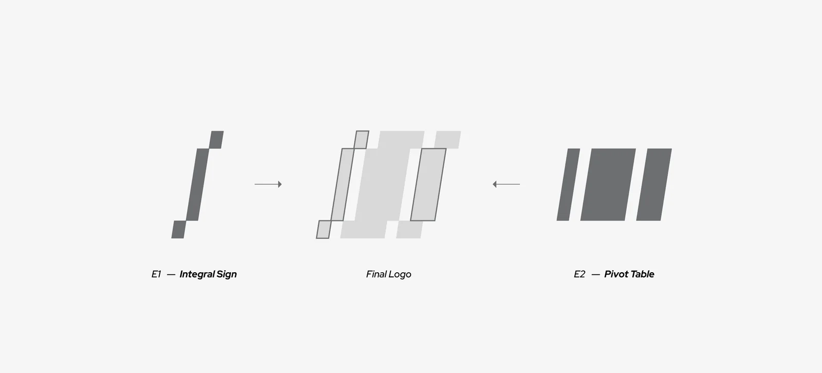
How the symbol is built: the integral sign on the left, the pivot table on the right, the final logo in the middle.
Next to it sits a lowercase wordmark. Lowercase was a deliberate choice: it feels confident without shouting, which is the tone Integral wanted with clients. Symbol and wordmark always stay locked together, in horizontal and stacked versions.
Midnight blue, with a spark
Most finance brands stop at navy. We kept the authority of a deep Midnight Blue and paired it with a bright Dodger Blue that feels digital and alive. Light Gray gives everything room to breathe. The palette has fixed proportions, roughly 50% Midnight Blue, 30% Dodger Blue and 20% Light Gray, so layouts stay balanced whoever designs them.
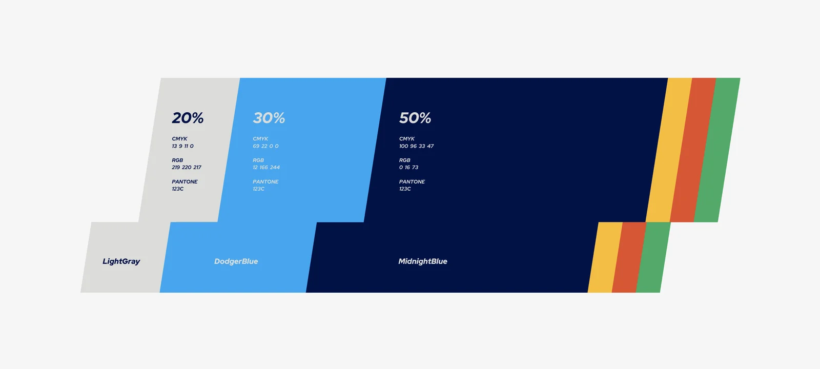
The palette in proportion: three core colors, plus one accent for each sub-brand.
| Color | Role | What it says | HEX |
|---|---|---|---|
| Midnight Blue | Primary: backgrounds, text, the wordmark | Authority and trust | #001049 |
| Dodger Blue | Primary: the symbol and highlights | Energy and a digital edge | #0CA6F4 |
| Light Gray | Secondary: surfaces and space | Calm and clarity | #DBDCD9 |
For type, a classic serif handles the headlines and a clean sans-serif carries the body text. The serif brings a sense of heritage, which matters when you're asking people to trust you with their books. The sans keeps everything easy to read on a phone. Both have Arabic partners, so bilingual reports, proposals and posts stay balanced. (More on that in our guide to bilingual brand identity.)
One family, three services: the brand architecture
Integral doesn't sell one thing. It runs business services, auditing, and accounting and bookkeeping, and each needed its own space without drifting away from the parent. So we built a master brand with three colour-coded sub-brands. Same symbol, same structure, different accent.
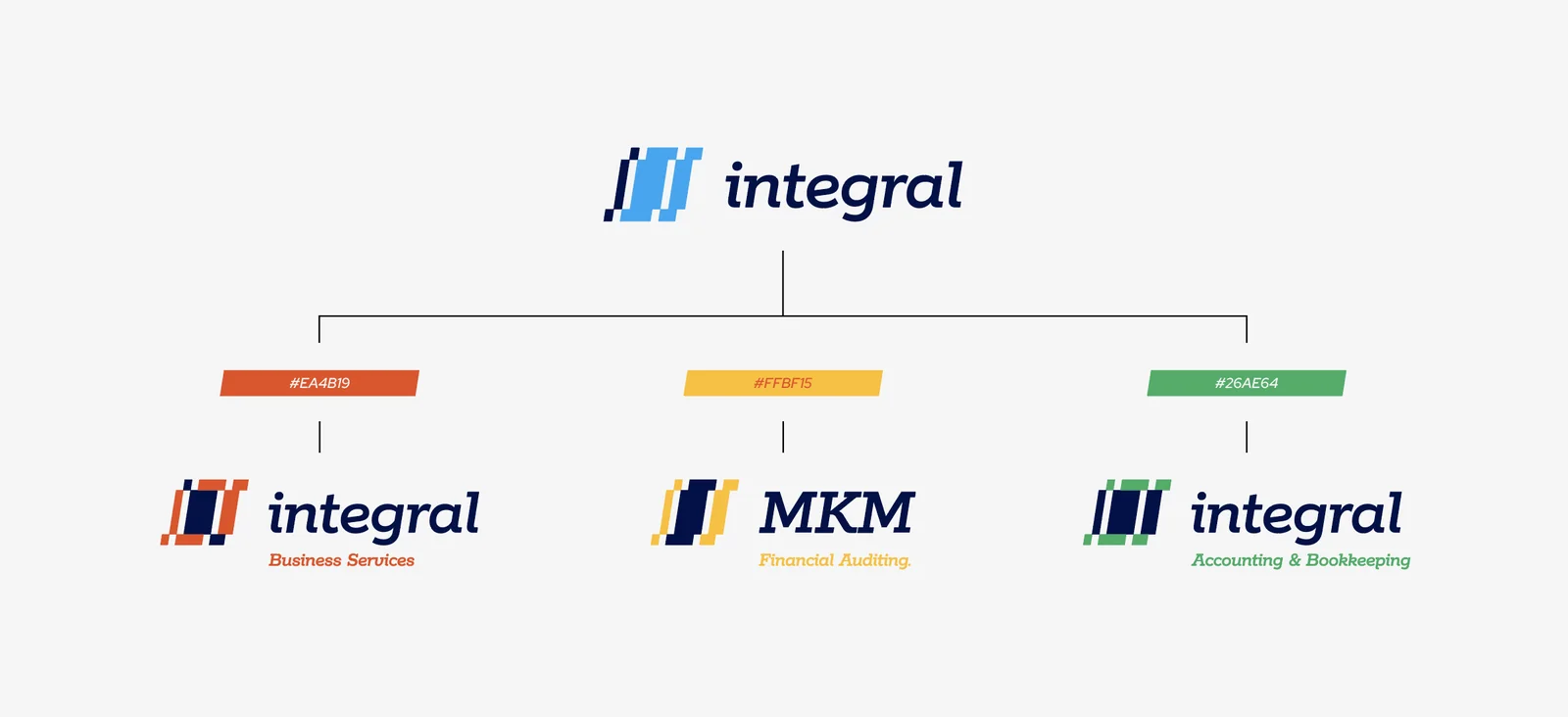
The brand family: one master brand, three services, one system.
| Brand | What it covers | Accent |
|---|---|---|
| Integral | The master brand | Dodger Blue |
| Integral Business Services | Business setup, PRO services, bank accounts, AML compliance, HR and payroll | Orange #E74C24 |
| MKM Financial Auditing | External, internal and stock audits | Yellow #FDBD18 |
| Integral Accounting & Bookkeeping | Bookkeeping, financial statements, payables and receivables | Green #25AC63 |
A client can tell at a glance which part of Integral they're dealing with, and still know it's all one firm. It also means a fourth service can be added later without redesigning anything. We go deeper into this in our piece on building one identity across a growing business.
Icons drawn on the same grid
Accounting services are abstract, and stock icons make them look even more generic. So we drew our own set for VAT, statements, reporting, home, charts and audit. Each one starts on the same grid as the logo and uses the same slanted, pixel-cut shapes.
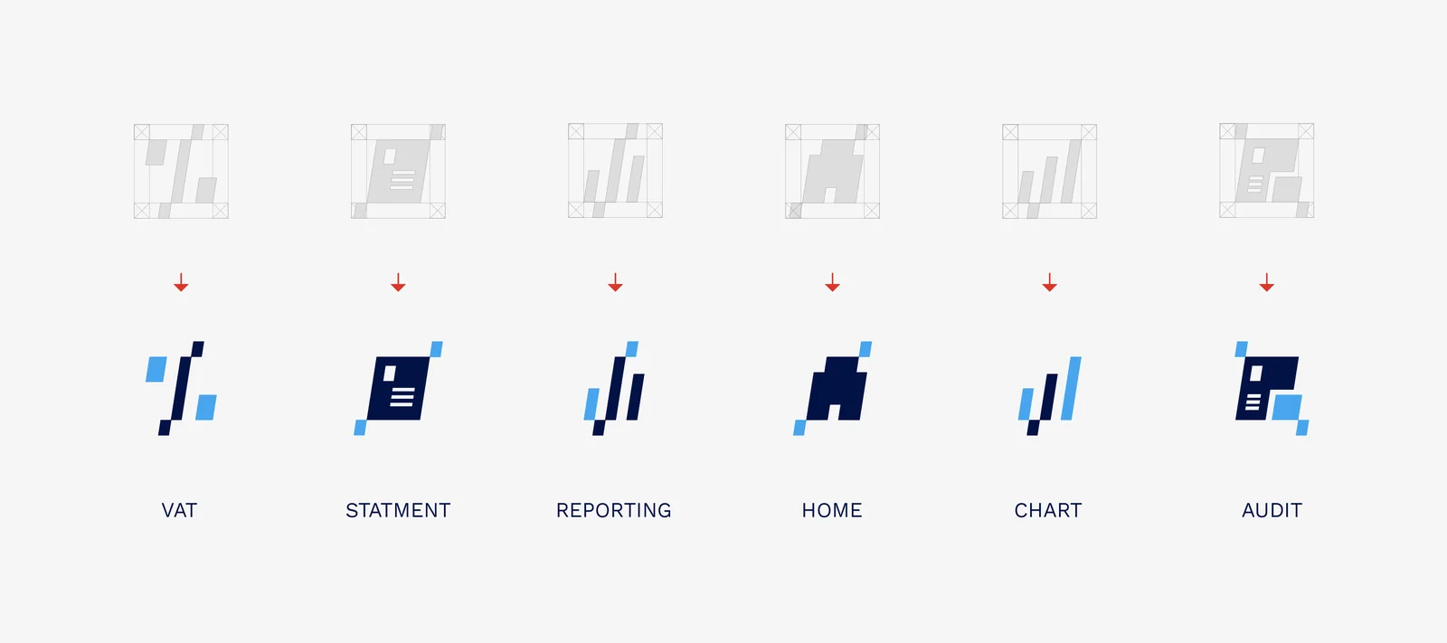
The icon set: sketched on the grid above, finished below.
It's a small detail with a real job: on a service page, a proposal or a social post, the icons help people find what they need quickly, and they never look borrowed.
From the business card to the billboard
We broke the symbol into a kit of slanted blocks and steps. They frame photos, hold headlines and build patterns, so even a layout with no logo on it still feels like Integral. Then we applied that kit everywhere a client meets the brand.
Website
We designed the UI/UX and built a prototype around clear routes into each service. The slanted blocks lead the eye down the page toward one simple action: get in touch.
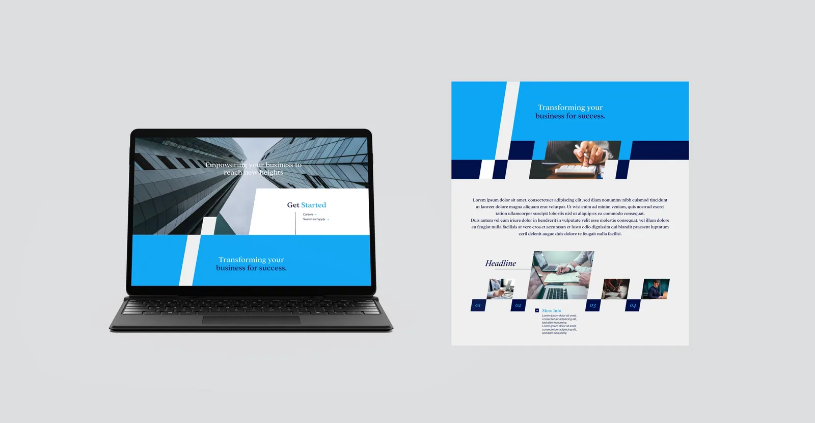
Website: the brand's blocks, colors and type, applied to the landing page.
Company profile and social media
The company profile tells the Integral story, from mission and values to a full breakdown of services. On social, the templates put real people at the centre, framed by the brand shapes, so posts feel human instead of looking like another tax reminder.
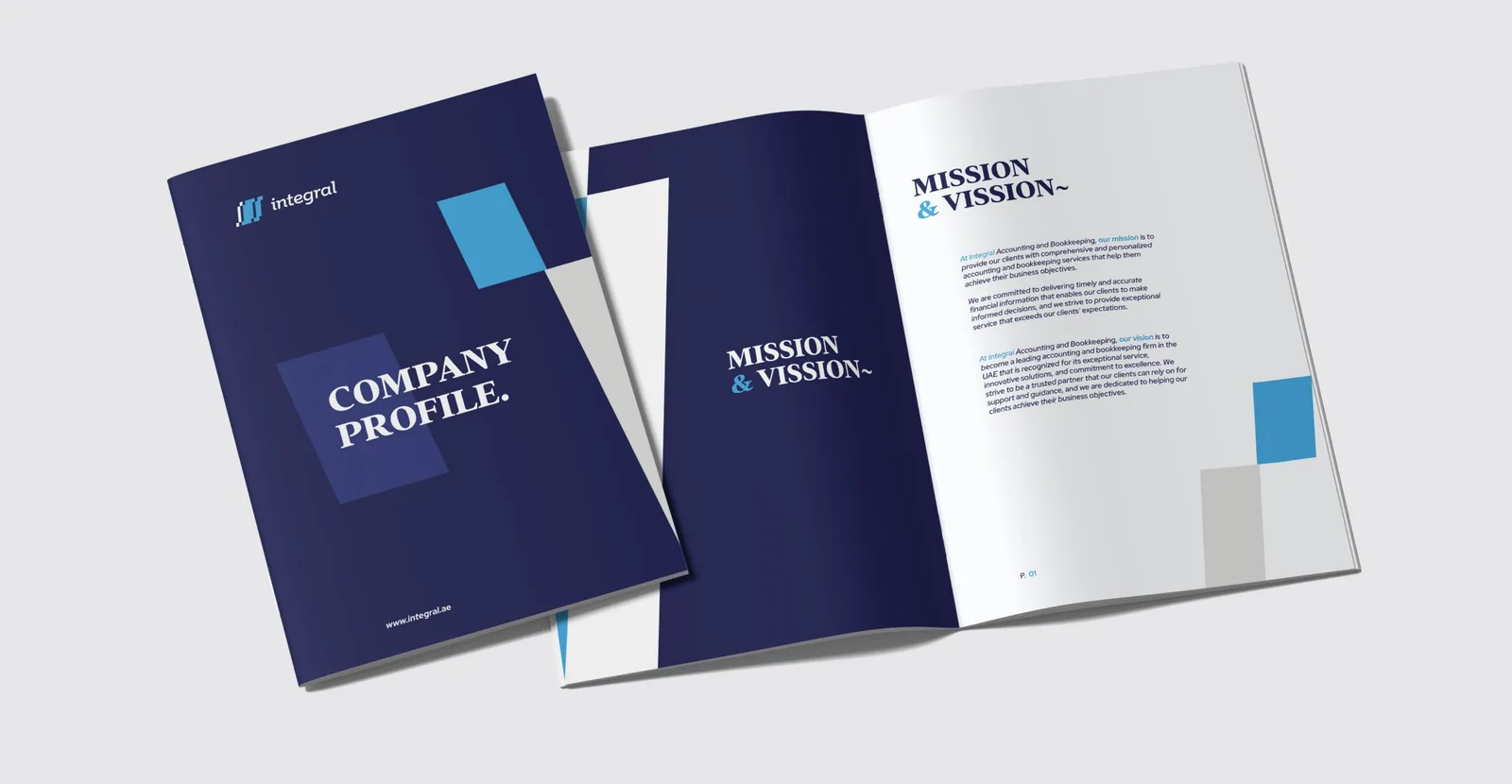
Company profile: cover and mission spread.
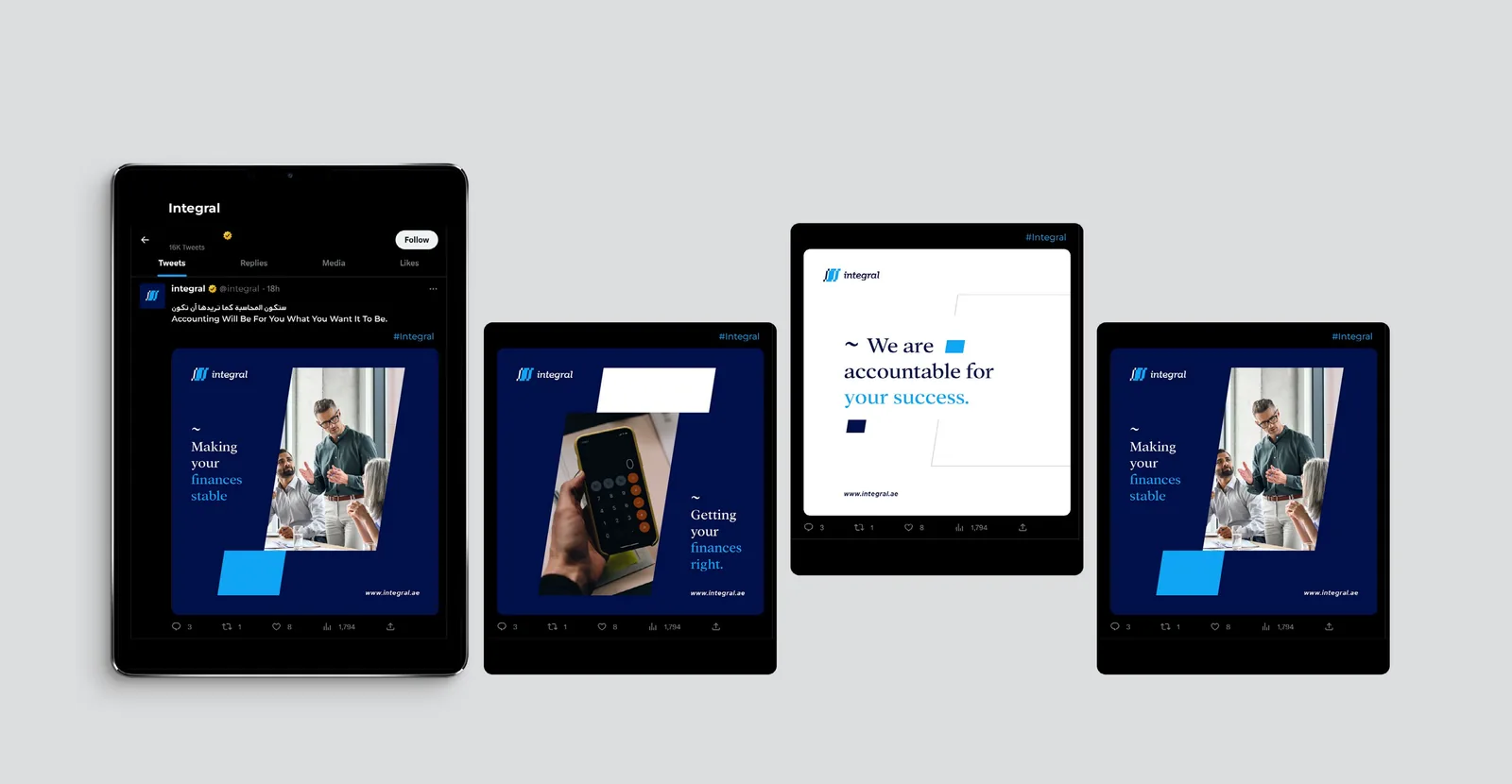
Social media: people first, brand around them.
Outdoor and posters
Outdoors, the symbol scales up into a bold graphic statement. The campaign line, "Accounting works like magic," takes a dry subject and gives it a smile, which is the opposite of what the category usually does.
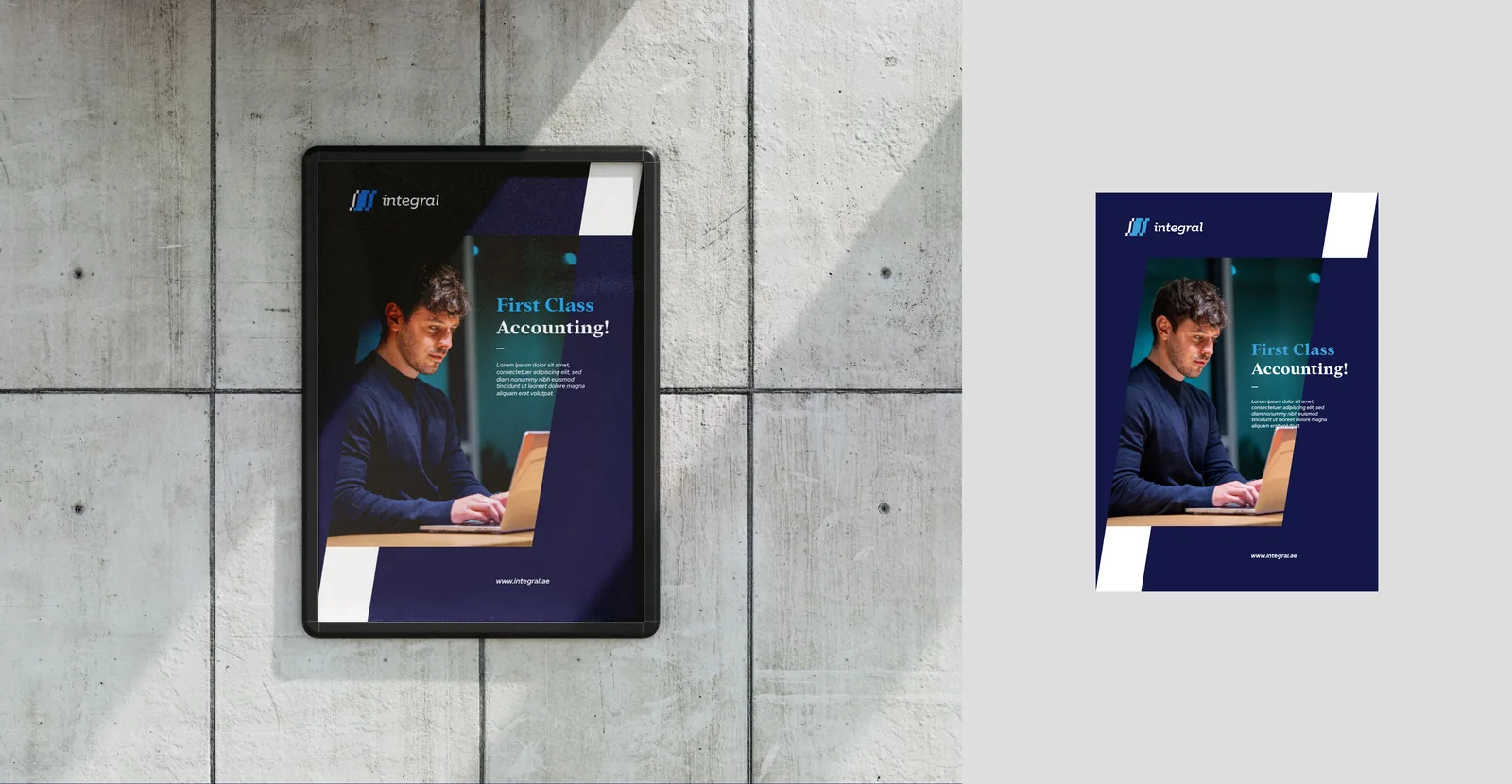
Poster: "First Class Accounting," framed by the brand's blocks.
Stationery and ID cards
For a professional services firm, the business card and the letterhead are often the first things a client holds. We designed cards, letterheads, folders, envelopes, notebooks and staff ID cards, all on the same system.
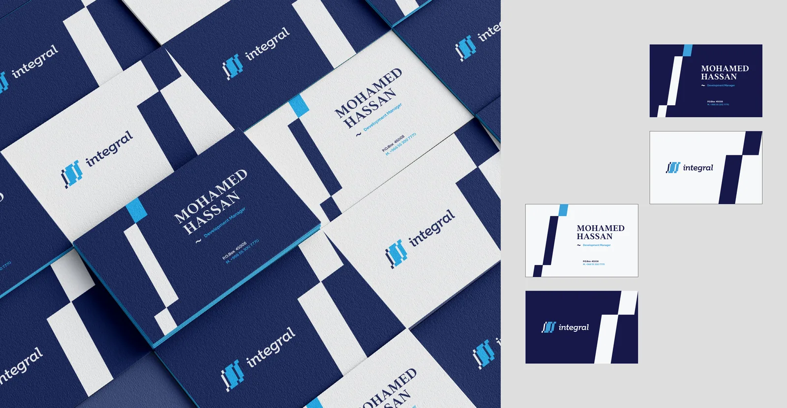
Business cards: navy on one side, white on the other.
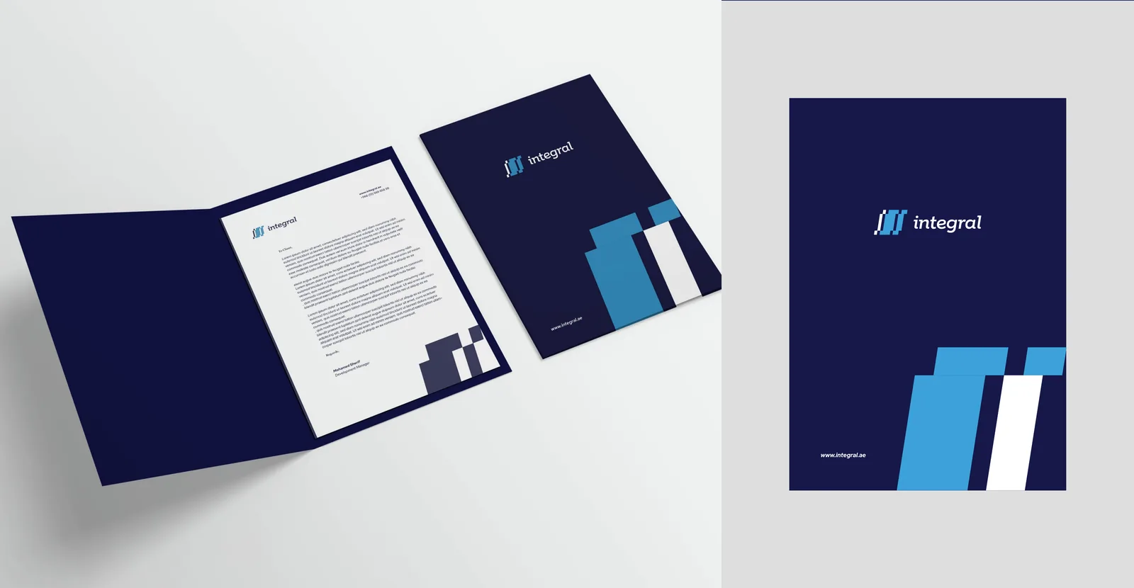
Folder and letterhead: made for proposals and client packs.
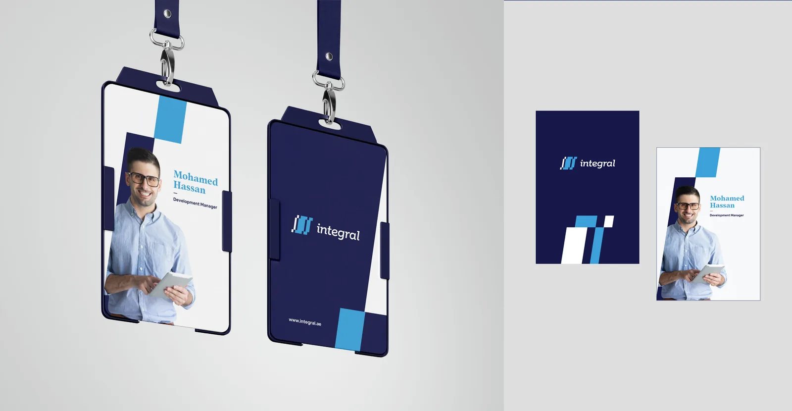
Staff ID cards: the team carries the brand into every client meeting.
Keeping it consistent: the brand guidelines
A new identity only stays new if everyone uses it the same way, from the internal team to the printer to the agency running social. So we documented everything in a 57-page brand guidelines book with six sections: brand overview, brand mark, colors, typography, graphic style and applications.
It covers the logo's clear space and minimum sizes, horizontal and stacked lockups for every sub-brand, color values for print and screen, type hierarchy in English and Arabic, and eight logo mistakes to avoid, from changing the colors to adding drop shadows. It even sets three standard sizes for using the symbol as a graphic on its own, so nobody has to guess.
What changed
Here is the short version of where the category sits, and where Integral sits now.
| Area | Typical UAE accounting brand | Integral |
|---|---|---|
| Idea | Generic trust and expertise | Every part completes the whole |
| Logo | Initials or a stock shape | Integral sign + pivot table, a rising chart |
| Color | Navy or teal, used loosely | Midnight and Dodger Blue in fixed proportions |
| Services | Separate logos, or no system | One master brand, three colour-coded sub-brands |
| Imagery | Calculators and skylines | Real people, framed by brand blocks |
| Tone | Formal and distant | Clear, corporate and warm |
| Consistency | Depends on who designs it | A 57-page guidelines book |
That last row matters most over time. A brand that only looks good when its original designer is in the room isn't really a brand. Integral's team can now run it on their own.
What other finance firms can take from this
Integral now has one clear idea, a look that holds together from the business card to the billboard, and a system that can grow with new services. Four lessons apply to almost any accounting, audit or advisory firm:
- Look for the idea in what you already have. Your name, your process or your tools often hold a better story than any trend.
- Plan for more than one service. Brand architecture is far cheaper to set up on day one than to fix in year five.
- Trust doesn't have to be cold. Clients want precision, but they also want to feel looked after.
- Write the rules down. Guidelines are what keep a brand consistent when the team grows.
If your business is industrial rather than financial, read how we rebranded NTS, an Egyptian kitchen equipment maker.
Financial services branding for the UAE, Saudi Arabia and Egypt
Integral is a Dubai firm, branded by our team in Cairo. Generator is a branding agency based in Egypt, working with finance, B2B, food, retail and lifestyle brands in the UAE, Saudi Arabia and across the Middle East and North Africa.
The lessons travel well. An accounting firm in Dubai, an advisory practice in Riyadh and an audit house in Cairo all face the same question: does our brand look as precise as the work we deliver? When the answer is no, the order is the same. Listen first, write the strategy, find one idea, then build a system that grows with you.
If you're comparing agencies, start with our guide on how to choose a branding agency in Saudi Arabia, Egypt and the UAE, see what a brand identity design company actually delivers, or read how we approach rebranding without losing what works.
Common questions
Why does an accounting firm need a strong brand?
Because clients can't see the quality of your work before they hire you. They judge it by how you present yourself. A clear, consistent brand tells them you are organised and precise before the first meeting. Integral had the expertise, but its look didn't show it.
What does the Integral logo mean?
The symbol joins the mathematical integral sign with the shape of a pivot table. In maths, an integral brings many small parts together into a whole, which is what good accounting does with a company's numbers. Together, the two shapes also read as a rising bar chart.
What is brand architecture, and why did Integral need it?
Brand architecture is how a company organises its brands and services. Integral runs business services, auditing, and accounting and bookkeeping. We built one master brand with three colour-coded sub-brands, so each service has its own space but clearly belongs to the same family.
How long did the Integral branding project take?
The design concept was presented in May 2023 and the full brand guidelines were delivered in July 2023. Timelines always depend on scope, number of sub-brands and how many applications are needed.
Do you work with brands in the UAE, Saudi Arabia and Egypt?
Yes. Generator is a branding agency based in Cairo, working with brands in the UAE, Saudi Arabia, Egypt and across the Middle East and North Africa on brand strategy, naming, identity, rebranding, websites and packaging.
Does your brand look as precise as the work you deliver?
If not, that's where we start. Generator helps brands in the UAE, Saudi Arabia, Egypt and across MENA find one clear idea and build an identity people remember. It would be a pleasure to hear what you're working on.
See the Integral project Start a conversationGenerator Design Agency · Cairo, Egypt · Working across the UAE, Saudi Arabia, Egypt & MENA · See more work · Our services